Introduction:
My first thoughts on the word abstraction is that it is:
- unusual
- unrealistic
- distorted
- deceptive
- diverse
- ambiguous
- strange
- unusual
- unrealistic
- distorted
- deceptive
- diverse
- ambiguous
- strange
Abstract photography: Depicting a visual image that does not have an immediate association with the object world and that has been created through the use of photographic equipment, processes or materials.
“Abstraction forces you to reach the highest level of the basics.” – Alan Soffer
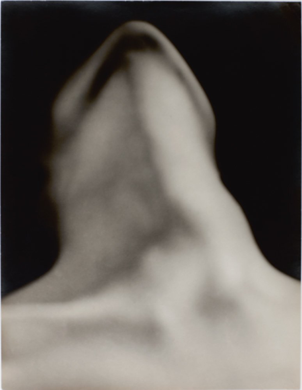
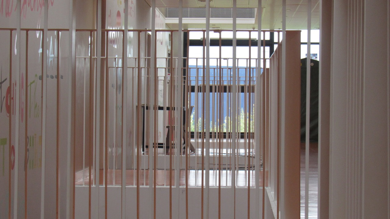
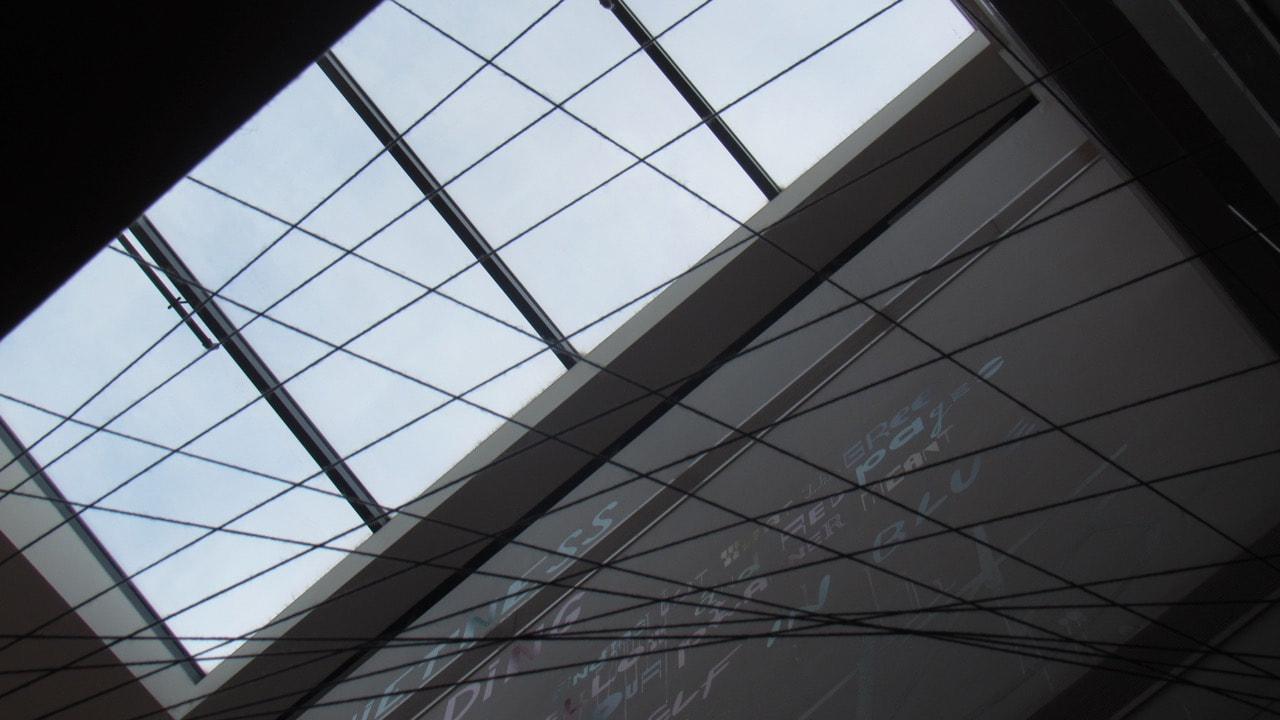
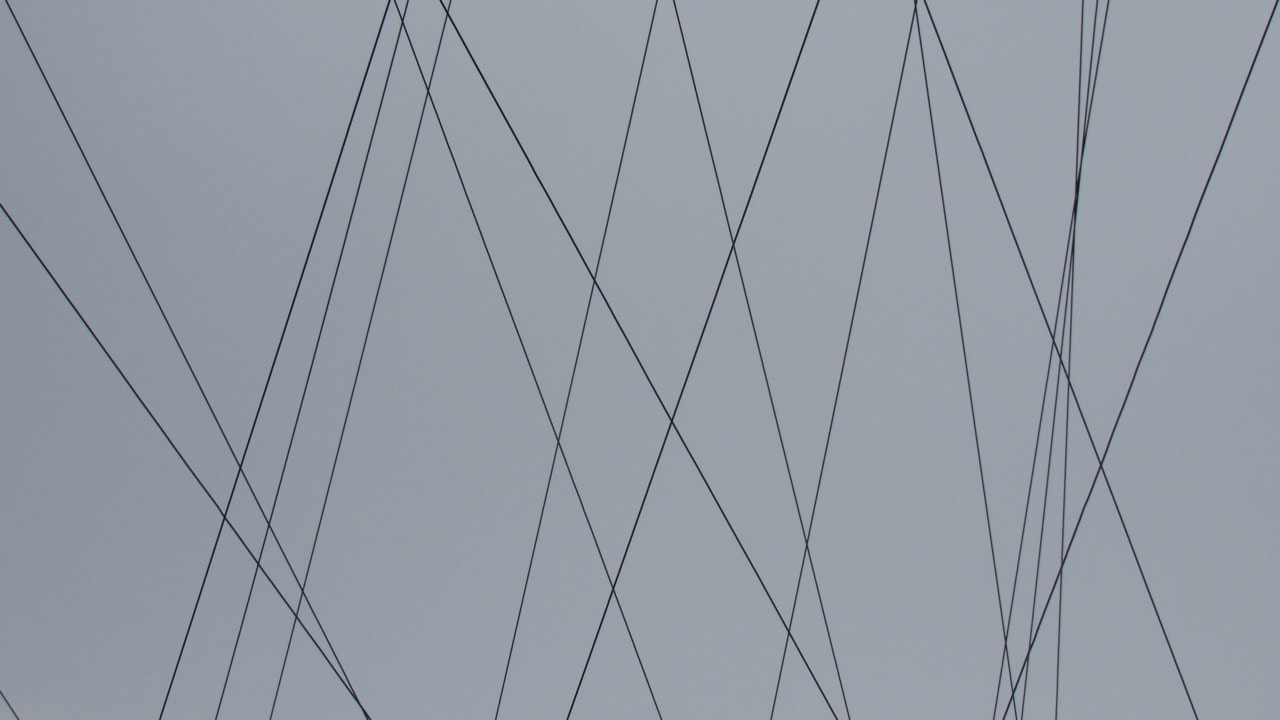
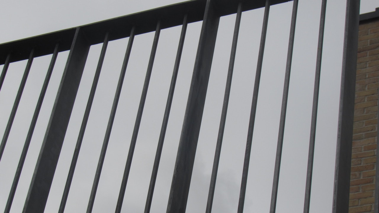
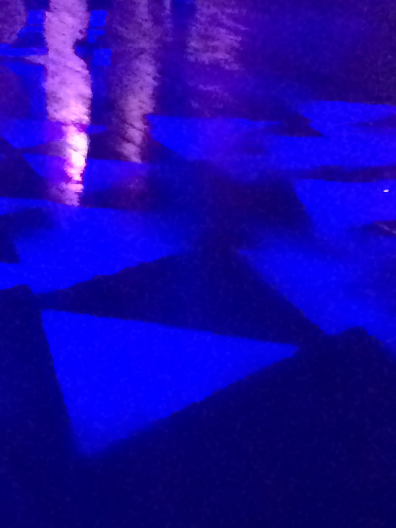
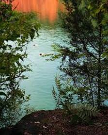
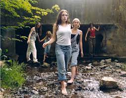
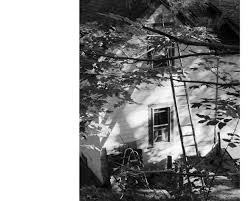
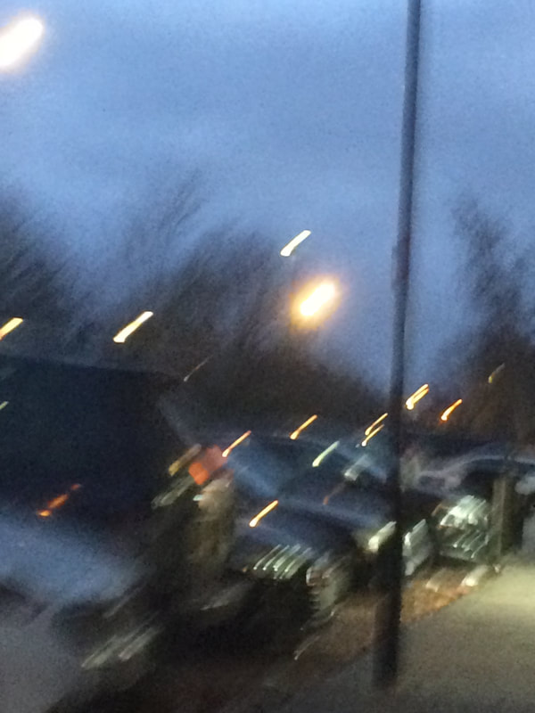
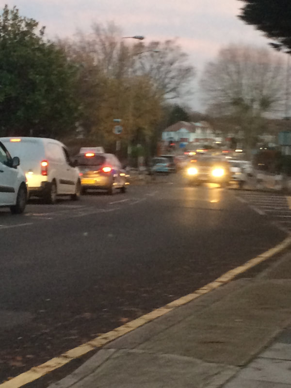
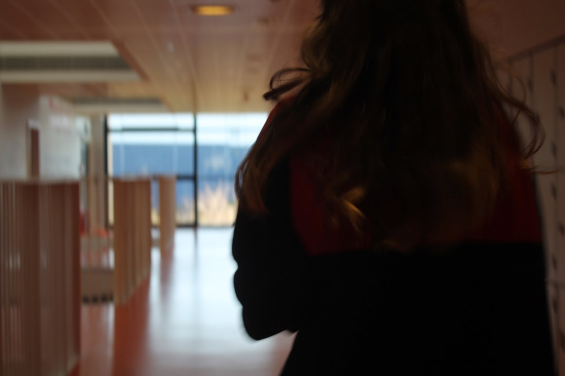
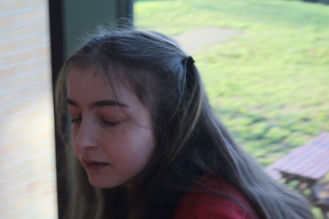
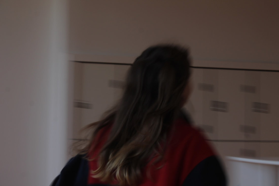
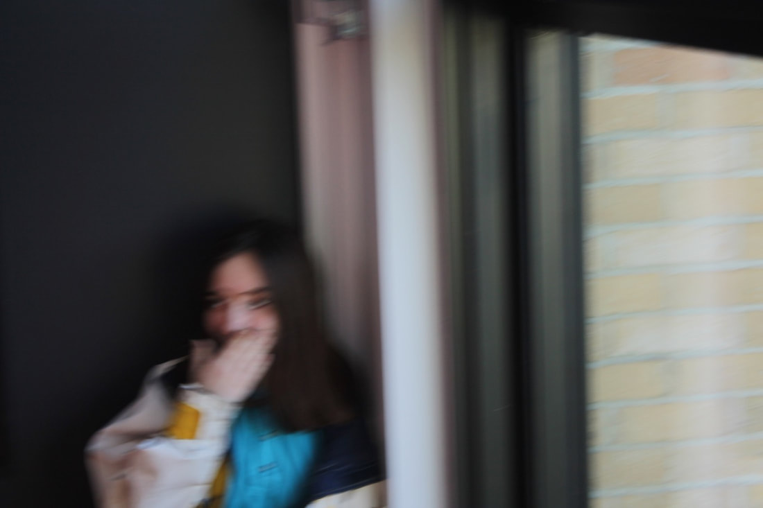
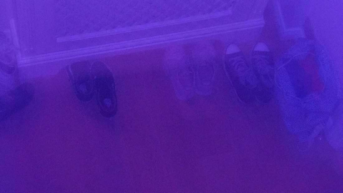
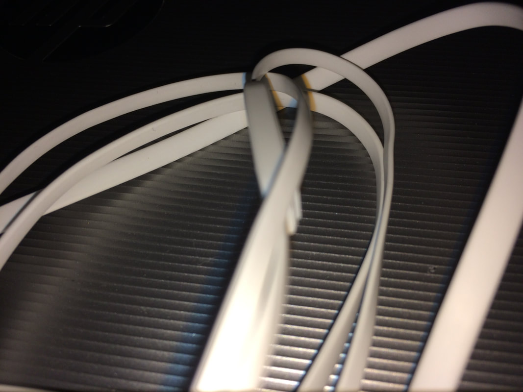
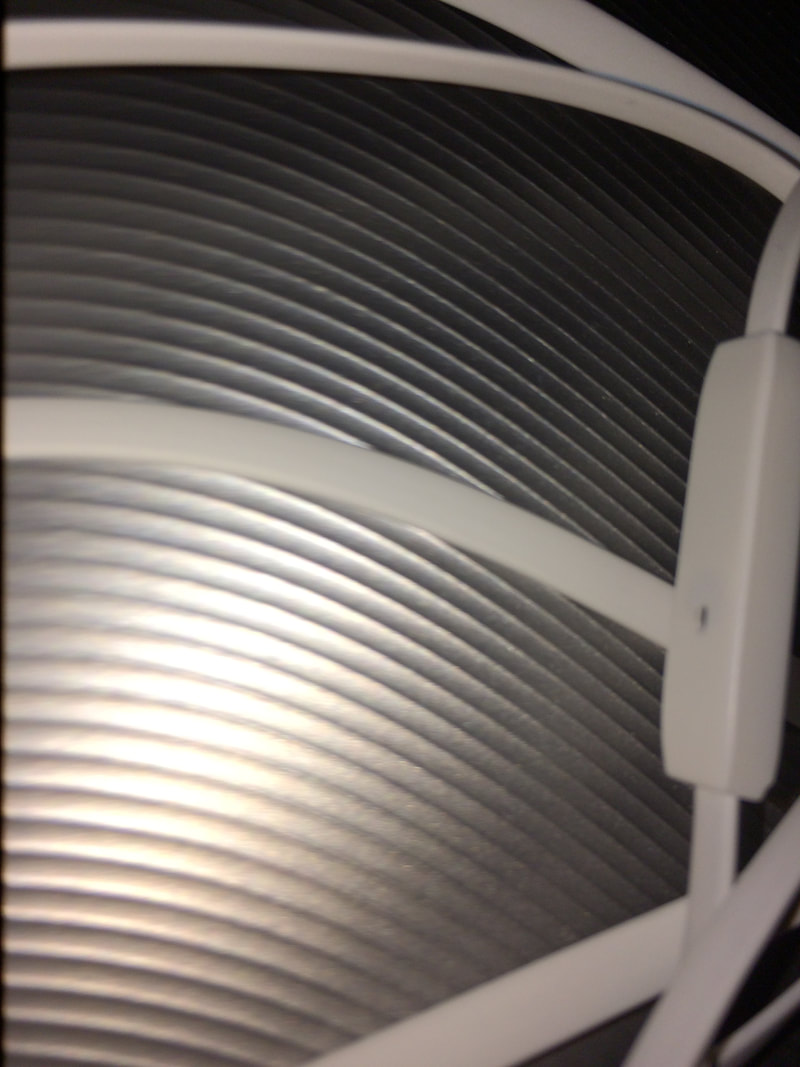
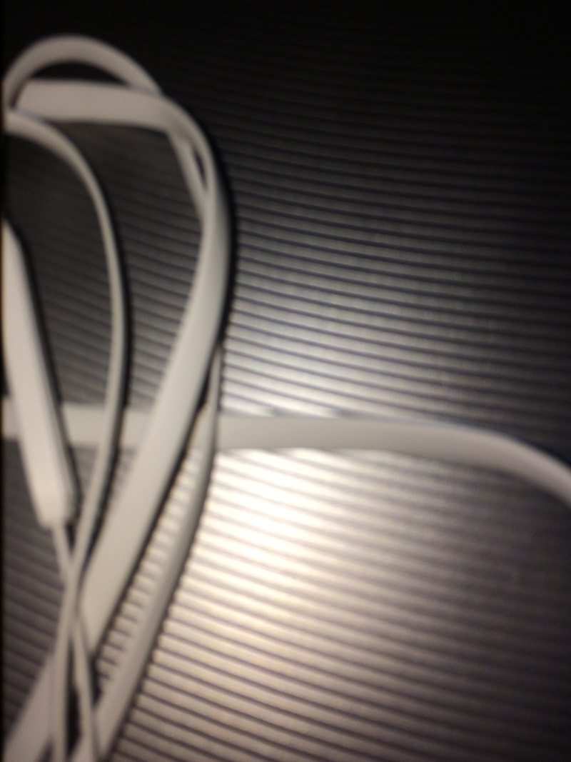
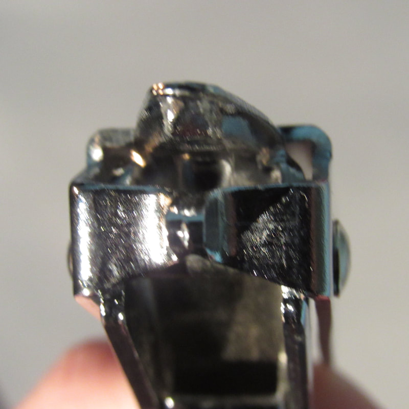
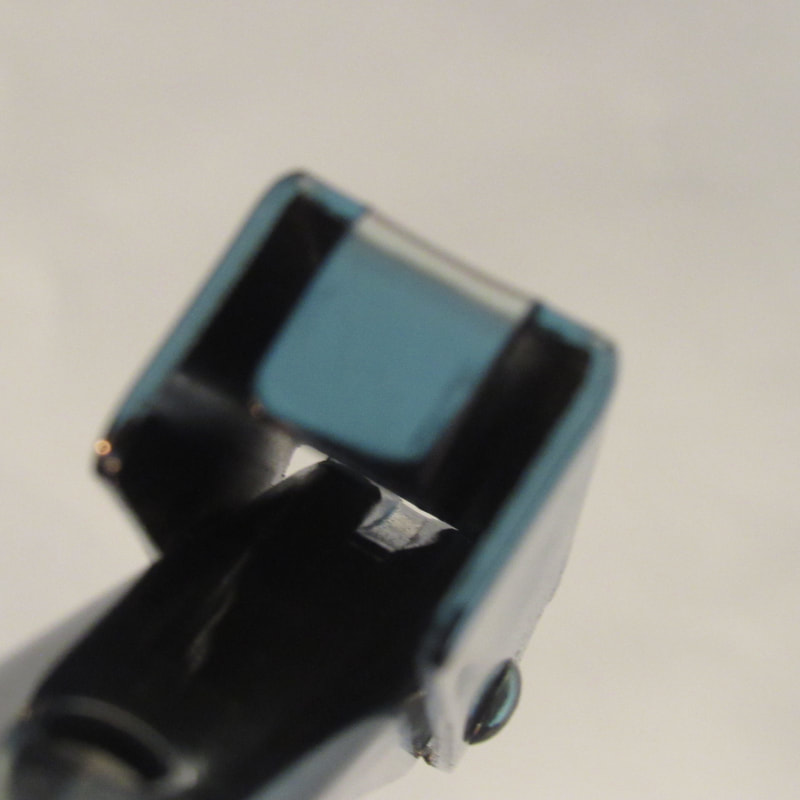
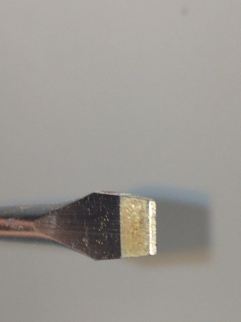
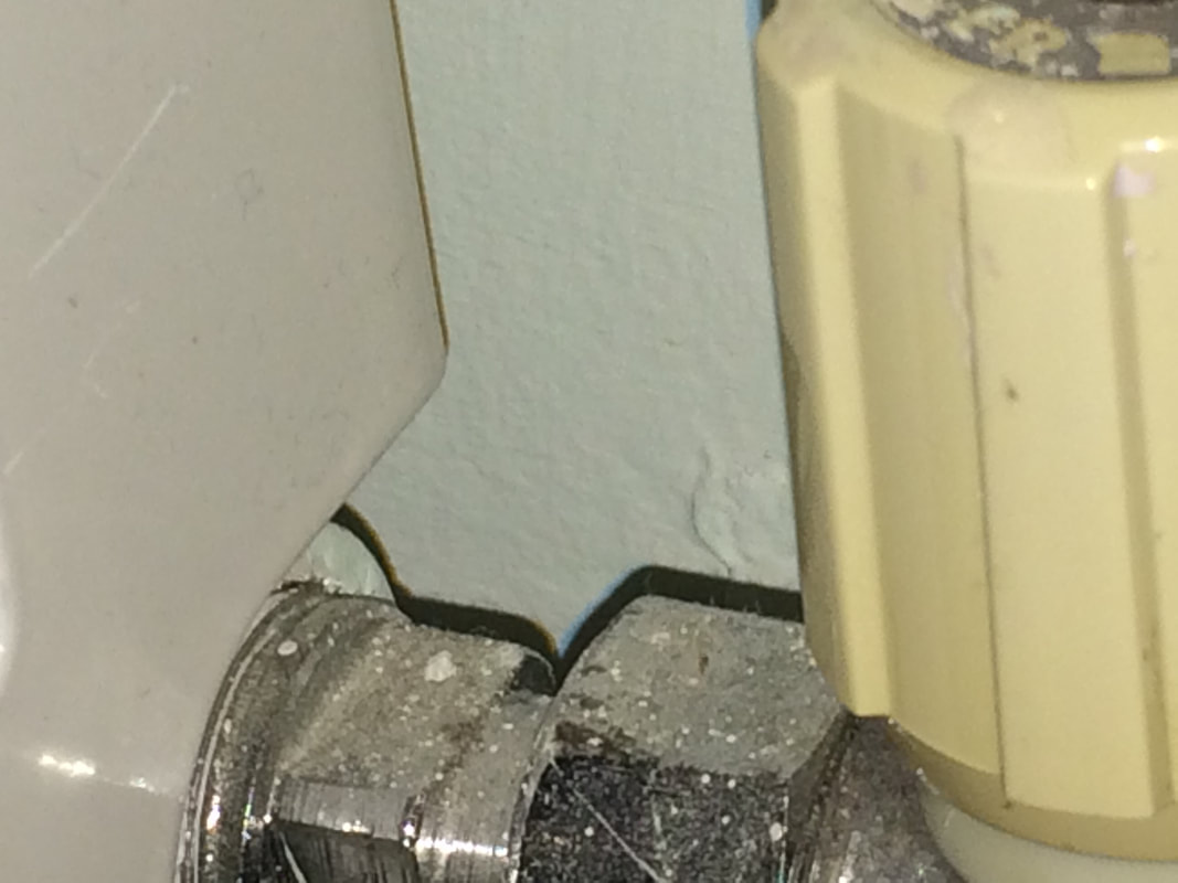
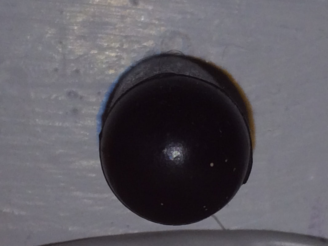
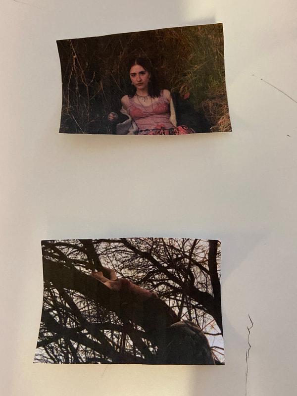
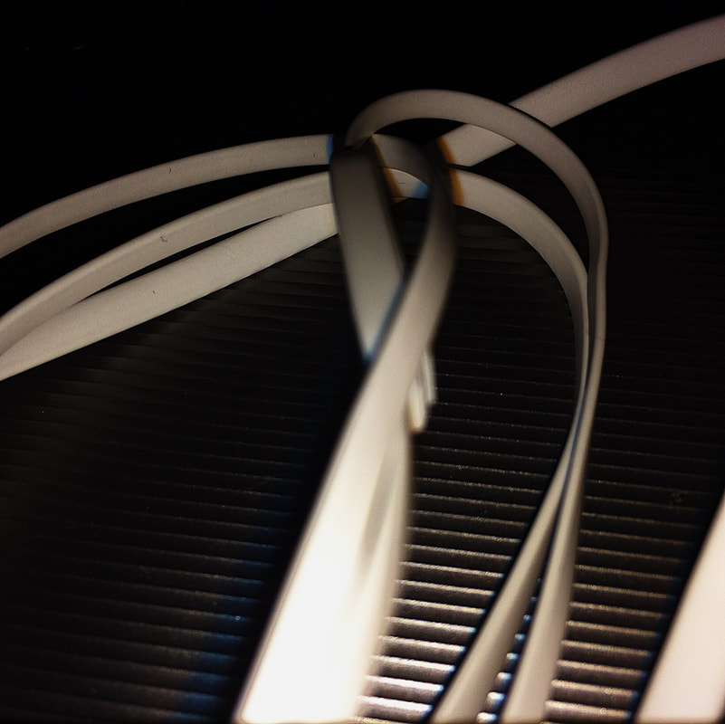
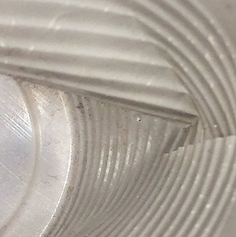
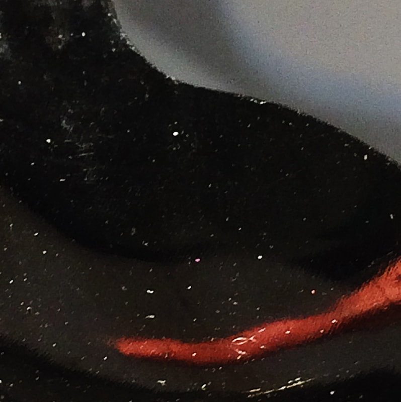
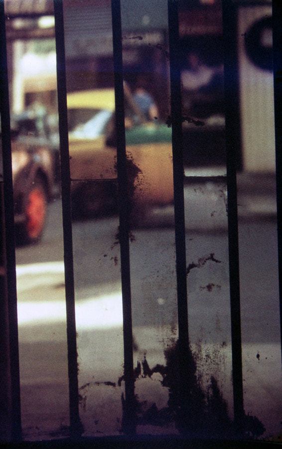
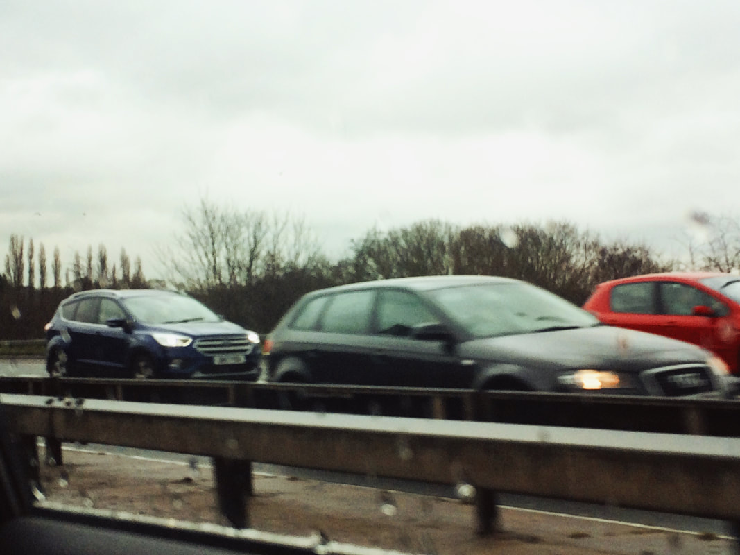
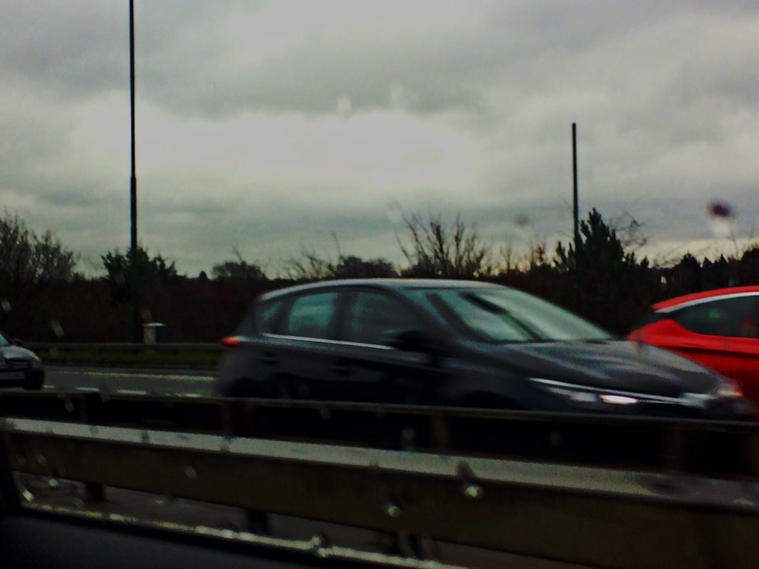
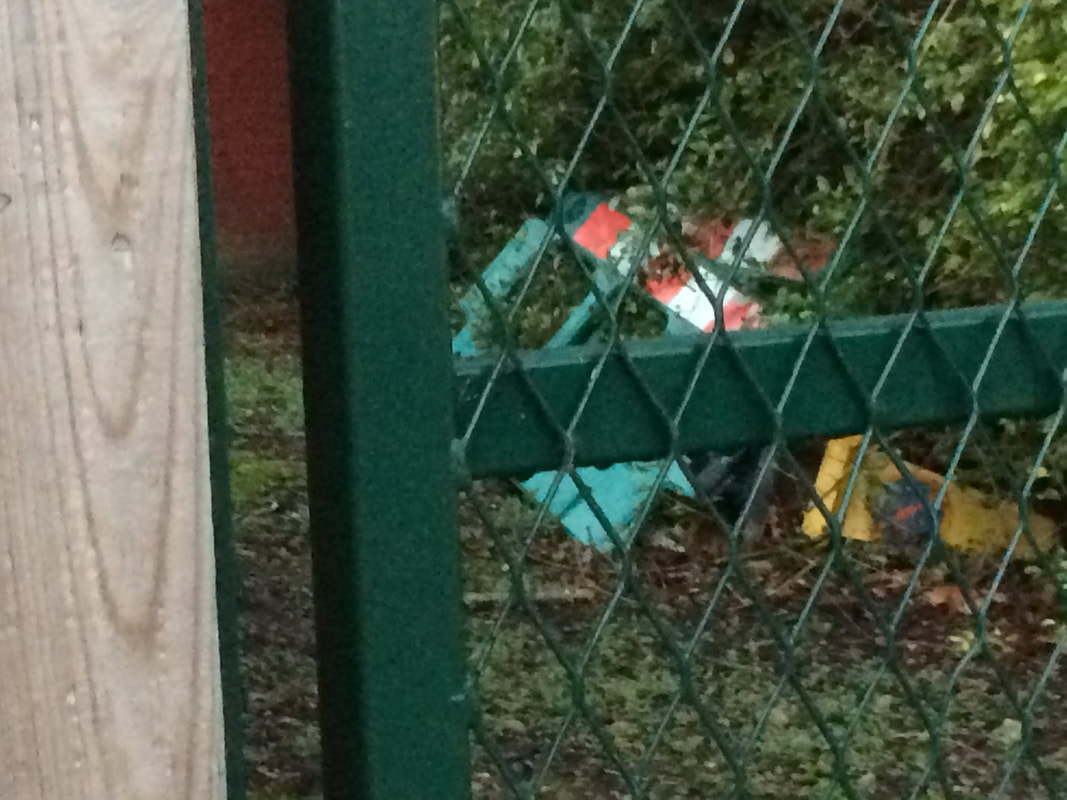
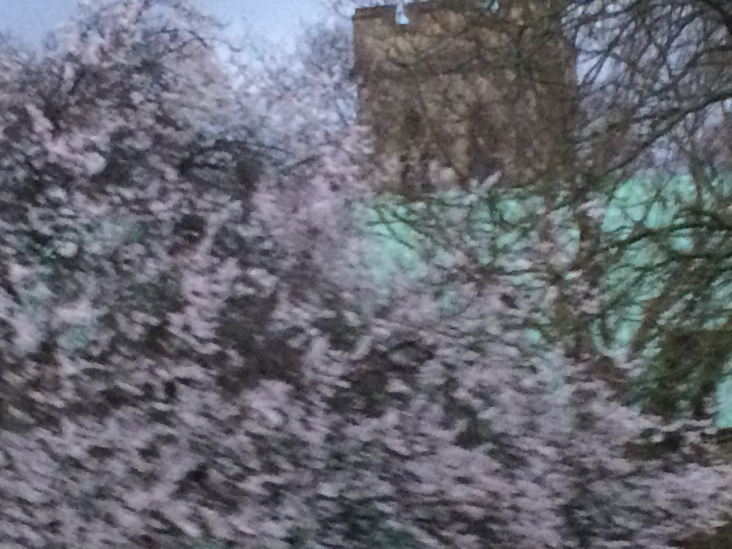
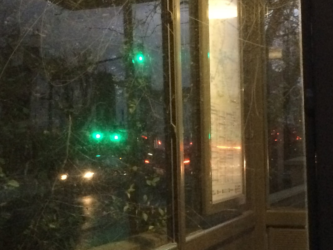
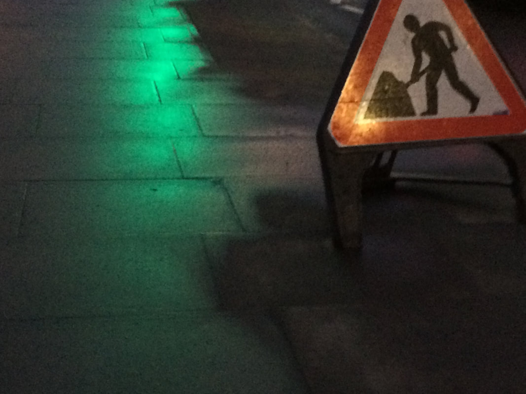
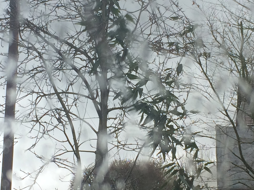
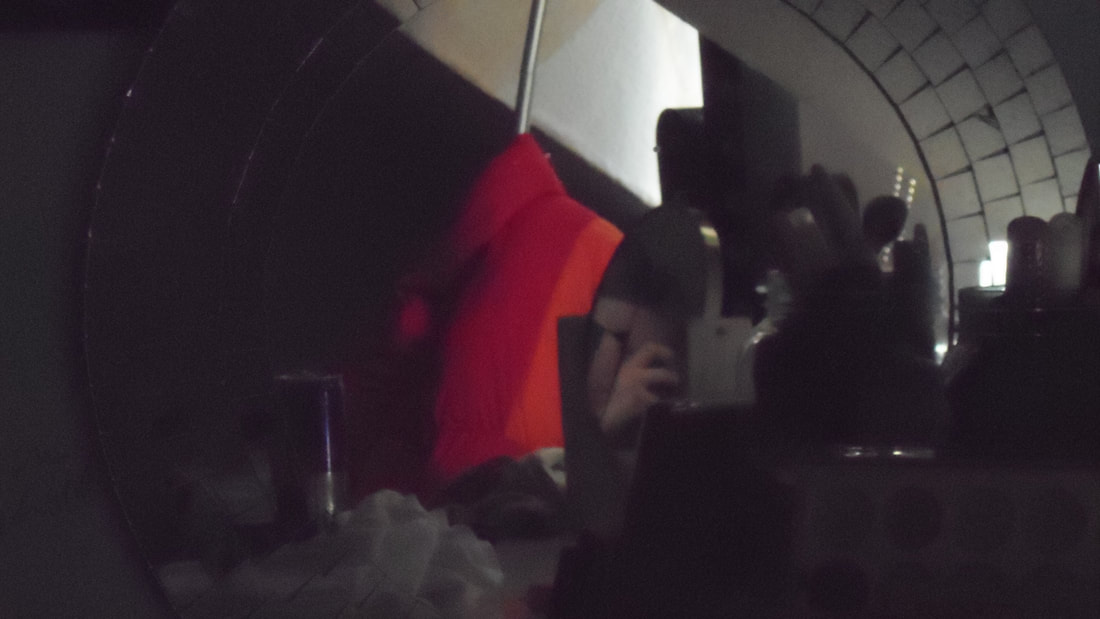
My photos: Summer abstraction photoshoot


Pictures taken in class: first abstract photoshoot
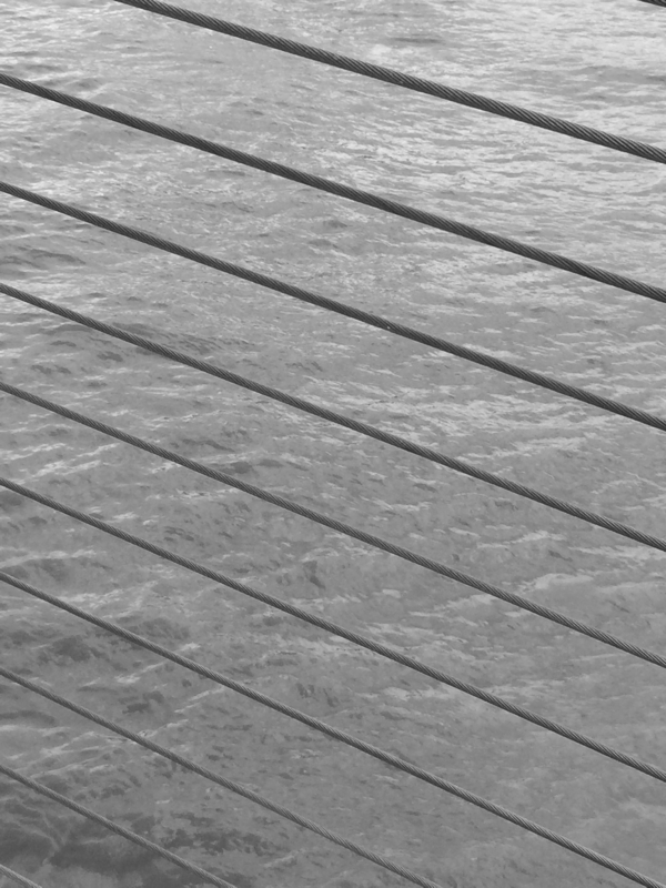
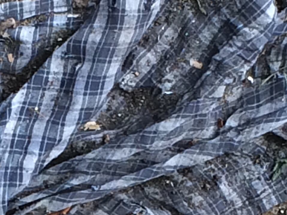
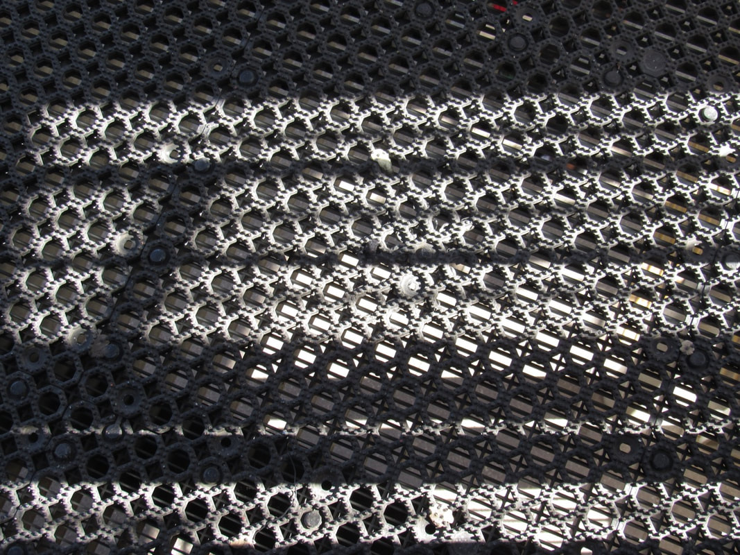
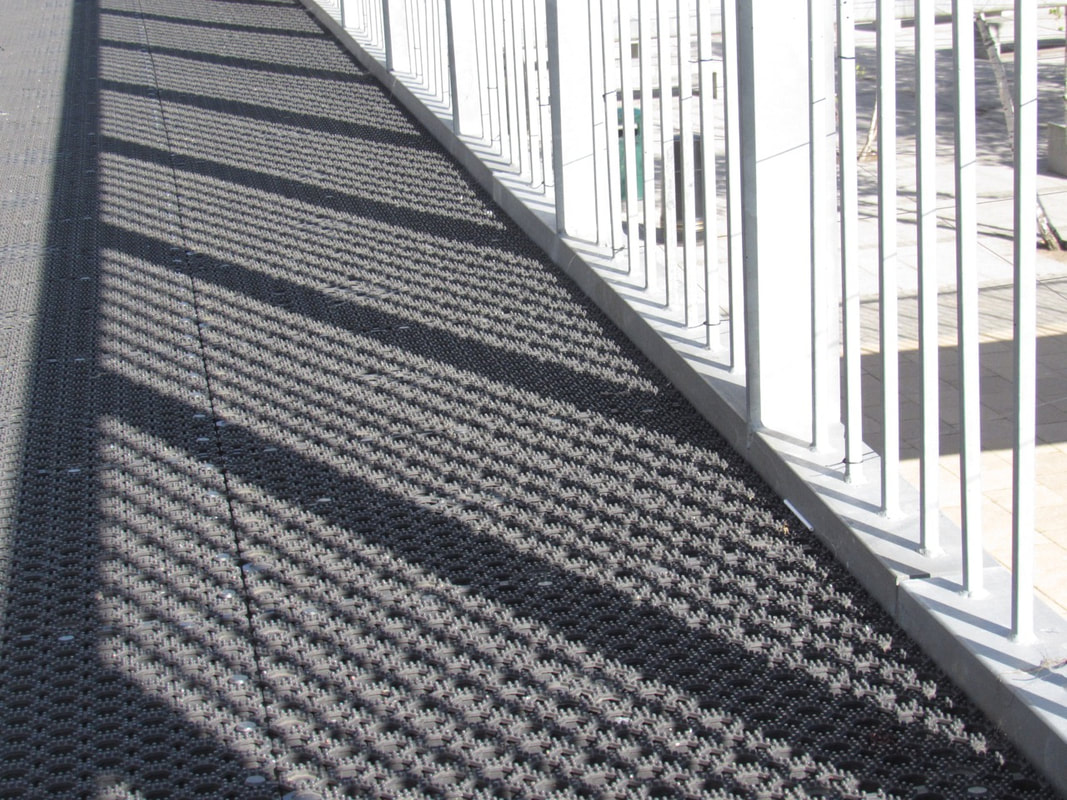
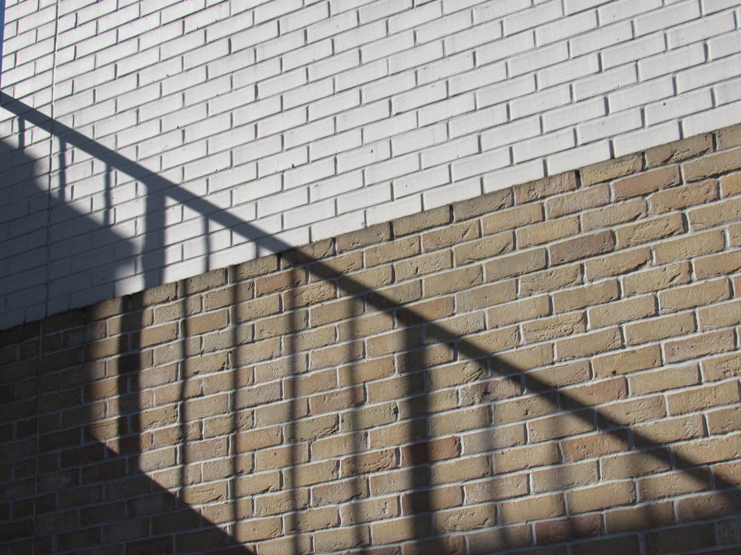
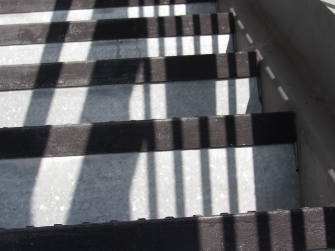
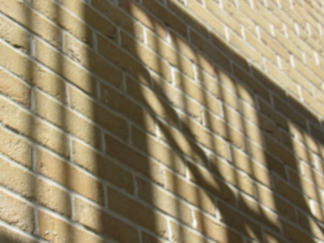
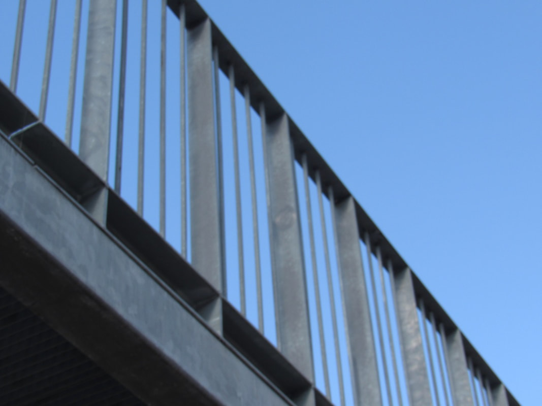
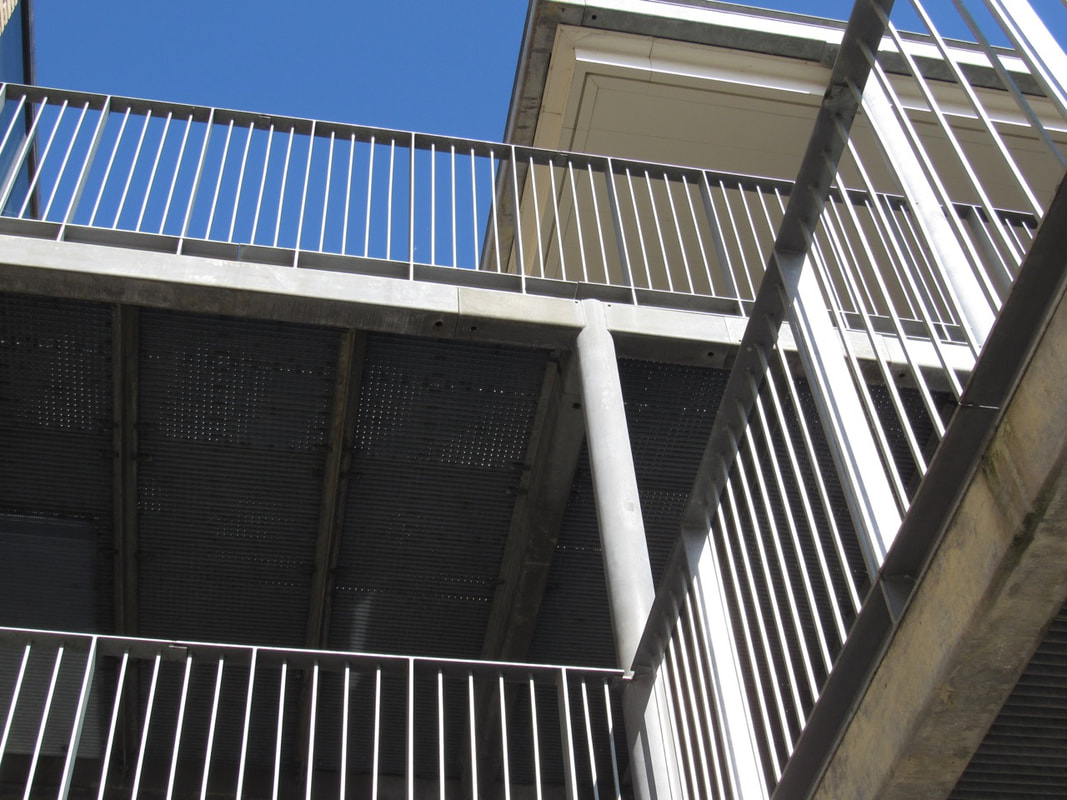
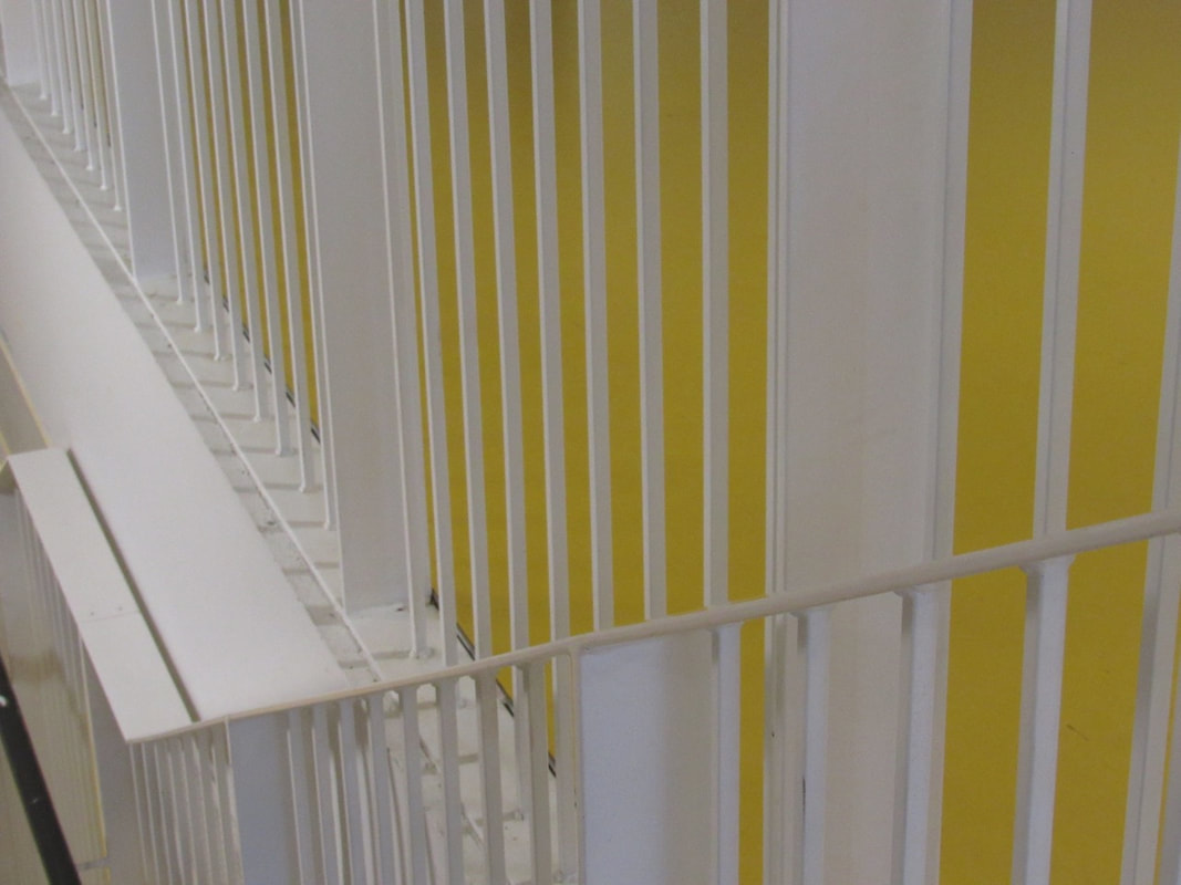
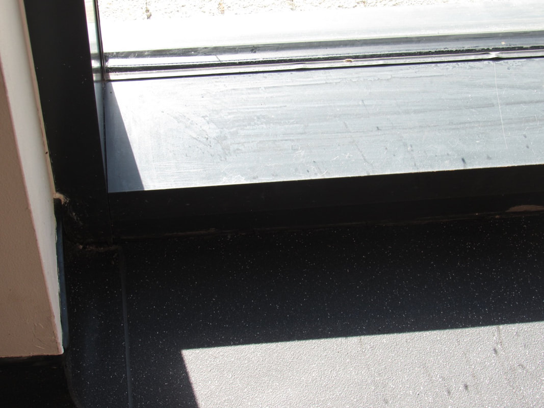
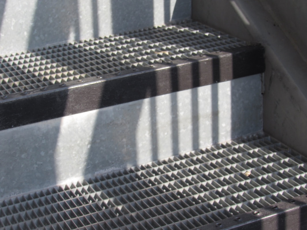
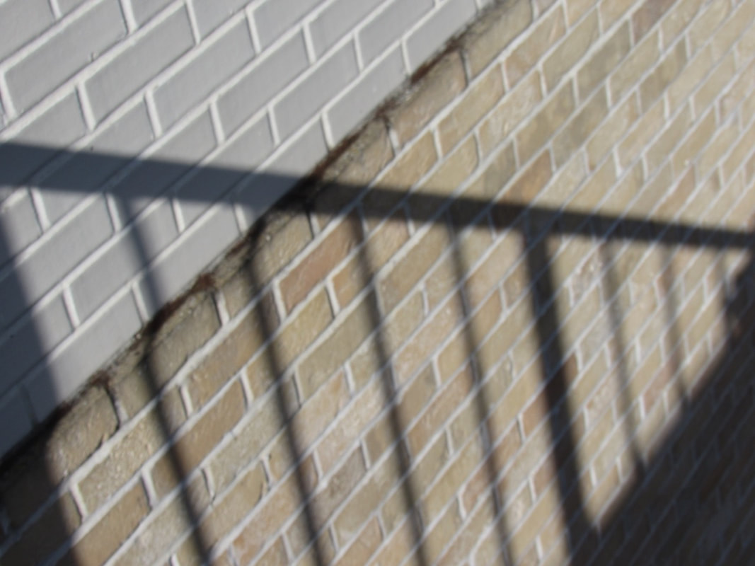
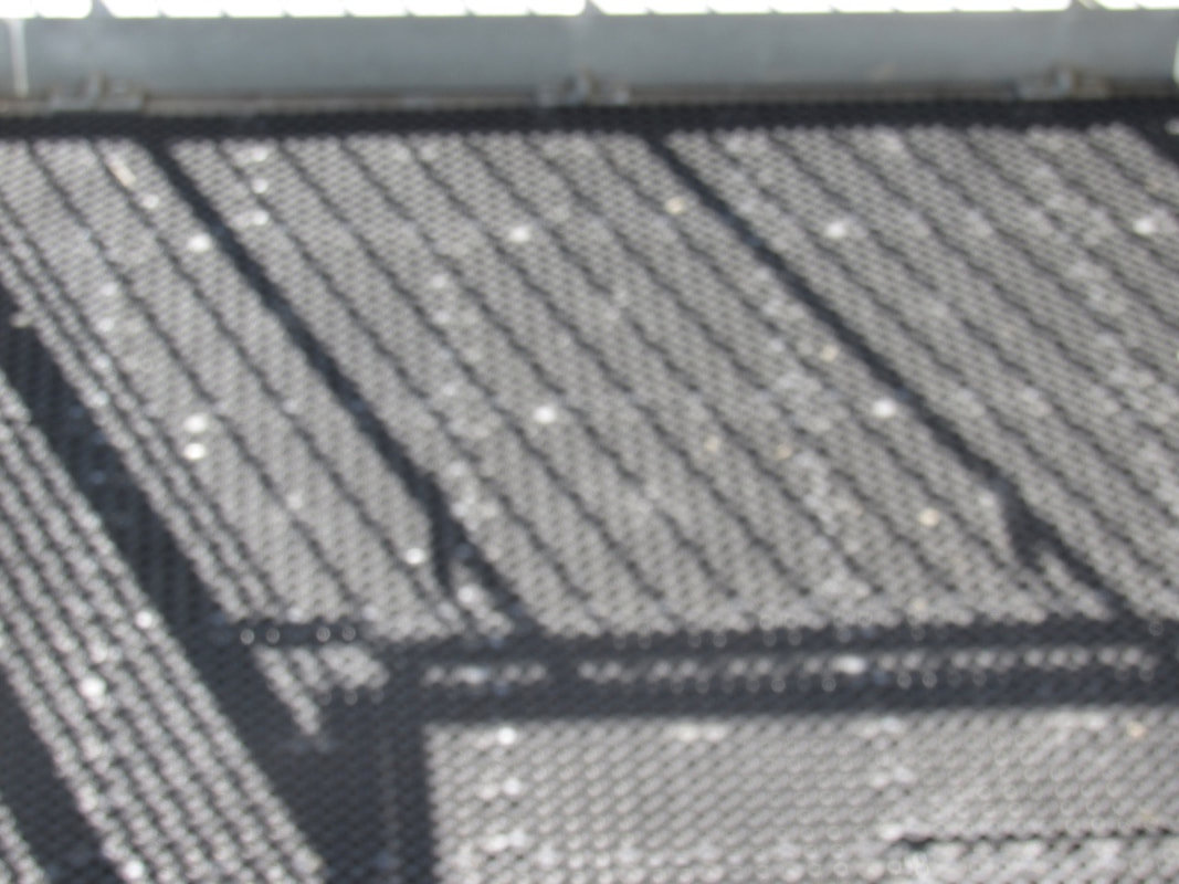
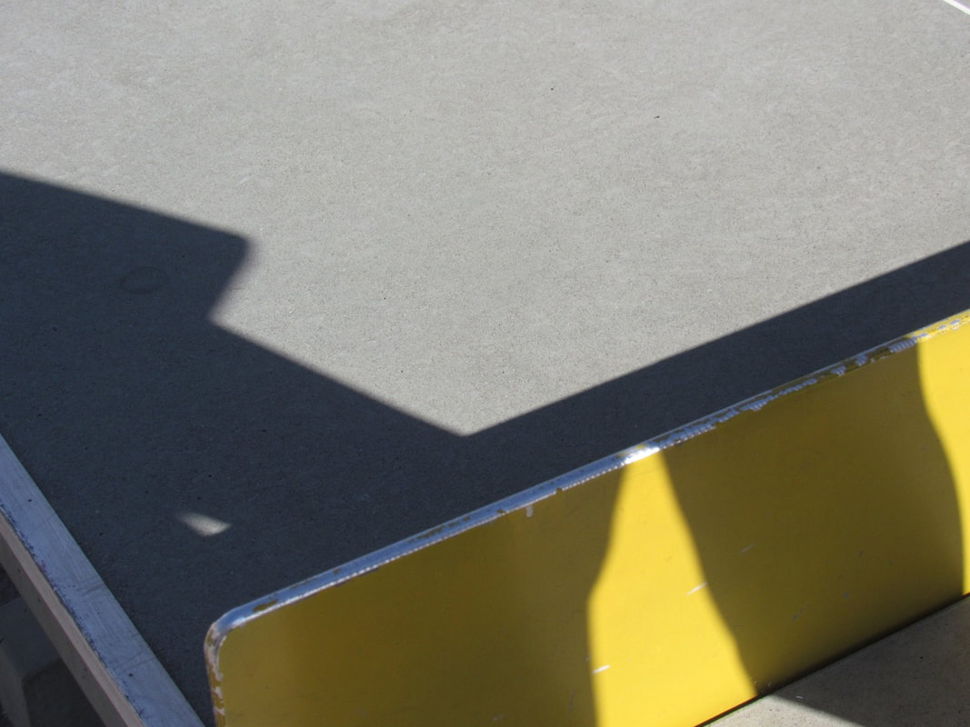
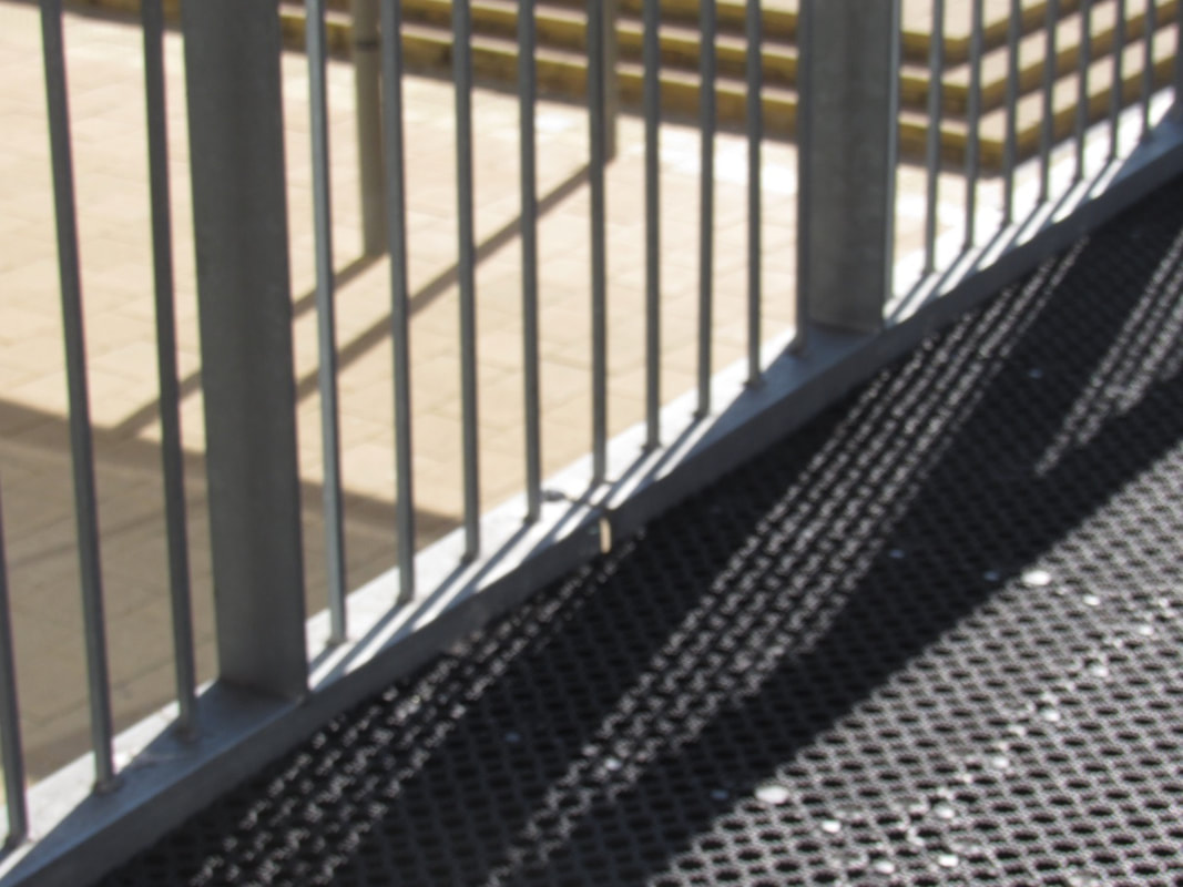
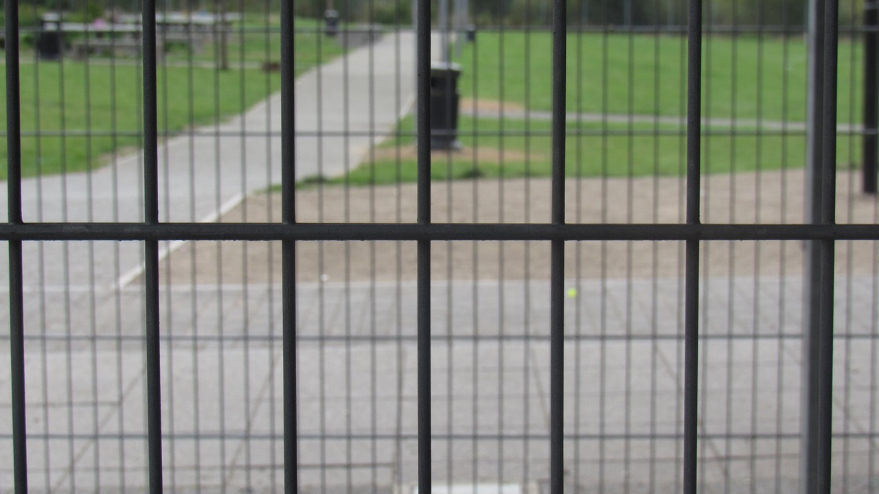
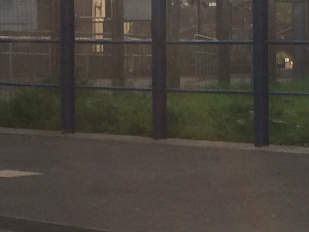
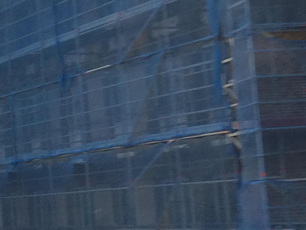
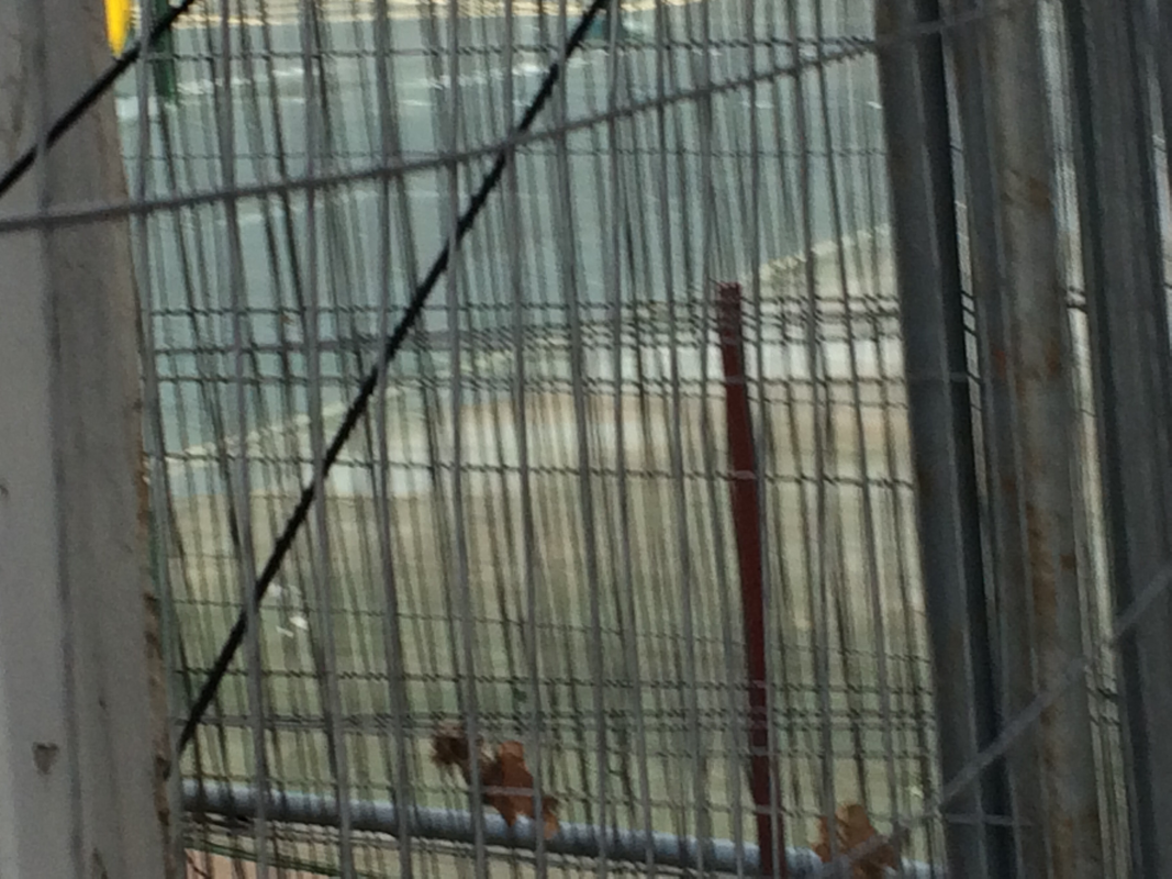
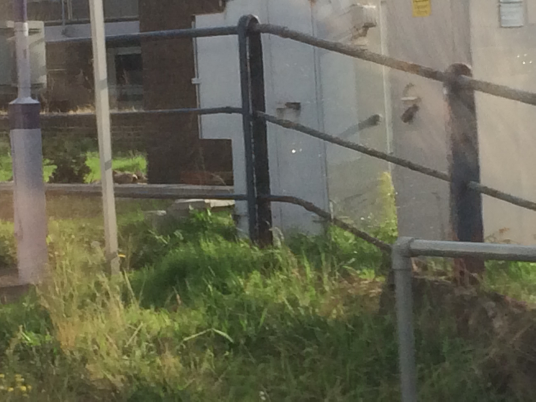
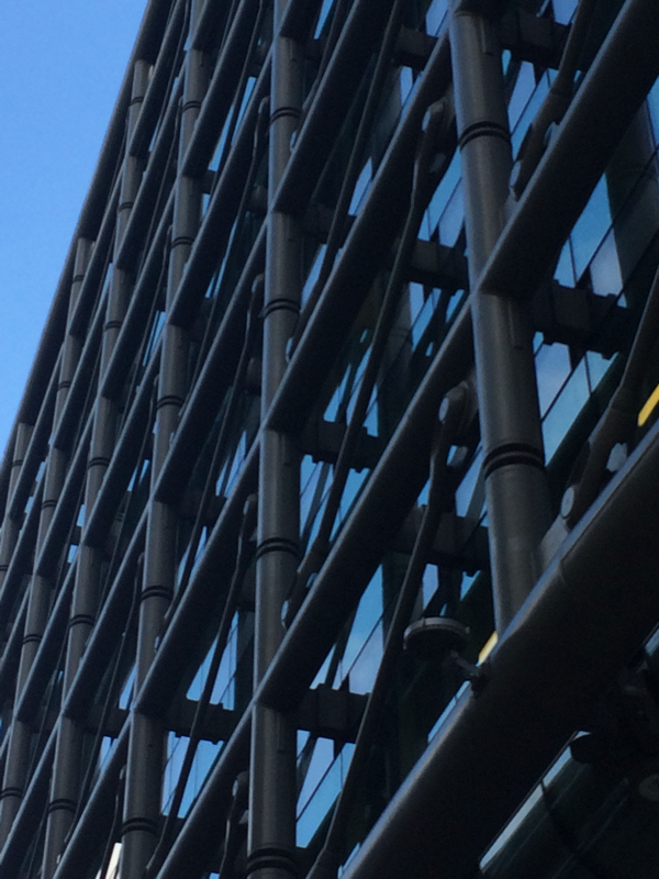
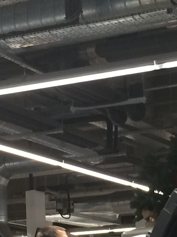
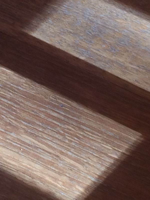
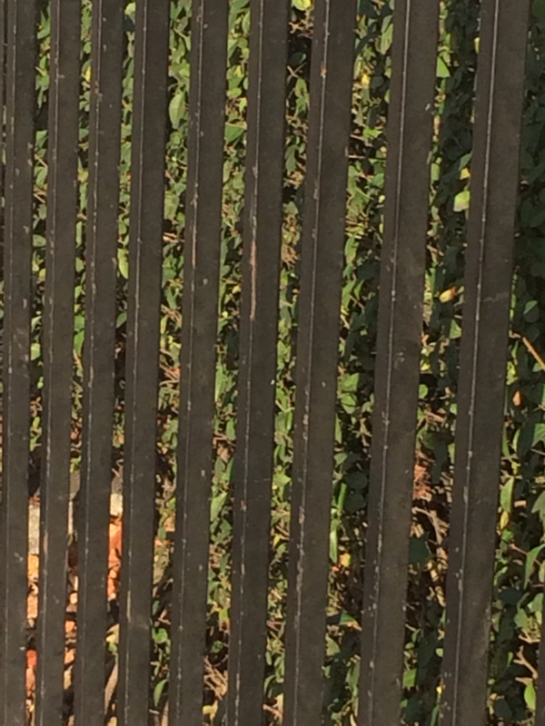
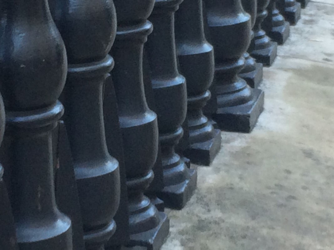
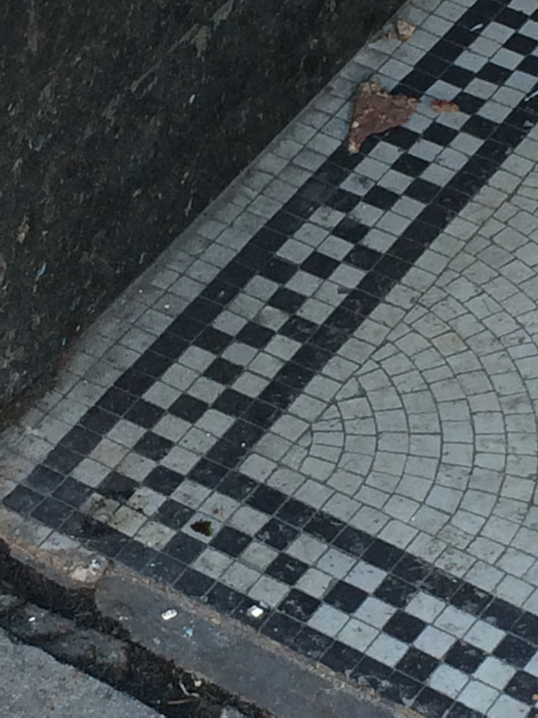
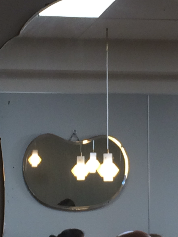
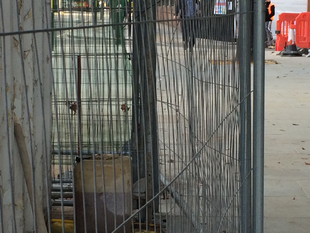
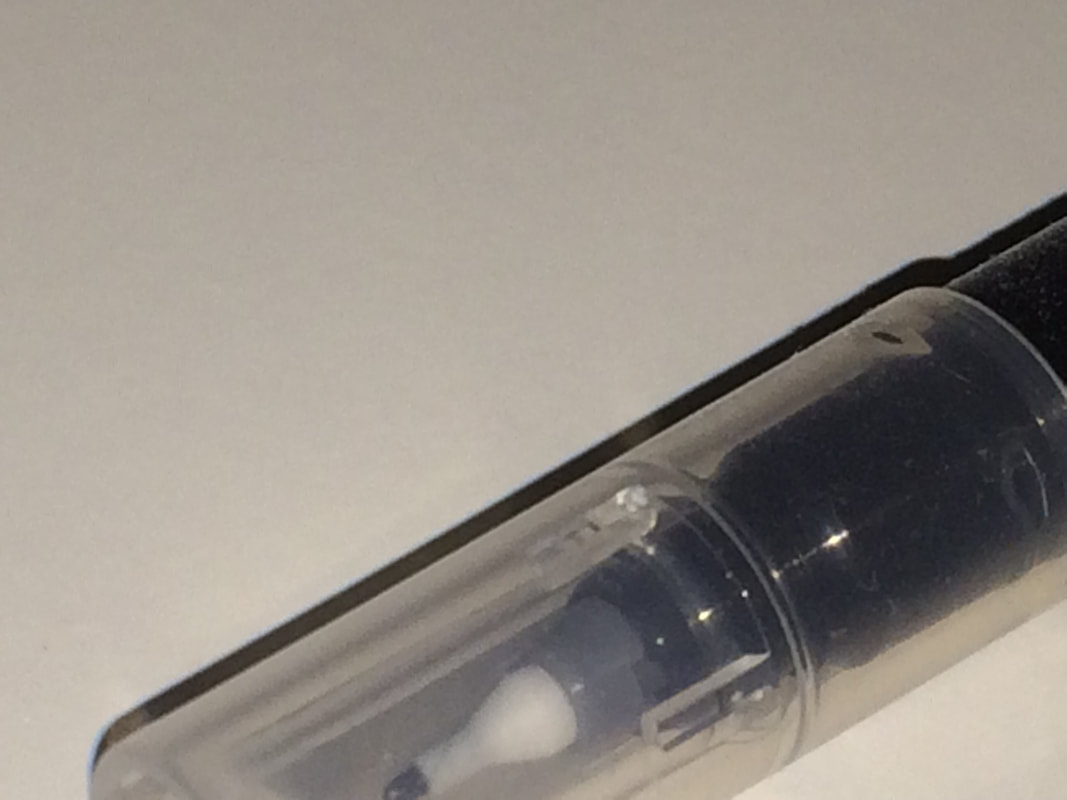
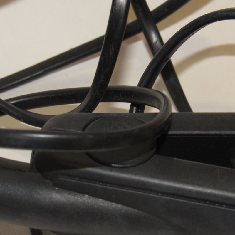
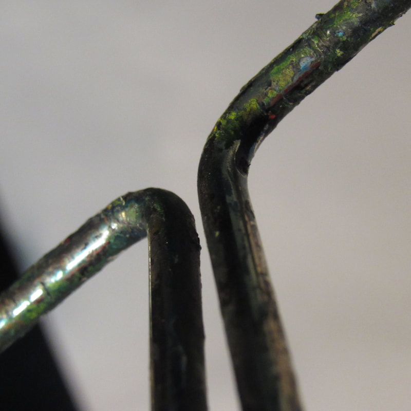
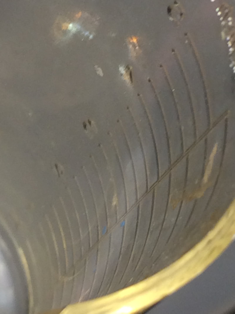
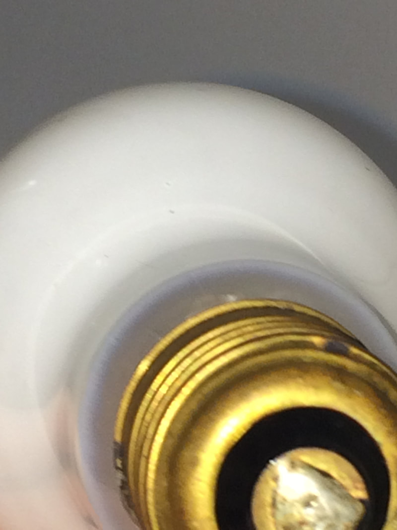
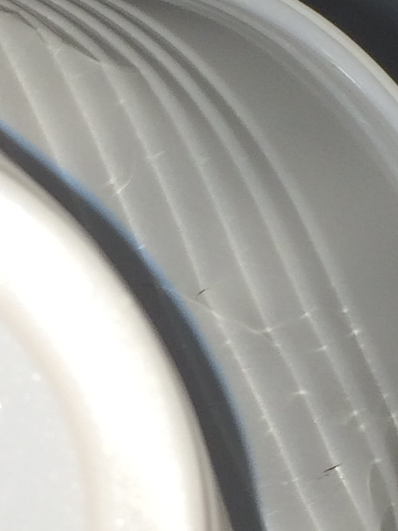
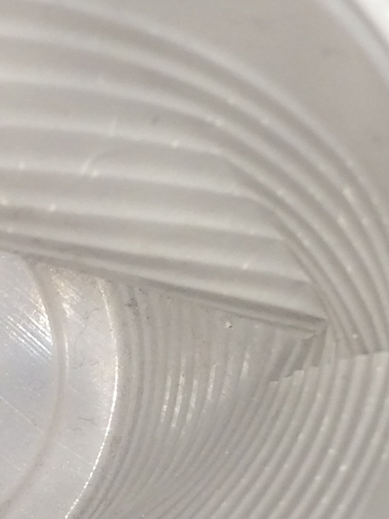
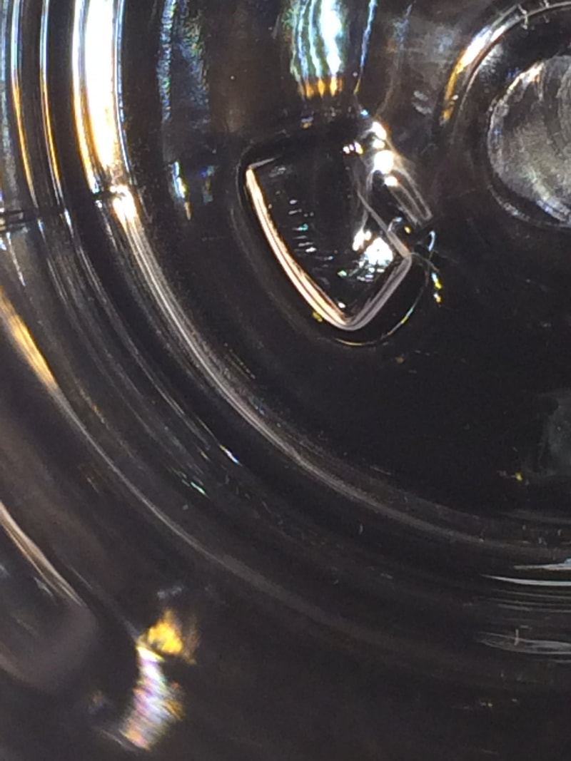
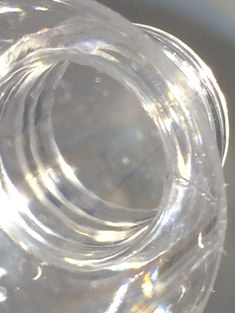
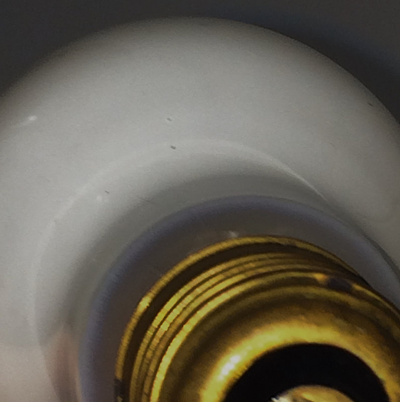
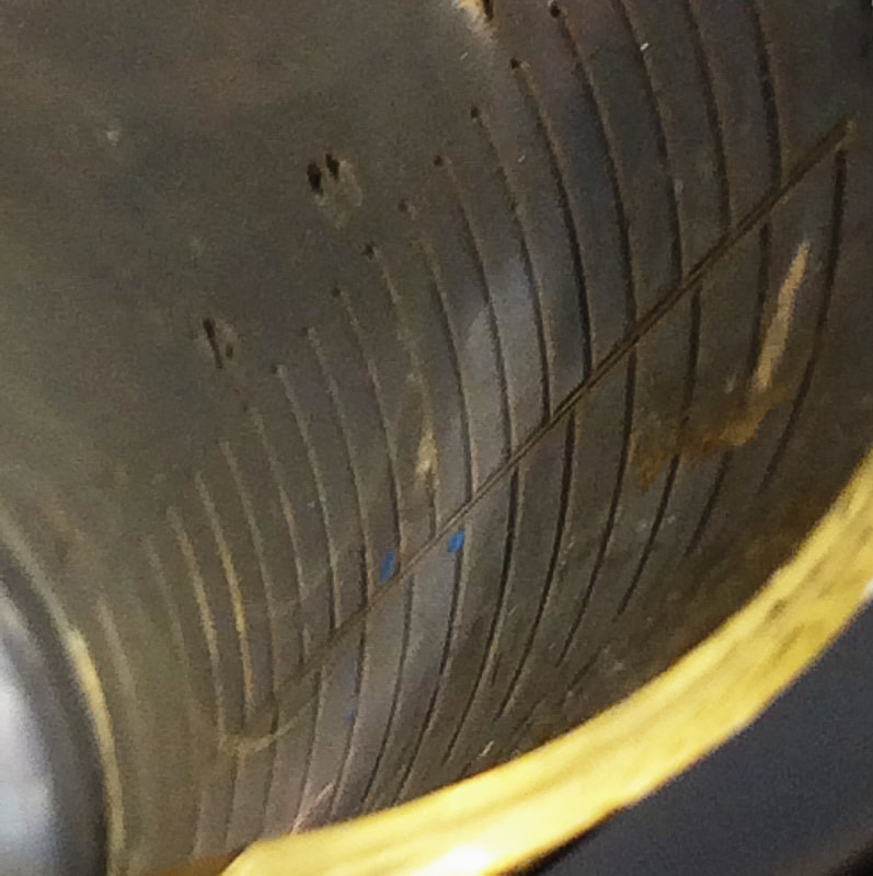
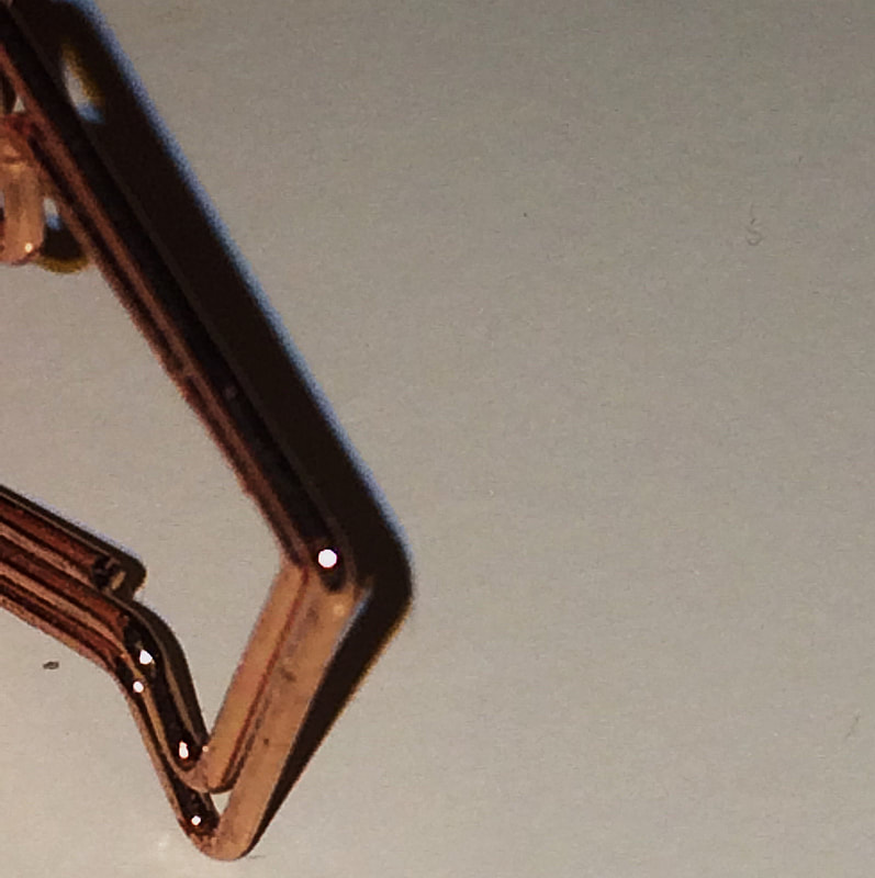
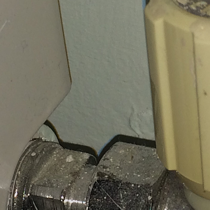
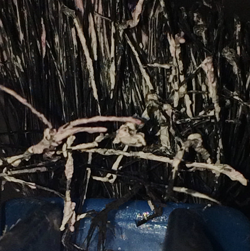
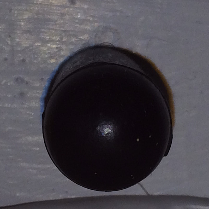
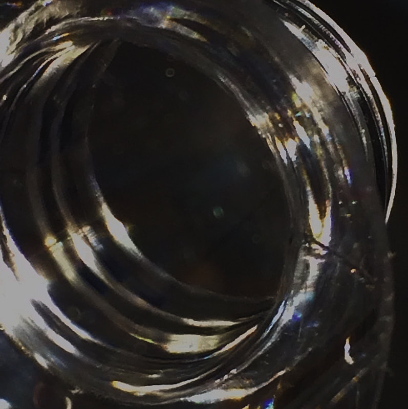
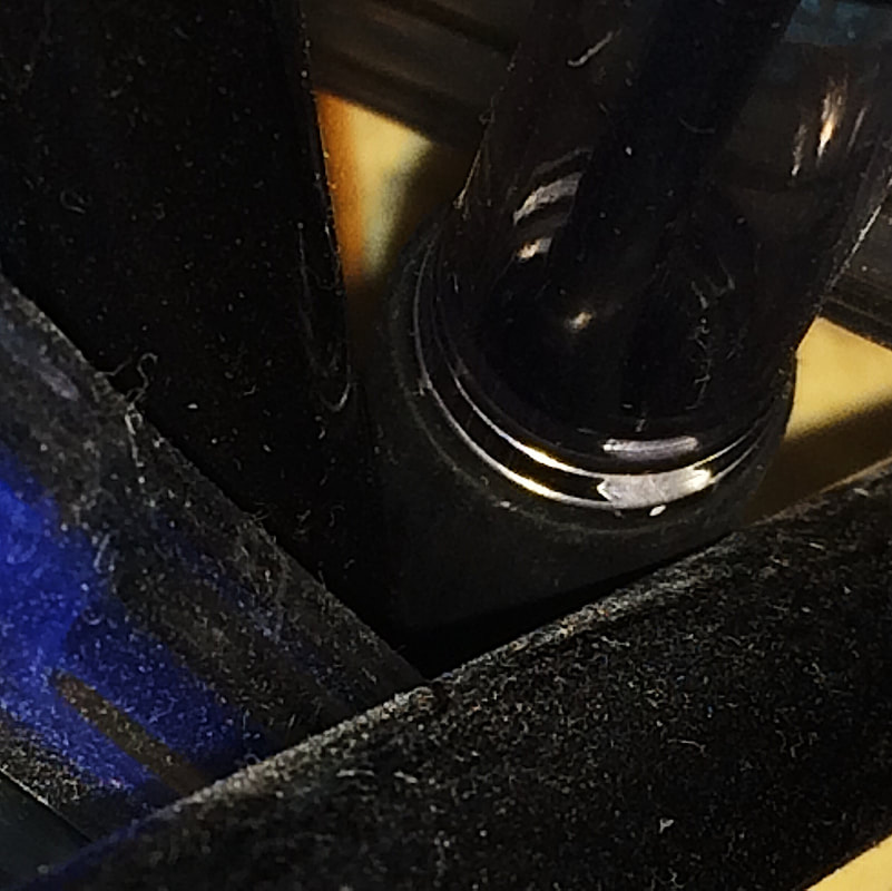
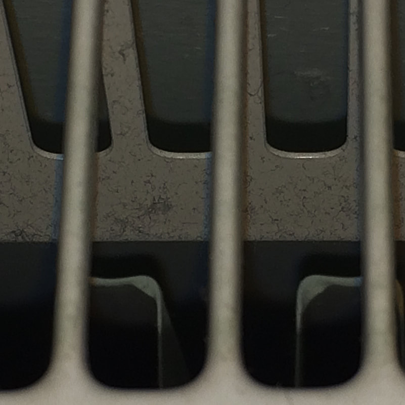
Our first photoshoot in class using the idea of abstraction. I focused on lines and patterns in my pictures.


WWW:
|
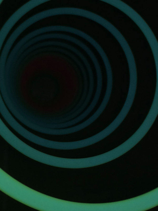
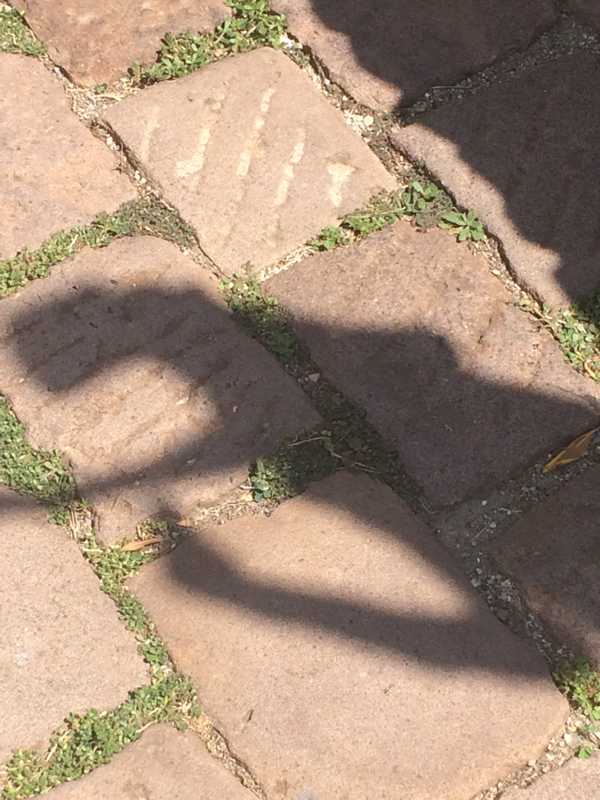
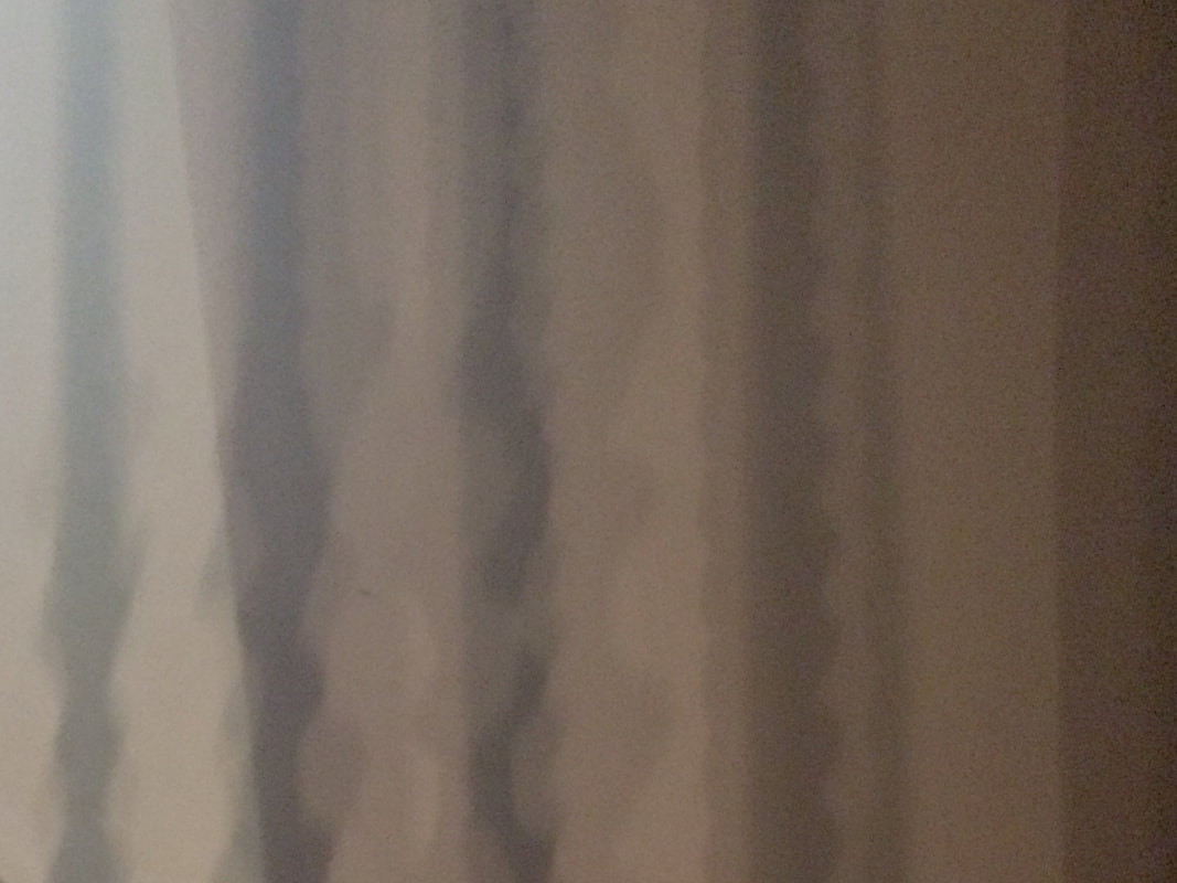
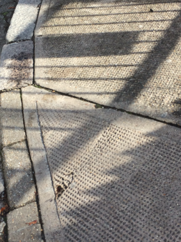
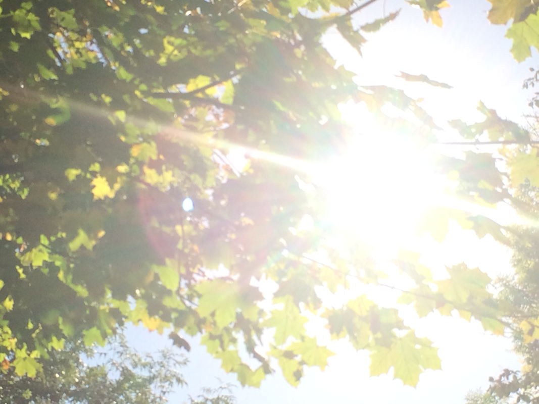
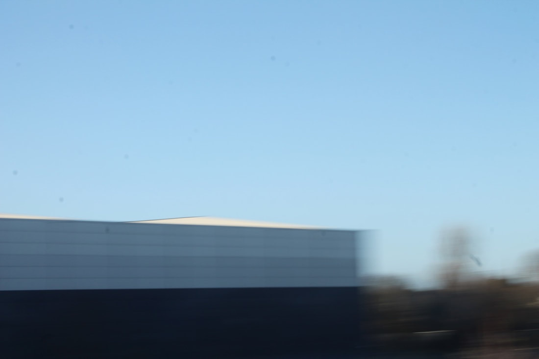
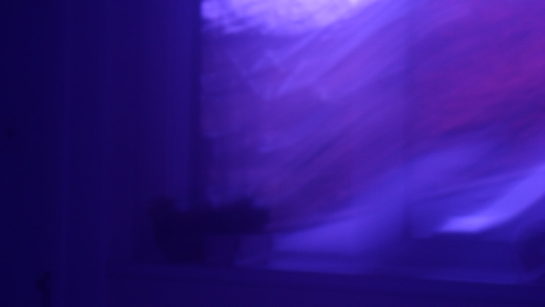
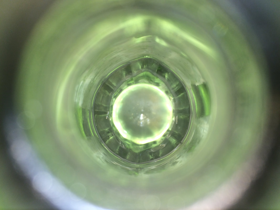
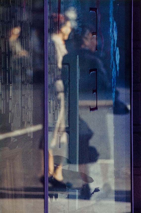
I think that this is the best abstract photo I took. I like how the shadows change shape. You can't really tell what the shadow is and I think thats what makes it look interesting.
|
|
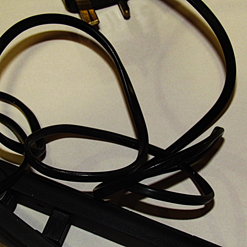
EBI:
|
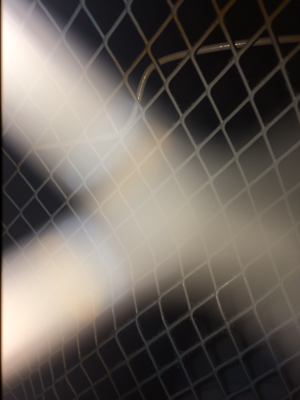
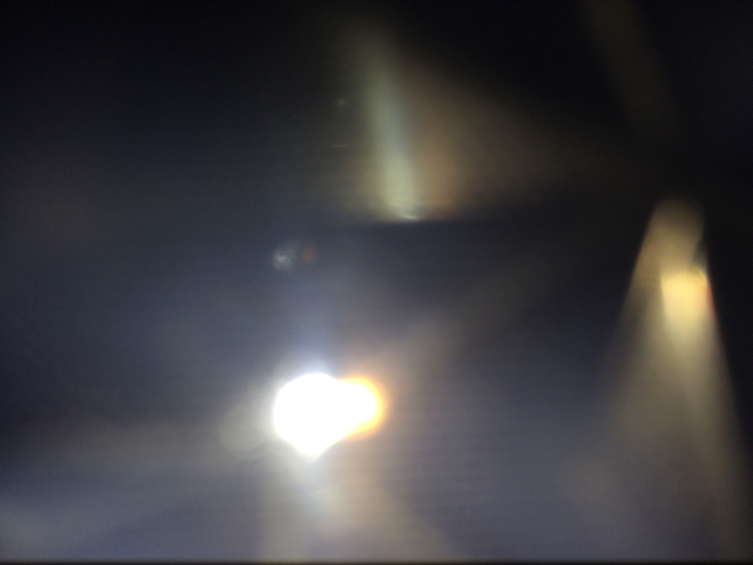
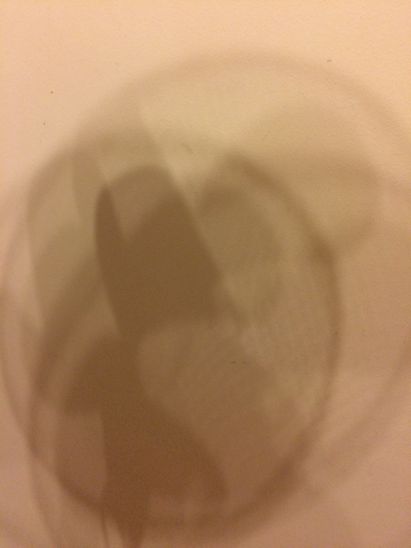
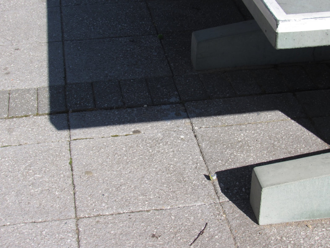
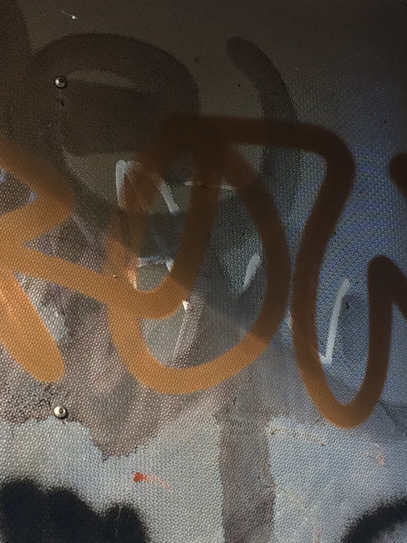
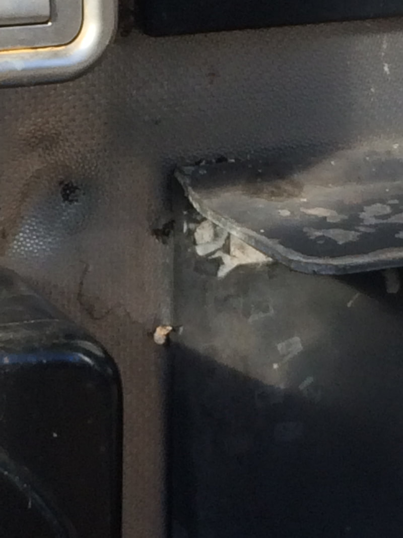
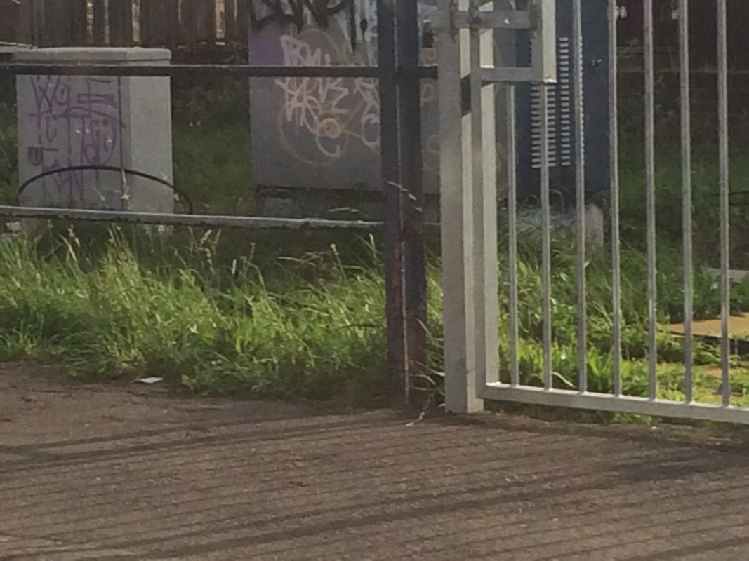
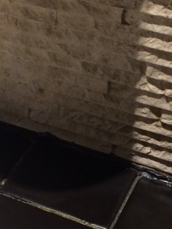
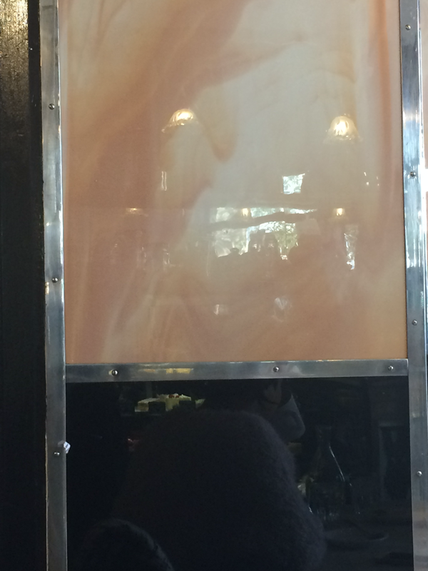
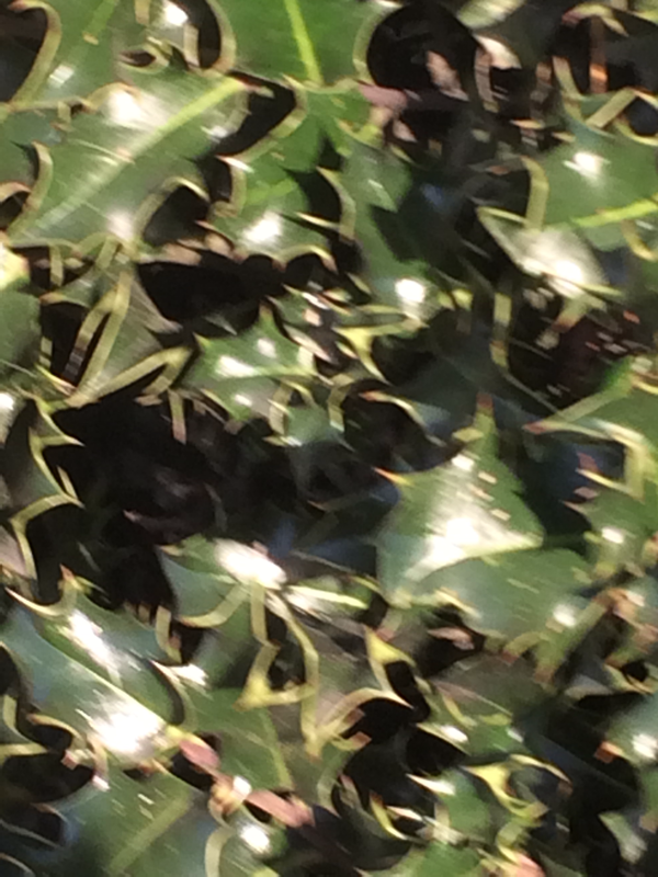
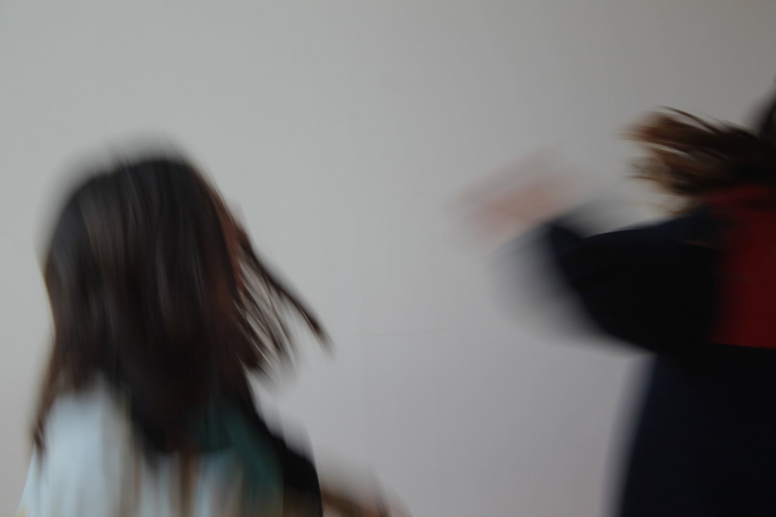
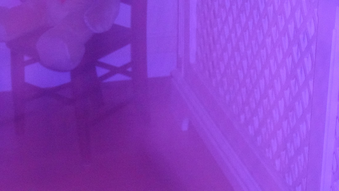
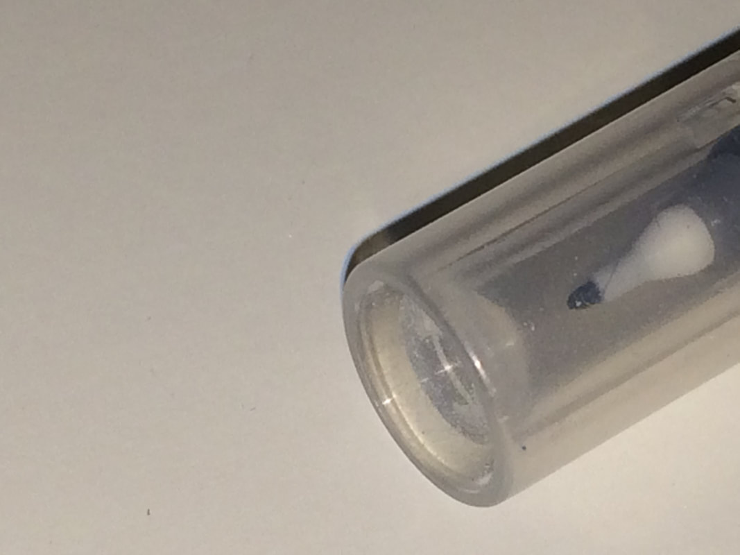
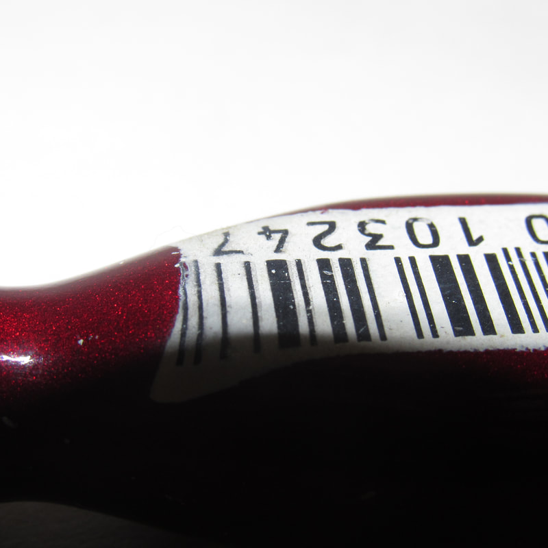
This is the least abstract photo that I took (in my opinion). You can tell what the photo is of, and it is also out of focus. I think that tho photo would have looked more abstract if I had taken the picture from a different angle.
|
|
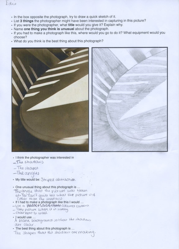
in this task we had to sketch a version of a photograph so we can focus on shape, lines and the shadows of the pictures.
The Formal Elements:
Focus : Which areas appear clearest or sharpest in the photograph? Which do not?
Light : Which areas of the photograph are brightest? Are there any shadows? Does the photograph allow you to guess the time of day? Is the light natural or artificial? Harsh or soft? Reflected or direct?
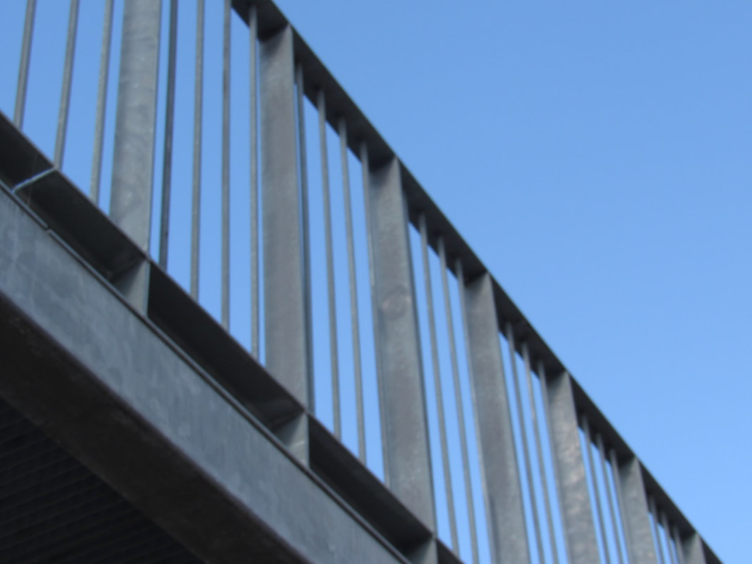
Line : Are there objects in the photograph that act as lines? Are they straight, curvy, thin, thick? Do the lines create direction in the photograph? Do they outline? Do the lines show movement or energy?
Repetition : Are there any objects, shapes or lines which repeat and create a pattern?
Shape : Do you see geometric (straight edged) or organic (curvy) shapes? Which are they?
Space : Is there depth to the photograph or does it seem shallow? What creates this appearance? Are there important negative (empty) spaces in addition to positive (solid) spaces? Is there depth created by spatial illusions i.e. perspective?
Texture : If you could touch the surface of the photograph how would it feel? How do the objects in the picture look like they would feel?
Light : Which areas of the photograph are brightest? Are there any shadows? Does the photograph allow you to guess the time of day? Is the light natural or artificial? Harsh or soft? Reflected or direct?
Line : Are there objects in the photograph that act as lines? Are they straight, curvy, thin, thick? Do the lines create direction in the photograph? Do they outline? Do the lines show movement or energy?
Repetition : Are there any objects, shapes or lines which repeat and create a pattern?
Shape : Do you see geometric (straight edged) or organic (curvy) shapes? Which are they?
Space : Is there depth to the photograph or does it seem shallow? What creates this appearance? Are there important negative (empty) spaces in addition to positive (solid) spaces? Is there depth created by spatial illusions i.e. perspective?
Texture : If you could touch the surface of the photograph how would it feel? How do the objects in the picture look like they would feel?
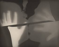
Research: Man Ray
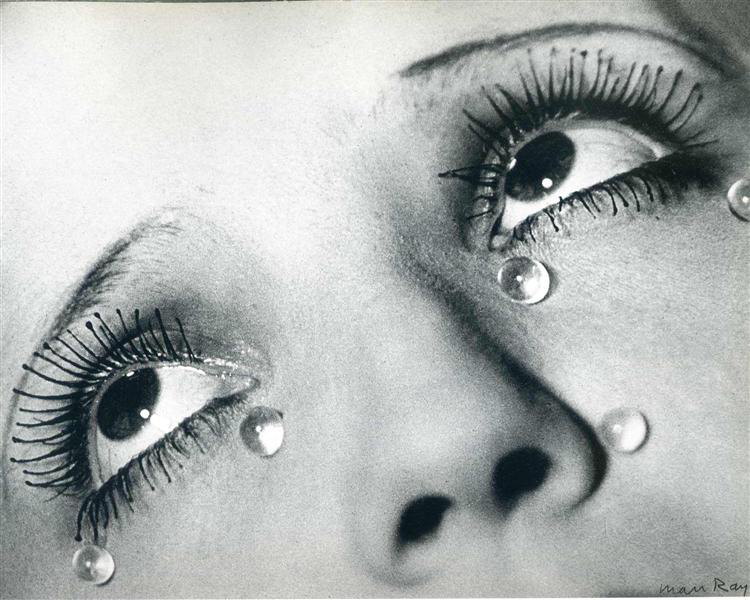
Man Ray was an American visual artist who spent most of his career in Paris. He was a significant contributor to the Dada and Surrealist movements, although his ties to each were informal. He produced major works in a variety of media but considered himself a painter above all.
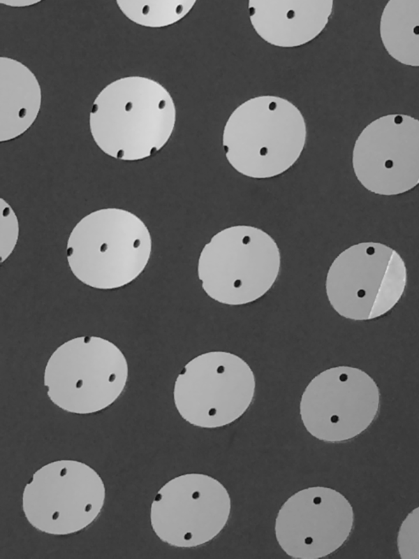
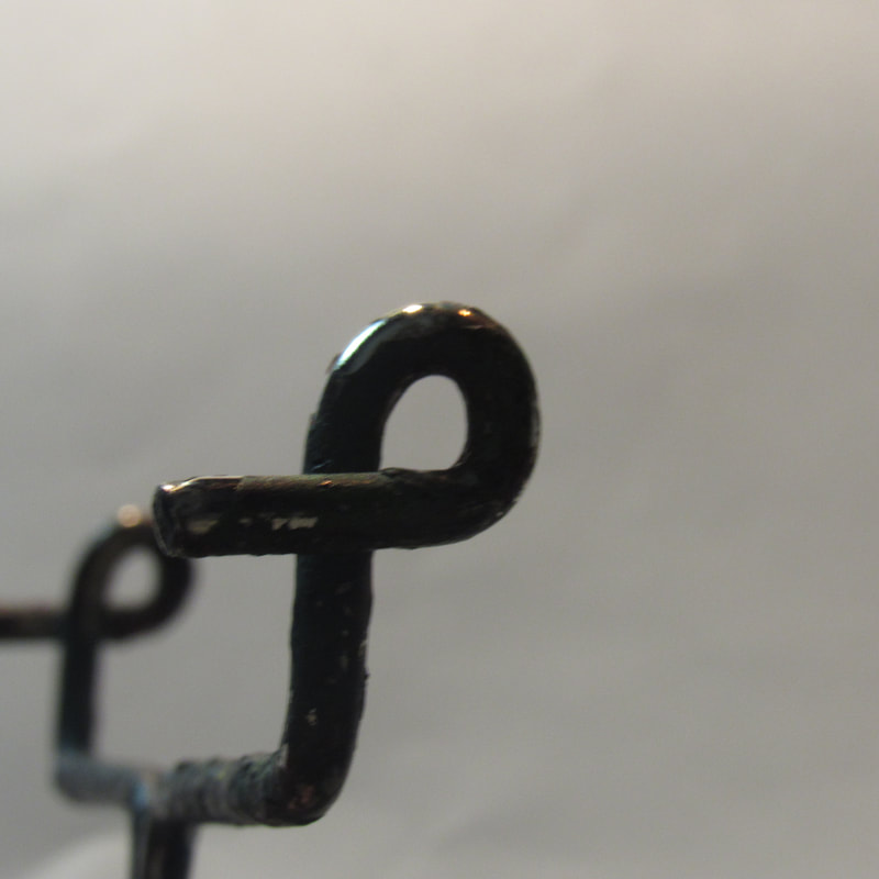
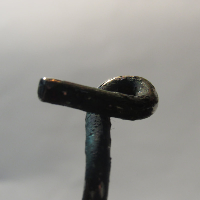
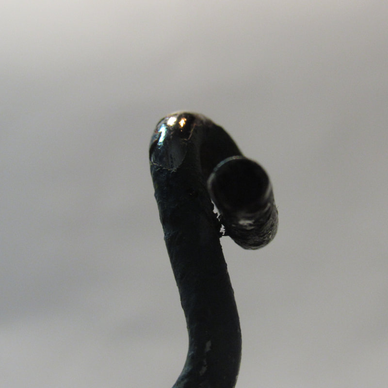
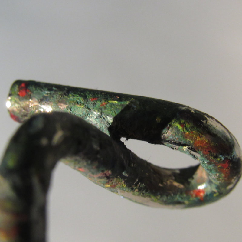
One formal element pictures: Repetition

The formal element that I chose was repetition, I focused on repeating lines and patterns.
Homelearning: abstract photoshoot
This photograph is by Alvin Langdon Coburn, vortograph, 1917, George Eastman House, Rochester, New York.
I think this photograph is abstract because you can't tell what it is and it allows the viewer to use their imagination to tell what the picture is of. It is also very dark with some lighter sections.
This photograph is by Wyndham Lewis, workshop, 1914-5 Tate purchased 1974. Wyndham Lewis and the estate of Mrs G A Wyndham Lewis.
I think that this photograph is abstract because there are lots of different shapes and patterns and you can't quite tell what the shapes and patterns are trying to show, its colourful (a lot of abstract pictures are black an white). there are lots of lines and colours that are repeated.
Homework:
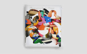
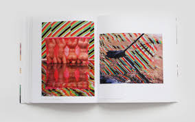
This book is called 'Photography is Magic' by Charlotte Cotton.
I think that the design of this book is interesting because it has lots of different mini-books coming out of the larger book.
I also think that the design of this book is interesting because it has lots of different chars in the book which are all at different levels (on the pages)
I also think that the design of this book is interesting because the artist seems to have made a room inside the book and has included lost of detail.
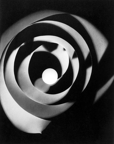
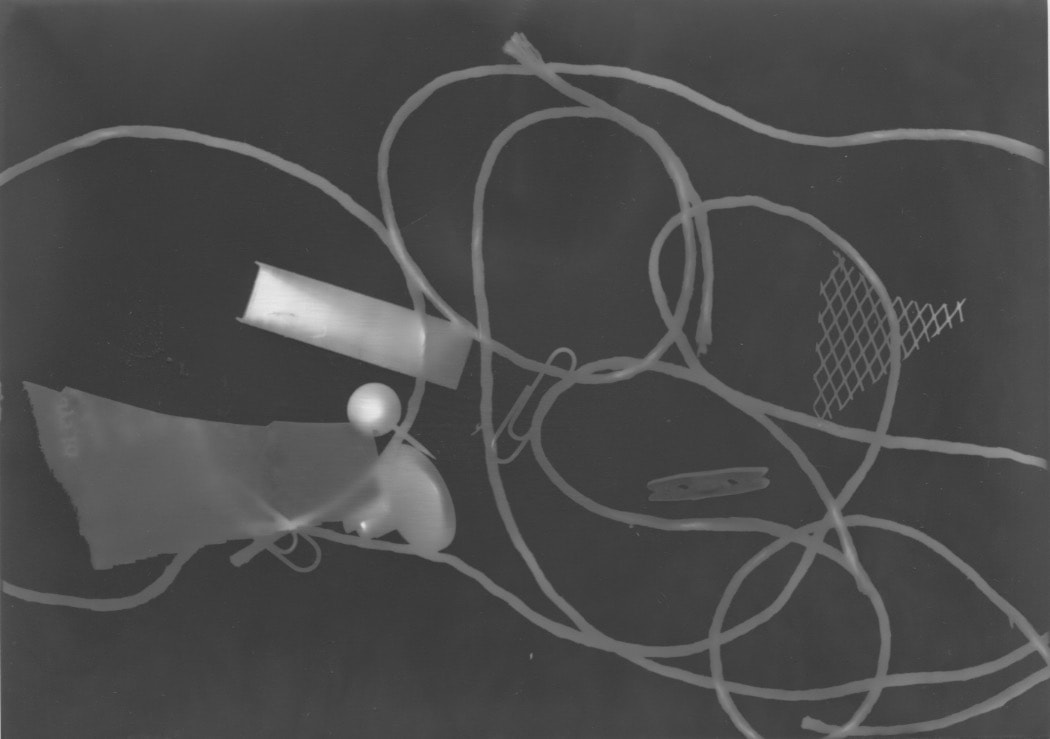
Photograms
what is a photogram?
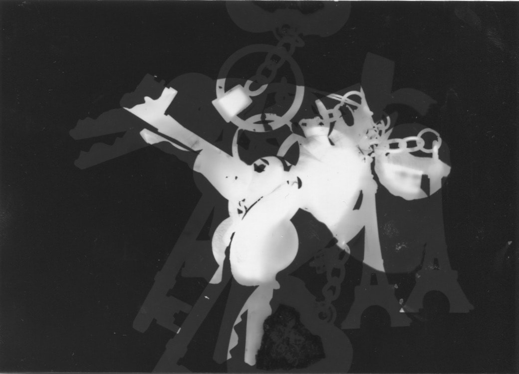
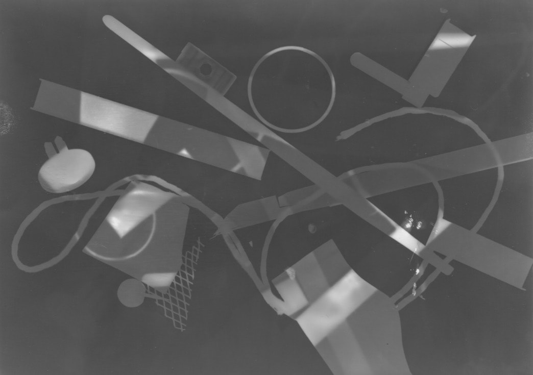
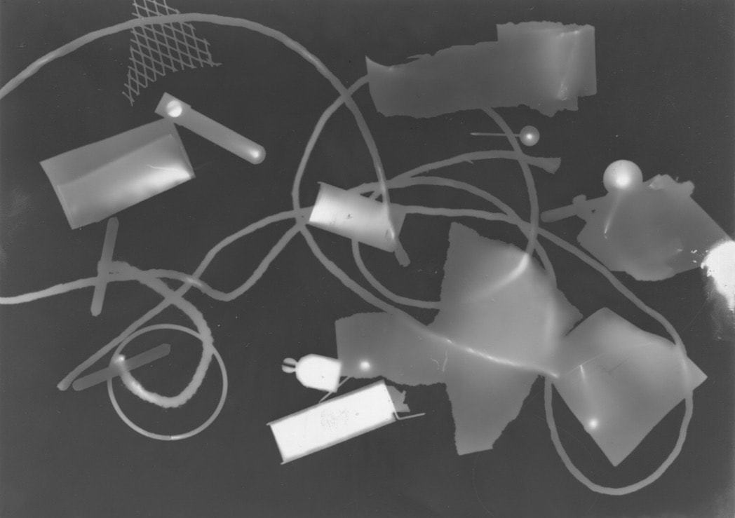
A photogram is a picture produced with different materials which can make shapes, letters or anything you want. These objects are put on top of light sensitive paper, with light going onto the paper. When you have processed the picture you should be able to see the shapes of the objects you put on the paper. Photograms don't need cameras as the light sensitive paper picks up the light and turns it into a picture.
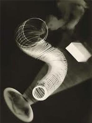
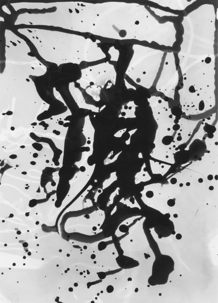
Man Ray, 1922, Untitled Rayograph, gelatin silver photogram. This is one of many photograms made by Man Ray.
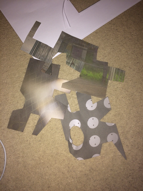
dummy abstract photo book:
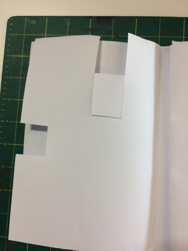
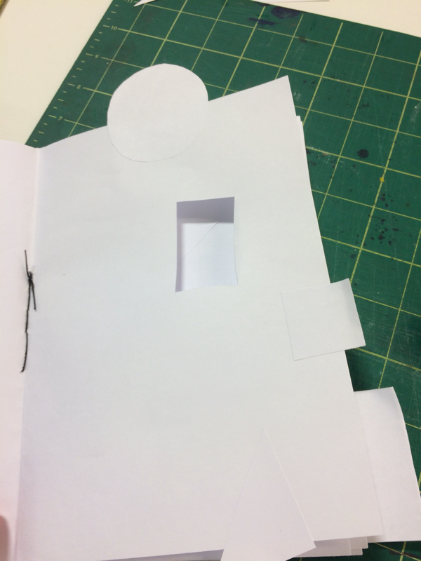
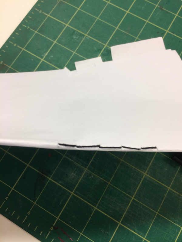
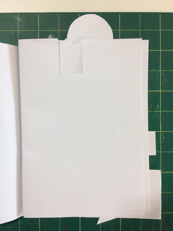
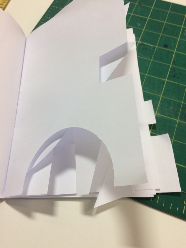
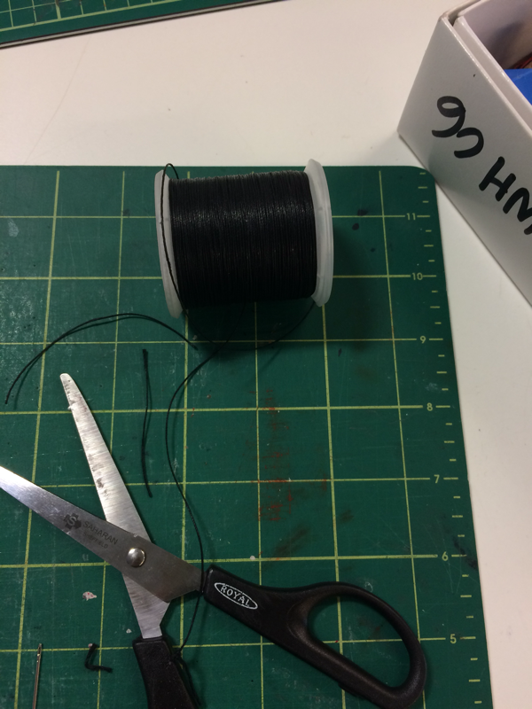
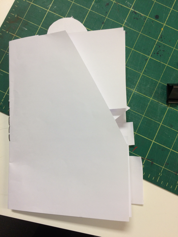
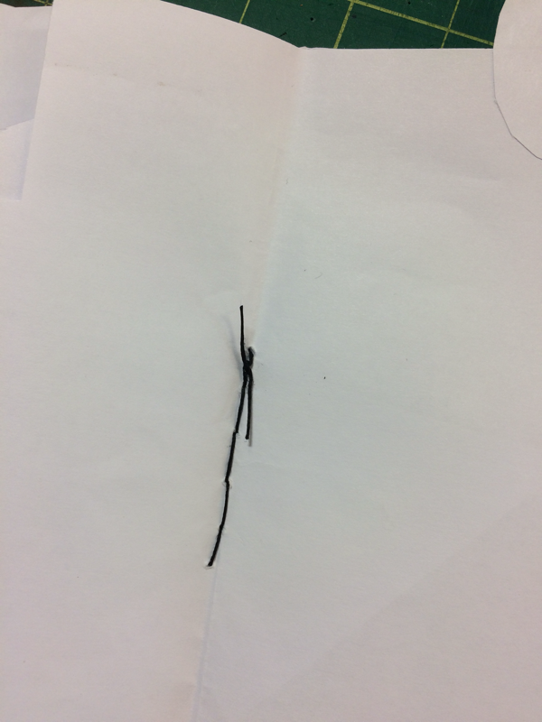
In my dummy book I decided to cut out different shapes in the pages and I binded it by sewing the centre of the book.
In my real book I think that I will try to cut different shapes out of the pages and I think that I will also try to
In my real book I think that I will try to cut different shapes out of the pages and I think that I will also try to
October homework:


WWW: I think that it went well because I took all 30 pictures and I am quite happy with how the pictures turned out.
EBI: I think that I could have experimented a bit more with different angles and perspectives that I took the pictures at.
Photograms:
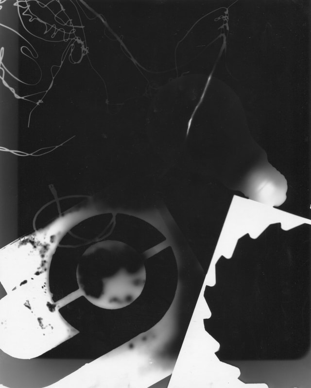
WWW: I think that the last photograms I made were the best.
EBI: Some of them weren't very abstract and three of my first photograms were a bit cloudy.
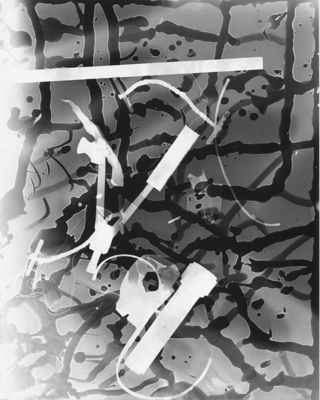
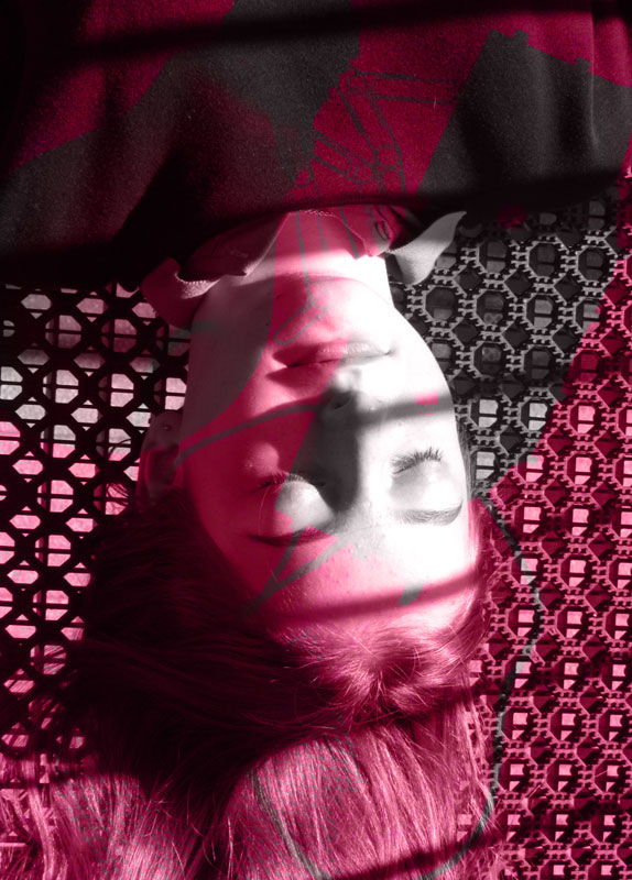
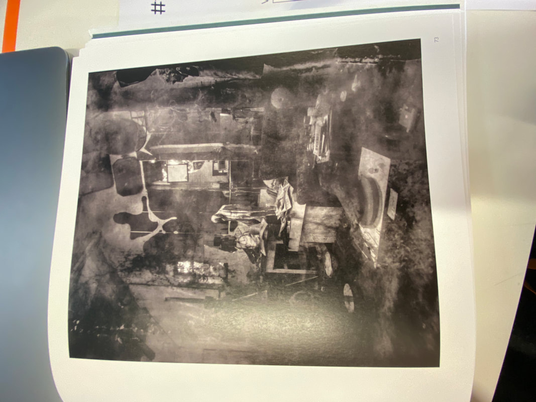
Photoshop:
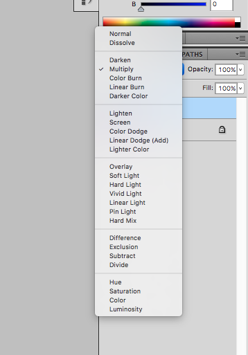
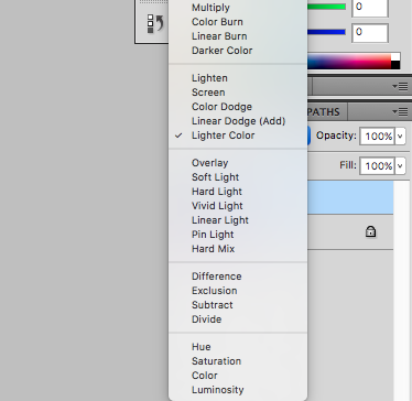
In this lesson we made photoshop pictures by using our photograms and mixing them with some other abstract pictures that we have taken.


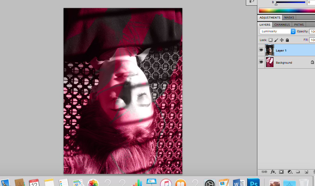
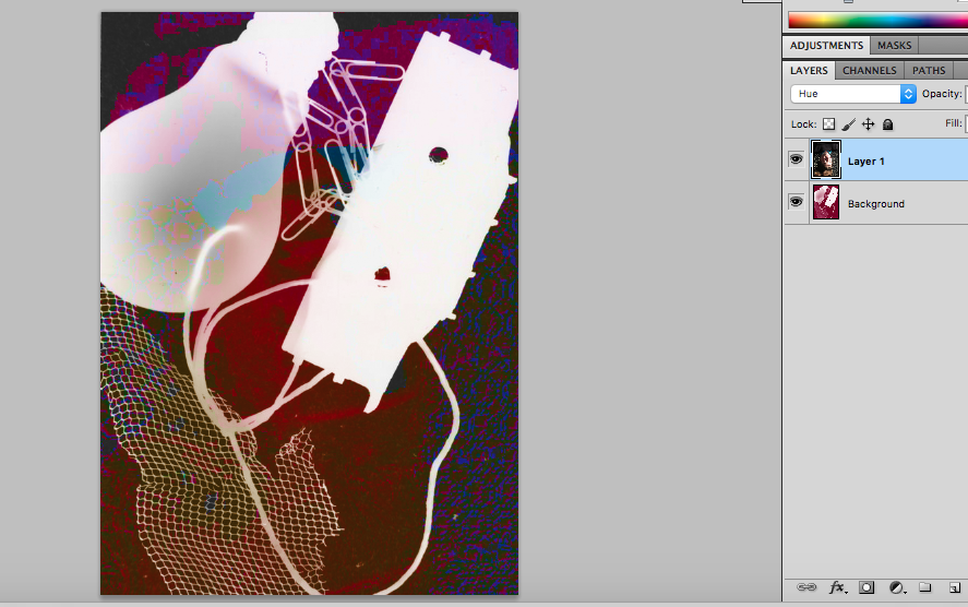
WWW: I think that I am getting more confident with using photoshop.
EBI: I think that I could have experimented with more photos and I could have tried layering more photos.

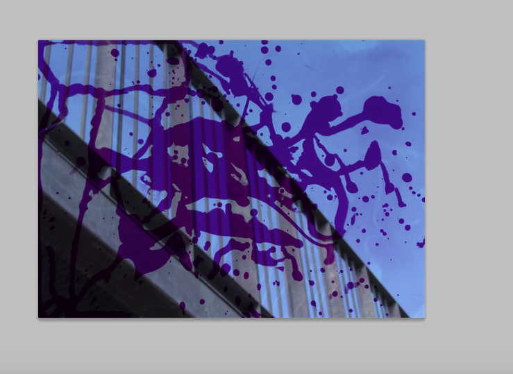
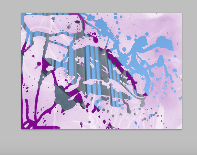
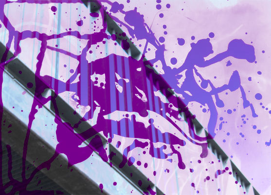
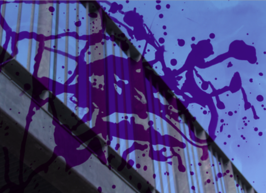
WWW: I am happy with how the duotone turned out, I think the colours go well.
EBI: I could have tried layering more pictures on top.
EBI: I could have tried layering more pictures on top.
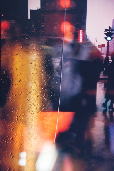
Ernst Haas
as part of our research we had to find some pictures taken by a chosen photographer and explain why we like them.
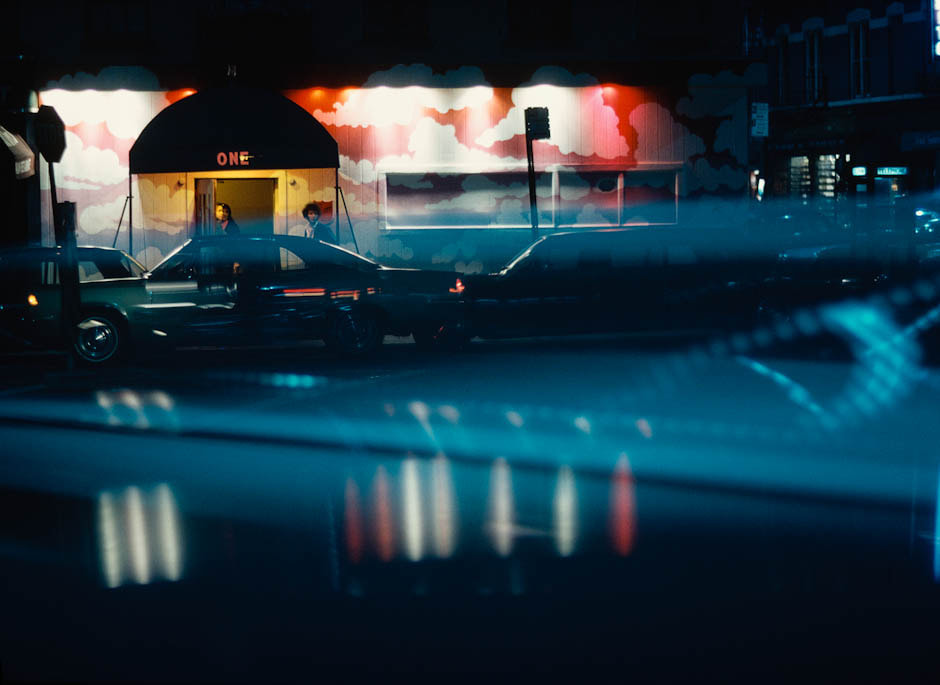
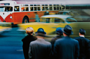
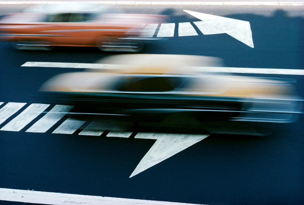
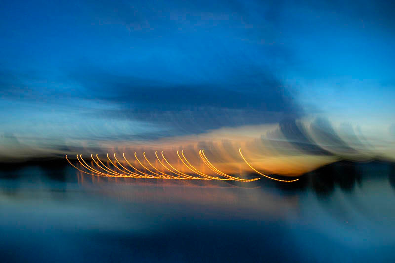
I think that Haas' pictures are abstract because they have a motion blur so it is hard to tell what certain things are. There is also a filter on his photos which makes the colours brighter which makes the pictures look less realistic more abstract.
The next step was to interpret our chosen photographer's pictures:
Abstract photobook
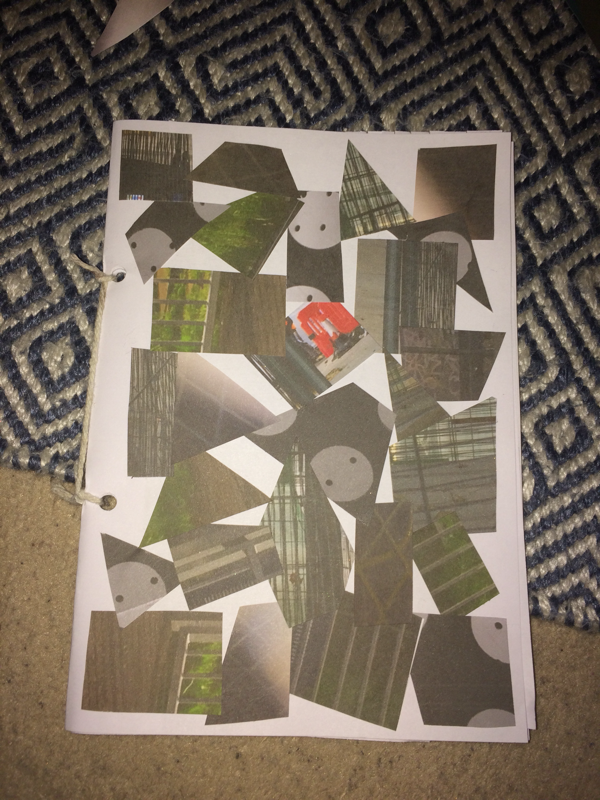
My inspiration for my photo book was some books that I had found on Pinterest/google when I was doing my research. I decided that I wanted to make all of the pages different sizes and shapes. For the front cover I decided to cut up a few of the pictures that I used in the book into triangles, squares and rectangles and put them into a collage. Then I binded the book with some string.
Ernst Haas:
Questions:
1. what did Ernst Haas find so interesting about the blur?
2. why did he choose to take pictures of moving objects?
3. how did Ernst Haas take his pictures so that only the objects that are moving are blurred?
4. what kind of photographer was Ernst Haas?
5. where they all part of a series?
6. if so, what was the series called?
Instructions:
1. use the slow-sync setting on the camera or shake the camera when taking the picture
2. find a road, some cars or other objects that are moving
3. make sure that the images are quite dark
1. use the slow-sync setting on the camera or shake the camera when taking the picture
2. find a road, some cars or other objects that are moving
3. make sure that the images are quite dark
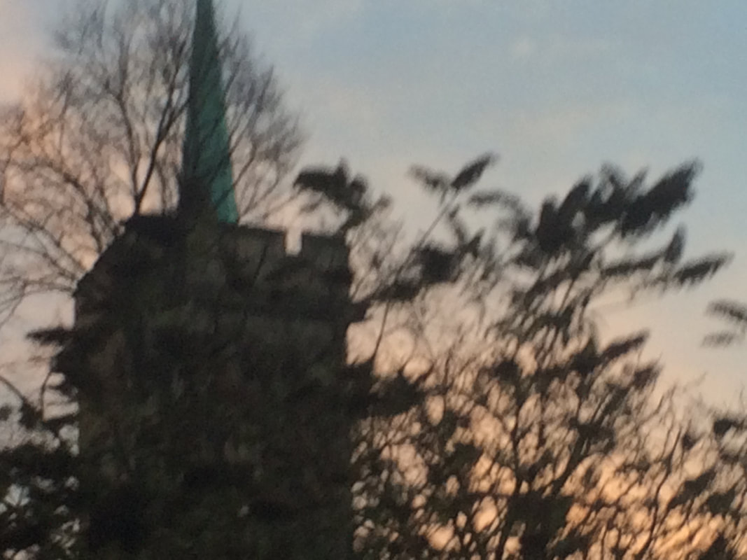
My attempt:

I used my instructions to make these pictures, I did not use slow-sync as I was not using the flash so instead I shook the camera to give the pictures a motion blur.
Home learning:

Puzzled 'em:
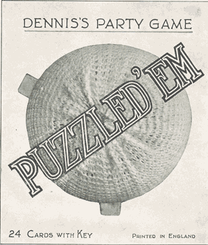
Explanation of the challenge:
Our challenges to create our own version of the puzzled 'em game with photos that we have taken ourselves (in school and outside of school). We have to decide how many cards we want to make, what objects we want to include and how we want to photograph the objects in order to make them look more confusing to the viewer.
Our challenges to create our own version of the puzzled 'em game with photos that we have taken ourselves (in school and outside of school). We have to decide how many cards we want to make, what objects we want to include and how we want to photograph the objects in order to make them look more confusing to the viewer.
research:
Dennis's party game, "puzzled 'em" was made in the 1930s by The 'Dainty' Series No. 21.
The game is made up of 24 cards, each with a printed black and white photograph of an object taken from an unusual angle.
The aim of the game is to confuse people, whoever guesses the object in the pictures correctly is the winner.
homework:
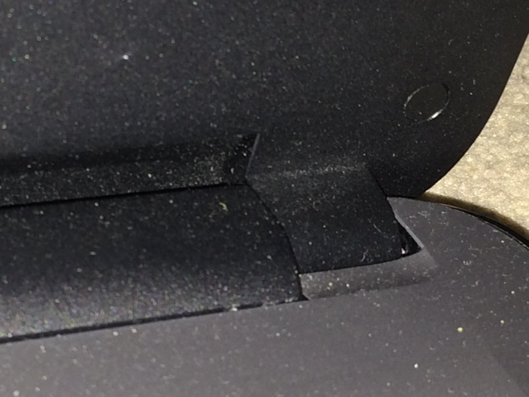
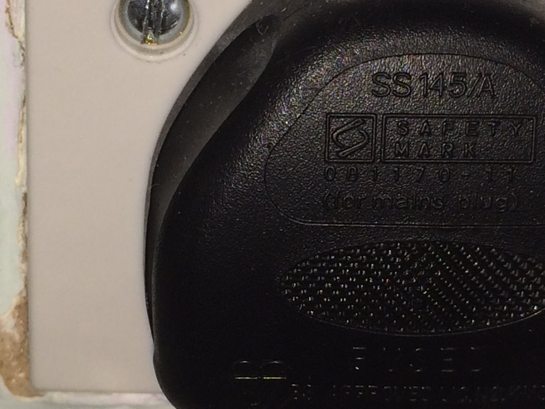
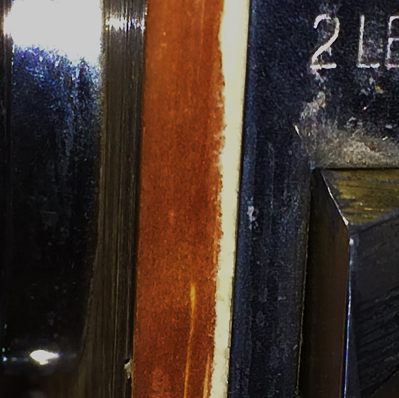
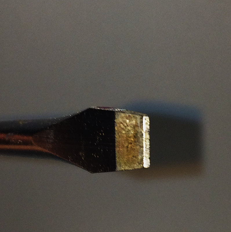
For my homework I found some objects lying around in my room, I photographed some of them in-context and some of them with a plain background so that it is less clear to see what the object is.
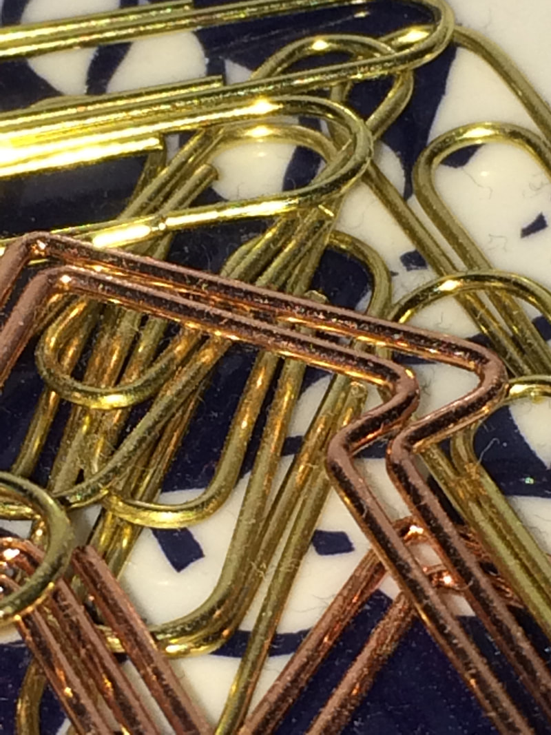
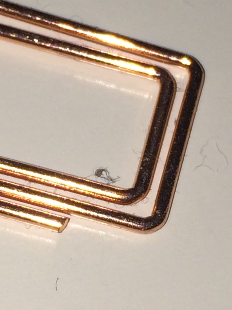
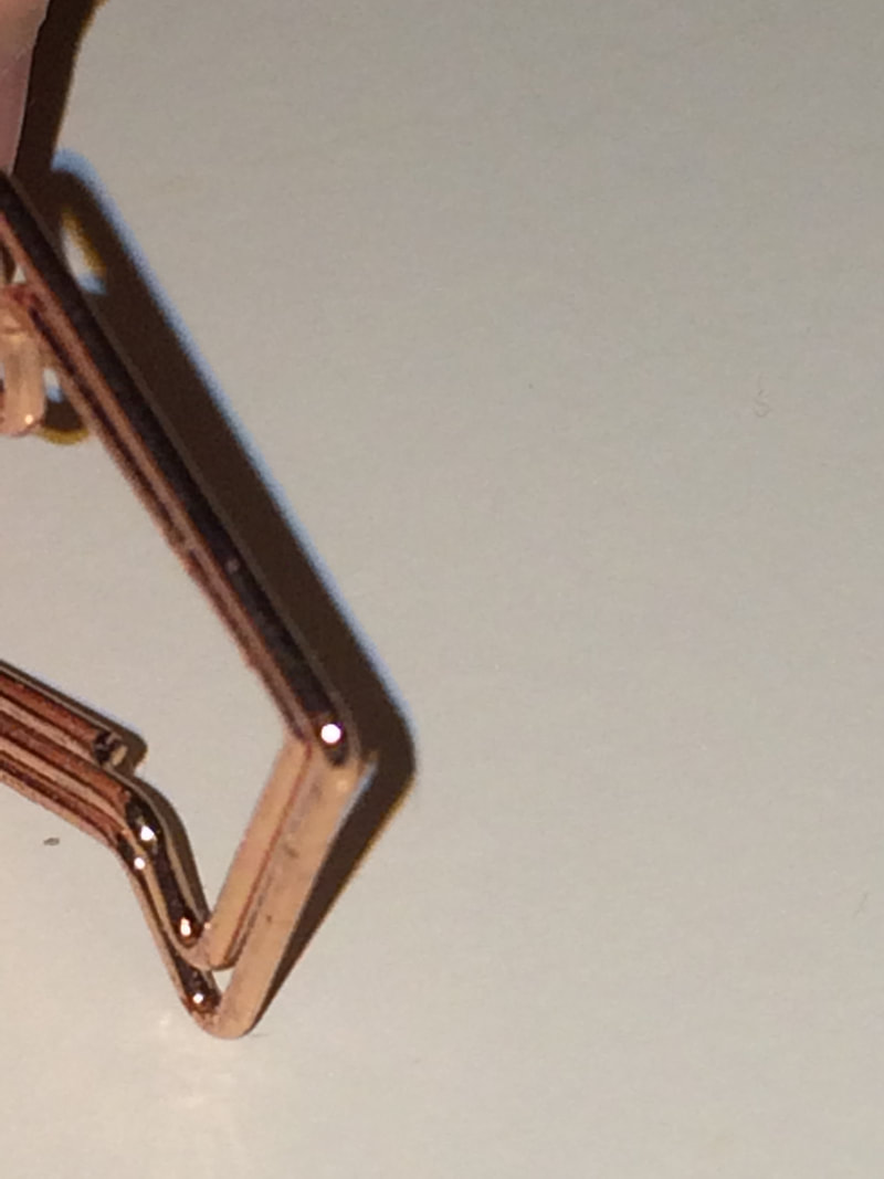
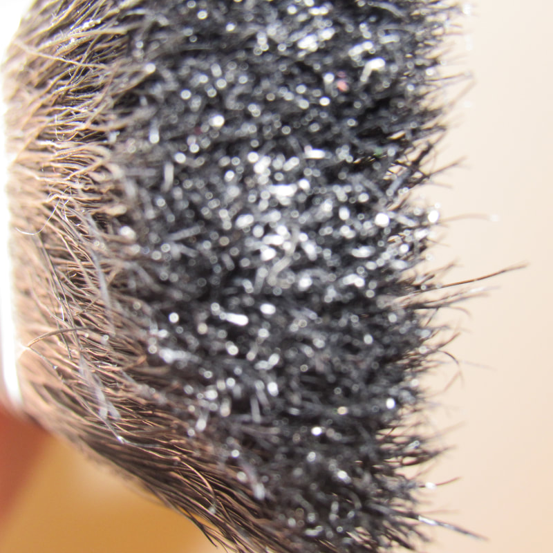
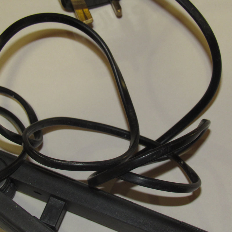
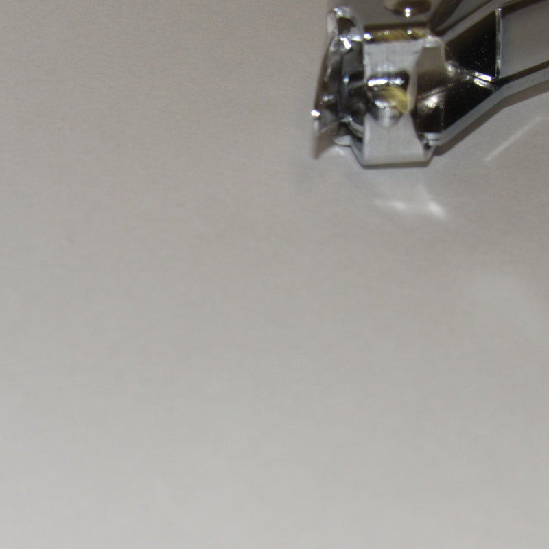
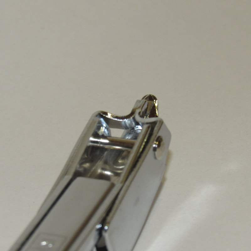
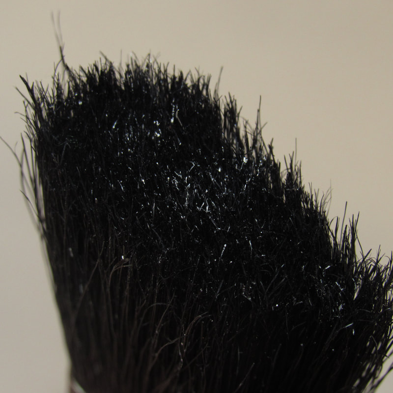
puzzled 'em pictures:
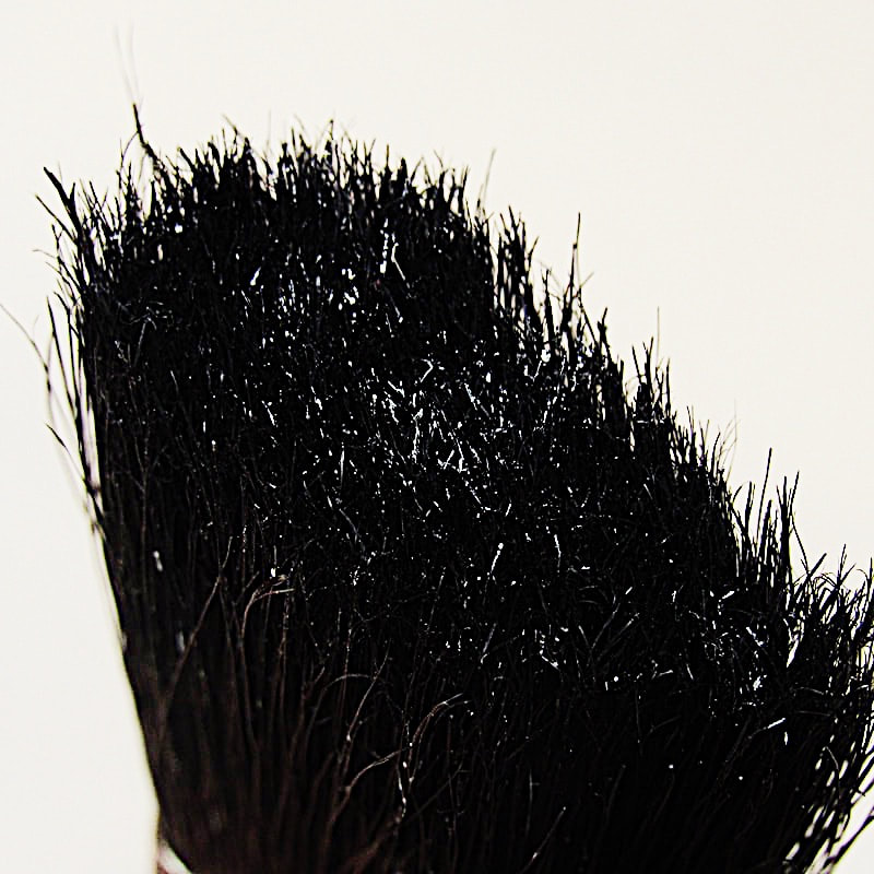
Theses are pictures I took in class using objects that we were given e.g. a paintbrush and a hair straightener.

List of my ideas:
- take multiple pictures of different objects from unusual angles
- take at least 50 pictures of objects
- then choose 20 pictures from the 50
- I will try to crop the chosen pictures and put them onto a white background in photoshop
- or I might decide to keep some of the photos in context
- I might try to search up some photographers and get inspiration for how to make the pictures more confusing
- I will share my pictures with some peers to see if they can figure out what the objects are
- I will get feedback from others and make the changes that I need to make
- I will then print out my finished pictures and put them onto pieces of card
- I will make a key for the pictures I took
- I will make/find a box to put my game into
Photoshoot no.2


Homework:
Our homework was to take pictures of 10 different objects at home.


Choosing my pictures:
I went through all of the pictures that I have taken during this project and I numbered my favourite pictures up to 20.
with my final 20 pictures I might edit them and then I will print them out and make a key for my pictures.
with my final 20 pictures I might edit them and then I will print them out and make a key for my pictures.
Edited pictures:

I decided to edit some of my pictures to make them look more confusing. I made them darker, added contrast and I made some of them quite saturated to make the colour brighter. Some of the photos were originally dark so I made them brighter. I also decided to make them all square so that they are all the same size.
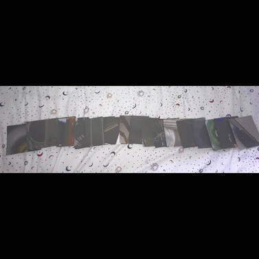
Finished piece:
|
|
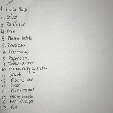
I printed out my pictures and numbered them from 1-17 and wrote out what each object is on a different piece of paper.
to make my finished piece better, I could have made a box to put my pictures in.
to make my finished piece better, I could have made a box to put my pictures in.
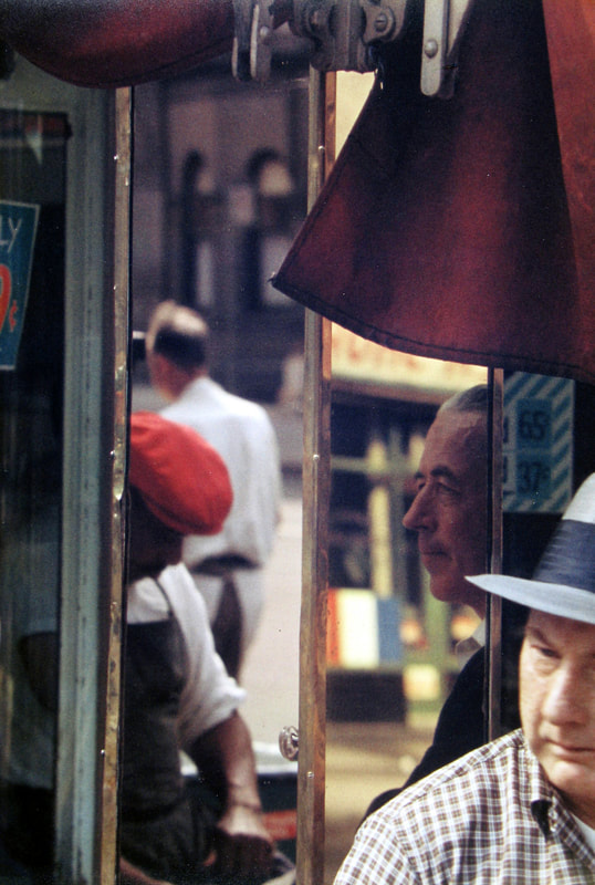
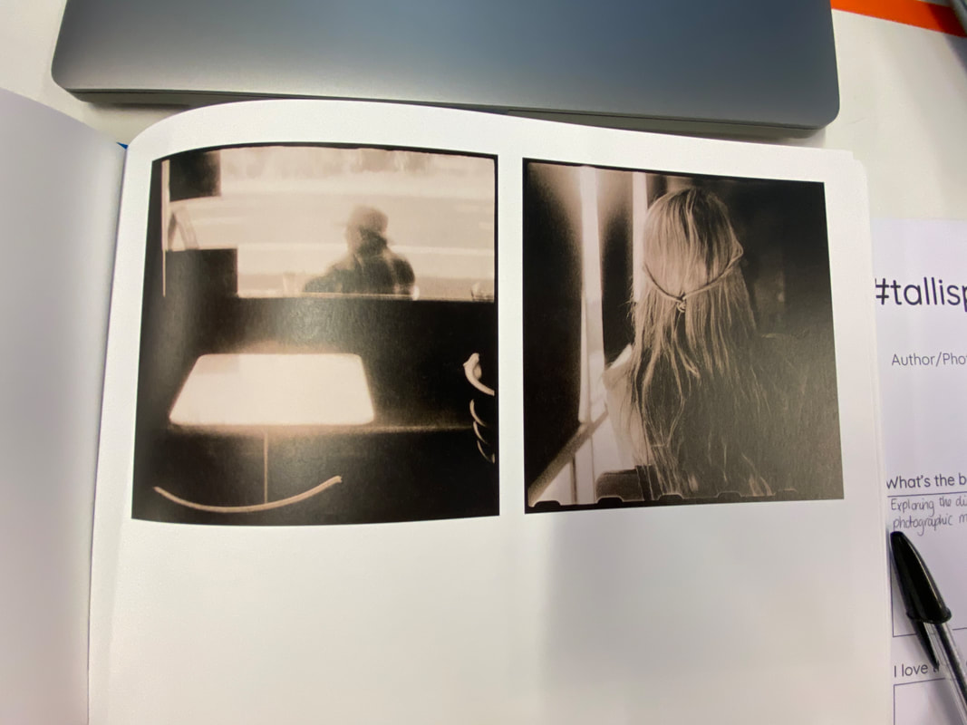
Saul Leiter:
3 characteristics that define Leiter's photographs:
- spots of bright colour (usually primary colours such as red)
- unusual cropping
- unconventional focus points
- spots of bright colour (usually primary colours such as red)
- unusual cropping
- unconventional focus points
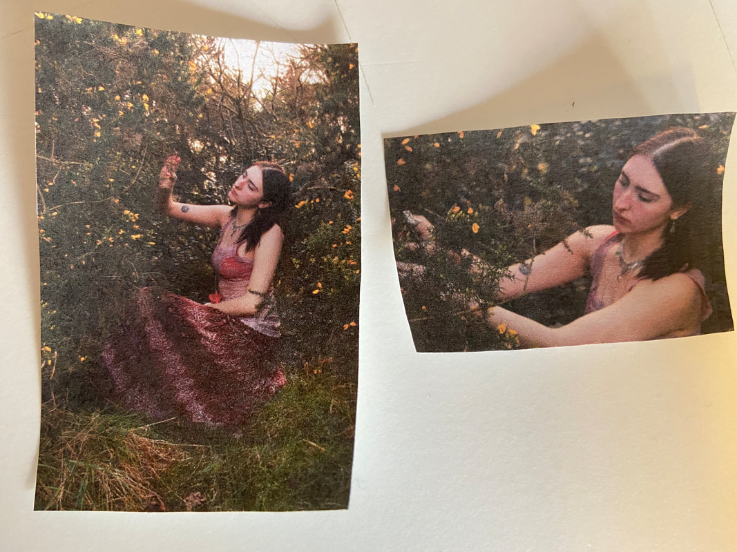
to be able to understand Saul letters photographs better we decided to recreate some of his photos as paintings where would focus on the bright colours we could see and the different shapes (rather than perfectly recreating the photo)
|
|
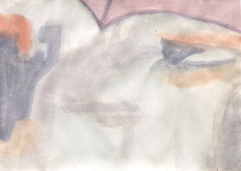
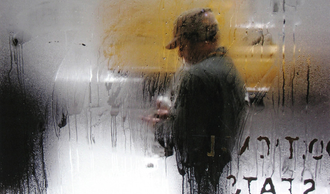
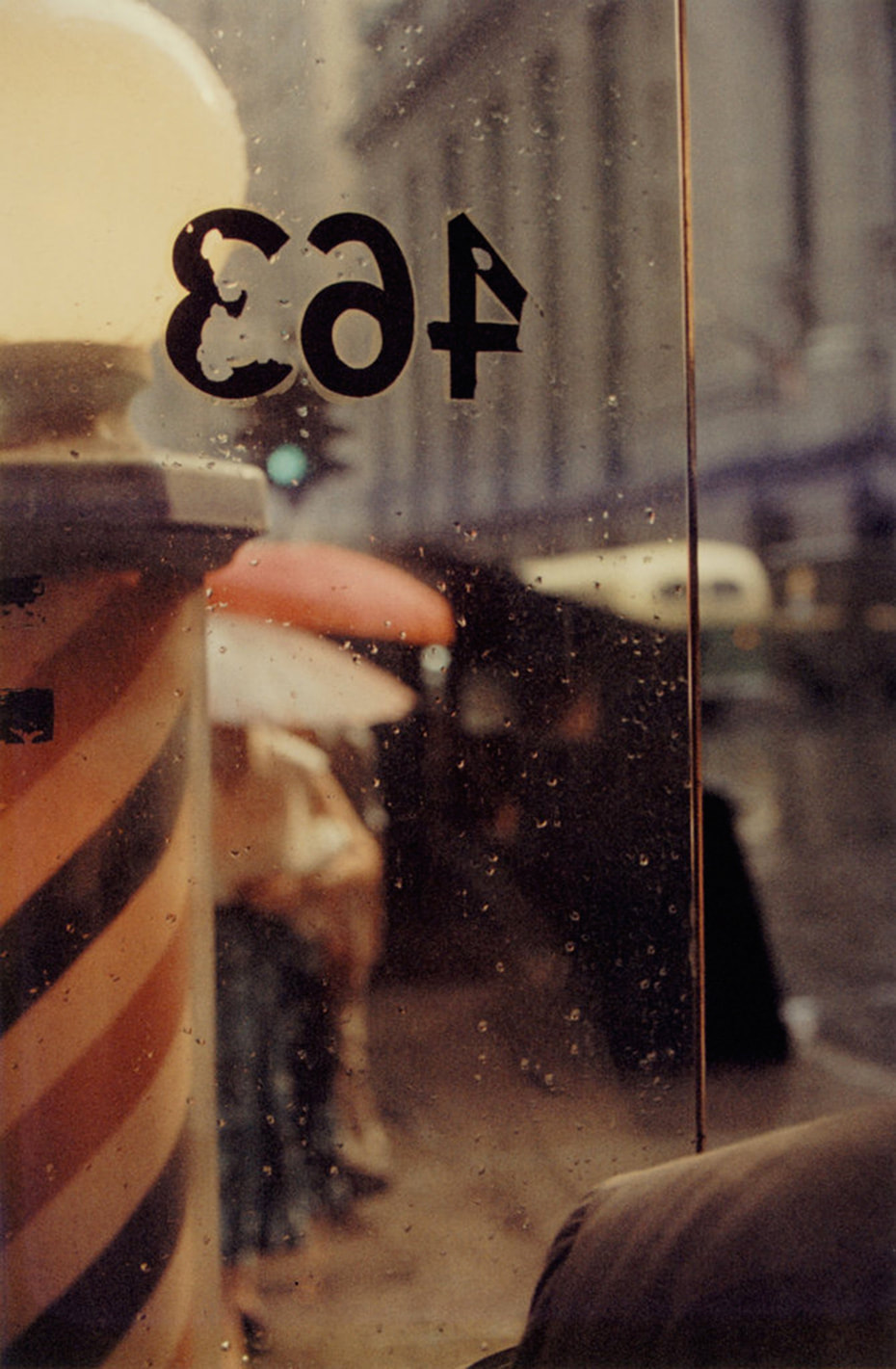
in this painting I focused on the bright colour red and yellow which can be seen in the centre of the photo. I also wanted to focus on the shape of the window frame and how it frames the photo. I noticed the contrast between the bright colours in the centre and the dark colours around the outside. |
|
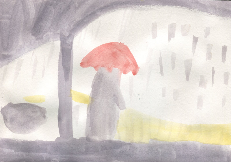
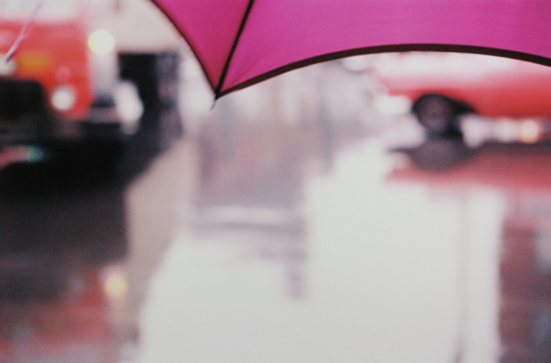
in this painting I first noticed how the umbrella is the only part of the picture which is in-focus. I also noticed the bright colours in the picture 9purple, orange and red). most of the pictures out of focus so I found it and to make the painting look blurred. |
|
what I learned from this exercise:
In this exercise I noticed more of the small details which can be seen in the two pictures I chose and also some repeating patterns and similarities I all of his pictures (what some of them have in common). It was helpful to focus on colours, shape and focus rather than to make a perfect recreation of the photographs so that we could see the smaller details.
In this exercise I noticed more of the small details which can be seen in the two pictures I chose and also some repeating patterns and similarities I all of his pictures (what some of them have in common). It was helpful to focus on colours, shape and focus rather than to make a perfect recreation of the photographs so that we could see the smaller details.
Homework:
As part of our Saul Leiter project, we had to pick out our favourite photograph by Saul Leiter and explain why we like it.

|
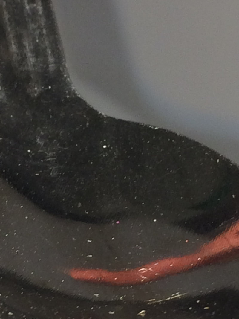
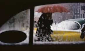
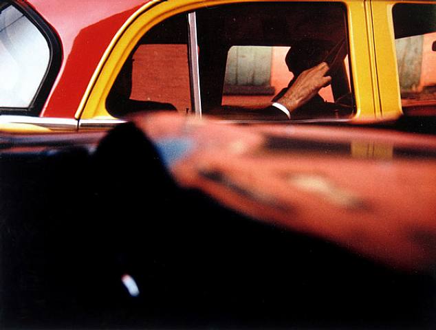
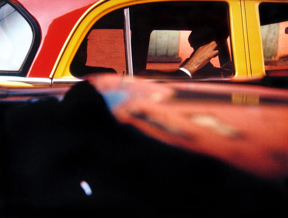
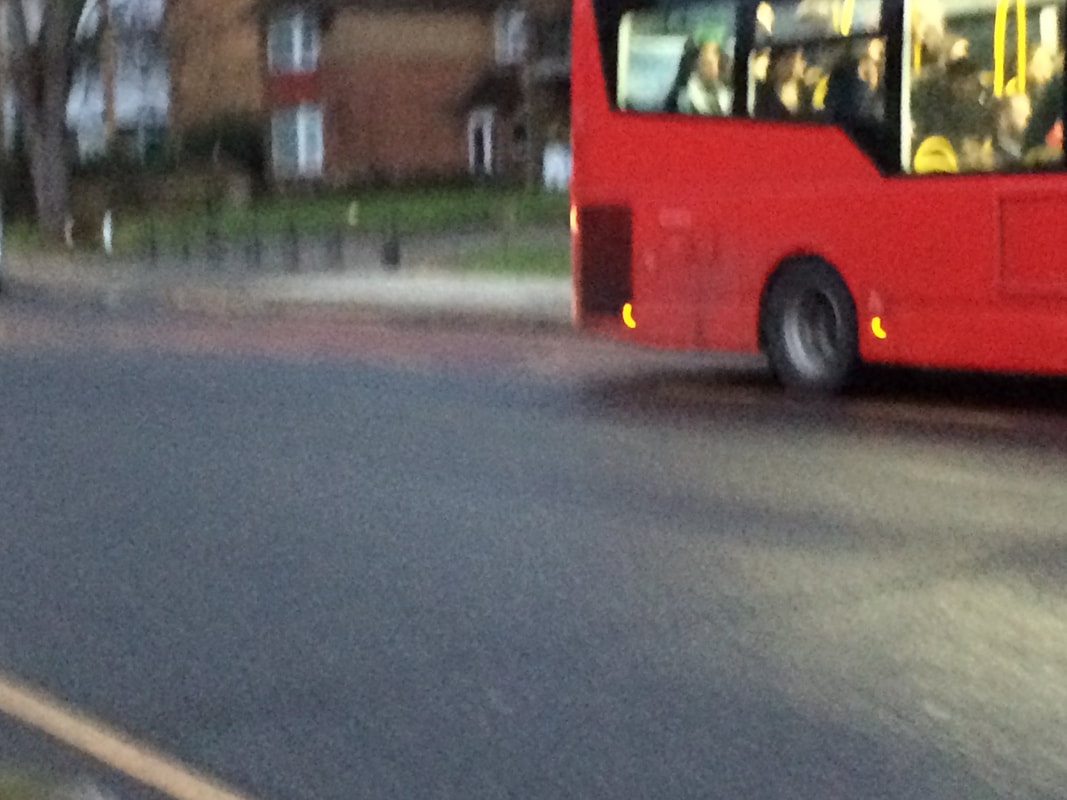
This photograph is one of my favourites. The reason I like it is because of bright colours of yellow and red, and the shadows which can be seen in the car. I also think this photograph is very interesting because there is an object at the bottom half of the photograph which is out of focus so we cant quite tell what it is. there is also a small reflection on the object which shows part of the red and yellow car which the photograph is focused on.
|
|
Analysing Saul Leiter's photographs:
In our two hour lesson we analysed Saul Leiter's photographs on google slides by highlighting the different shapes that Leiter used.
|
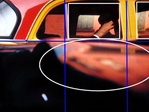
I decided to analyse one of my favourite photographs by Saul Leiter.
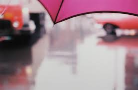
In this photo I found there is a repetition of squares in the car windows. I also found that at the bottom of the picture there is a large object which is out of focus, it is also roughly an oval shape. I also put a small grid on the picture to see how the shapes are laid out. |
|
Pictures:
Our homework over the half term was to try to take pictures in the style of Saul Leiter.
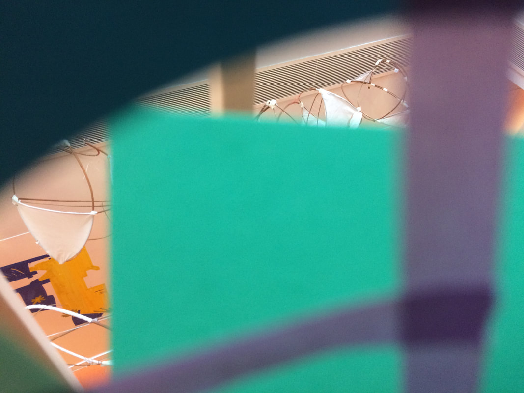
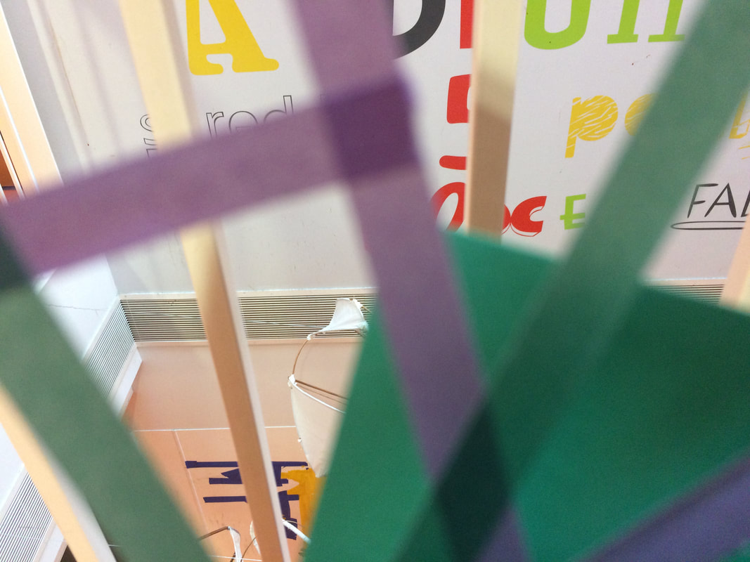
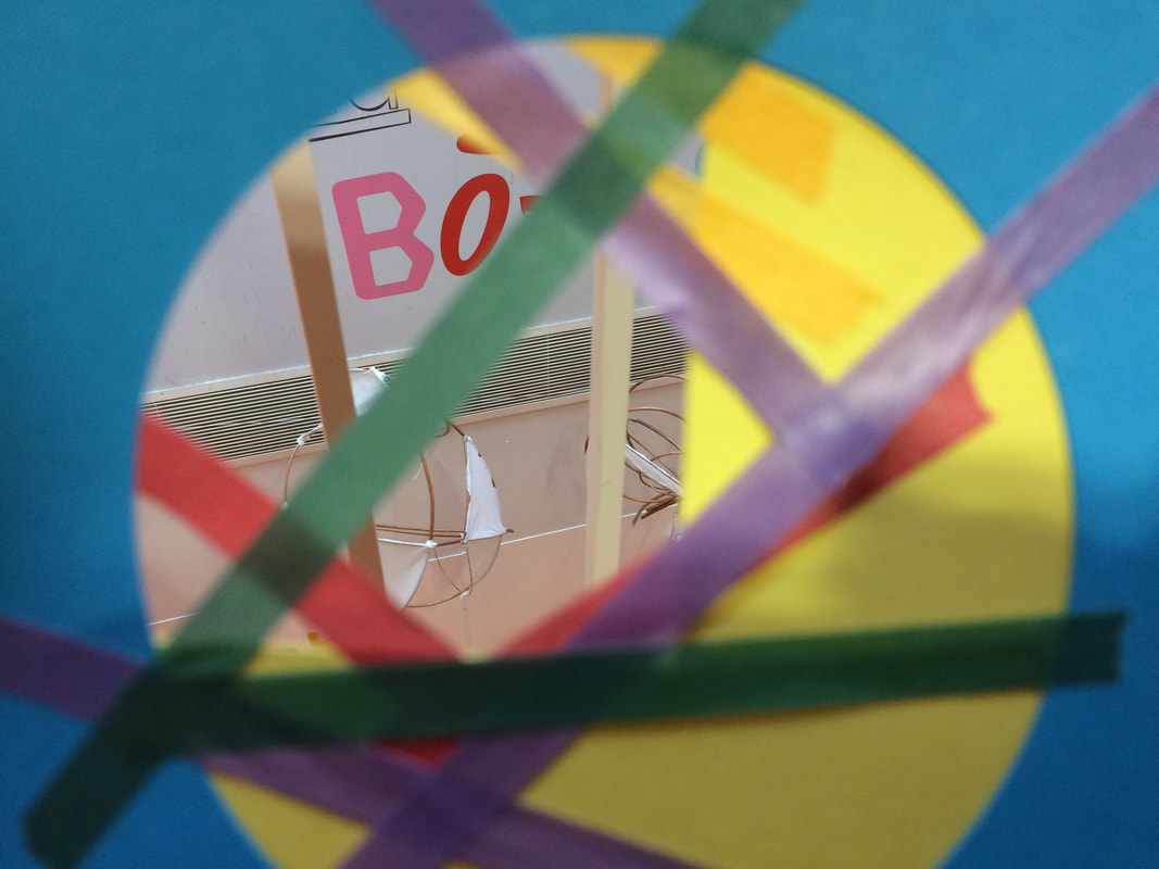
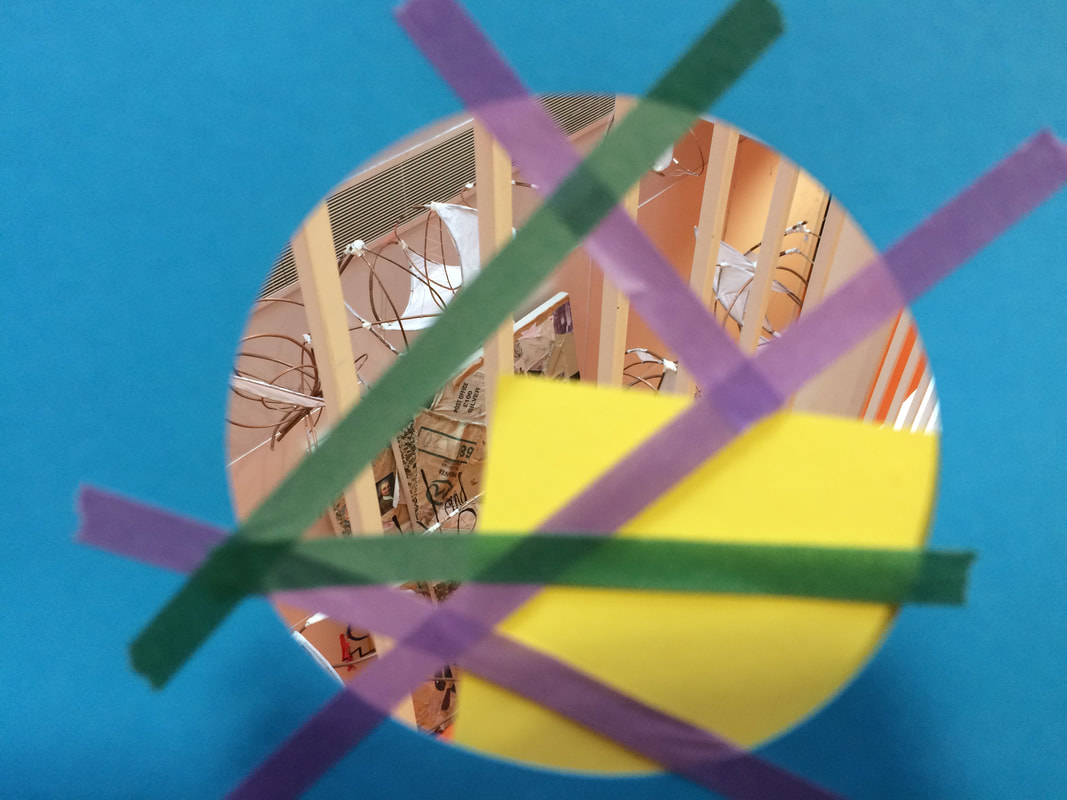
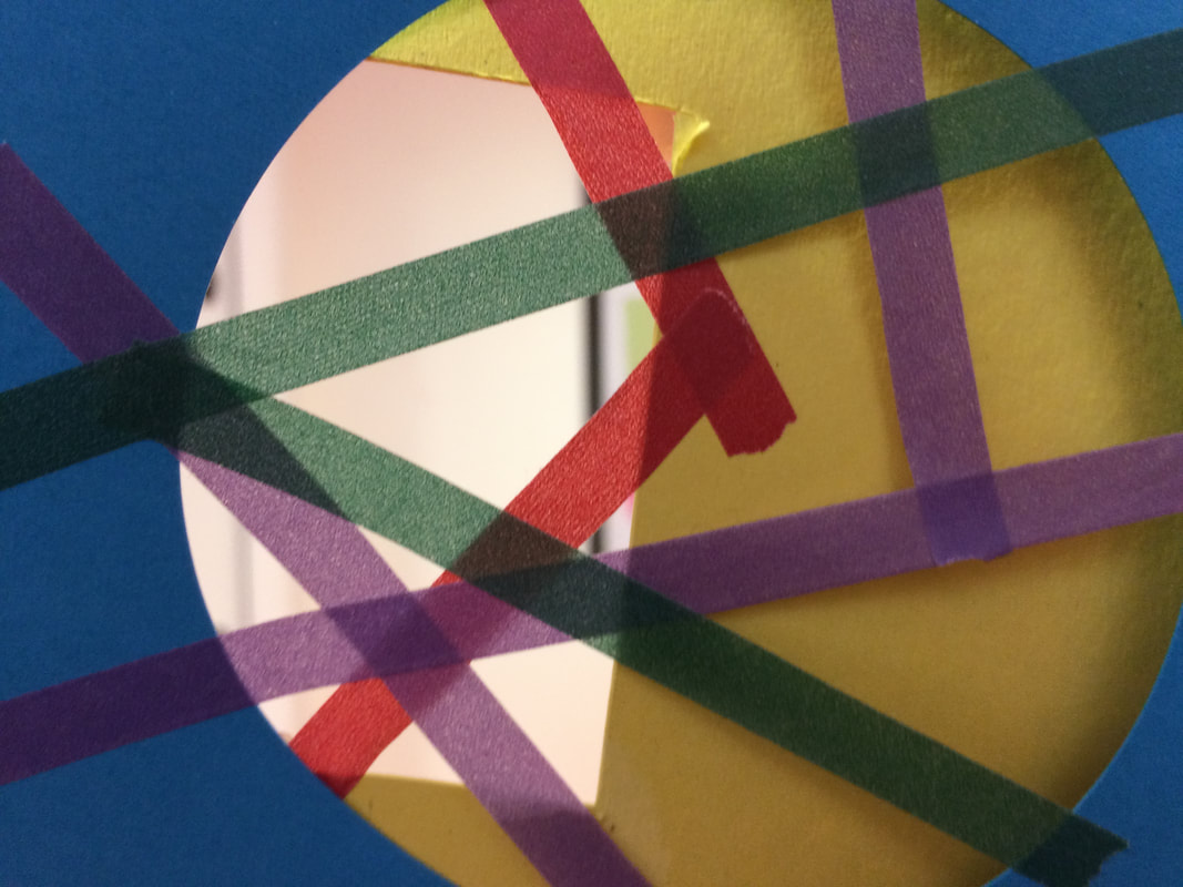
View-finder pictures: pt 1
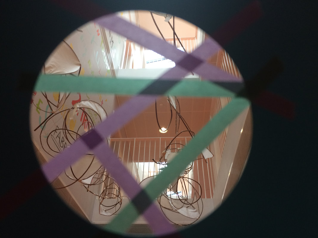
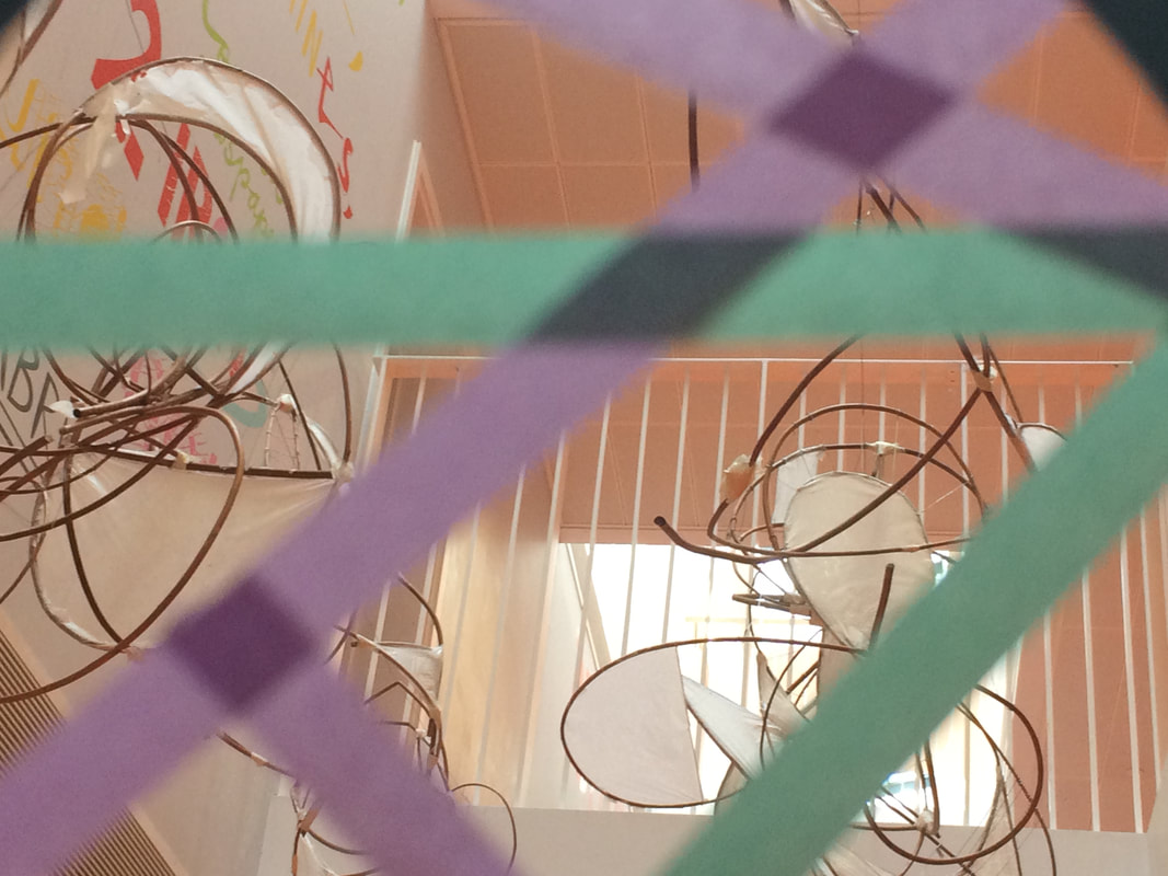
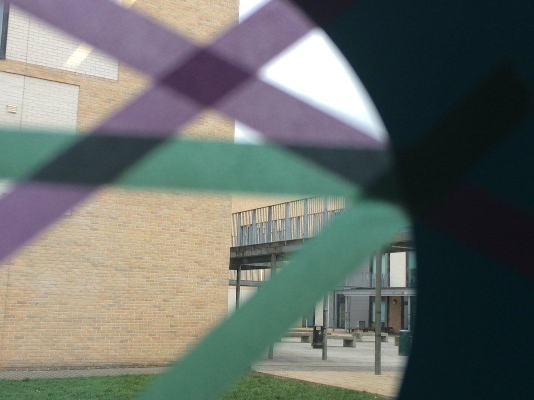
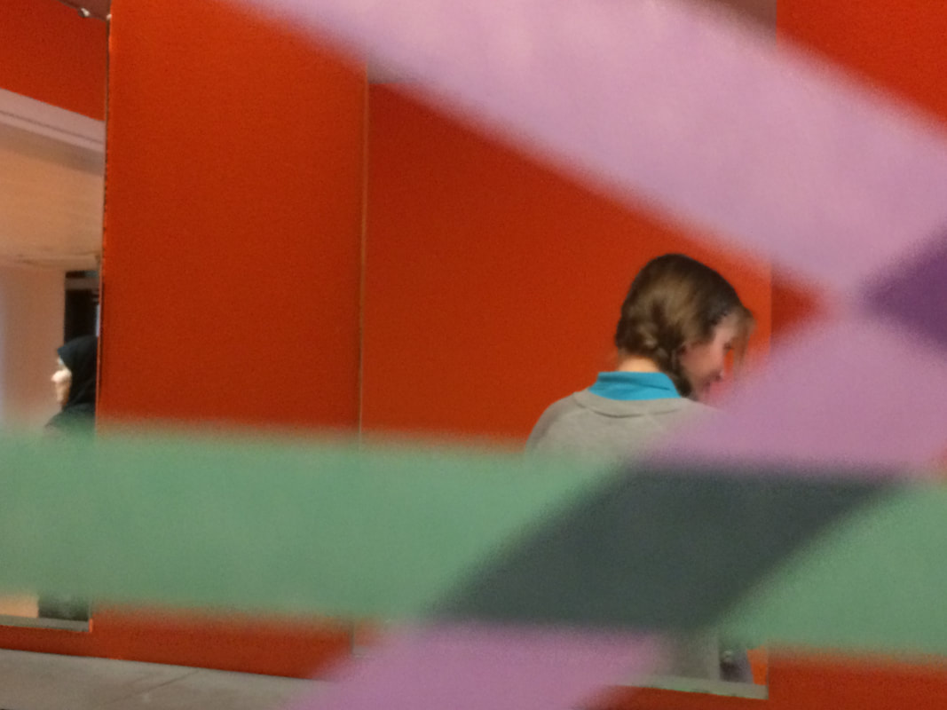

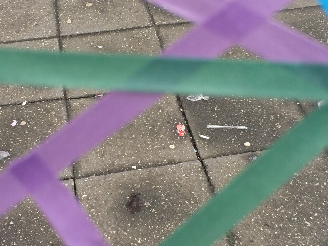


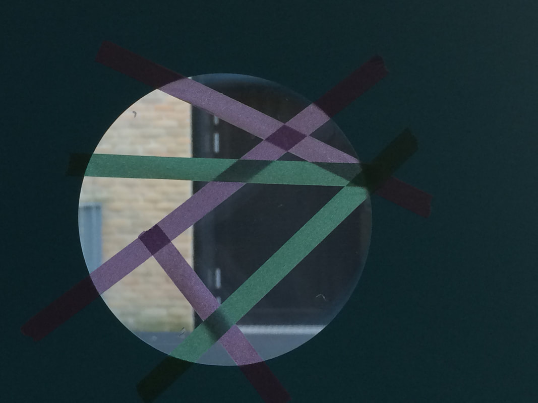
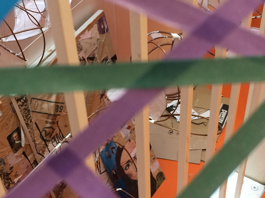
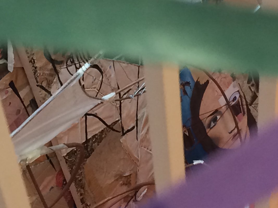
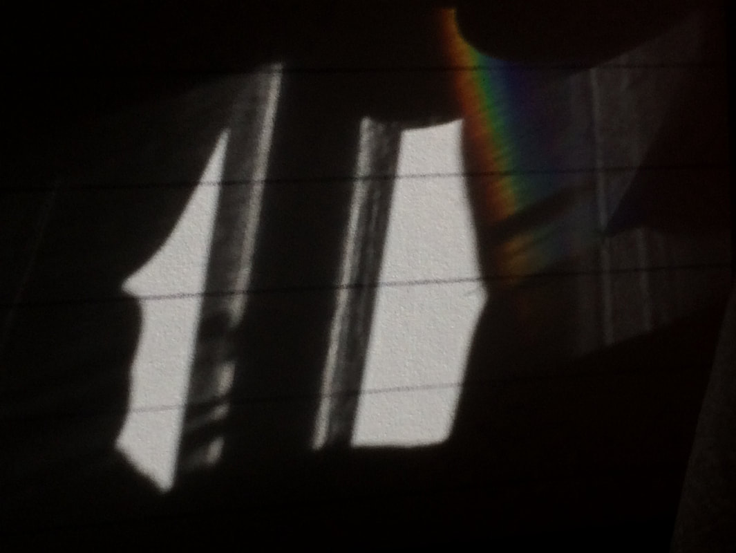
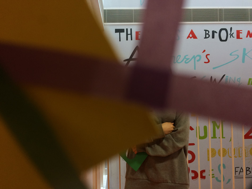
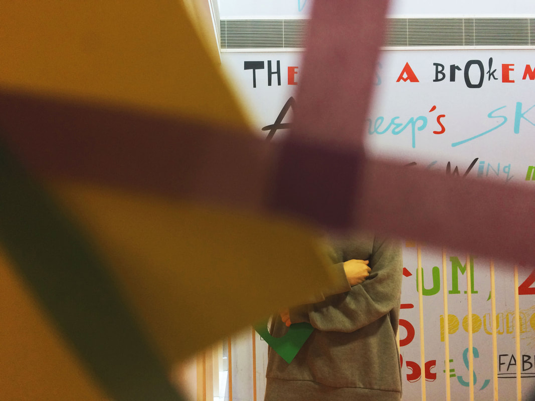
WWW: I think I used the lines in the tape quite well and I also used a range of angles and proximity. I took a lot of close up pictures so that the tape was blurred.
EBI: I could try to use more than one piece of card and also use the corners of the card in the pictures.
EBI: I could try to use more than one piece of card and also use the corners of the card in the pictures.
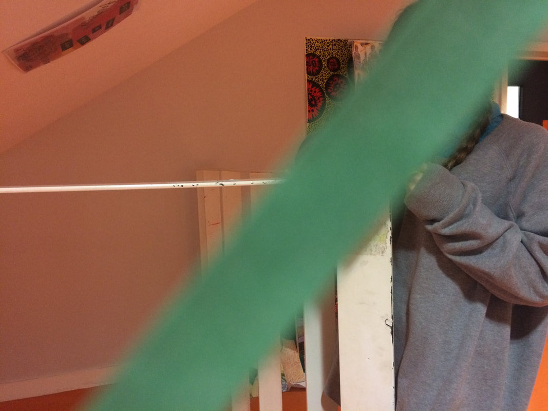
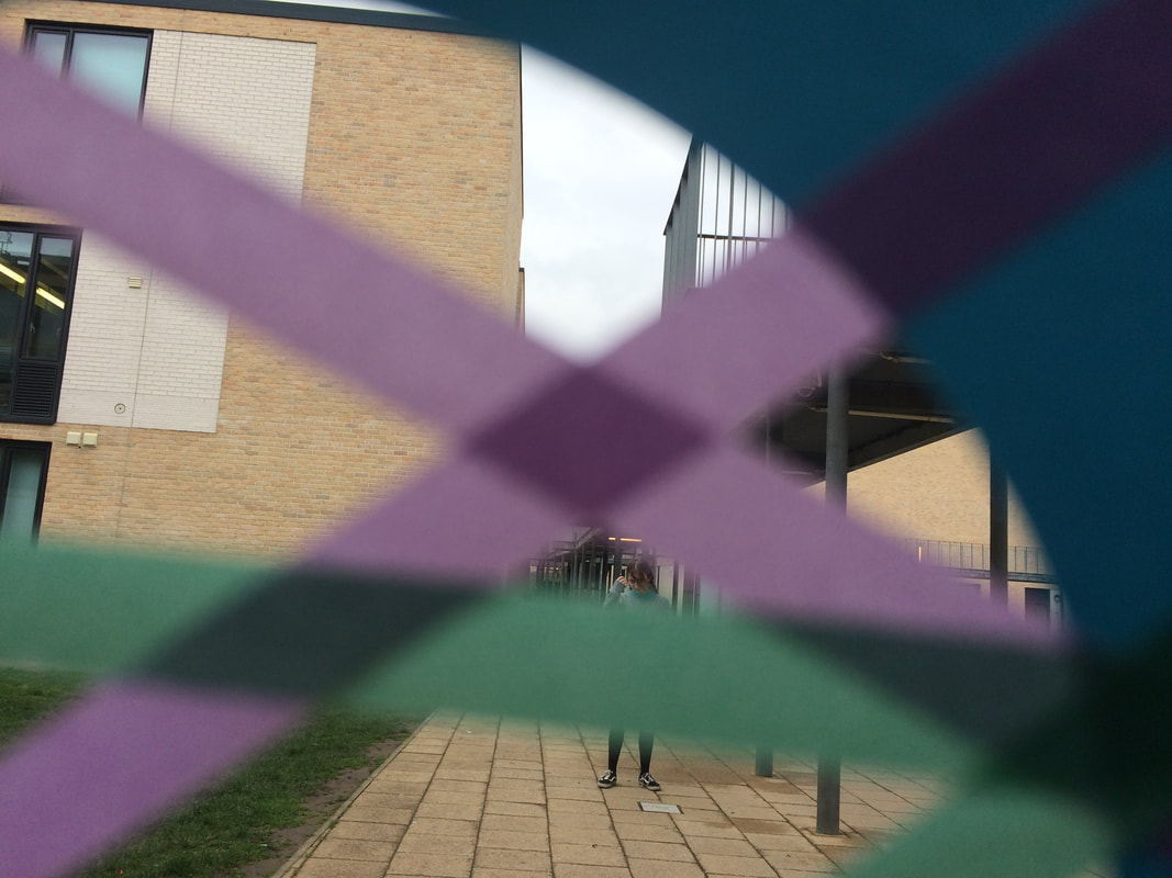
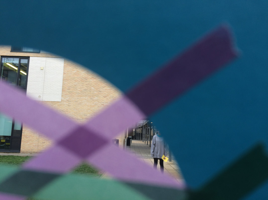
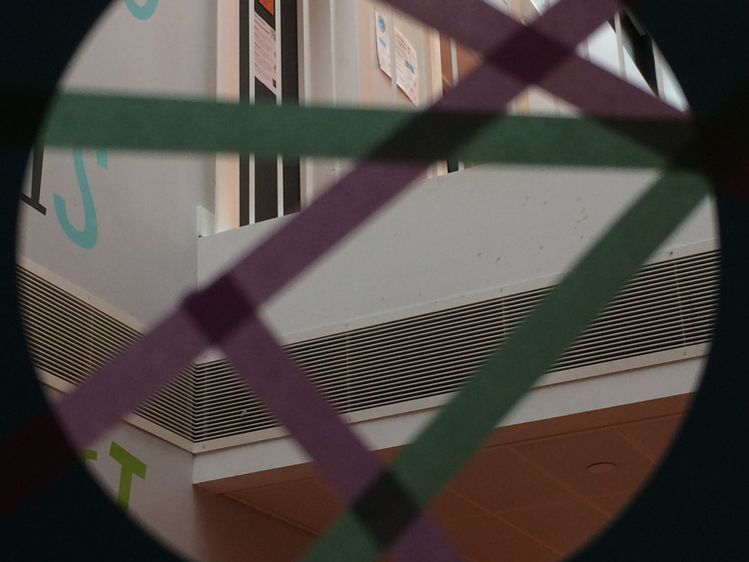
View-finder pictures pt.2:
I decided to take a second set of pictures based on the feedback I gave myself on the last photoshoot with the viewfinder.
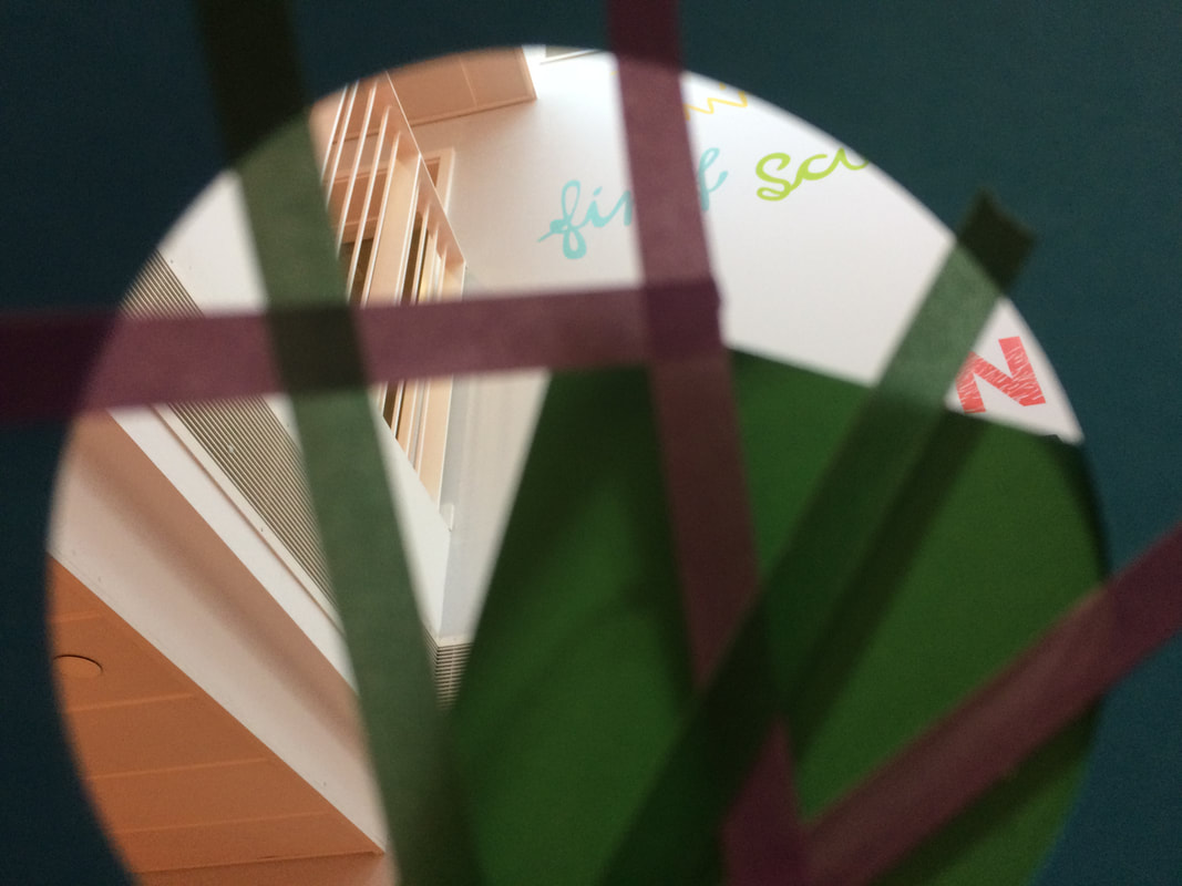
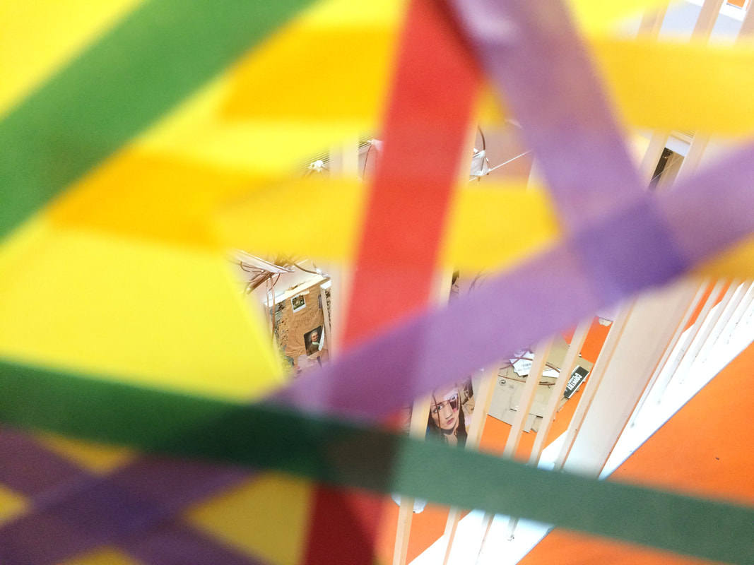
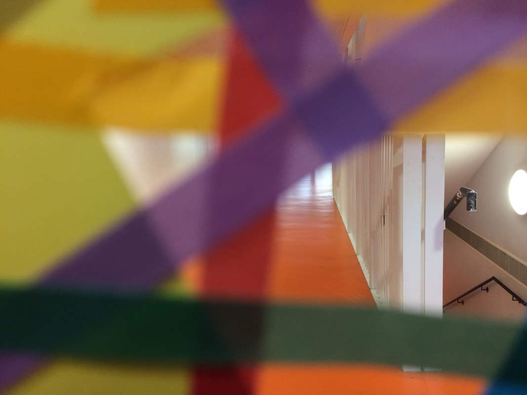
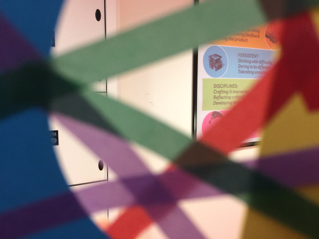
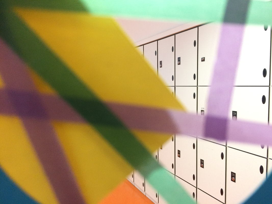
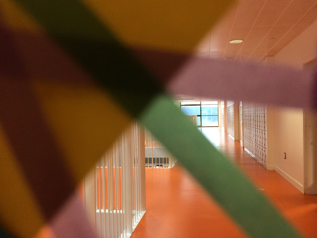
I edited the picture to make the colours more vibrant and make the picture brighter. I think that this reflects the bright colours that Saul Leiter uses in his photographs as well as the use of cropping.
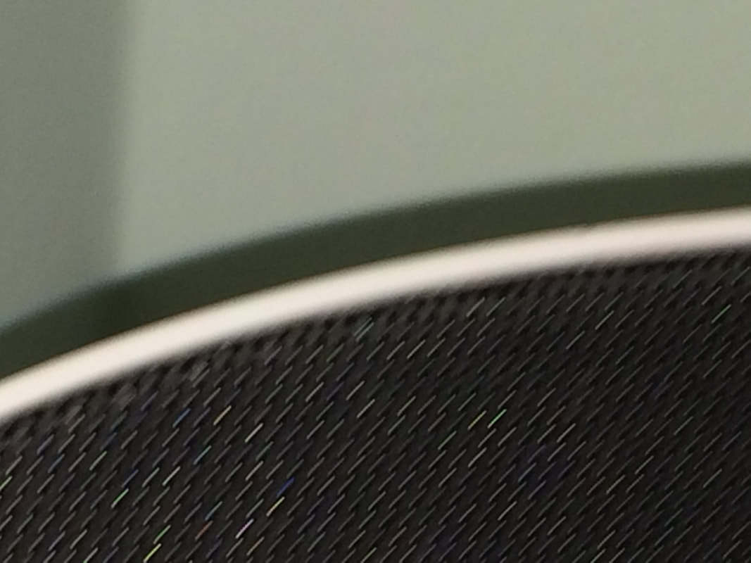
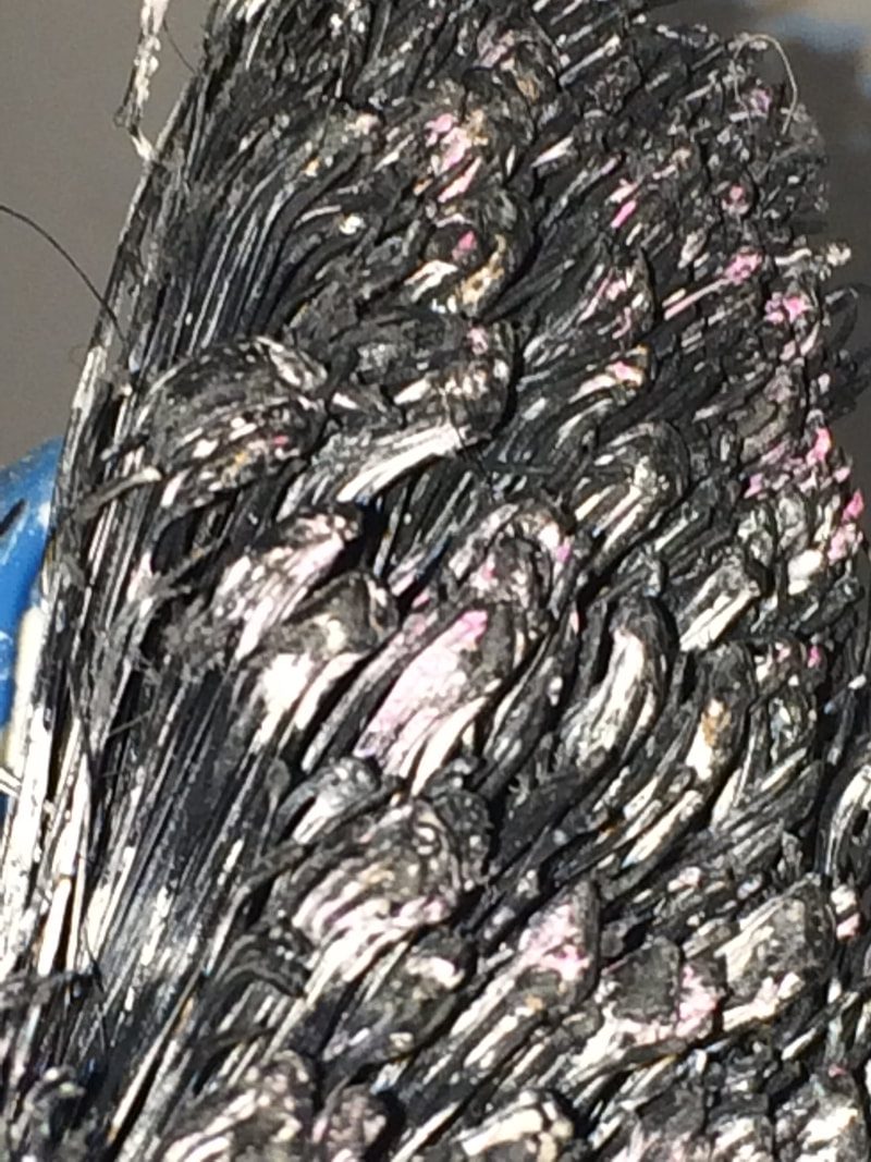
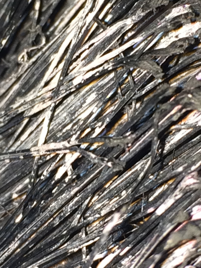
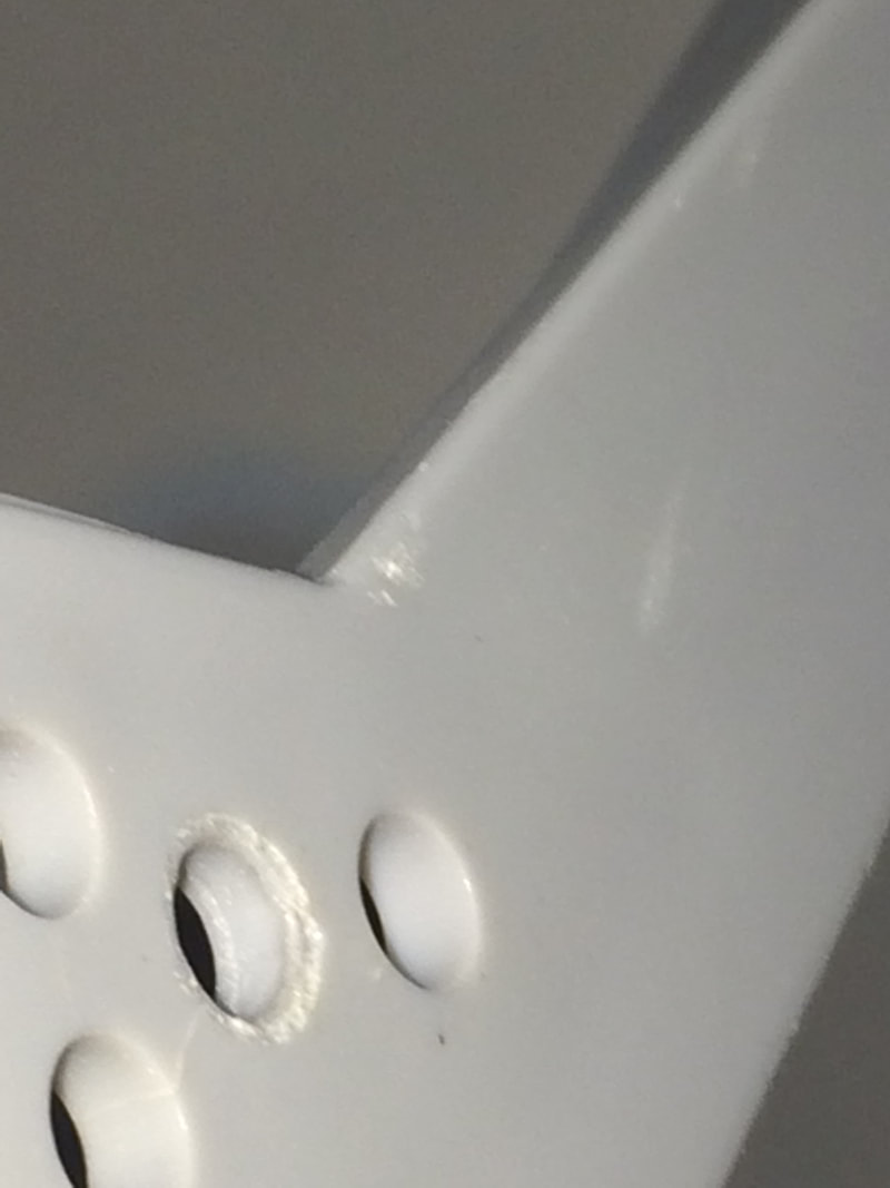
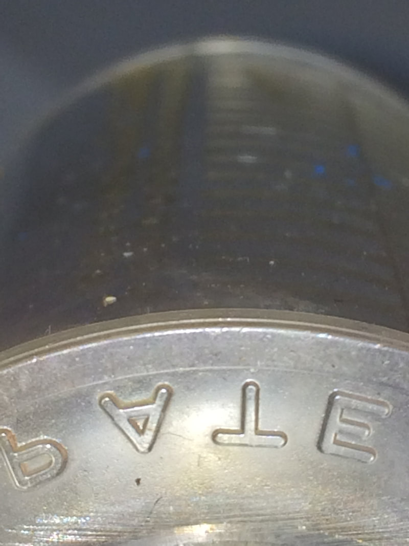
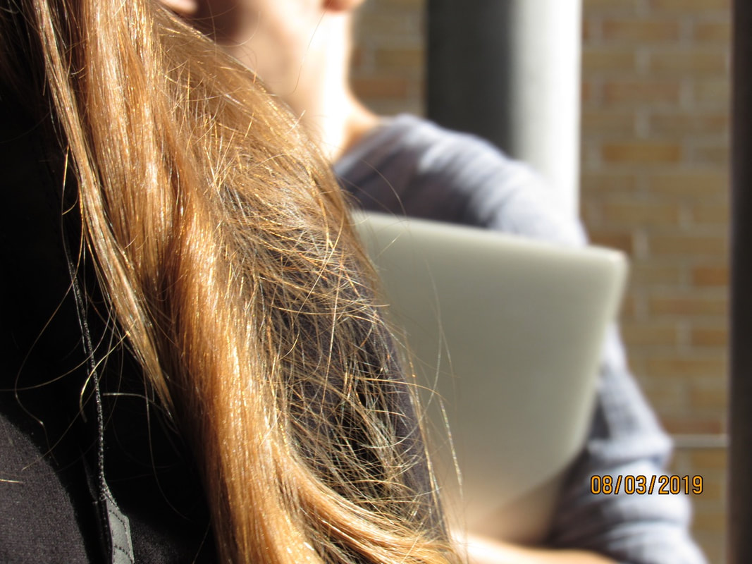
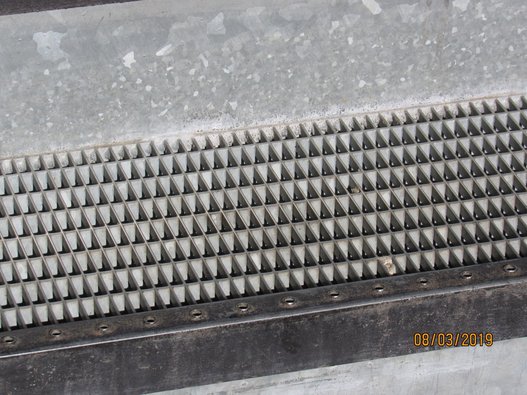
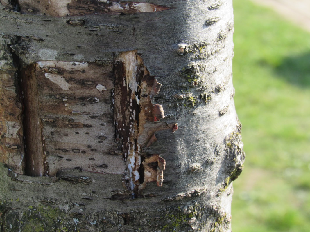
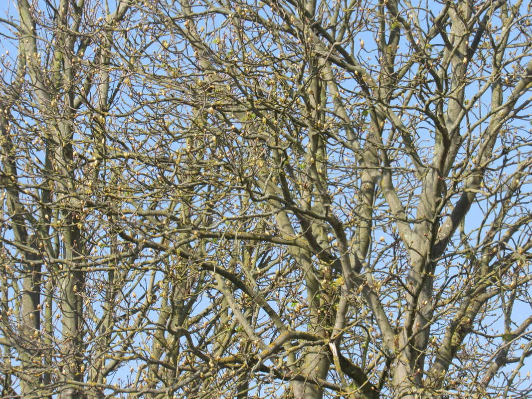
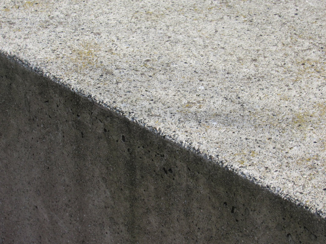
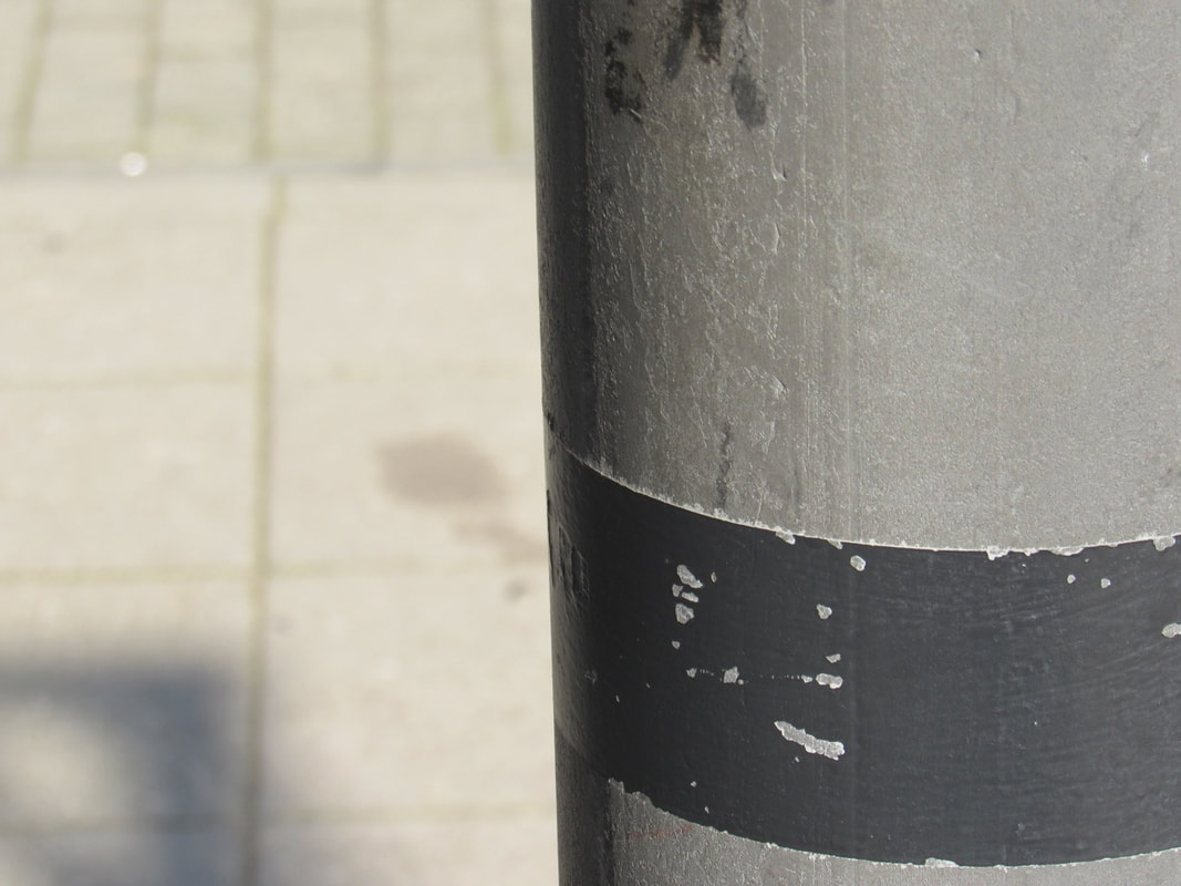
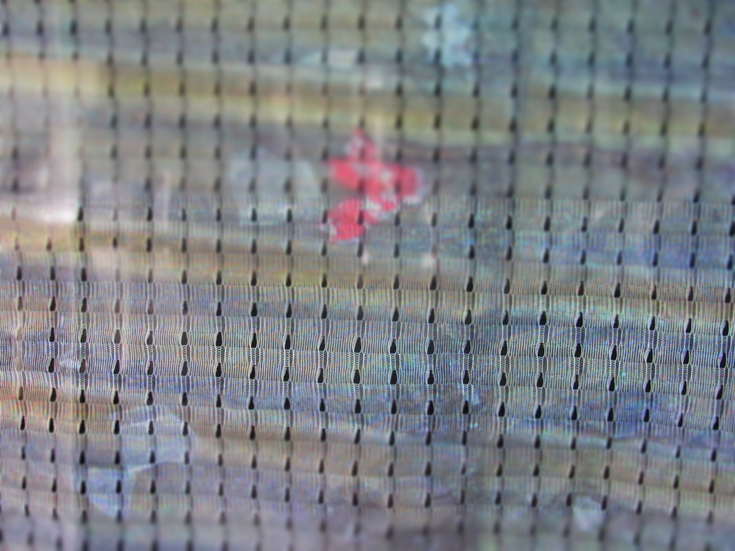
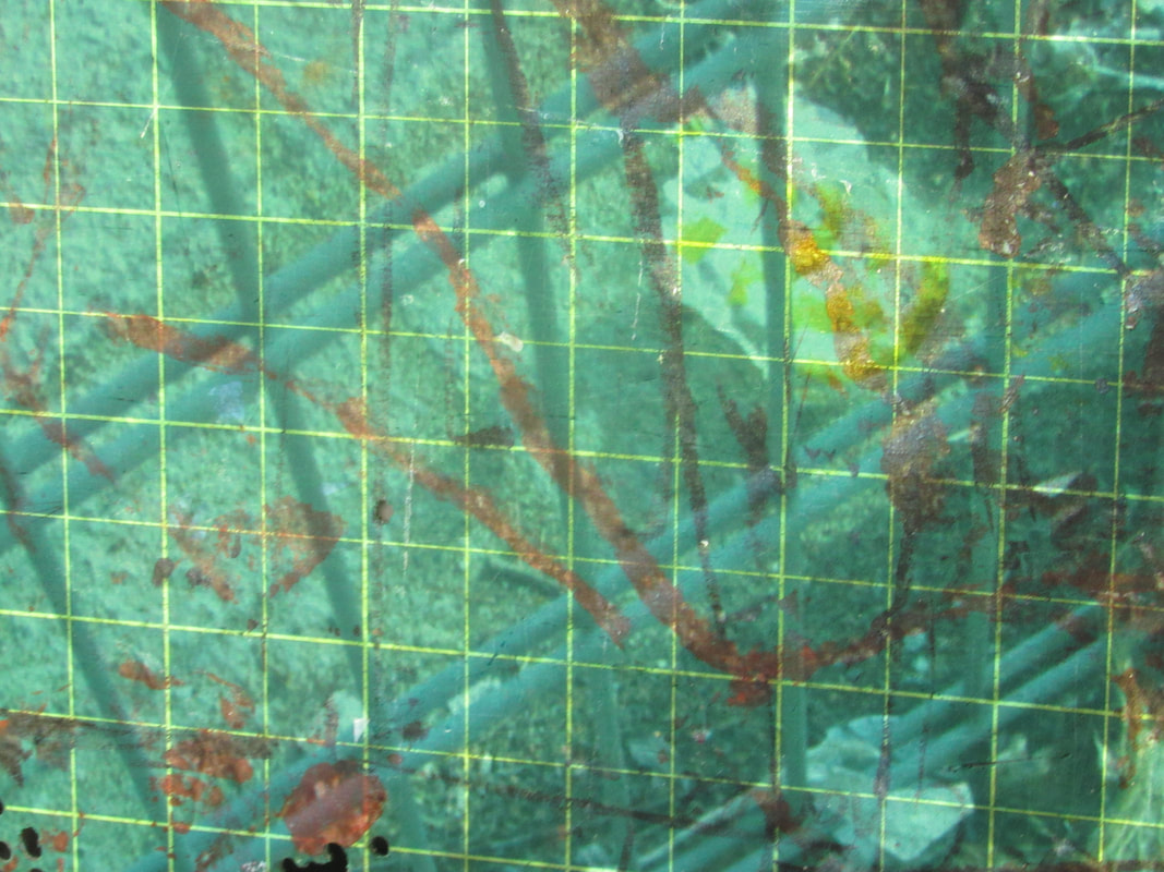
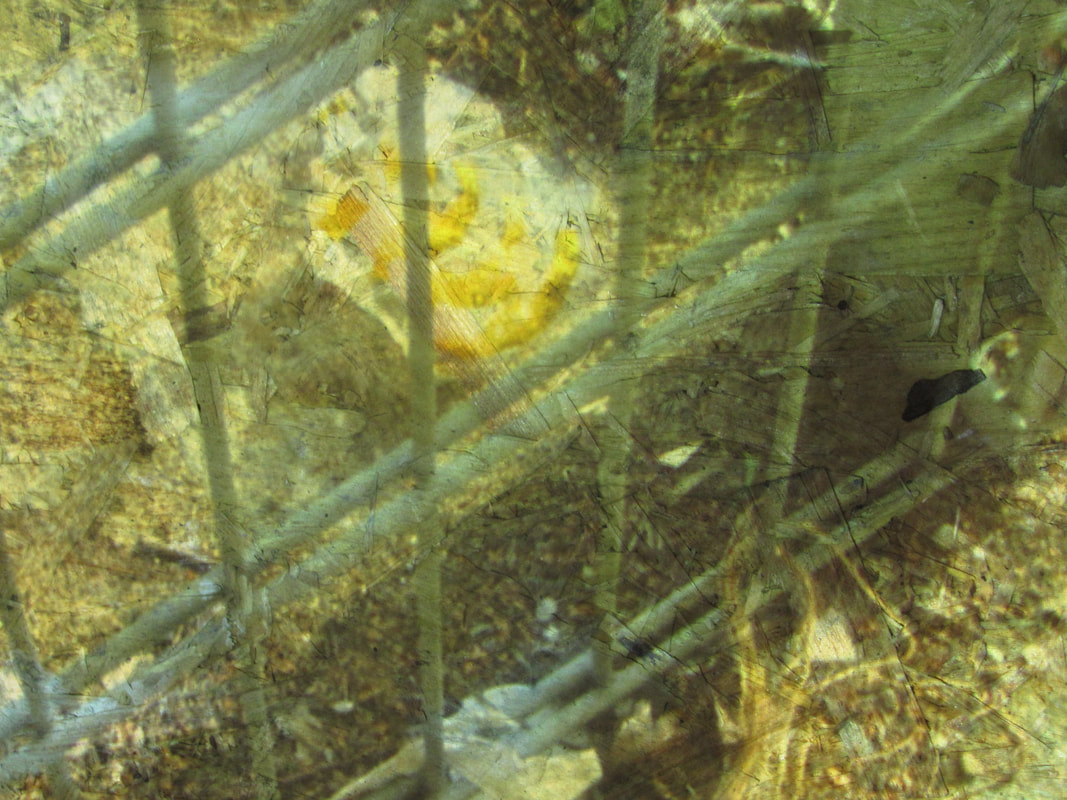
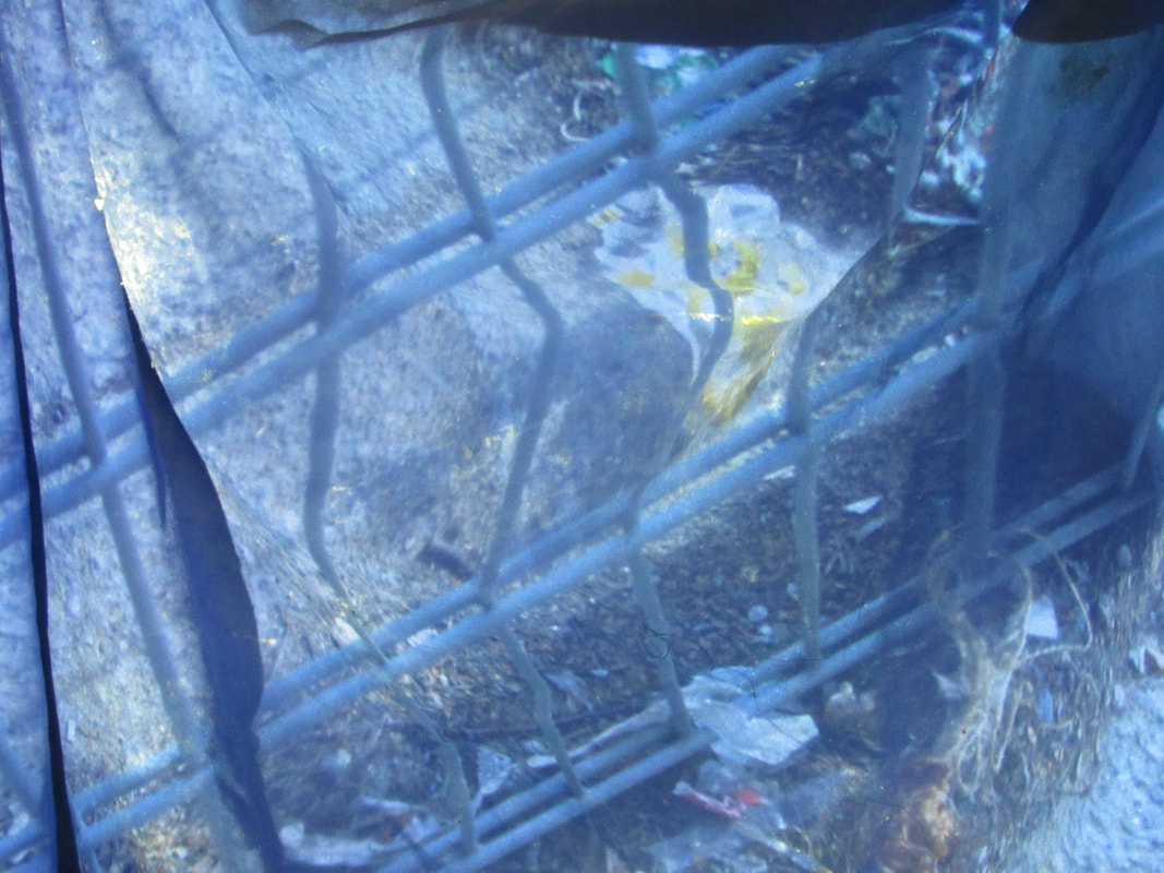
Formal element: texture
I chose the formal element texture and took pictures that show texture.
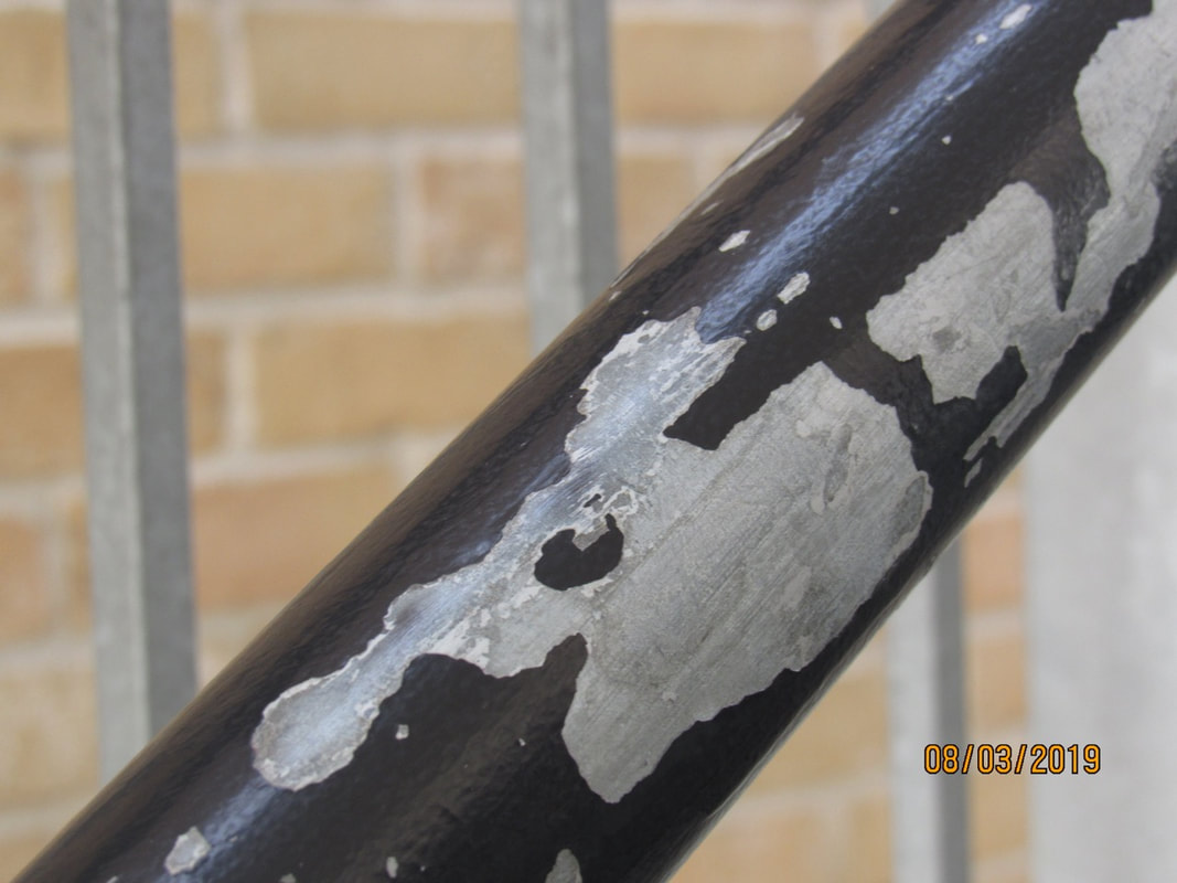
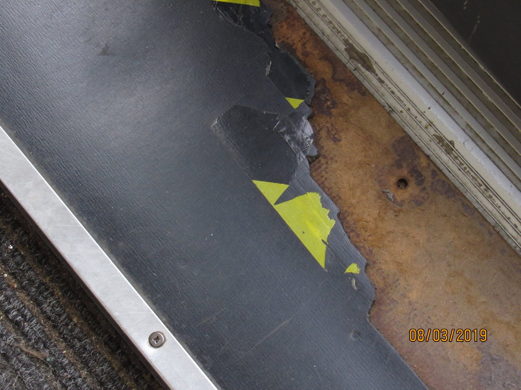
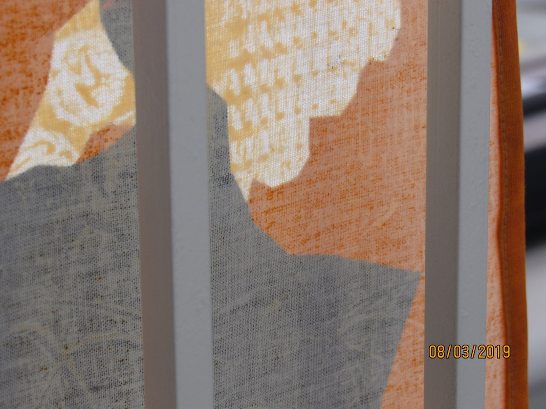
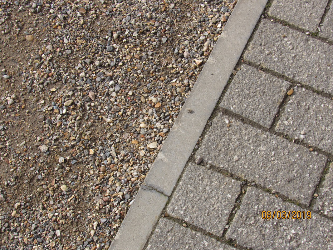
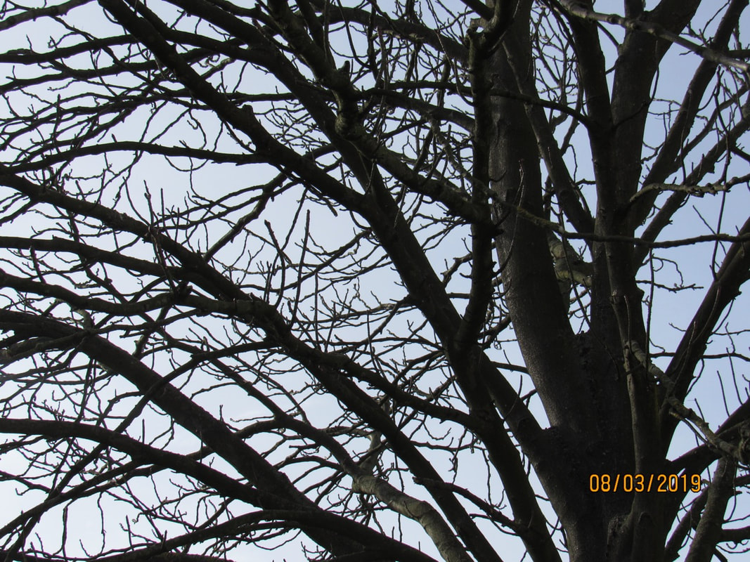
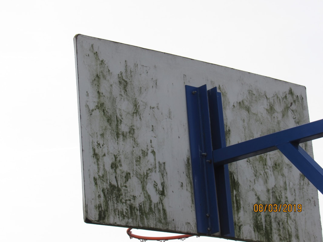
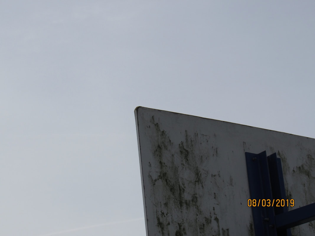
I think that overall these pictures went quite well. I did not intend to have the date in the corner but I think the pictures look fine with or without it.
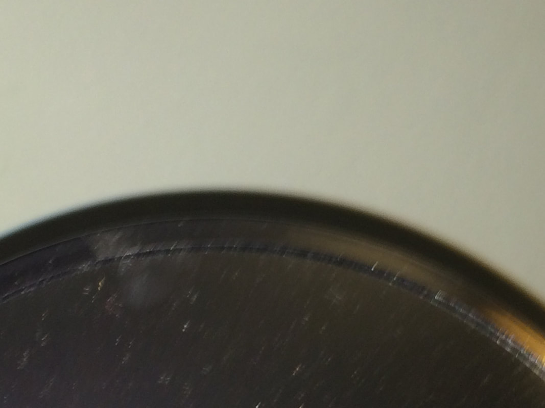
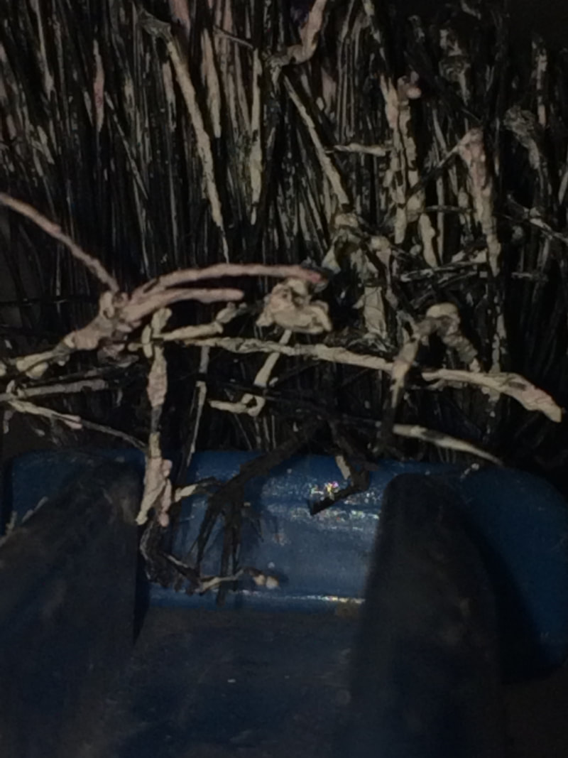
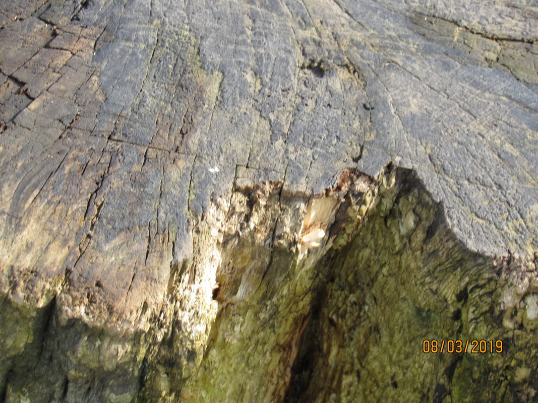
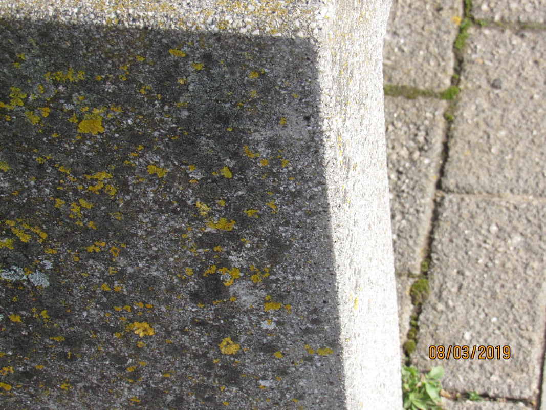
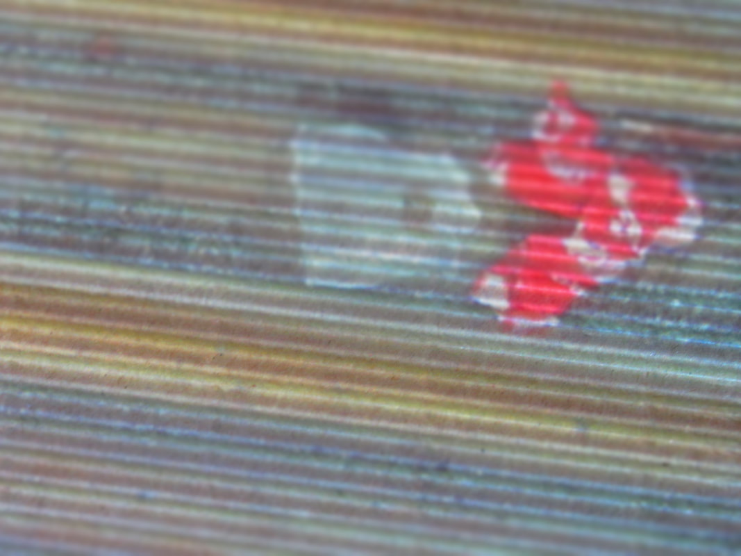
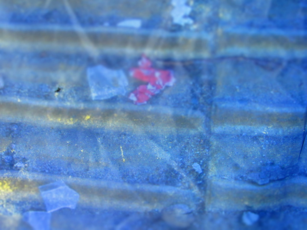
2nd texture photoshoot:
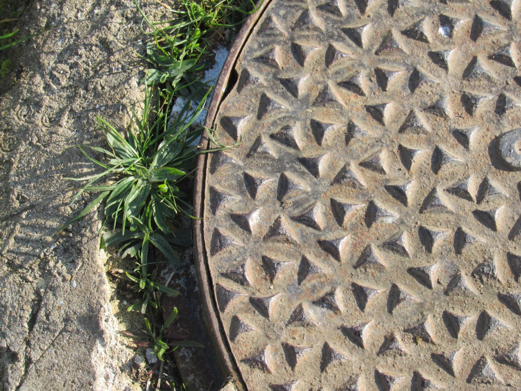
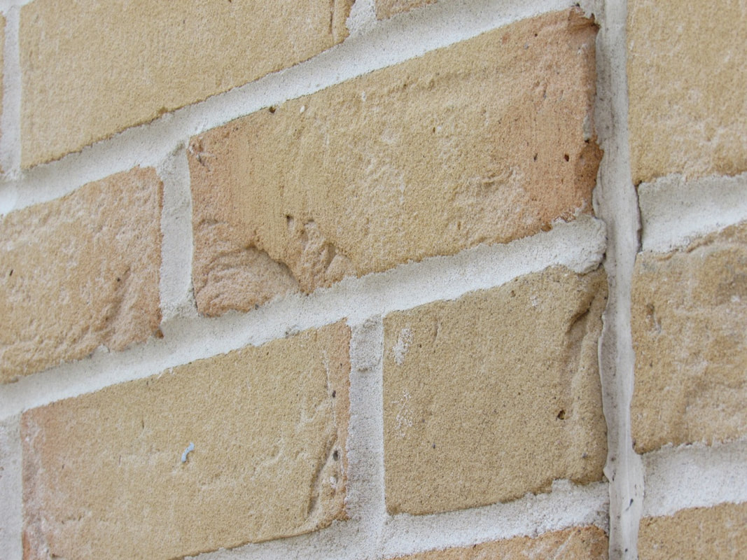
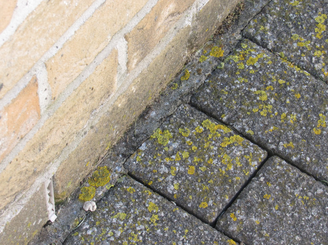
I think that in my second attempt at the textured photos I thought about what went well in my previous photos and worked on finding new textures. I also took the pictures without the date in the corner.
texture: final piece
For my final piece for the abstraction topic I used my best photos from my texture pictures and projected them onto different textured materials.
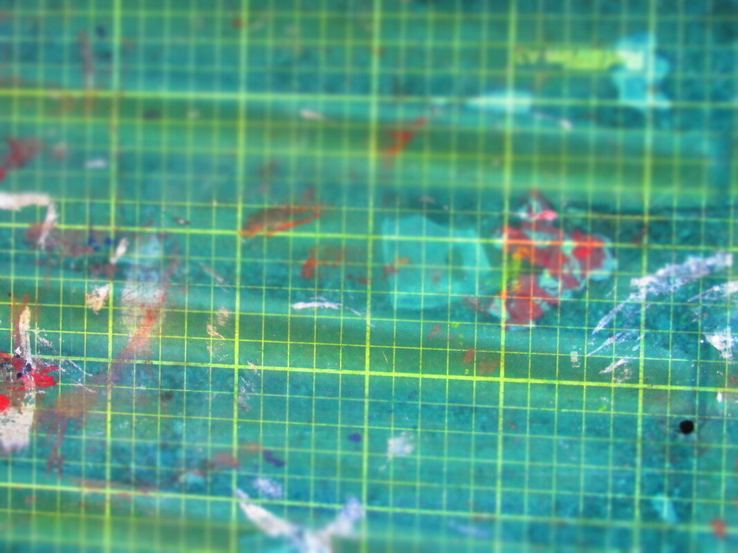


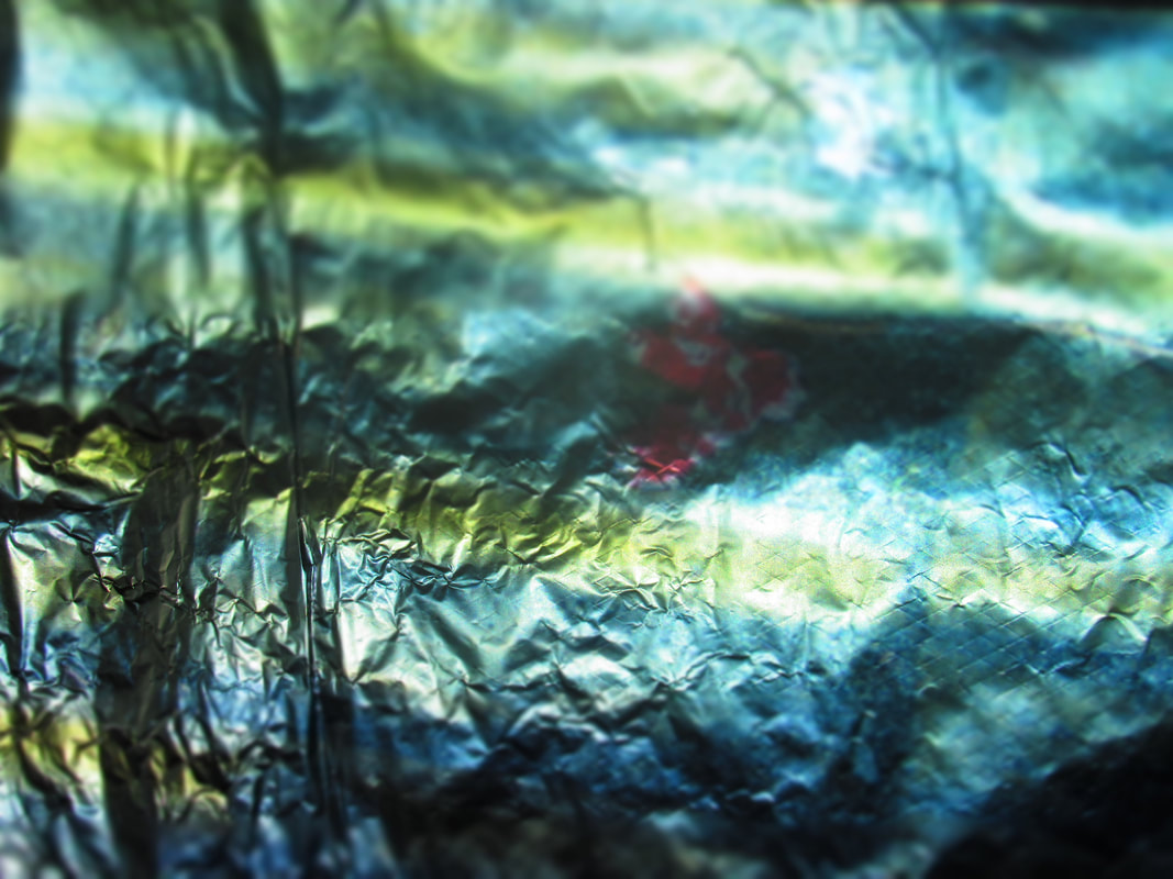
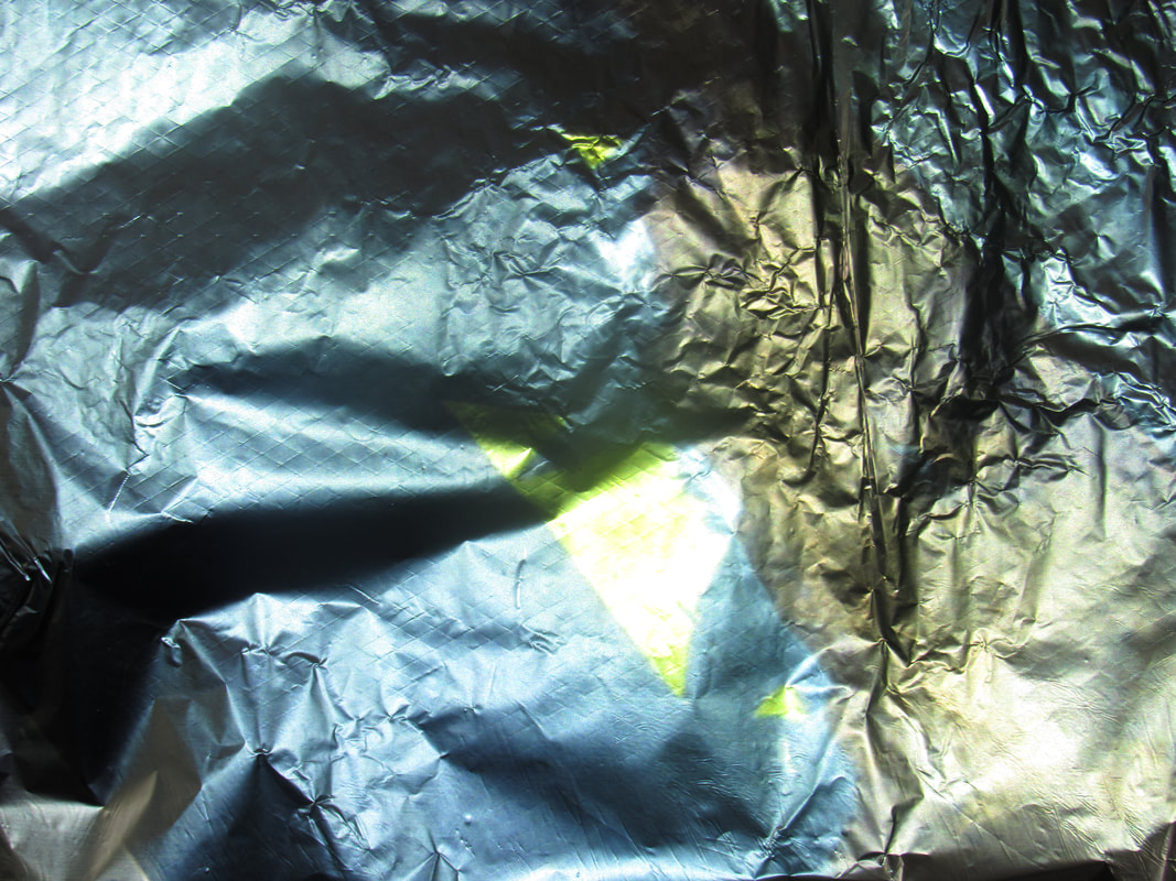
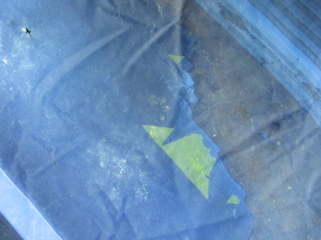
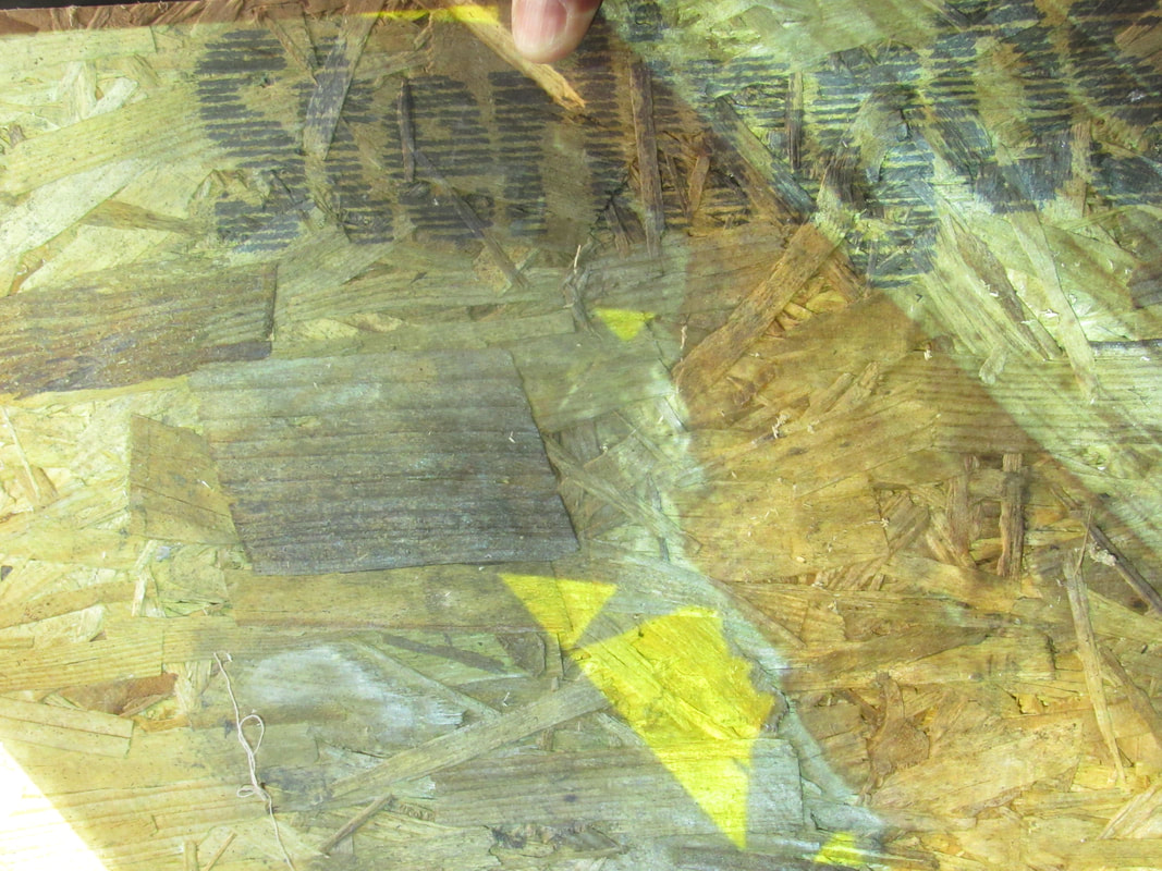
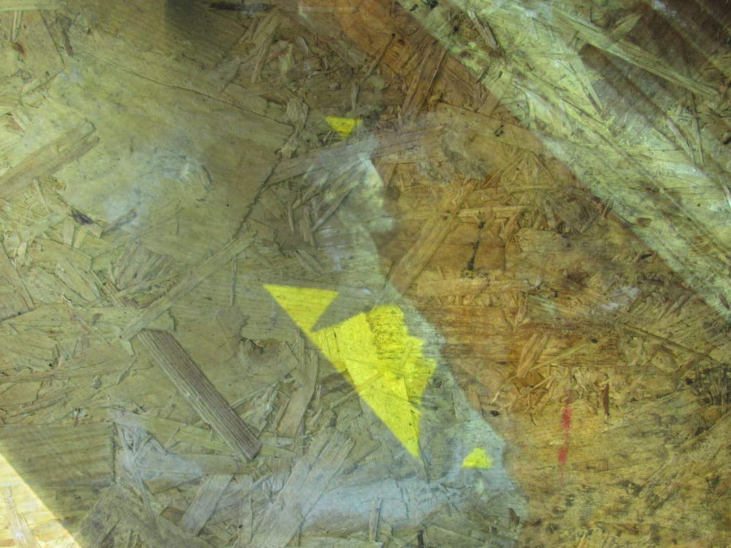
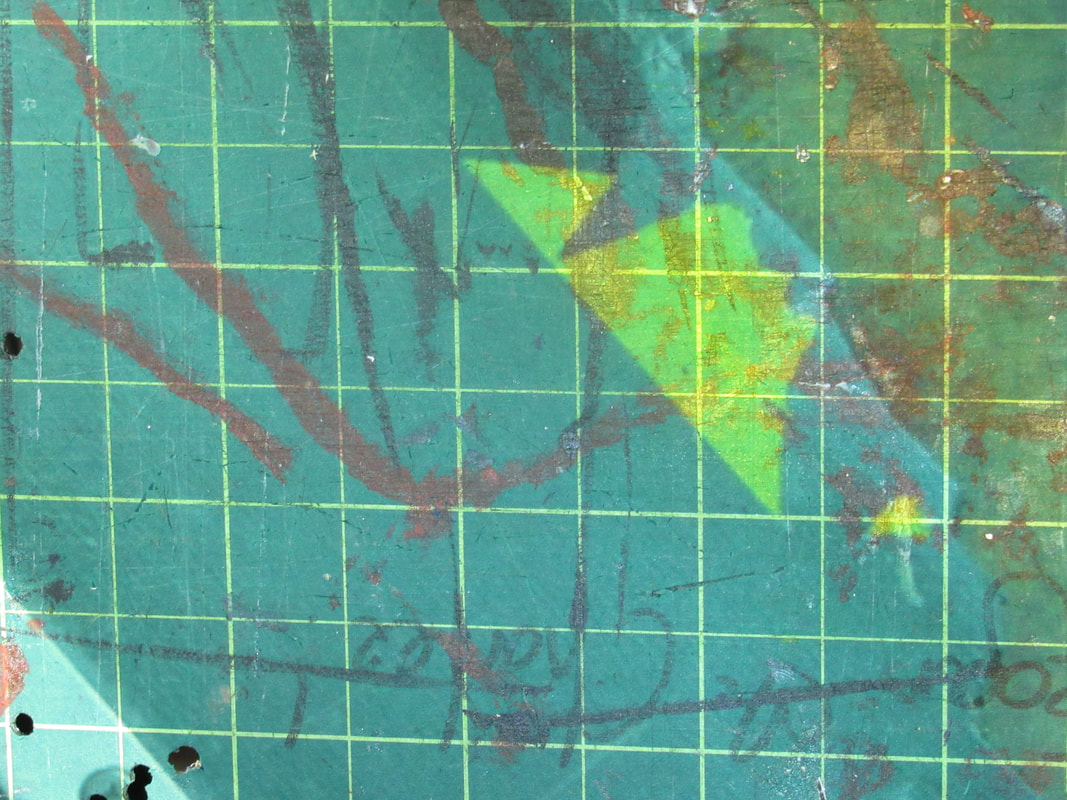
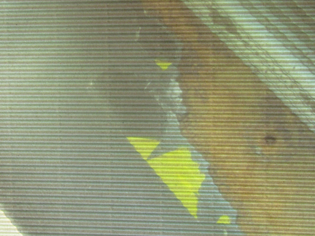
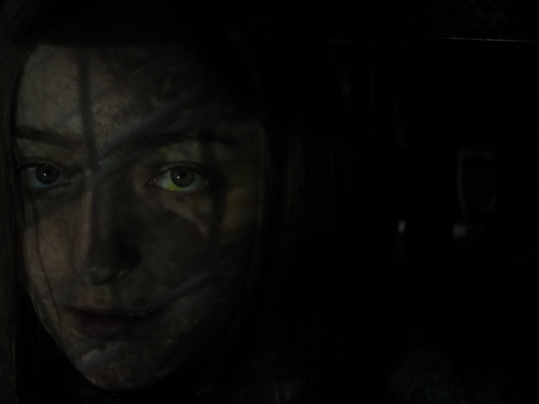

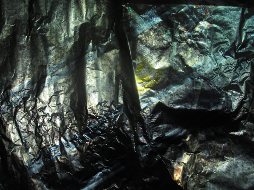
WWW: I personally think that the tinfoil worked quite well as it had quite a nice effect and as well as using some materials I projected them onto people.
EBI: I could have tried to use a wider range of materials as well as perhaps editing the photos before projecting them to emphasise the texture in them.
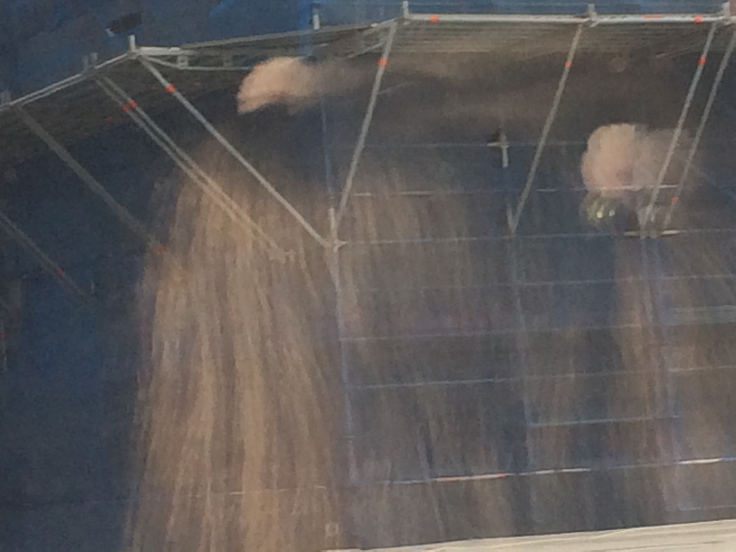
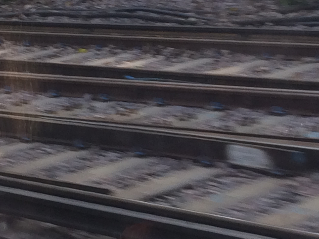
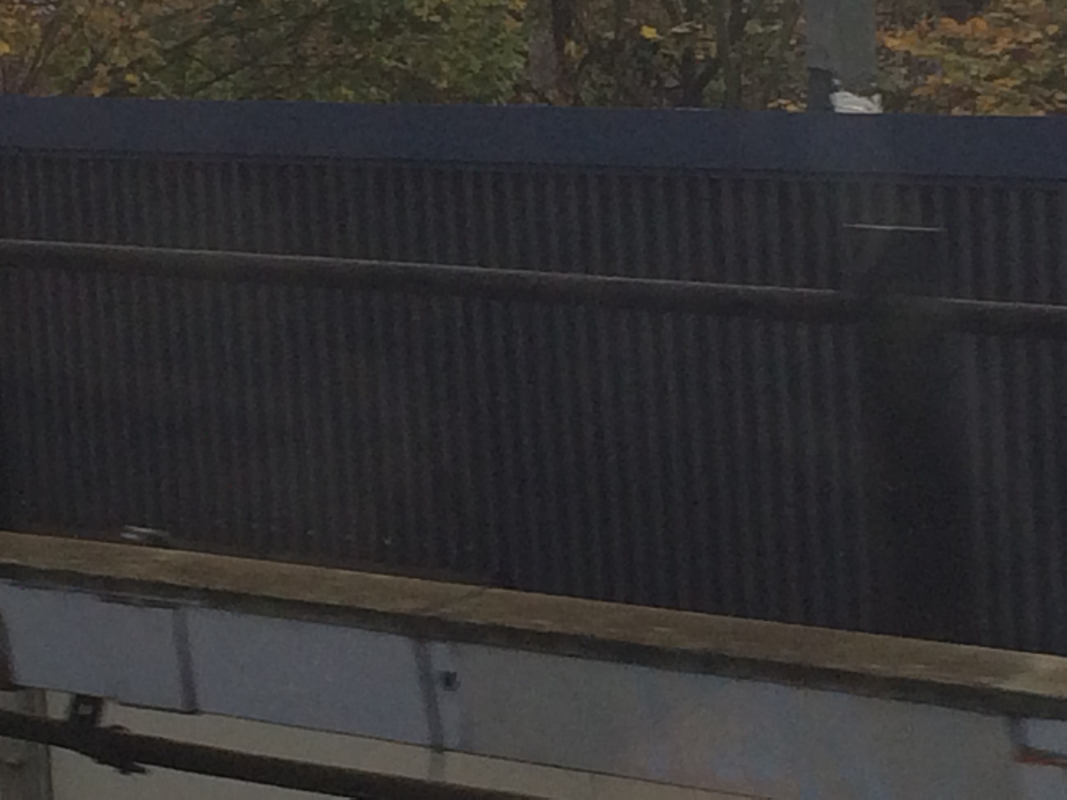
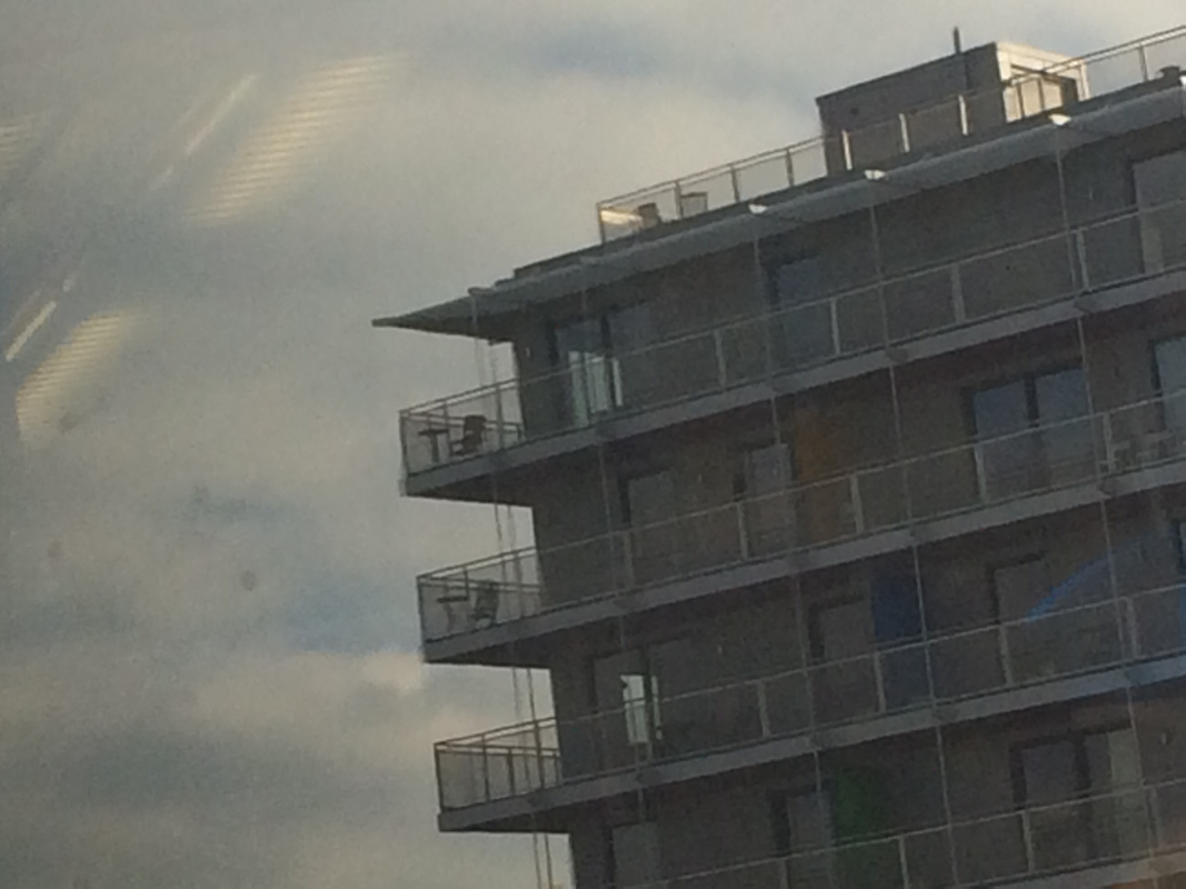
Formal Elements Homework:
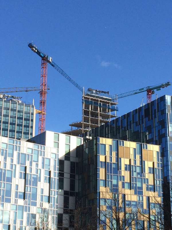
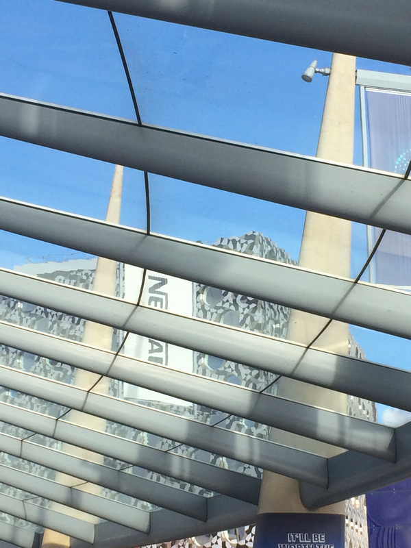
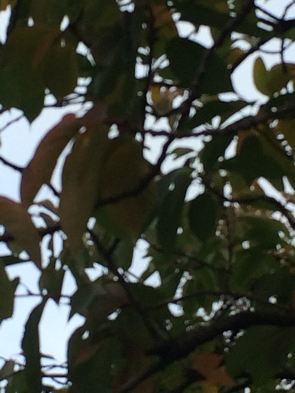
for my homework I did a powerpoint on all of the formal elements including definitions of the formal elements as well as some pictures that I took outside of school.
WWW: I showed all of the formal elements and added definitions as well as some pictures that I have taken outside of school.
EBI: I think that I could have added four photographs for each of the formal elements rather than an odd number of pictures for each formal element.
EBI: I think that I could have added four photographs for each of the formal elements rather than an odd number of pictures for each formal element.
