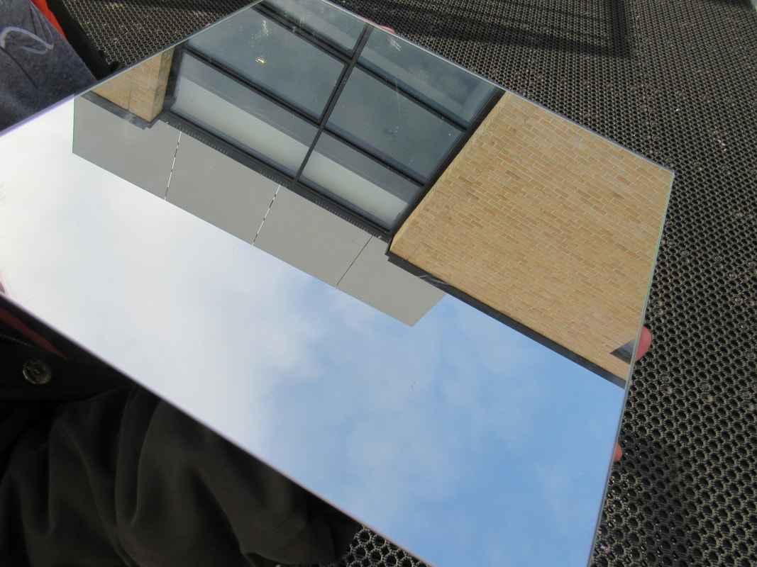
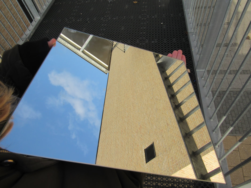
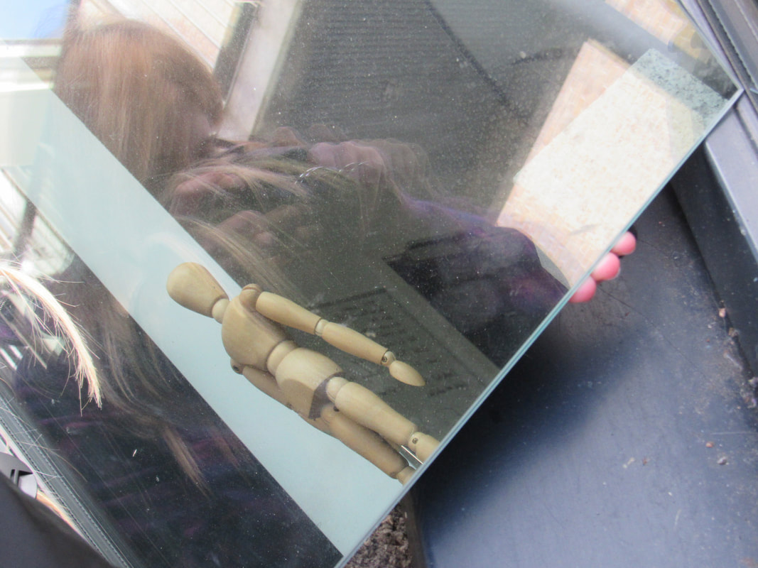
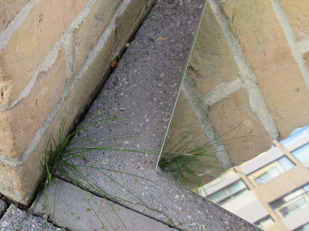
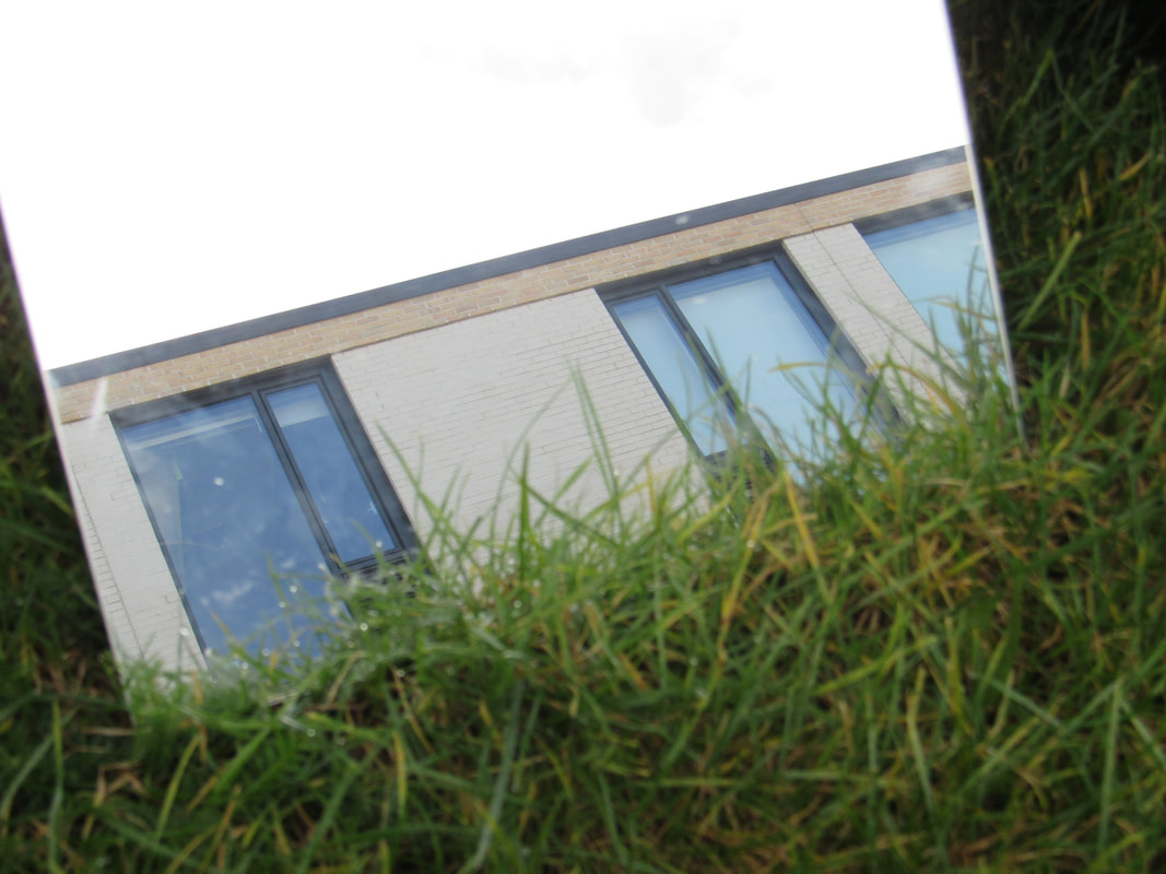
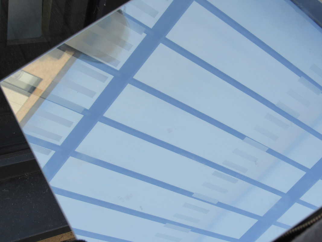
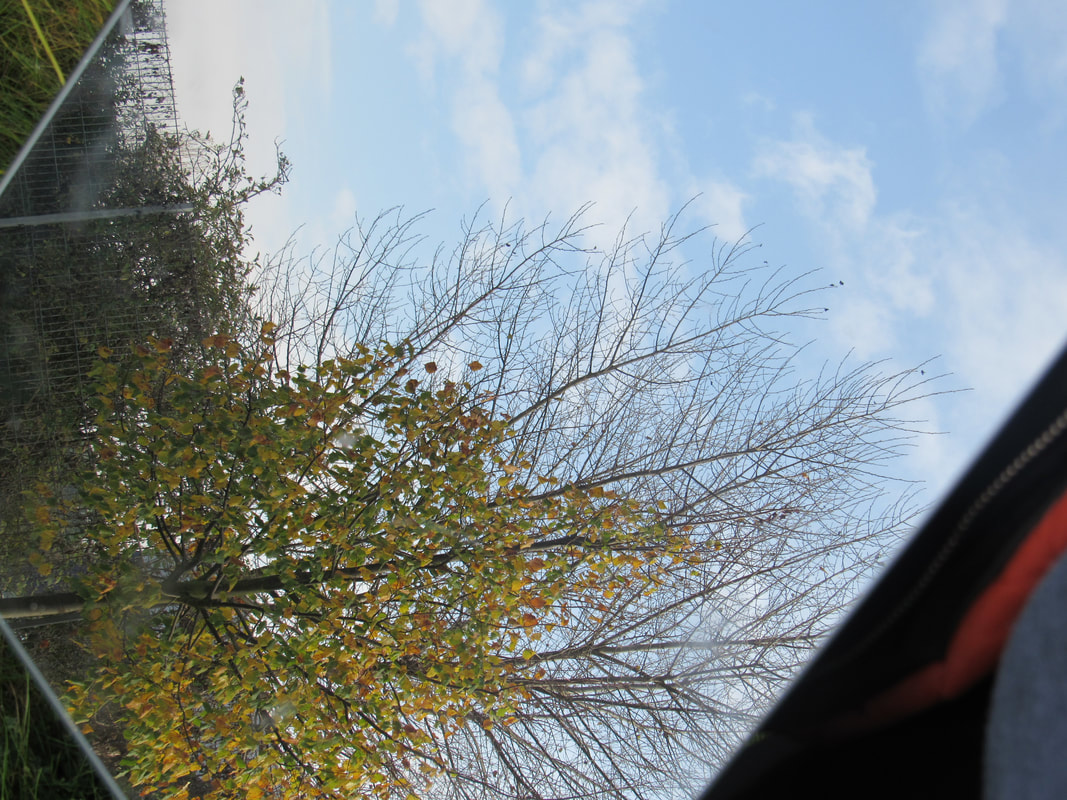
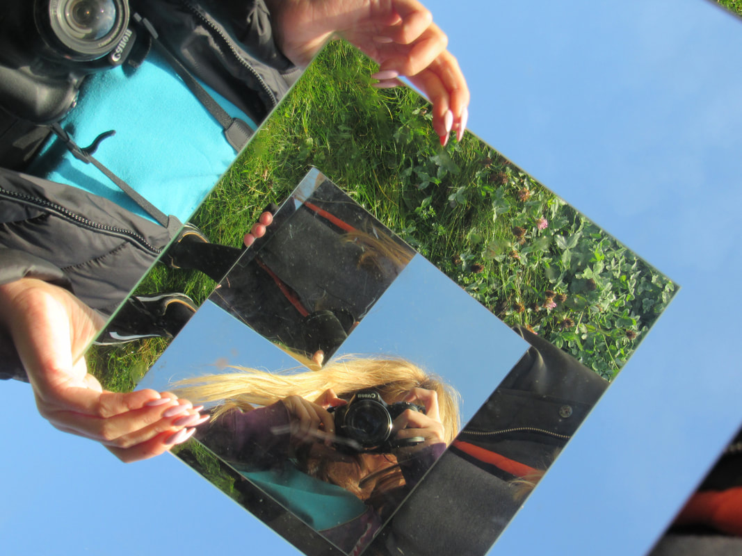
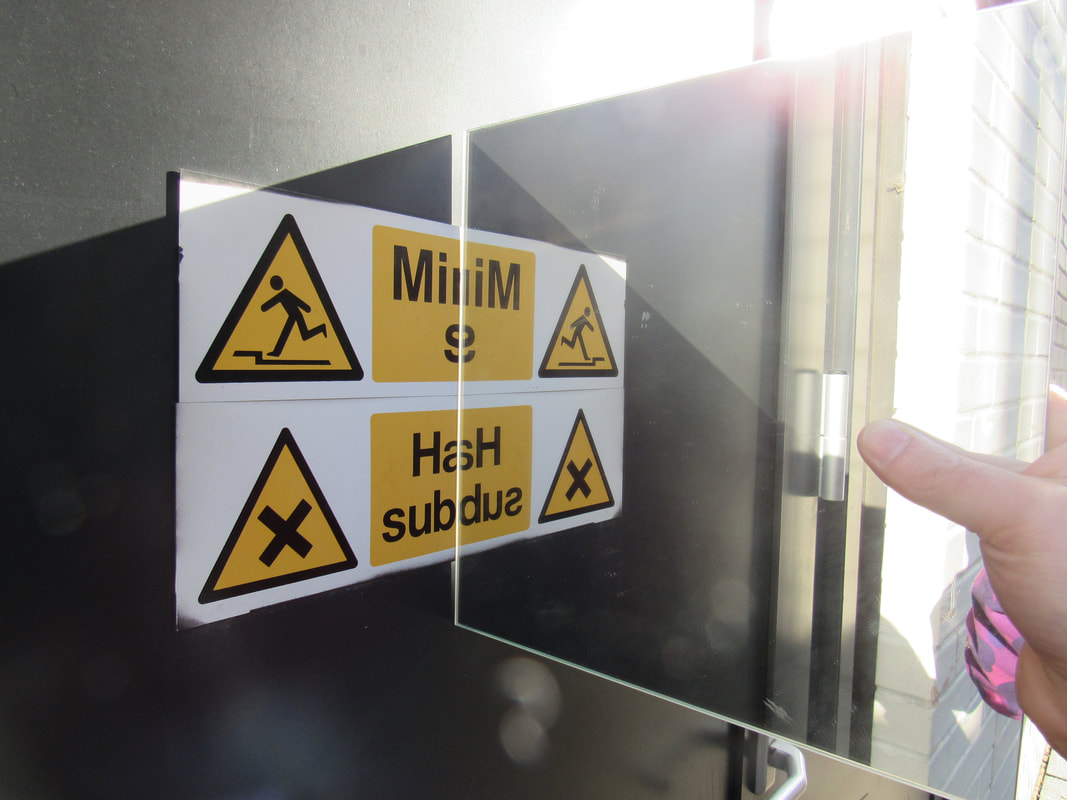
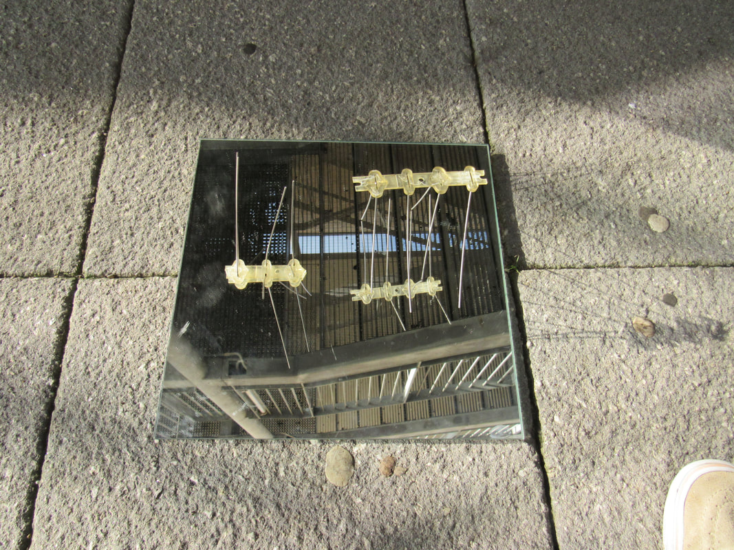
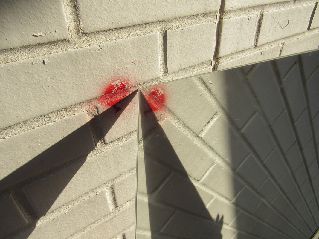
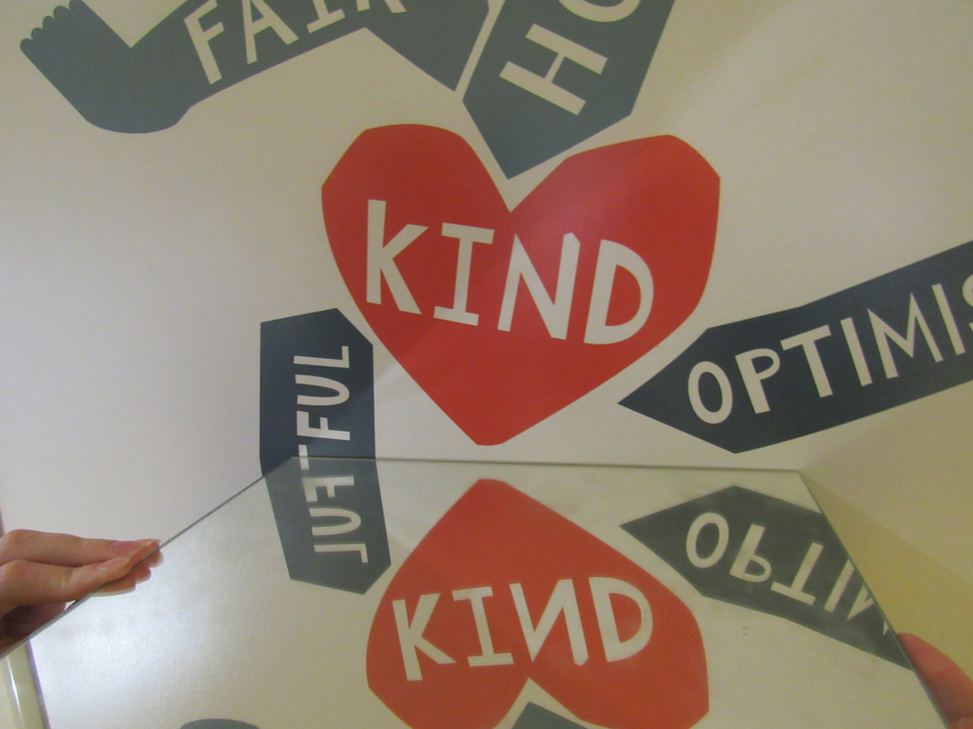
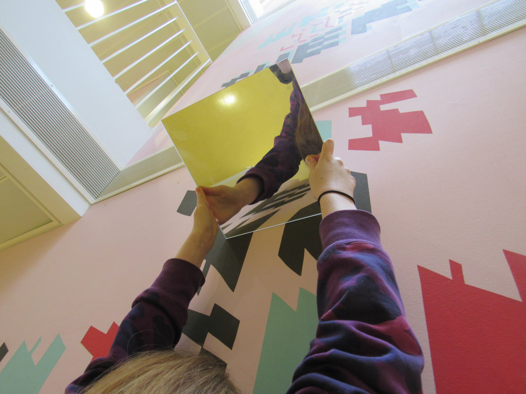
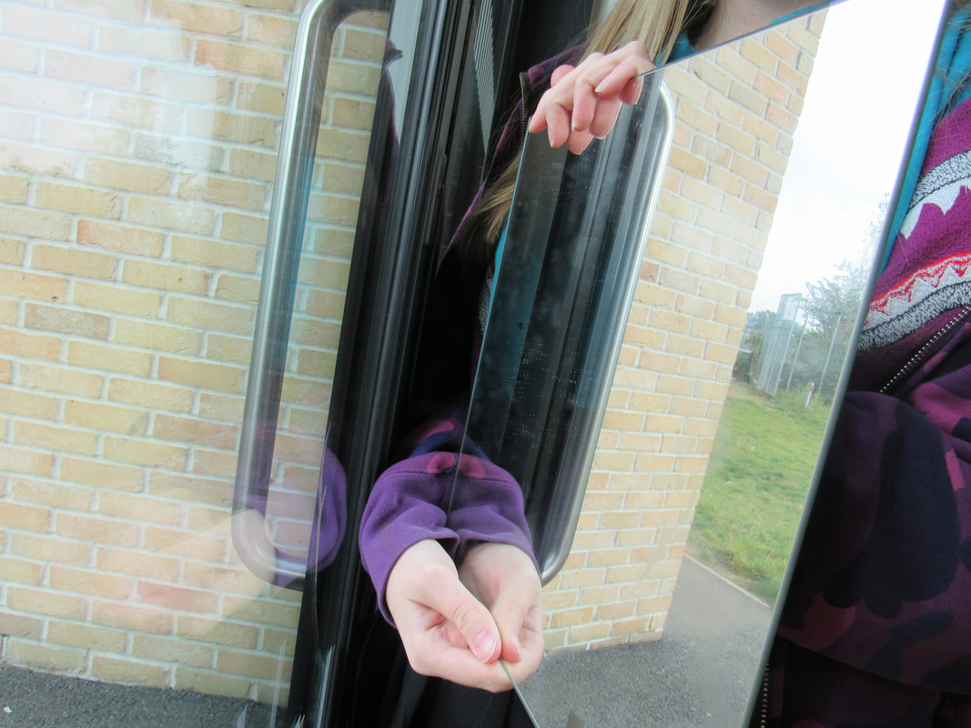
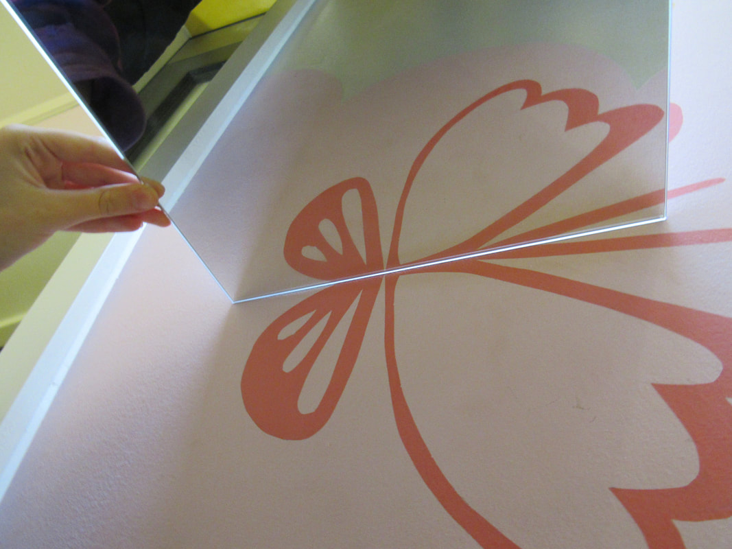
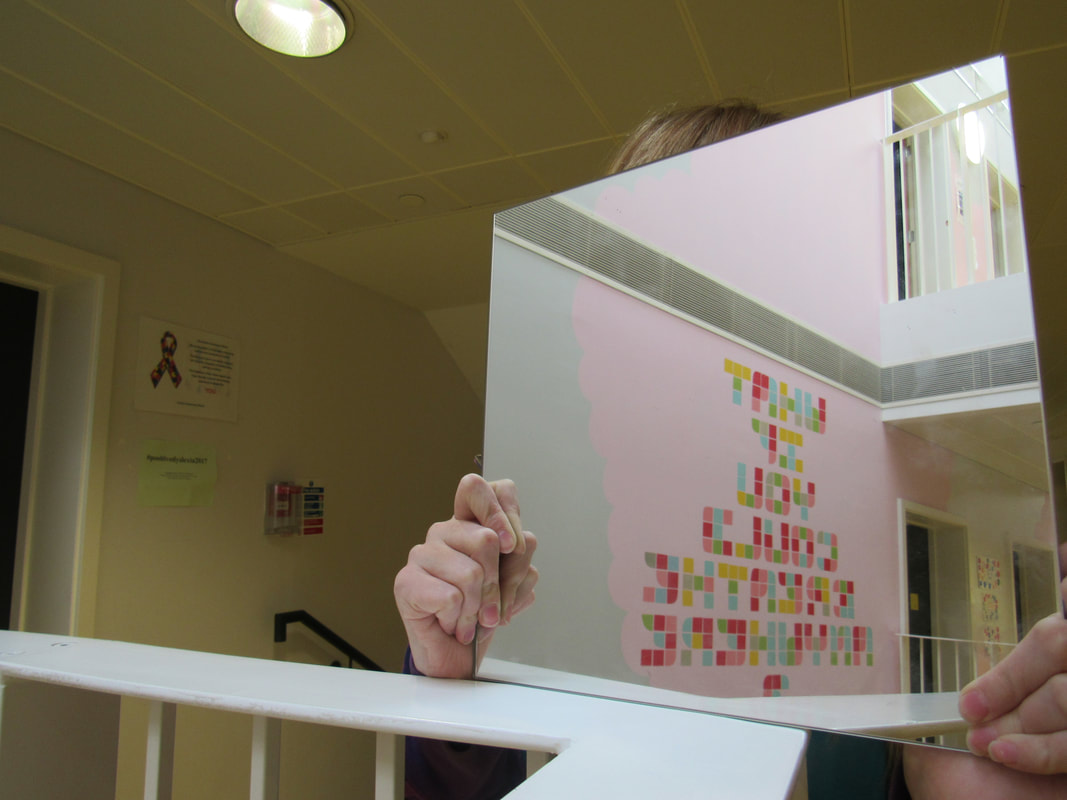
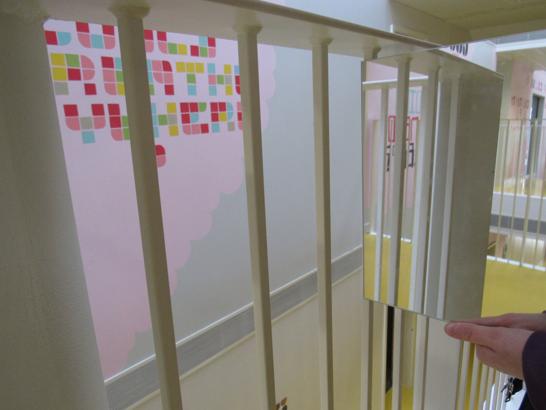
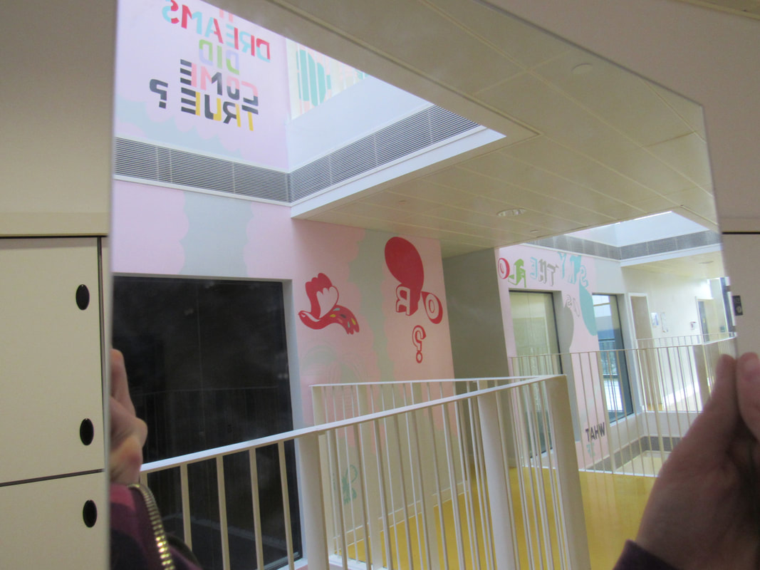
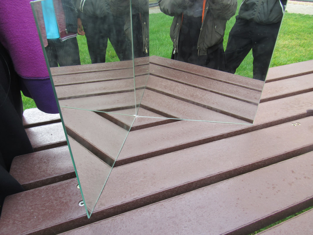
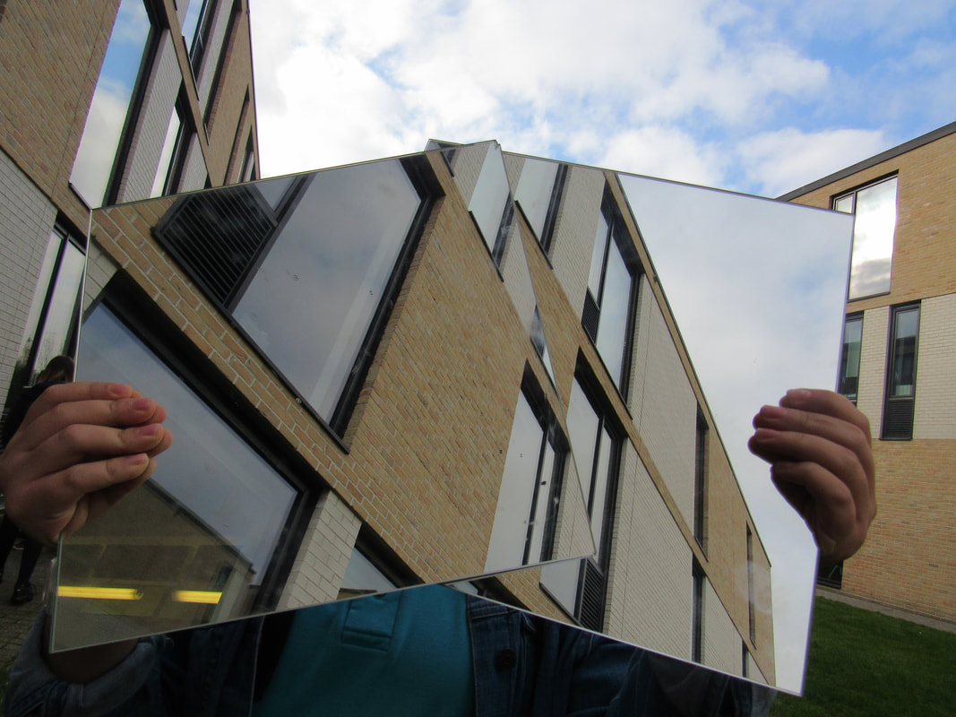
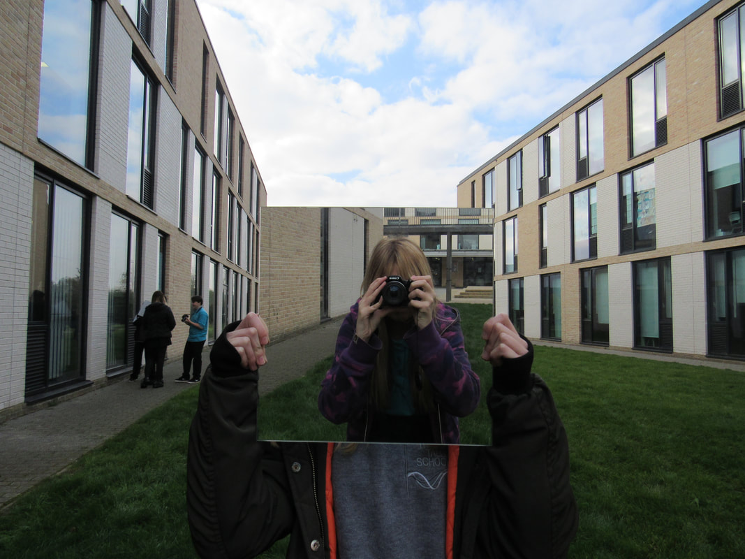
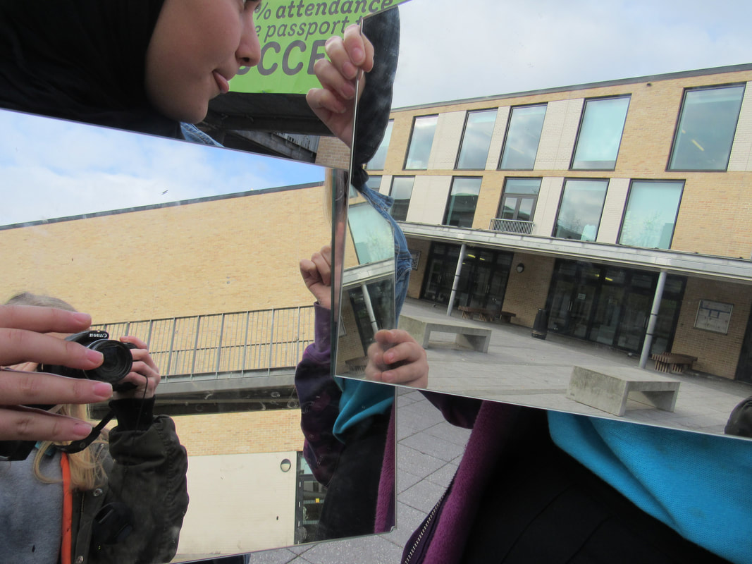
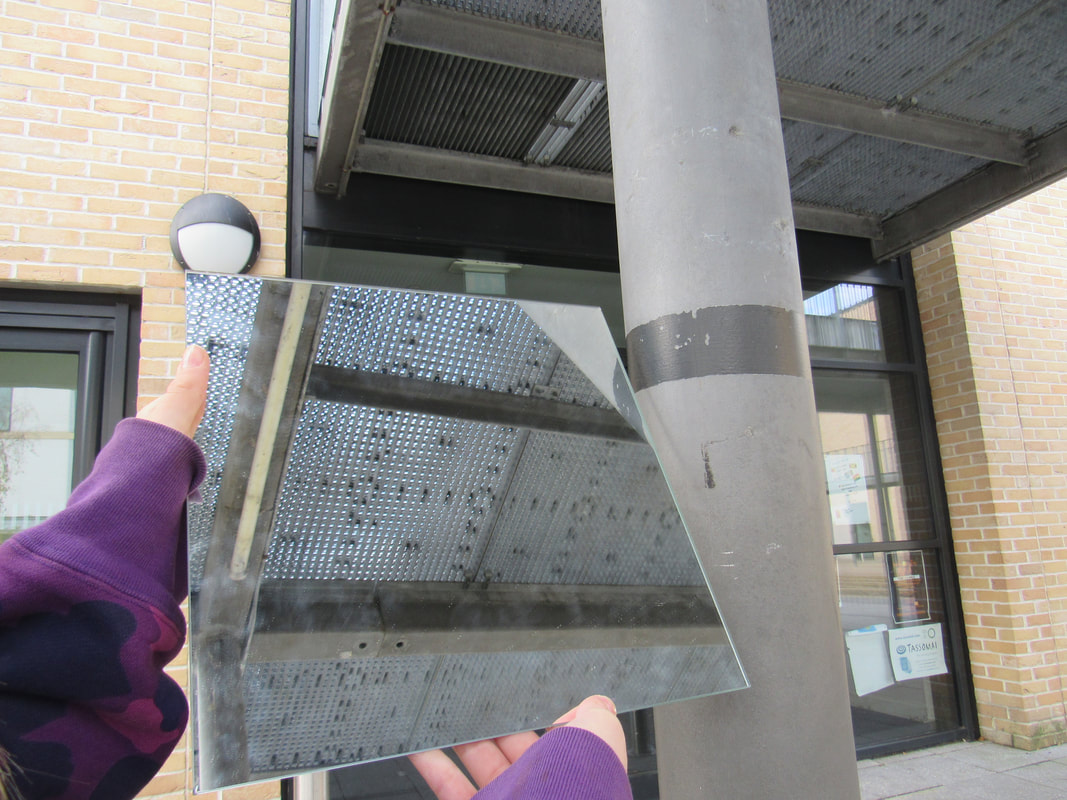
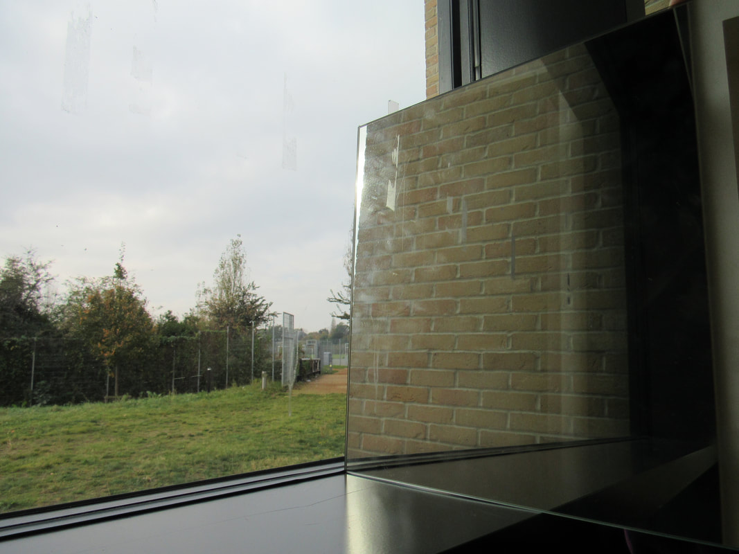
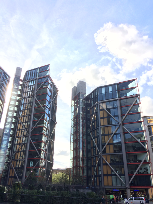
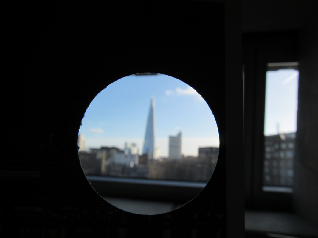
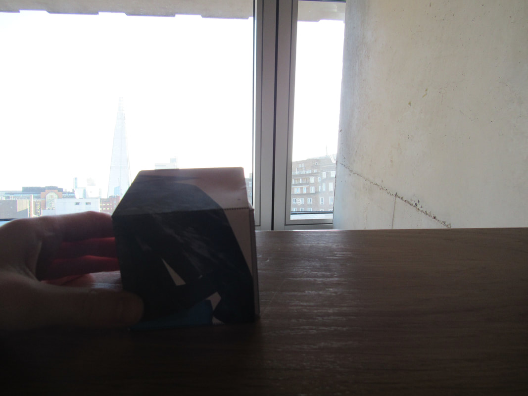
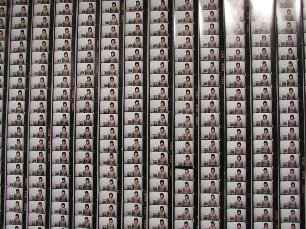
Mirror edge pictures:
WWW:
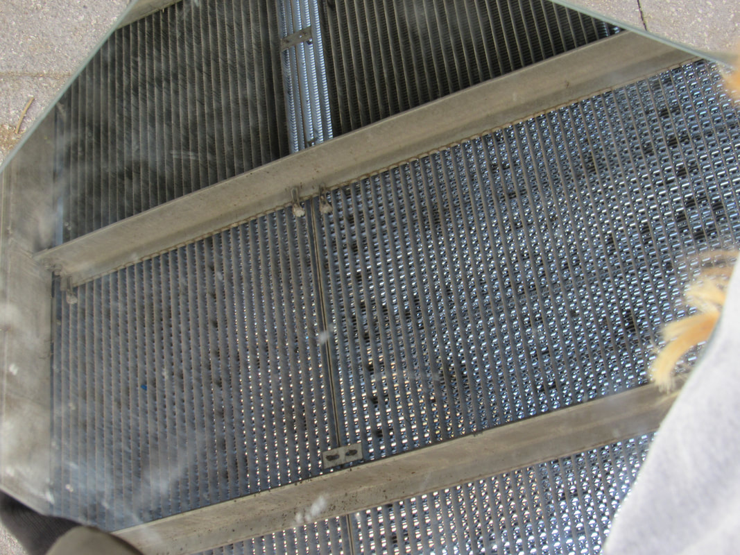
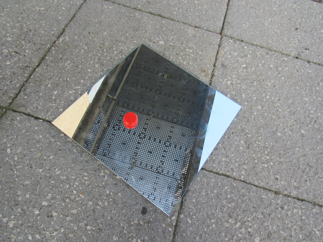
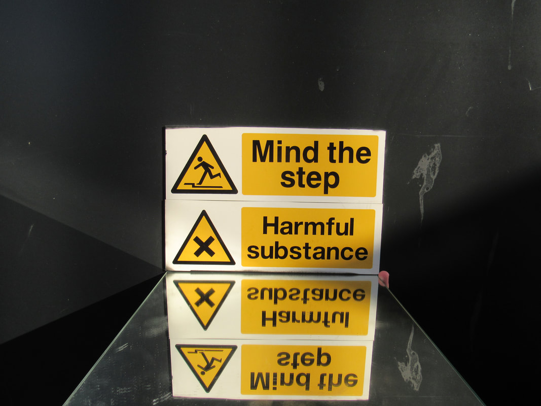
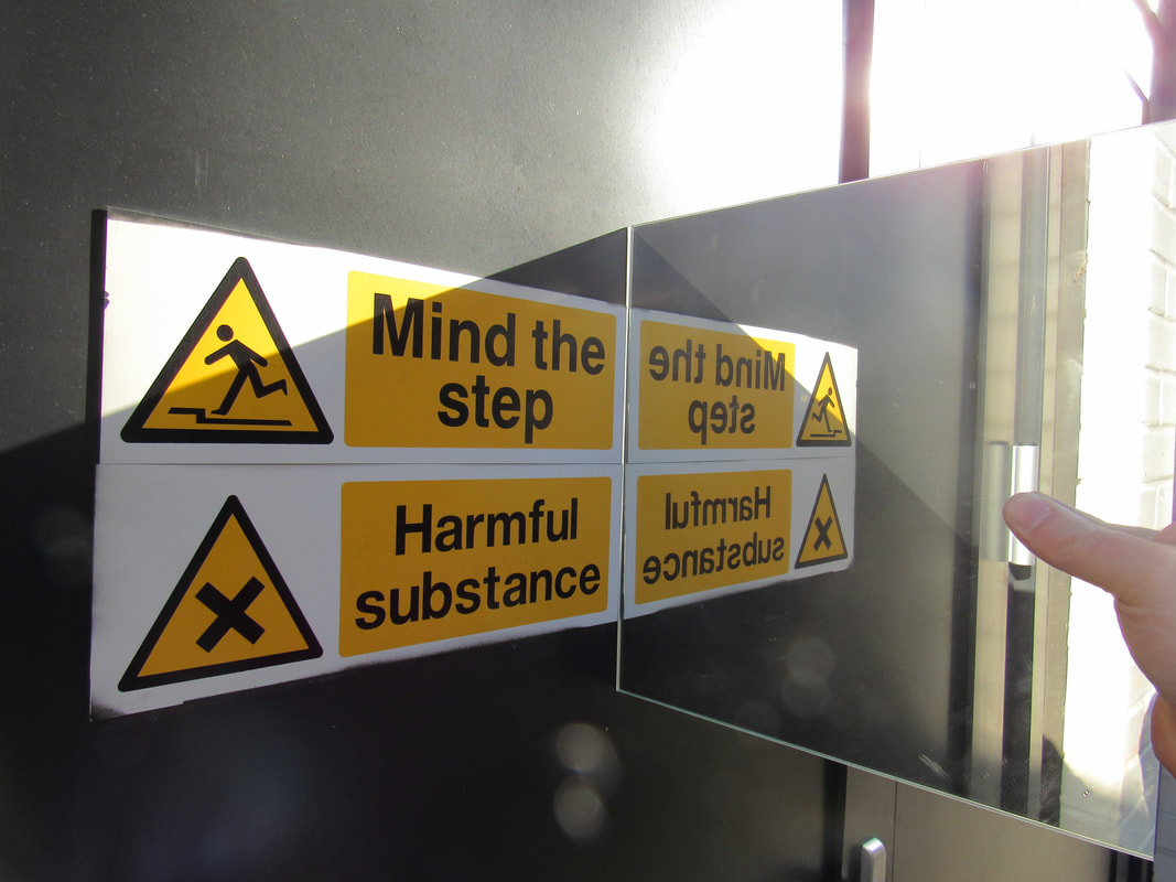
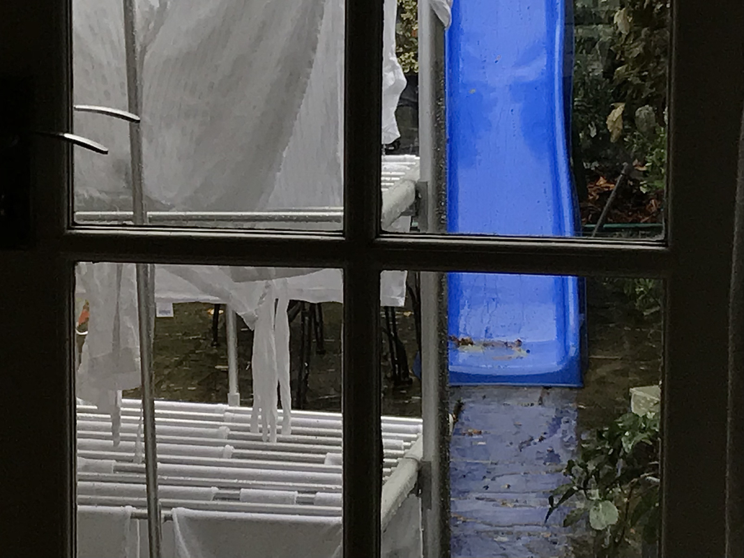
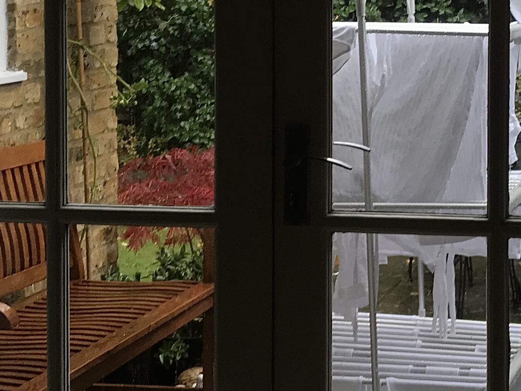
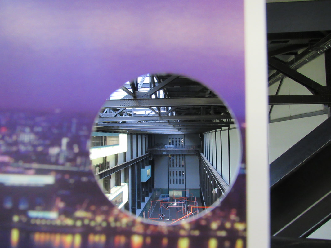
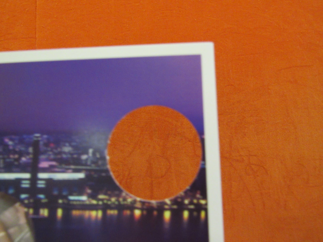
We experimented with different ways of making the picture look different with mirrors.
EBI:
we found more interesting places to put the mirrors and tried not to get peoples hands in the pictures.
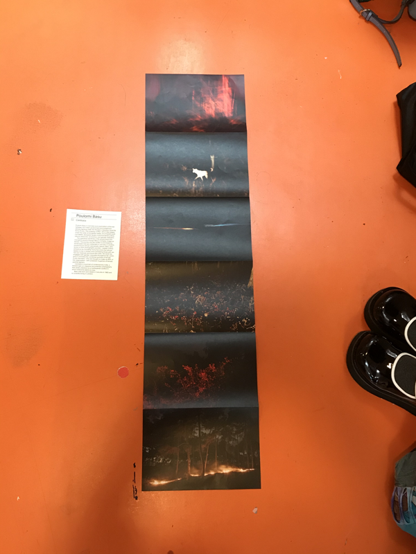
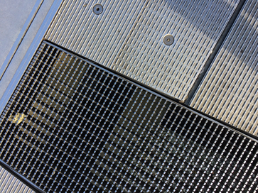
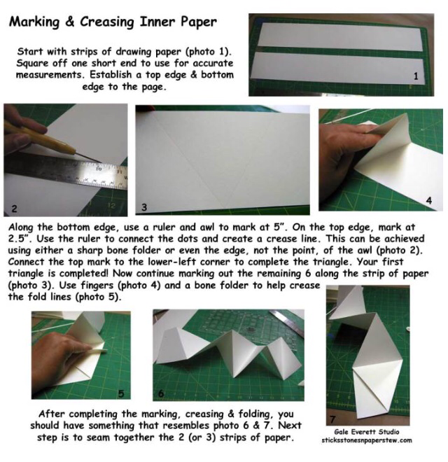
What is a concertina fold?
A concertina fold is a continuous paper folding of brochures and similar printed material in an accordion-like fashion, that is with folds alternatively made to the front and back in zig-zag folds.
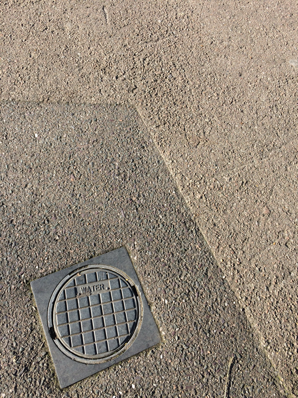

EBI:I think this picture could be more abstract. As it isn't very original.
|
WWW:I like this picture because it has a lot of edges in it and I like the perspective of the picture.
|
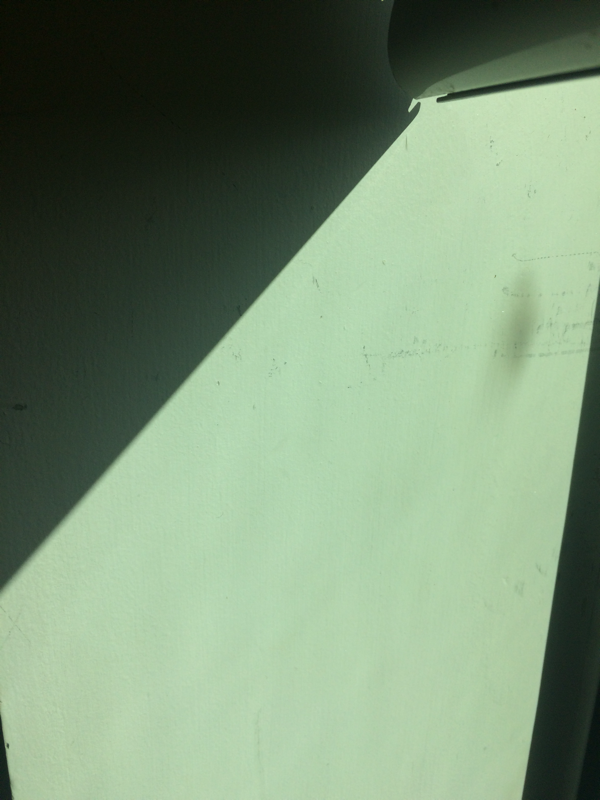
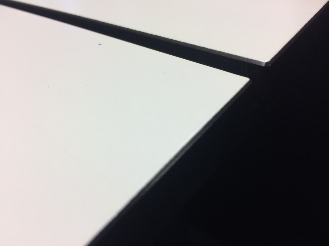
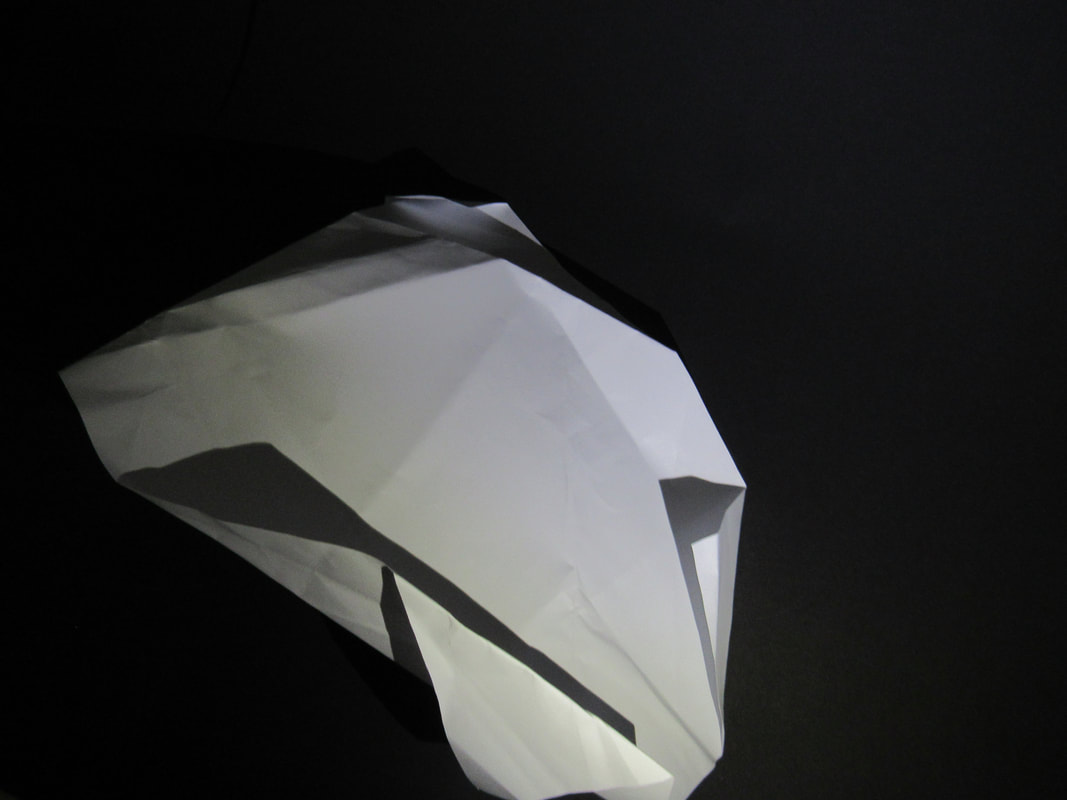
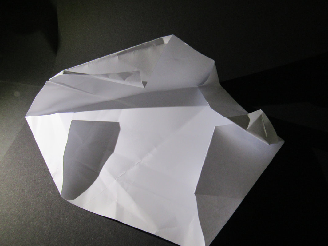
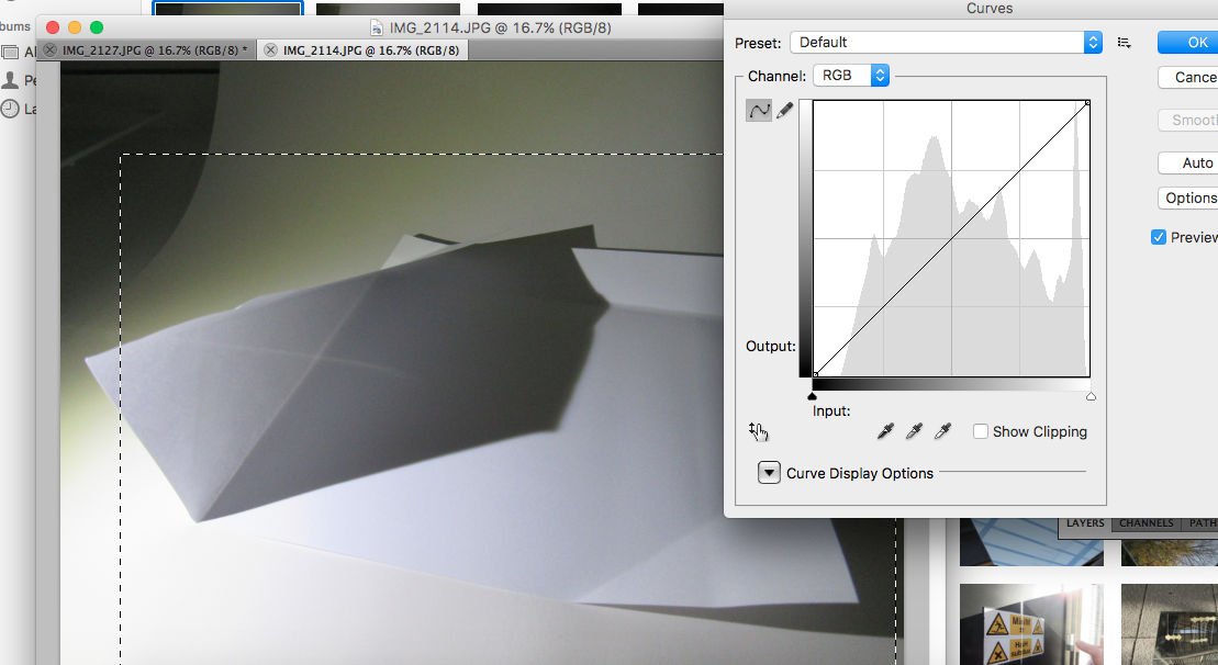
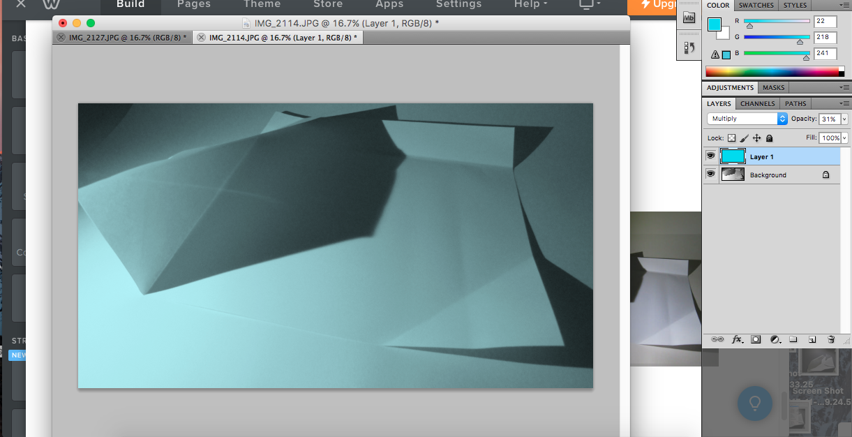
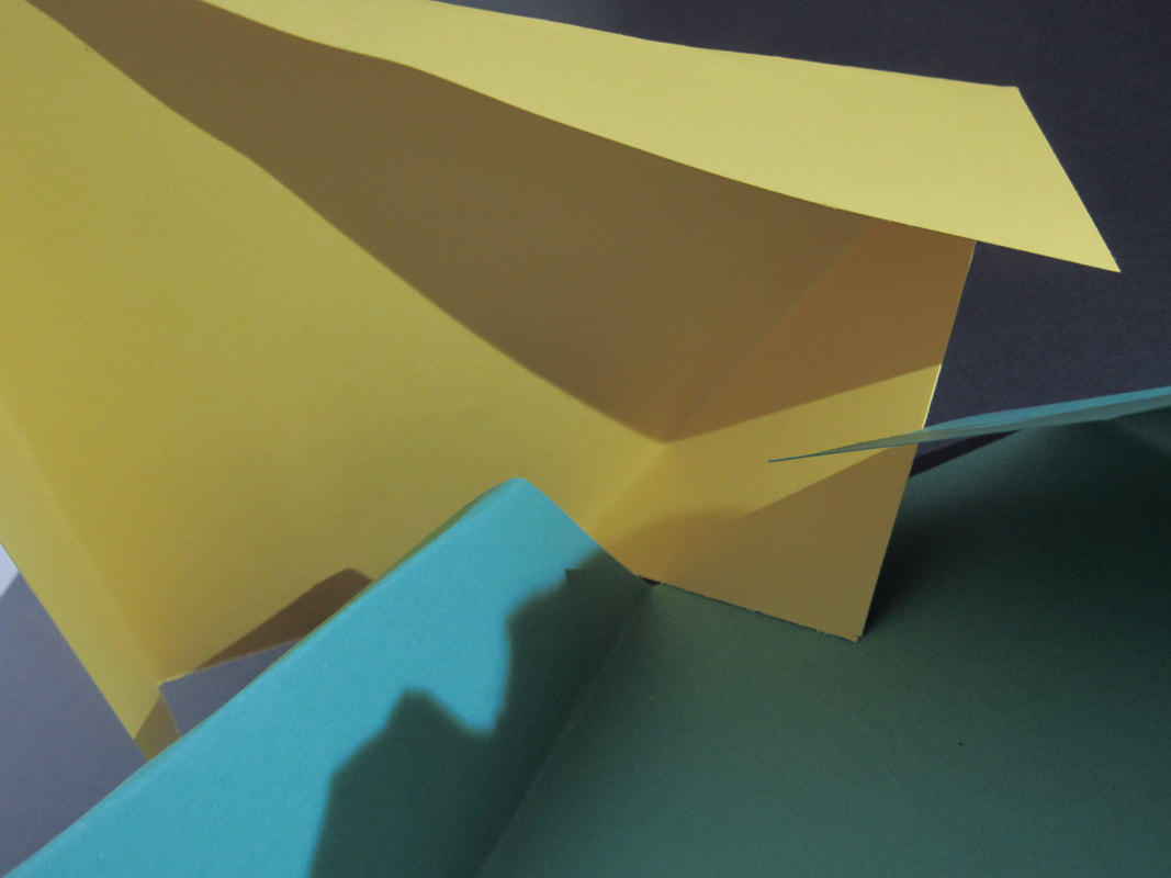
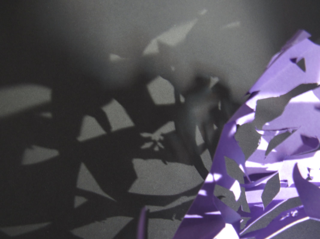
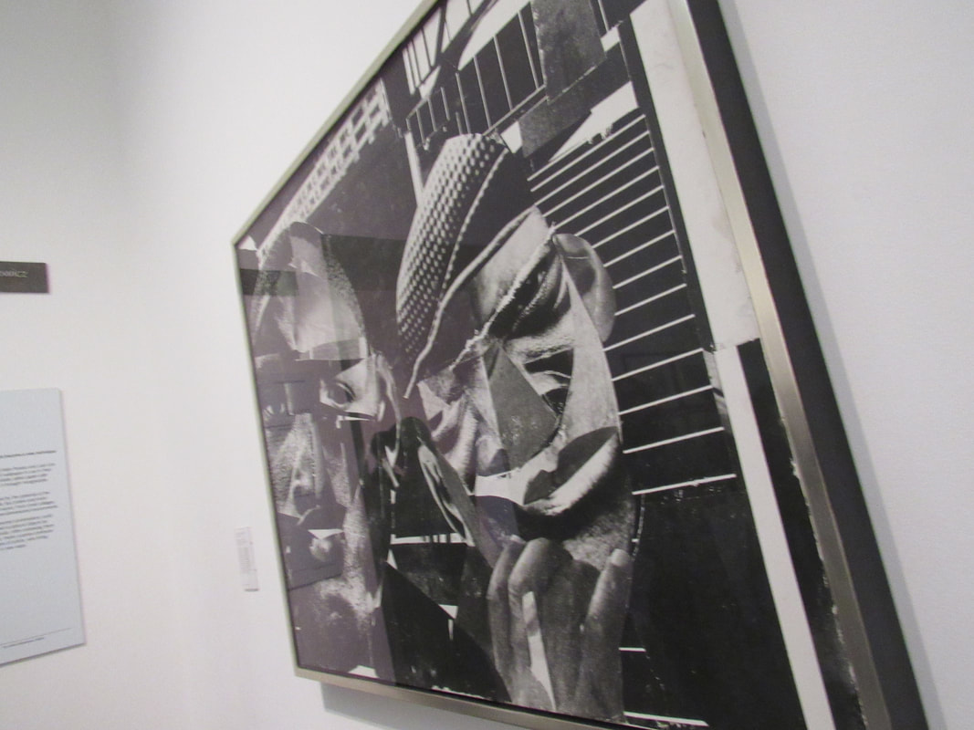
Paper fold edge pictures:
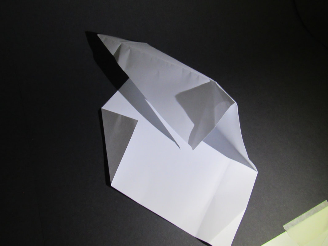
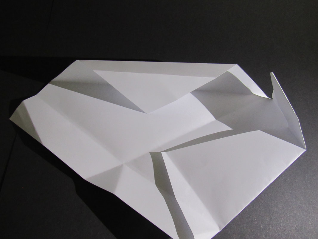
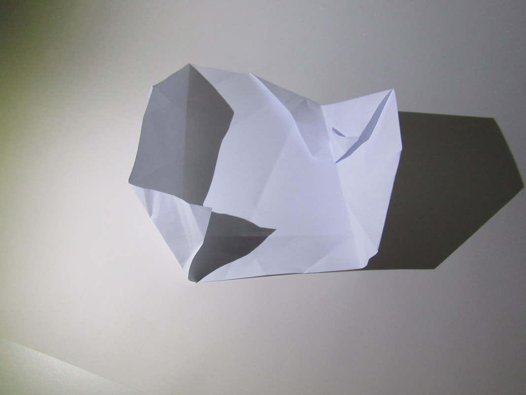
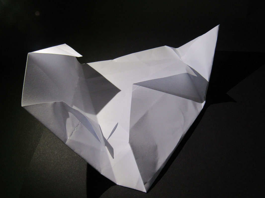
My editing:
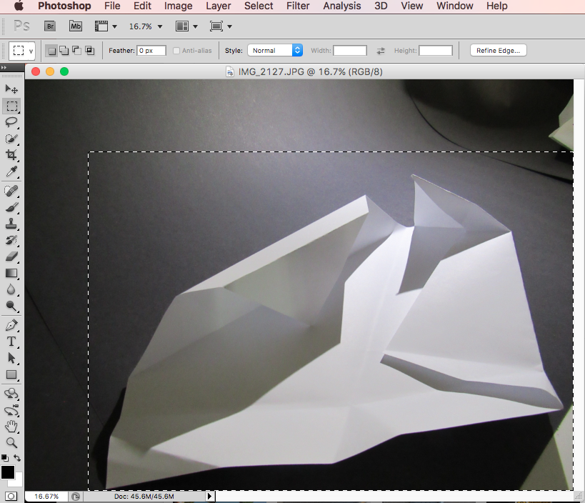
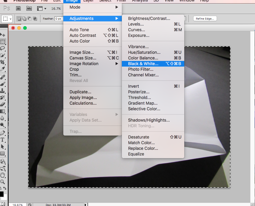
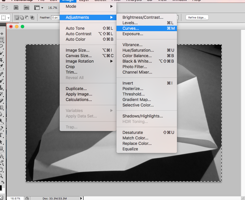
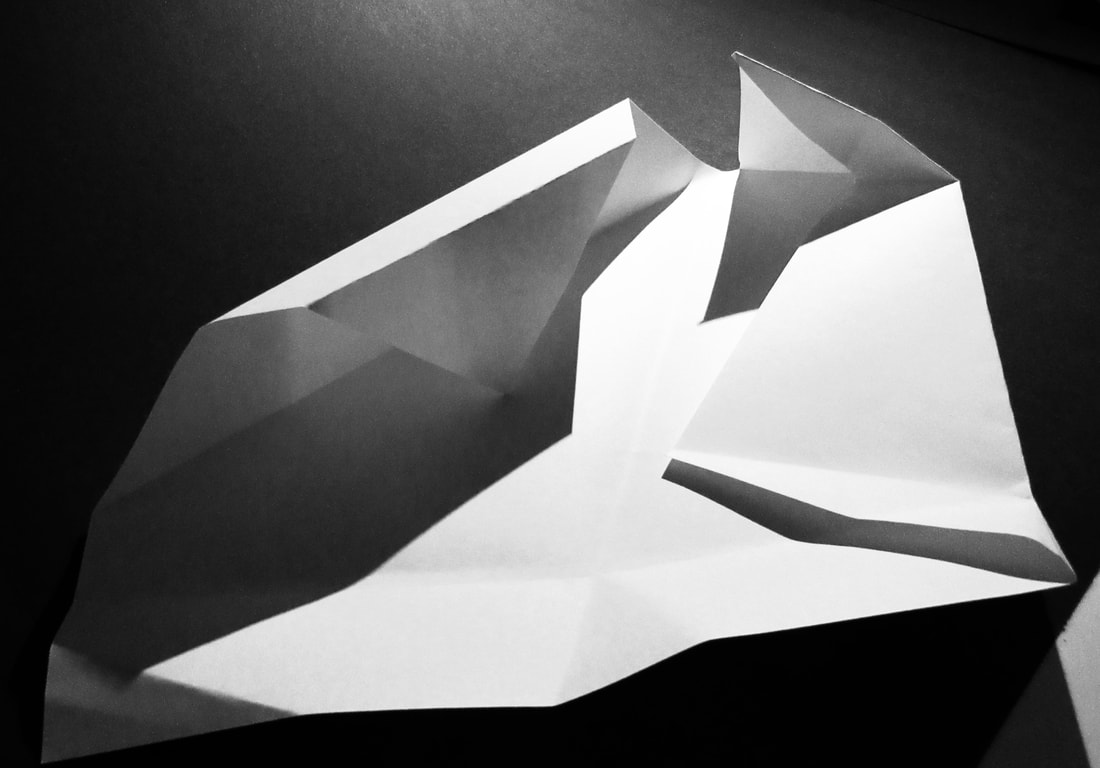
I cropped this picture and made the shadows darker and the highlights lighter, then I also changed it to black and white.
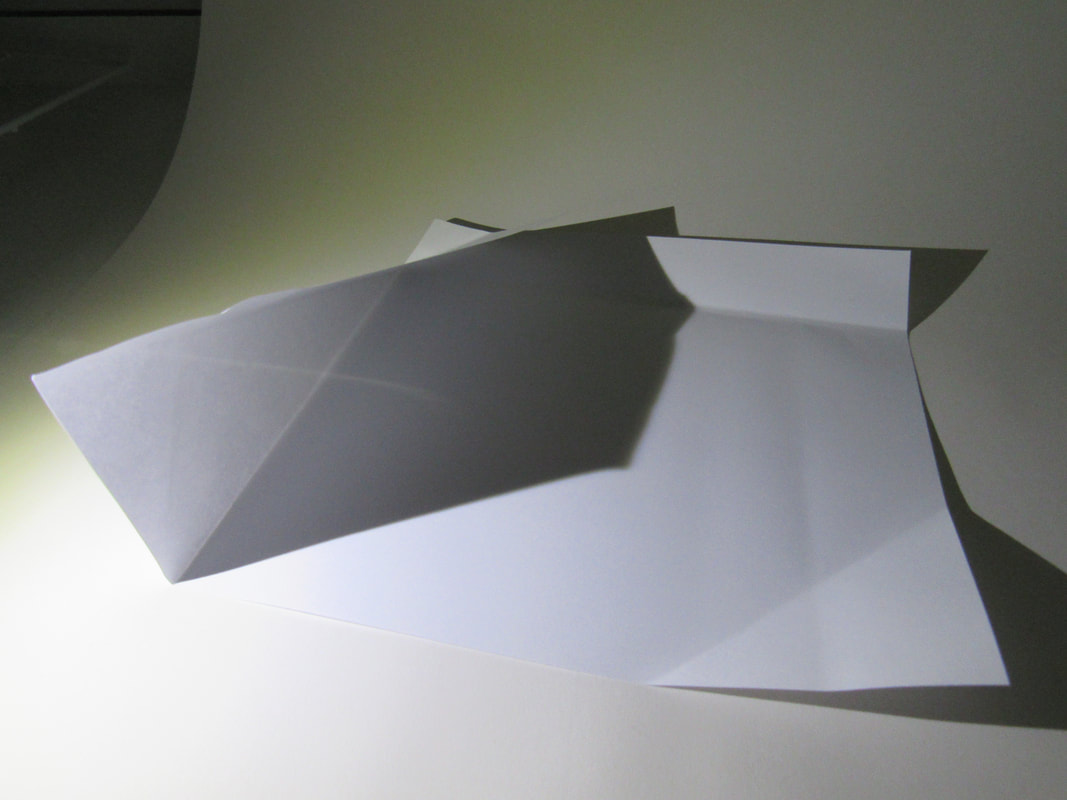

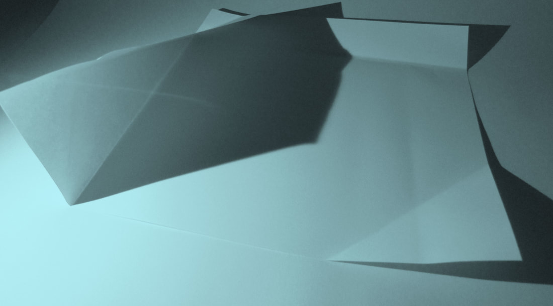
WWW:
Im not very confident with using photoshop so I am quite happy with what I have achieved in this lesson.
EBI:
I think that I could have tried playing around and taking more risks with photoshop more as I was being quite safe with my editing.
Drawings:
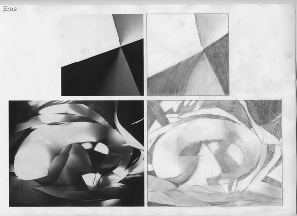
Our task for this lesson was to draw the pictures on the left. It didn't matter if they were perfect, we just had to draw what we could see.
WWW:
I think that I tried my best and did quite well at drawing them. I spent a long time trying to make them as accurate as possible.
EBI:
I think that I could have tried to make the shadows a bit darker and I also could have tried to work a little bit quicker.
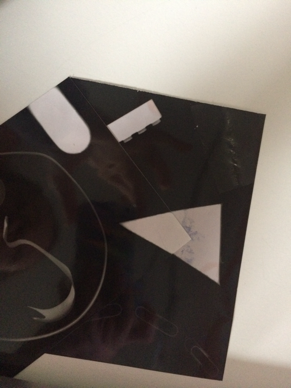
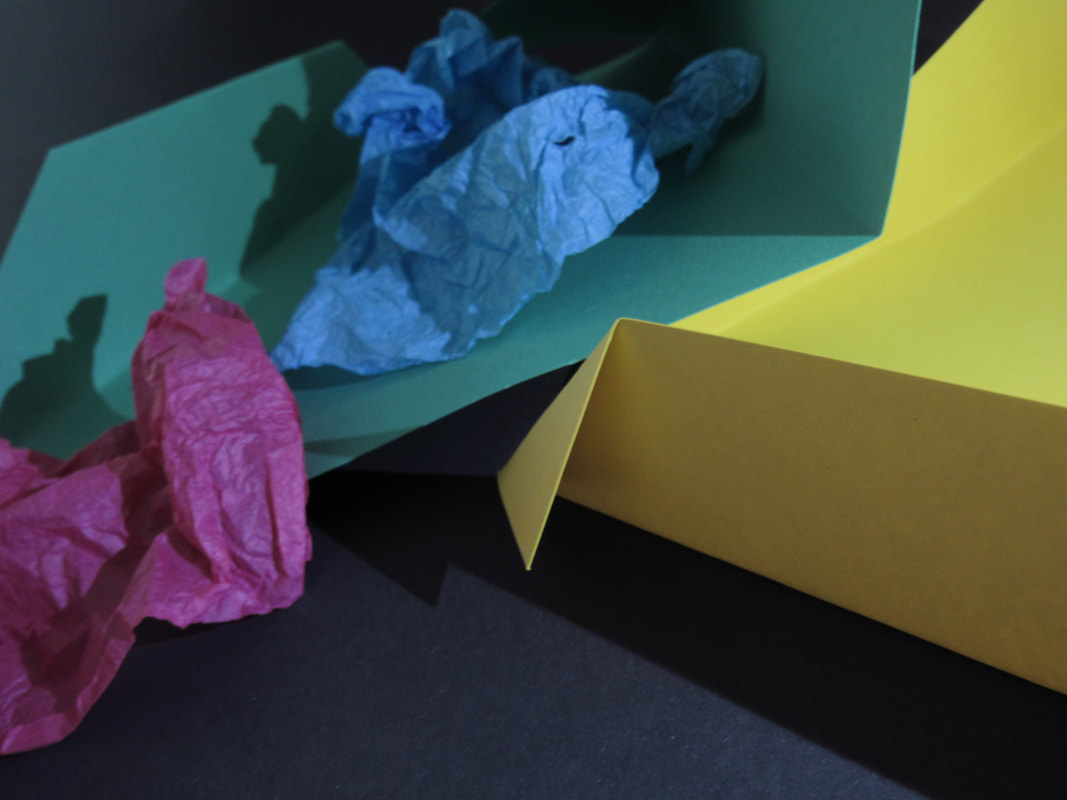
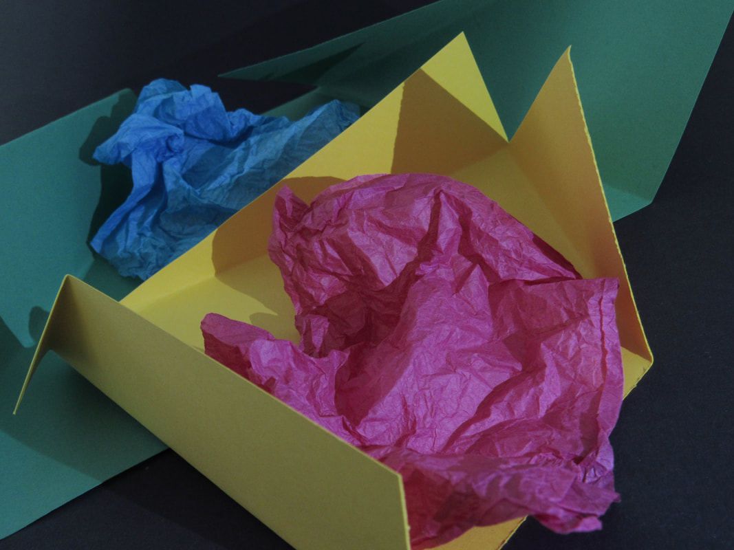
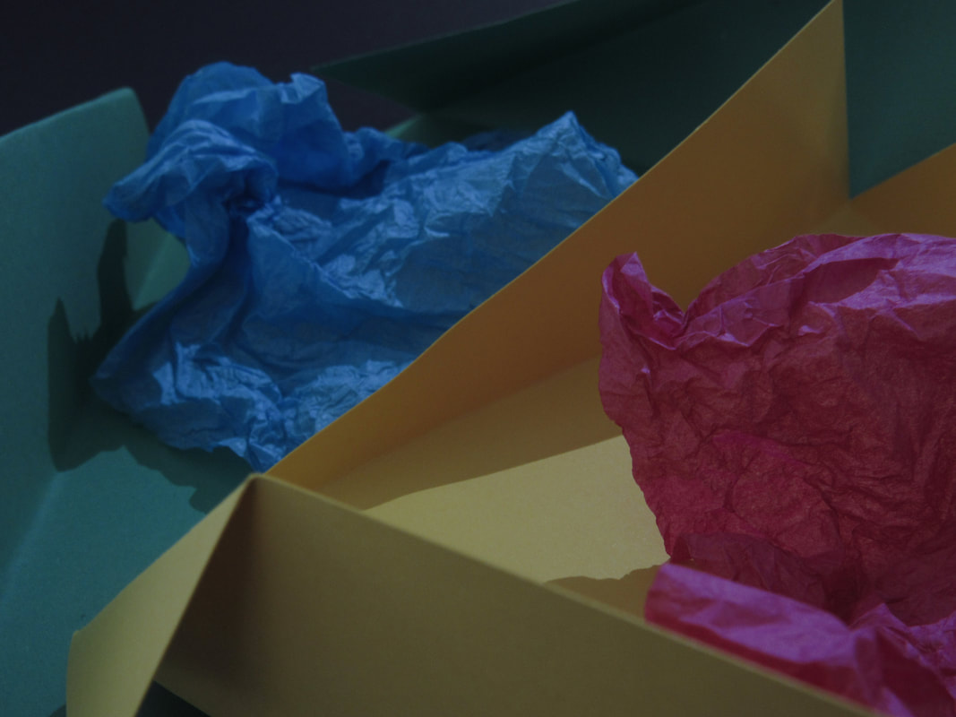
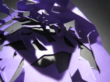
Coloured paper folds:
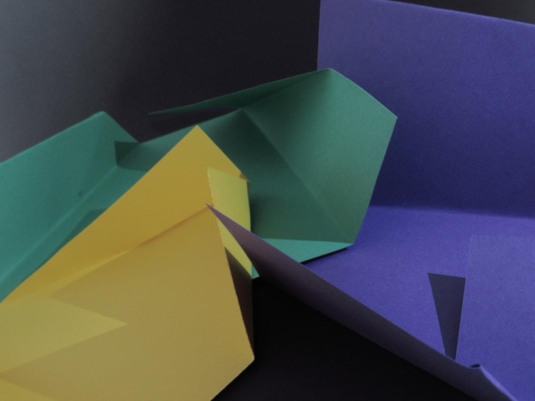
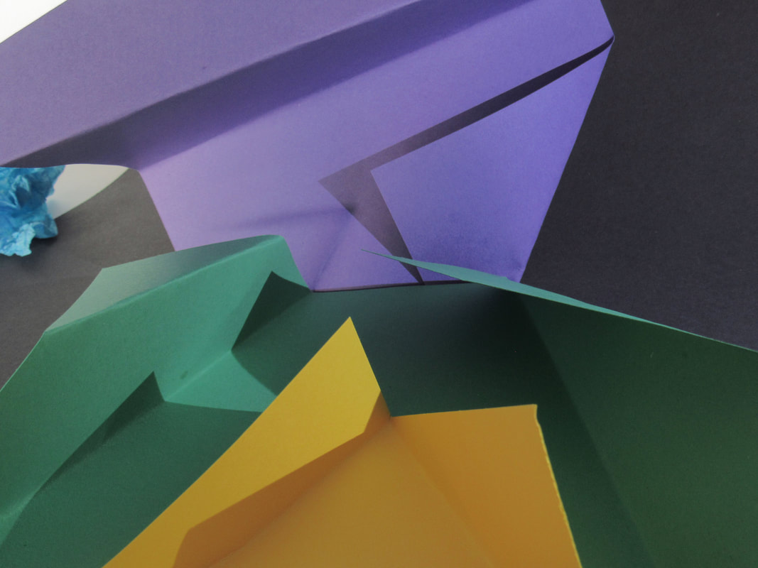
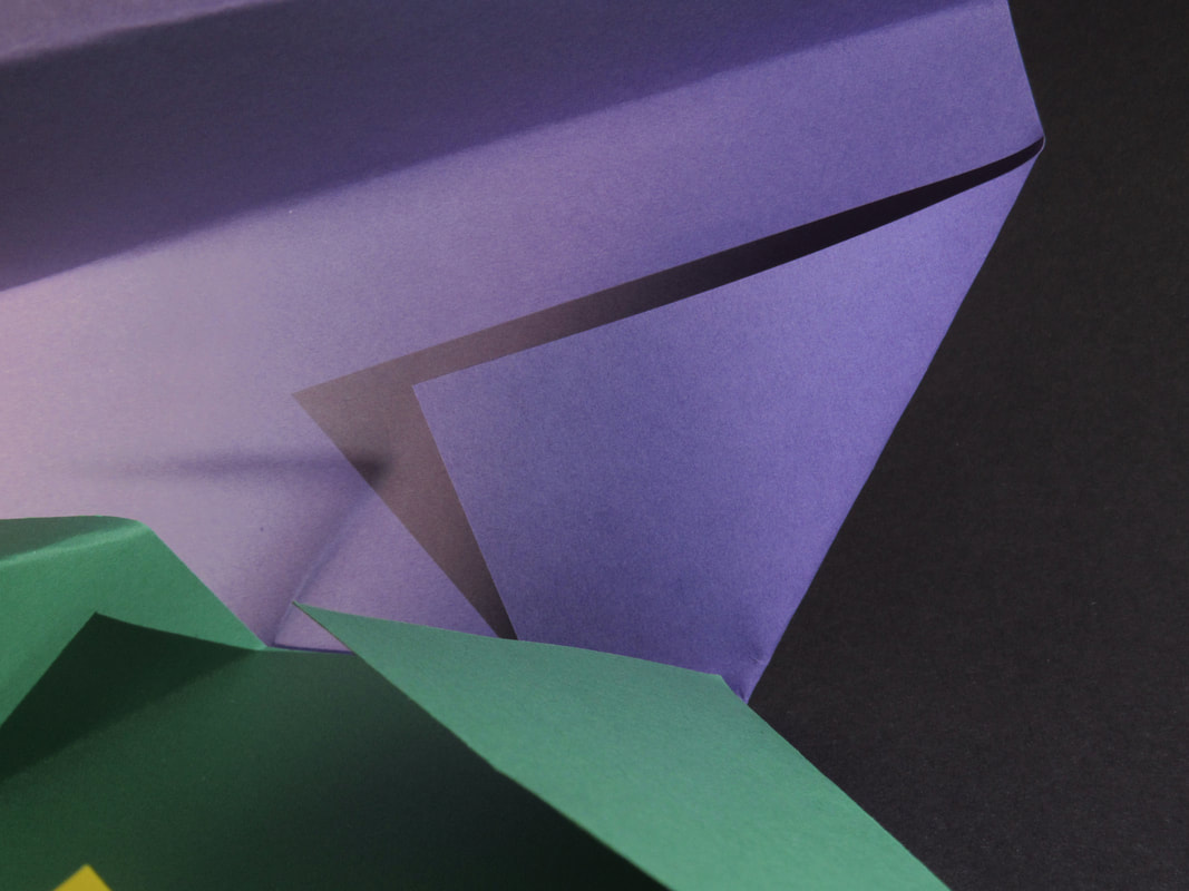
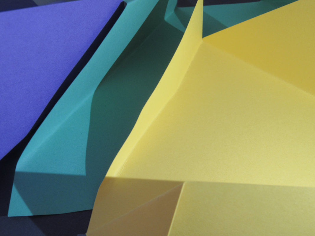
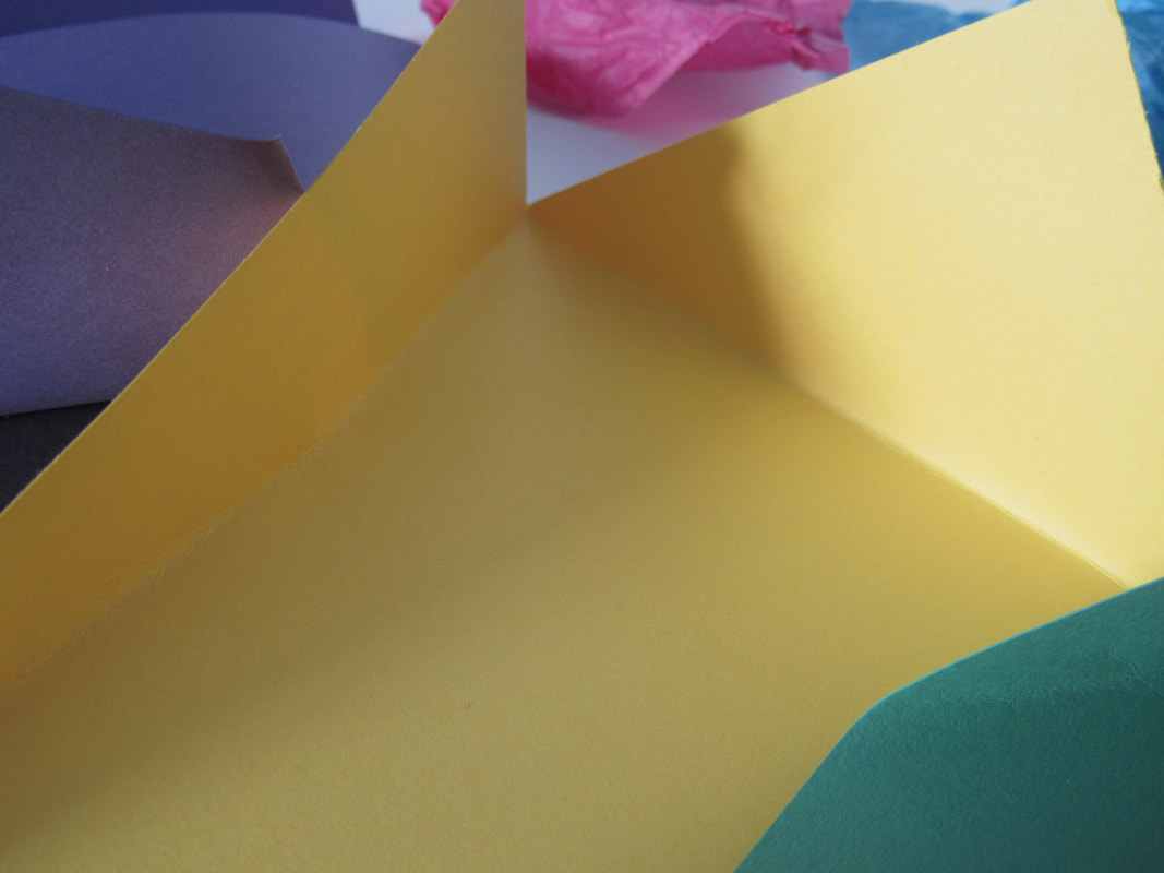
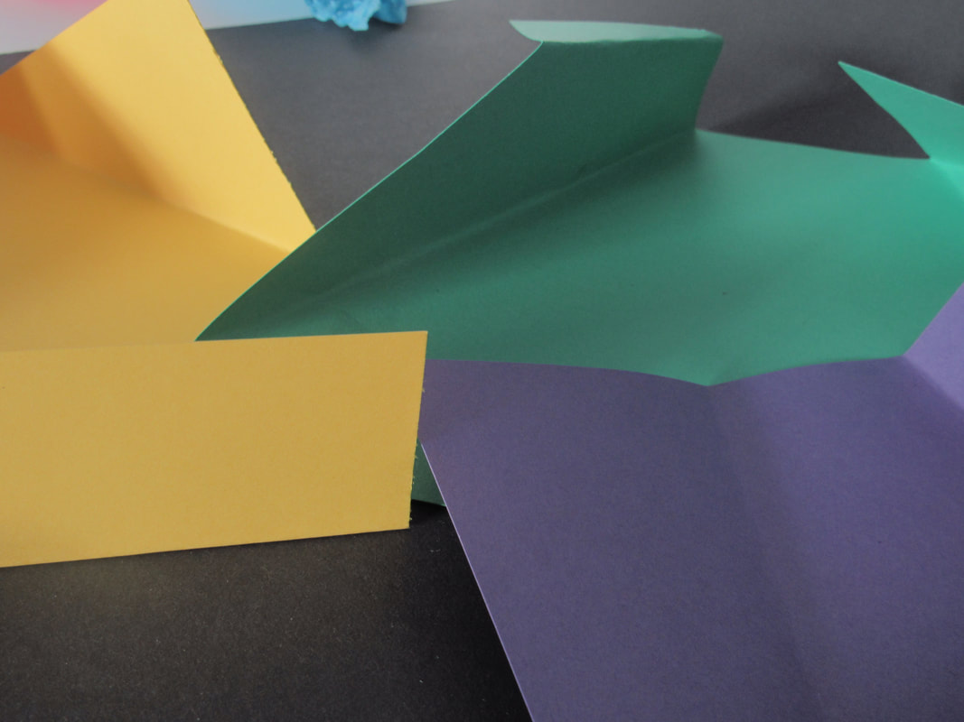
WWW:
I like how I used different colours of paper do the folds and I also used scrunched-up tissue paper.
EBI:
I think that it was quite dark when I was taking the pictures so it is quite hard to see the vivid colours of the paper.
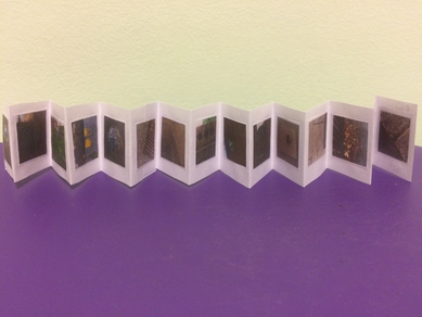
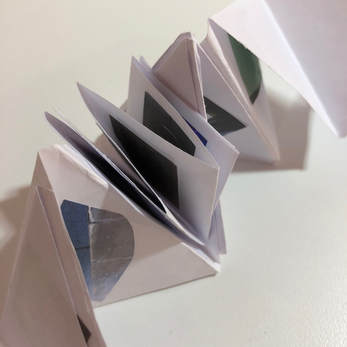
concertina book:
|
This is my concertina book so far, I am going to make a different one soon and I am going to cut out the pictures in different shapes this time.
|
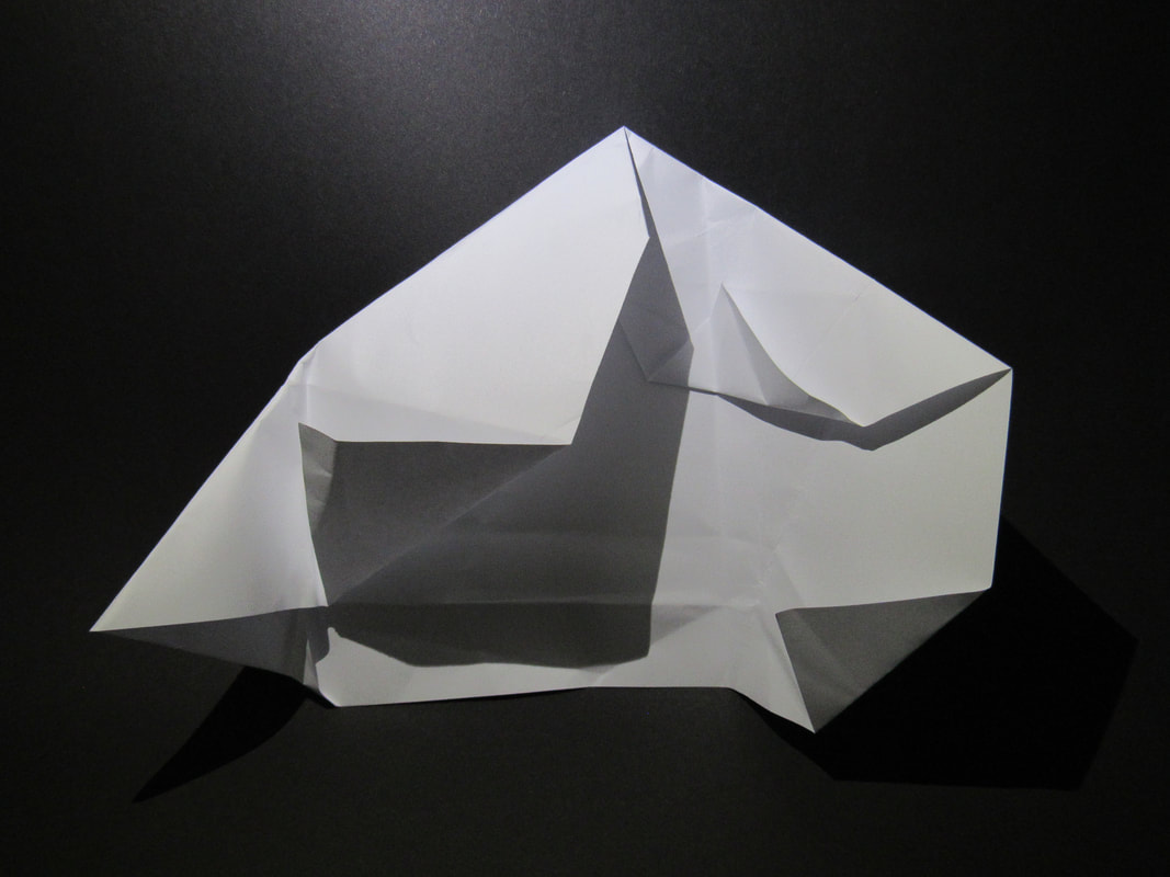
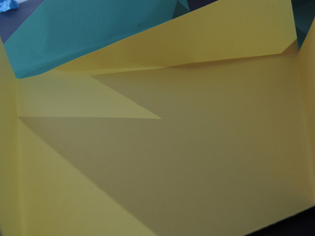
Paper Folds:
WWW:

|
I quite like this picture because I realised that it looks a it like a carved pumpkin even though I didn't plan for it to look like one.
|
|
It was quite hard to get the camera to focus when there was little light so this photo is a bit blurry.
|
Different styles of concertina books:
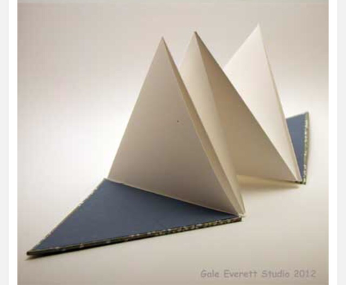
This is a triangular shaped concertina book and I am going to try to make this for our project.
This is a much more complex concertina book but I guess it would be interesting to try to make.
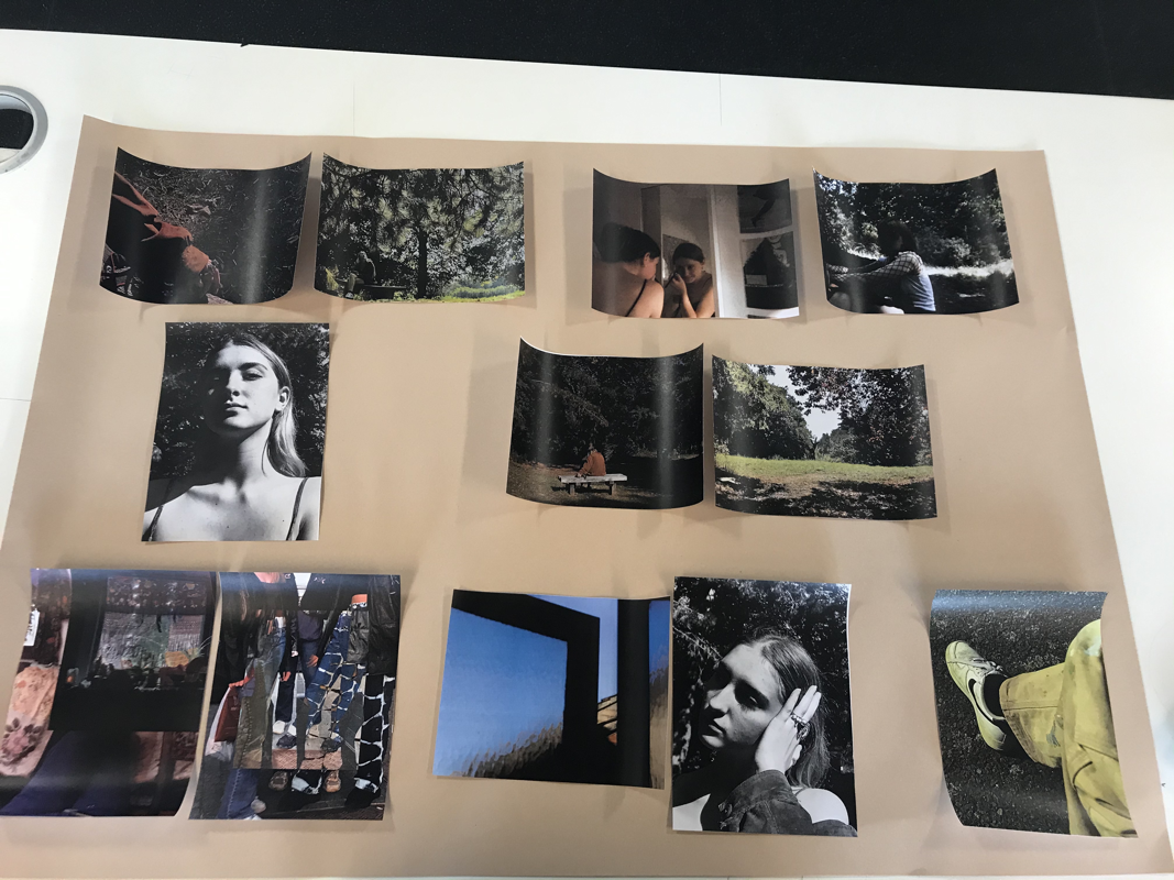
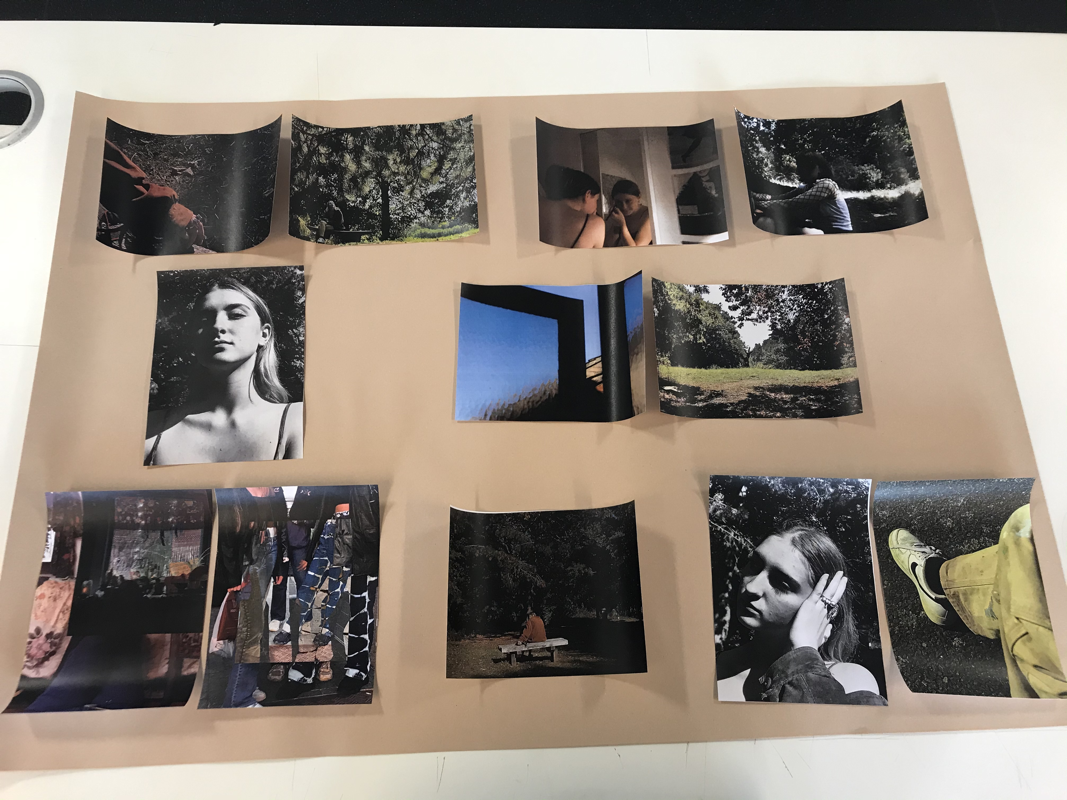
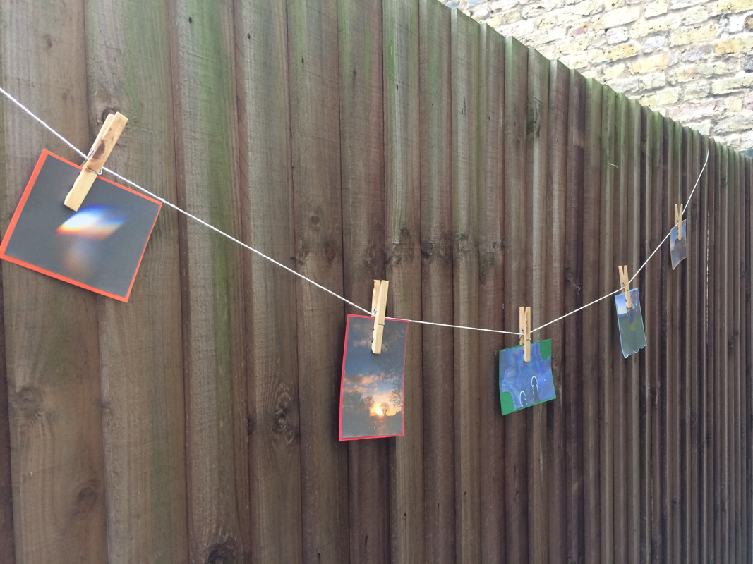
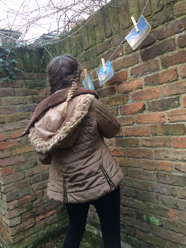
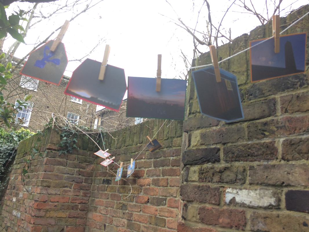
Edges Assessment:
This assessment is based on edges and gives us practise on getting work done by a deadline.
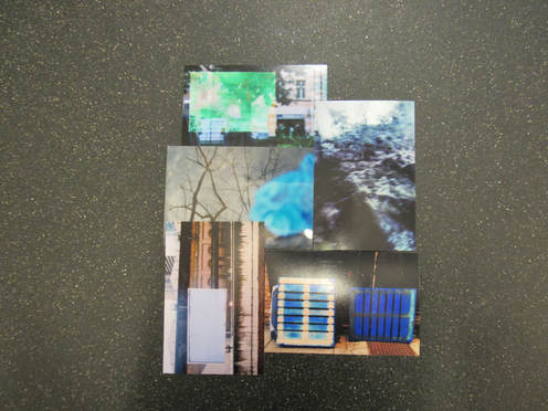
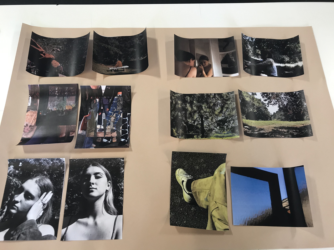
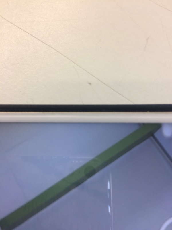
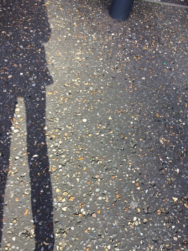
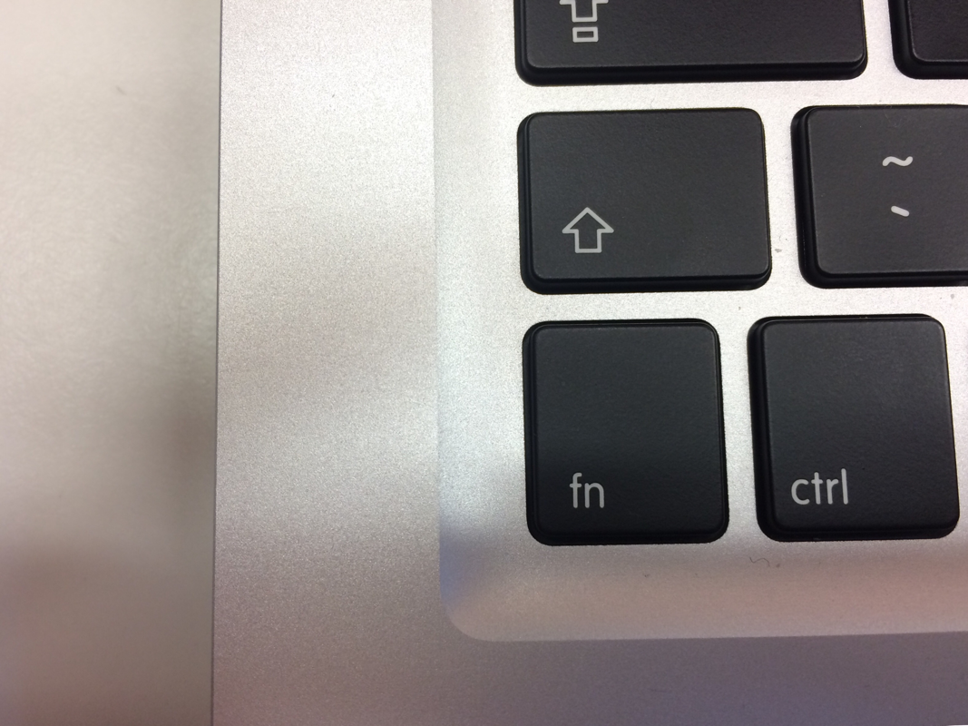
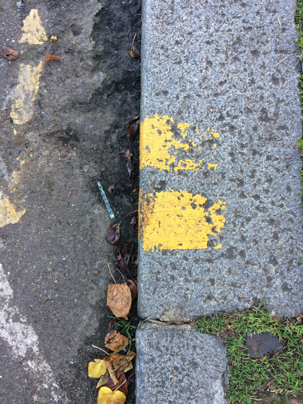
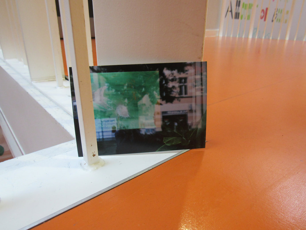
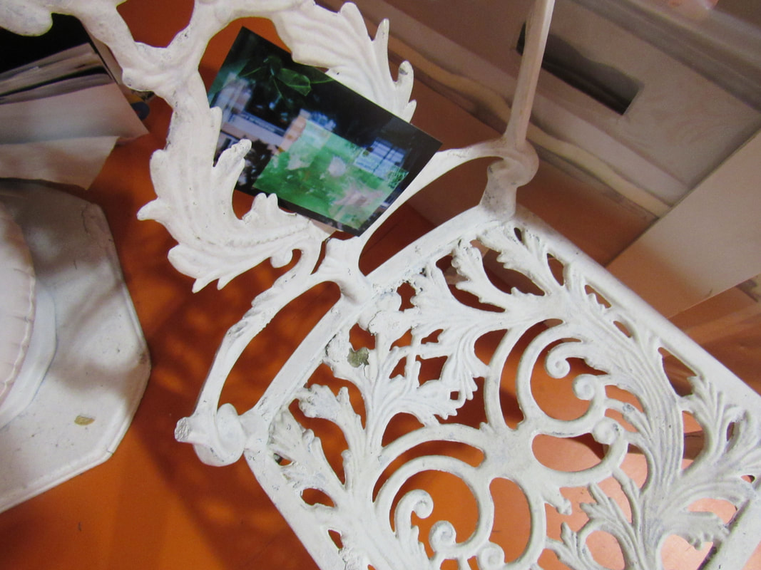
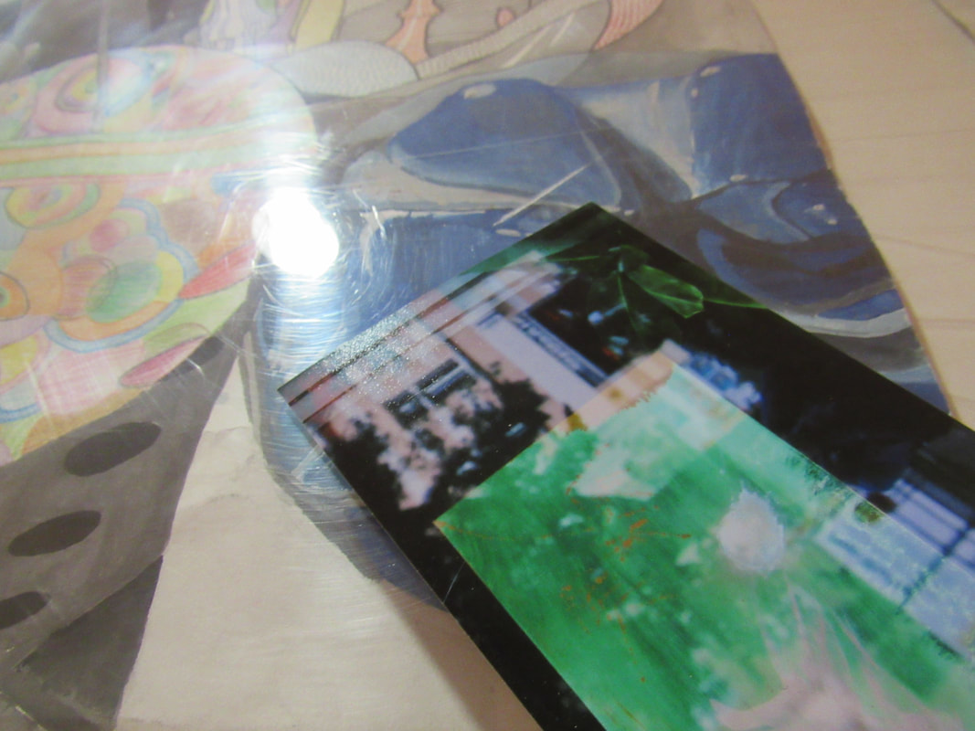
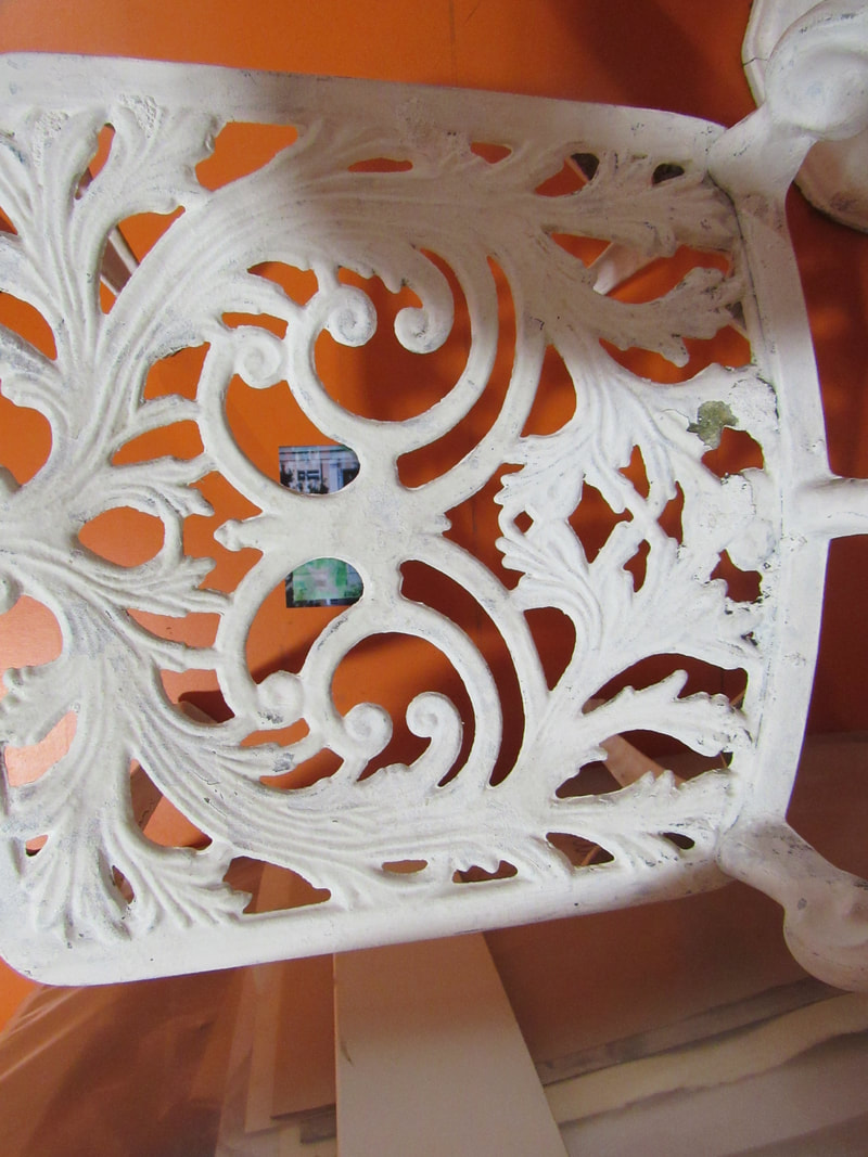
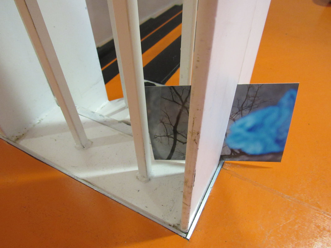
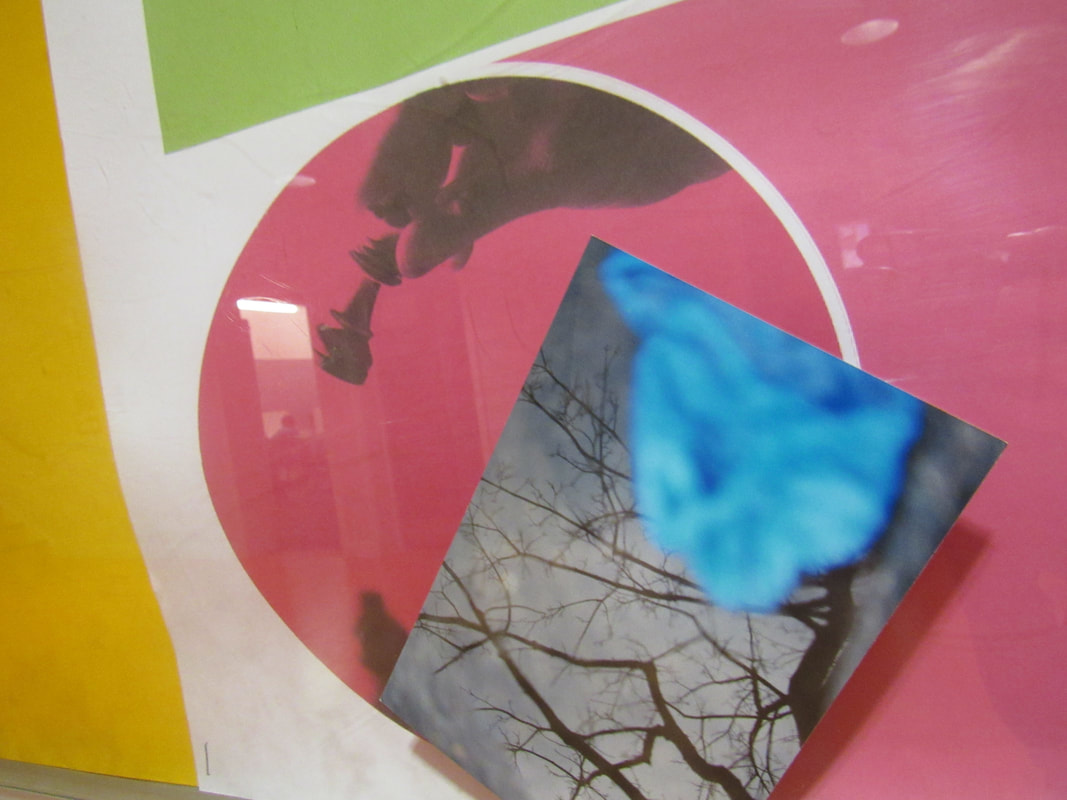
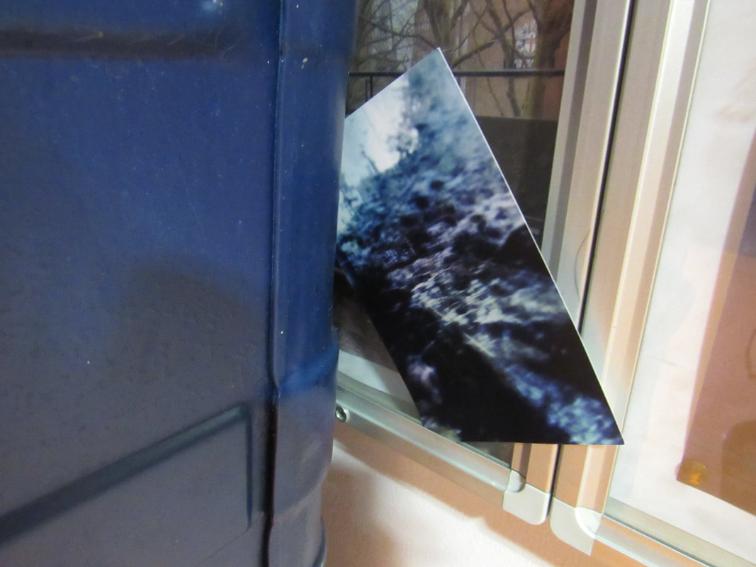
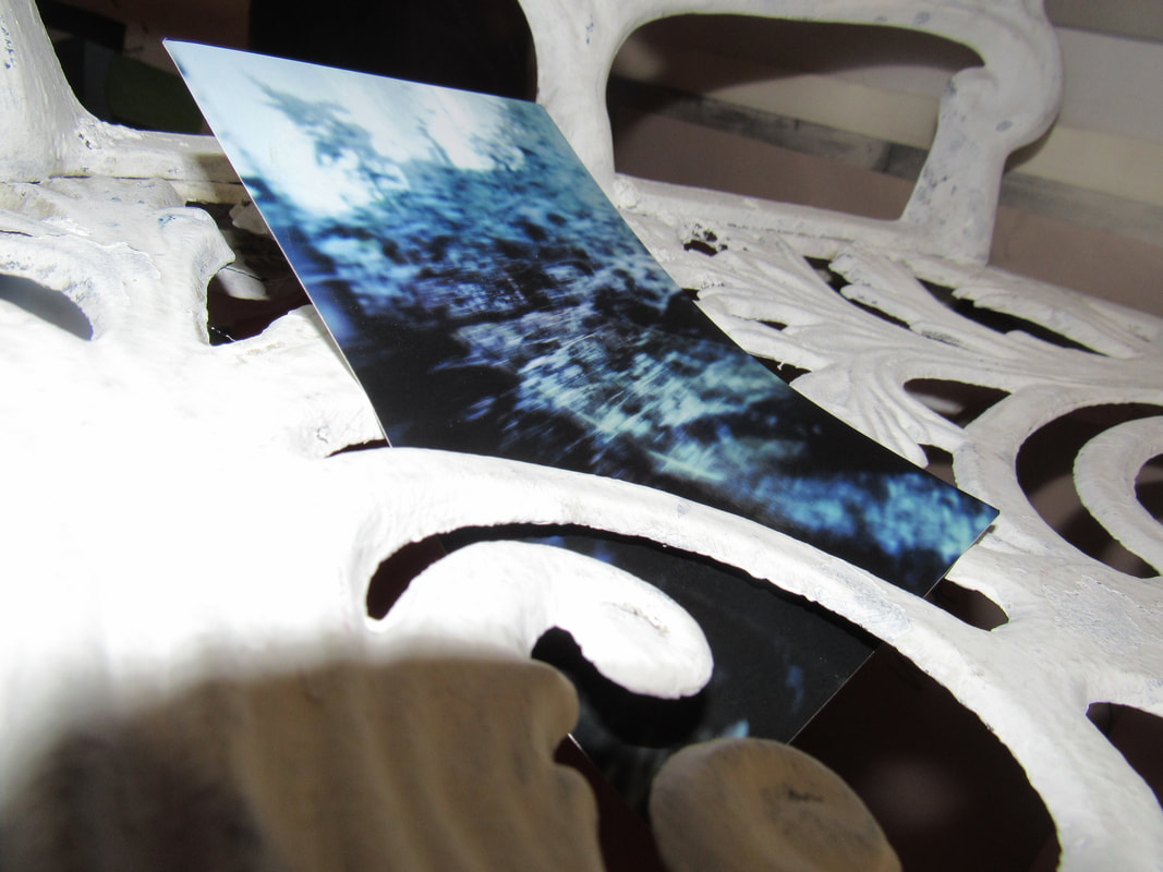
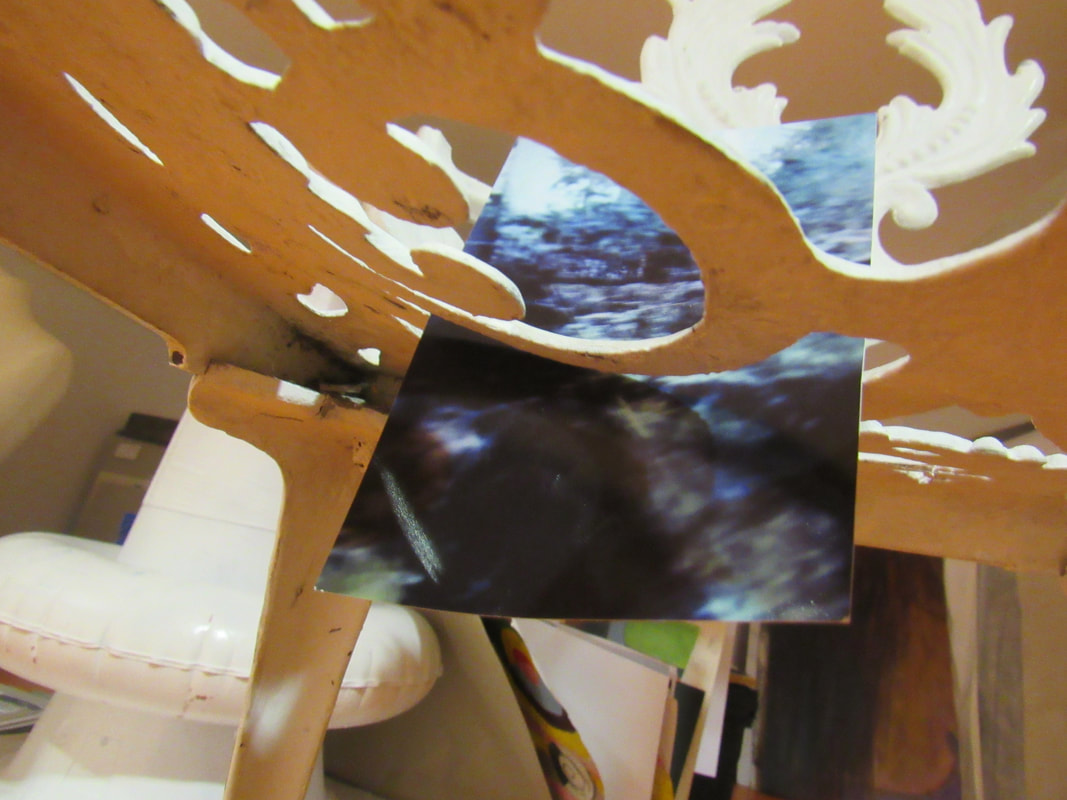
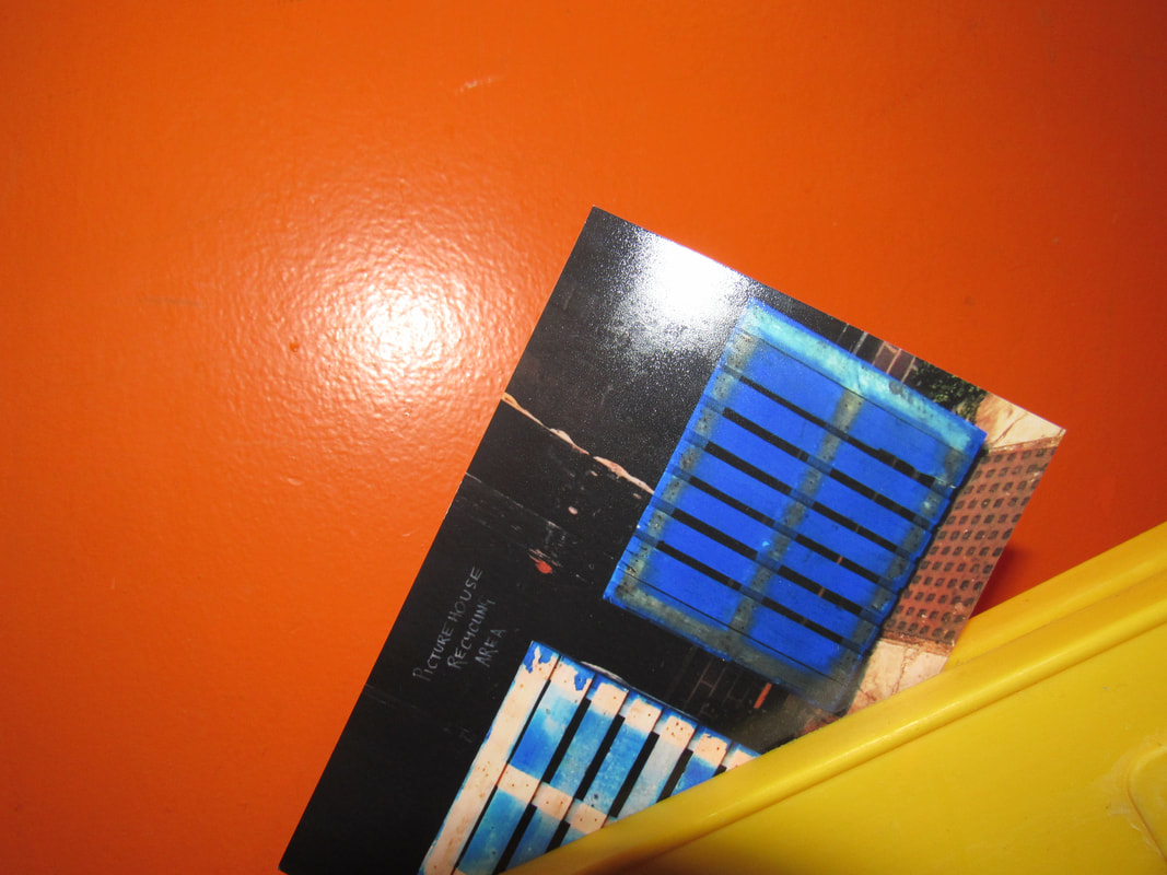
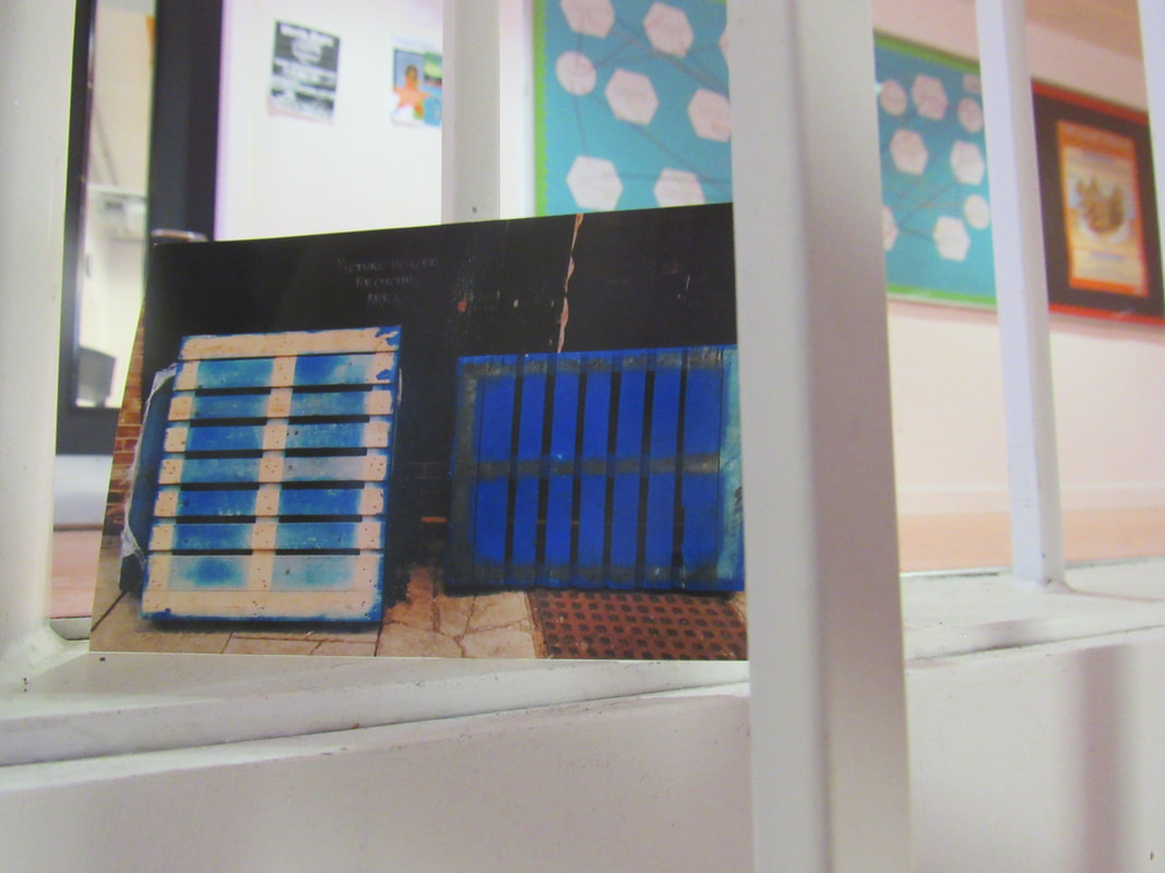
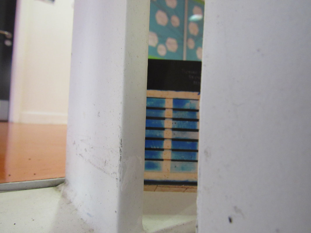
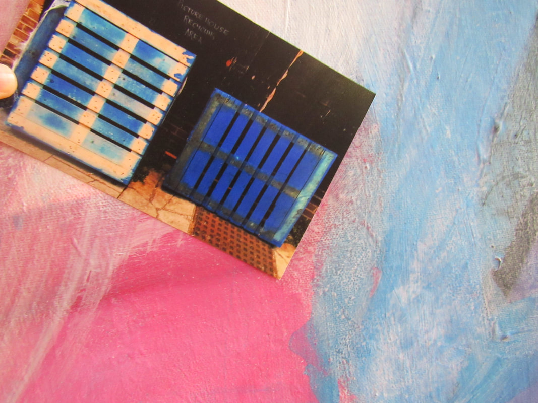
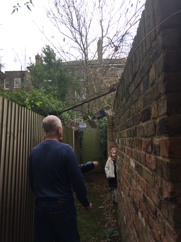
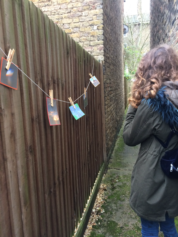
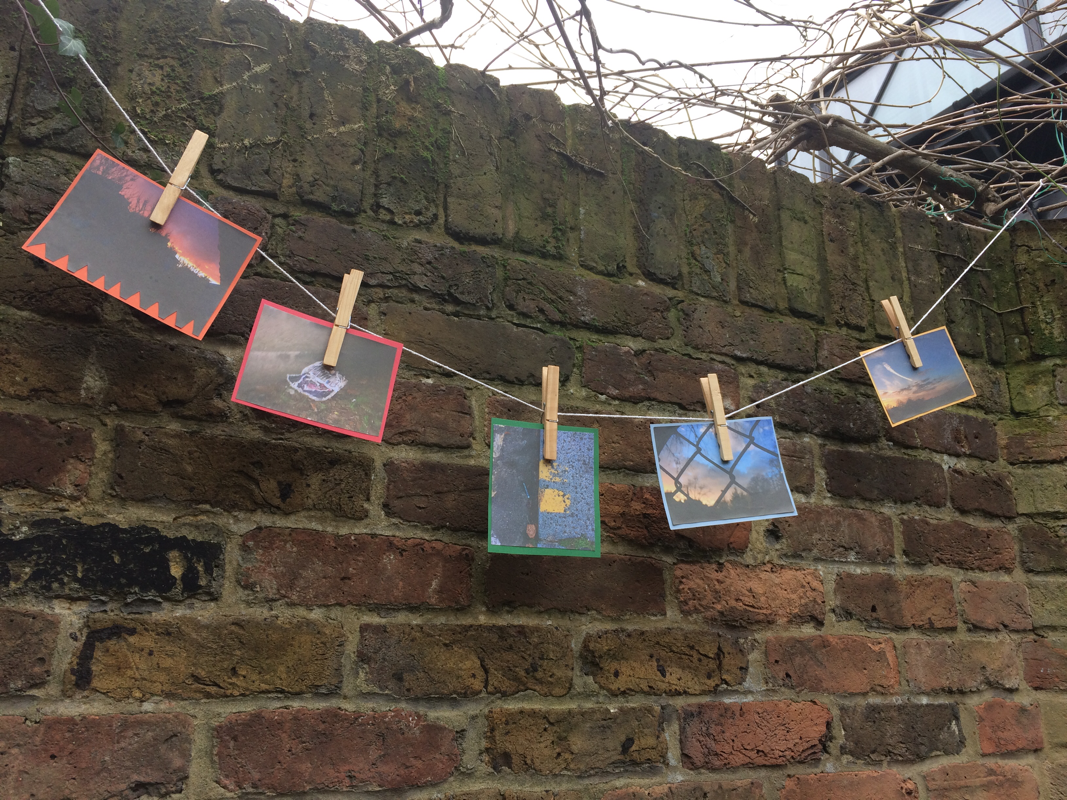
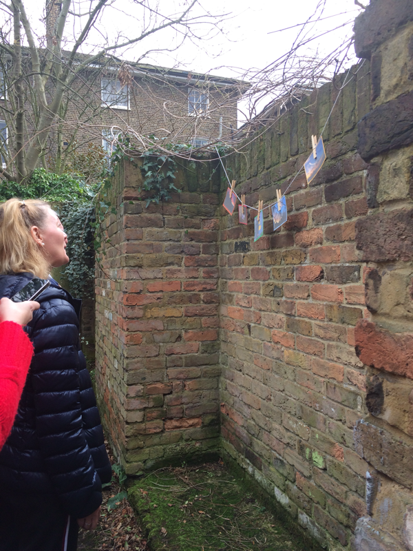
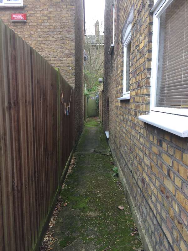
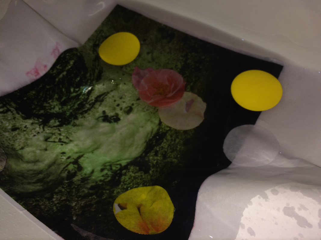
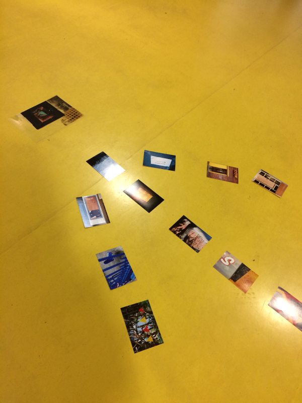
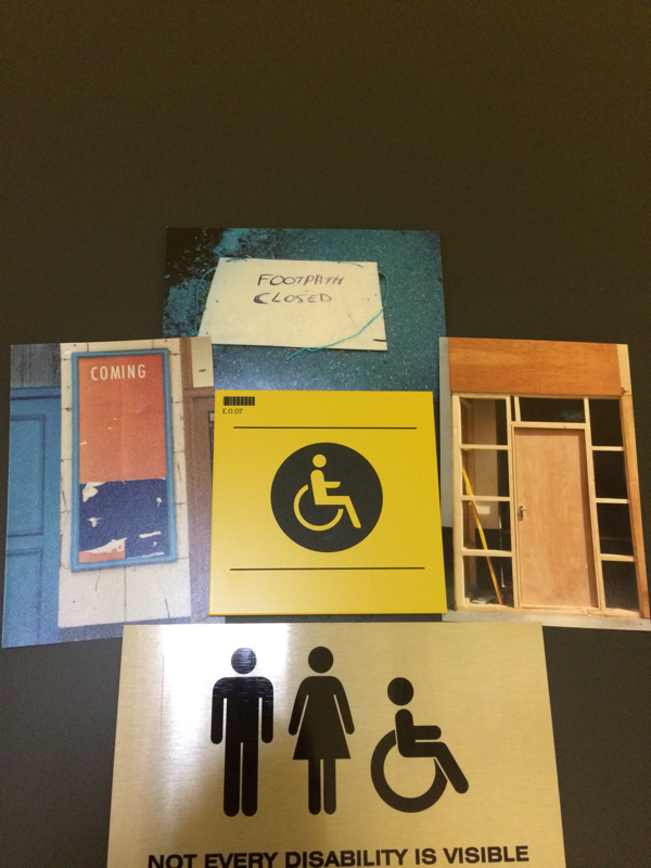
We had to pick out 5 pictures that we liked. My pictures were not deliberately linked together but I like the colours that were on them, there was an accidental theme which was green and blue. We had to take pictures of them in different locations, these are the pictures that I took and why I chose them:
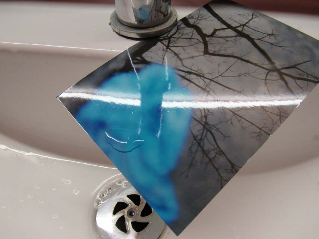
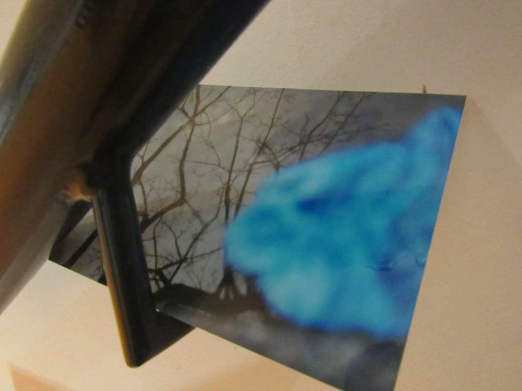
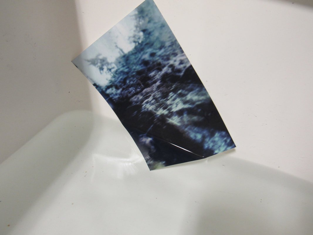
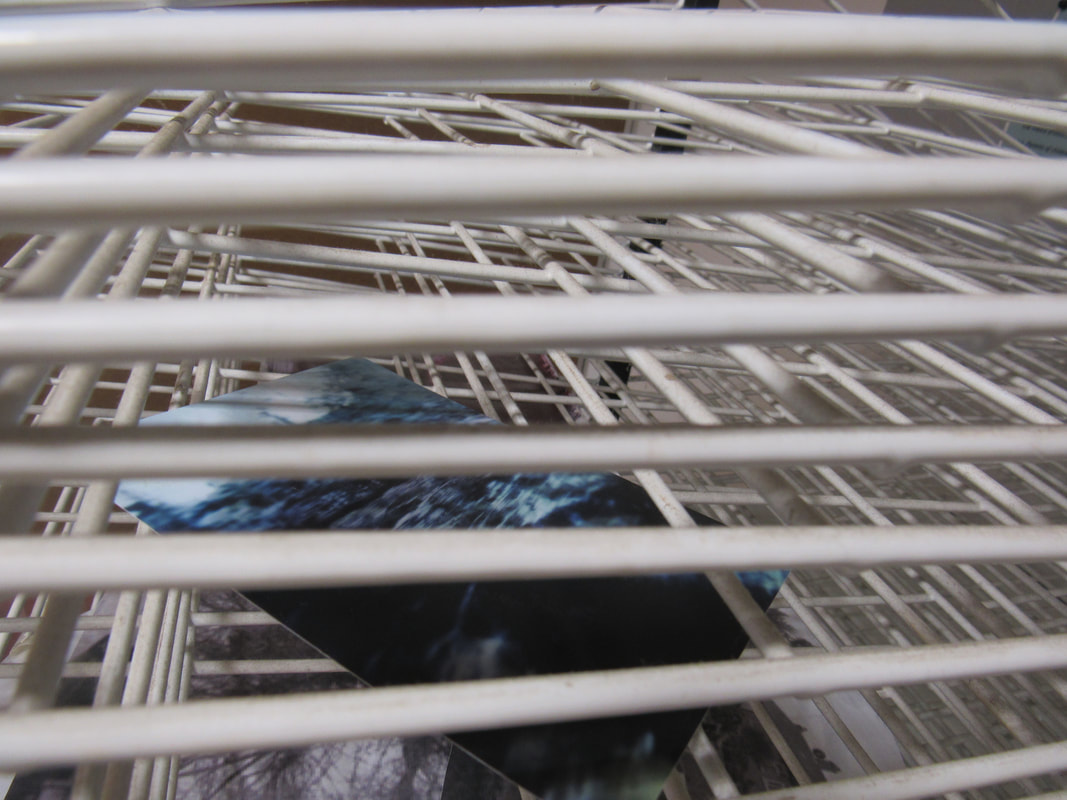
WWW:
I like the different locations that I put my pictures in. I also feel like I worked quite hard and I was focused on the photos that I was taking.
EBI:
I feel like I could have taken a few more photos that were in different locations. If it was a little brighter outside and it hadn't rained then I would have gone outside to try to find some new locations to put my pictures and the lighting would have been better. I think that I could have tried to be a bit more original and tried a few more different angles.
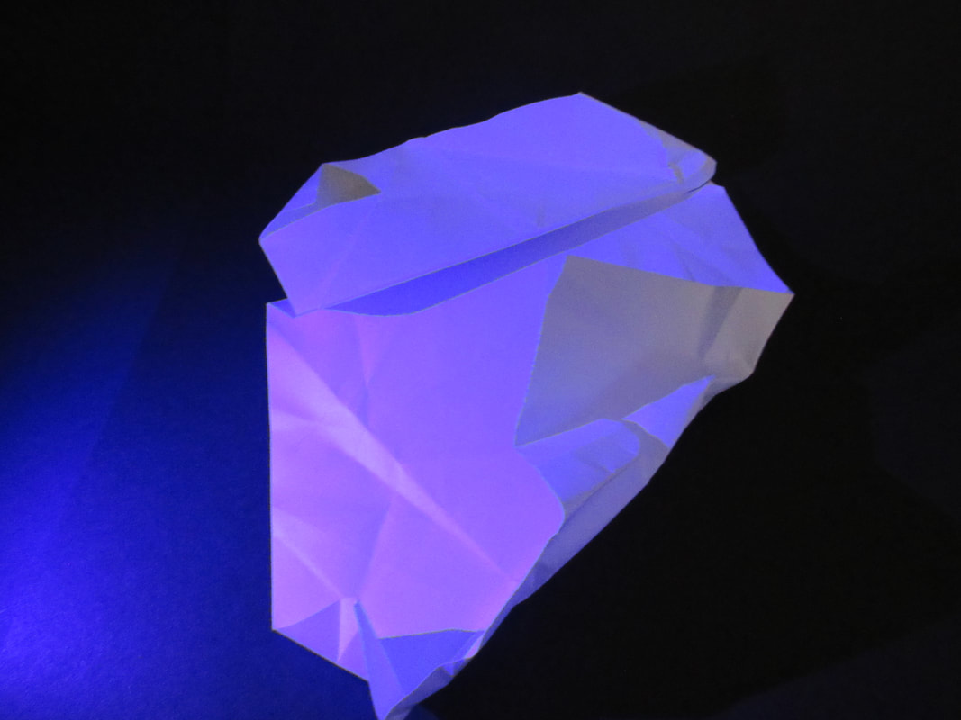
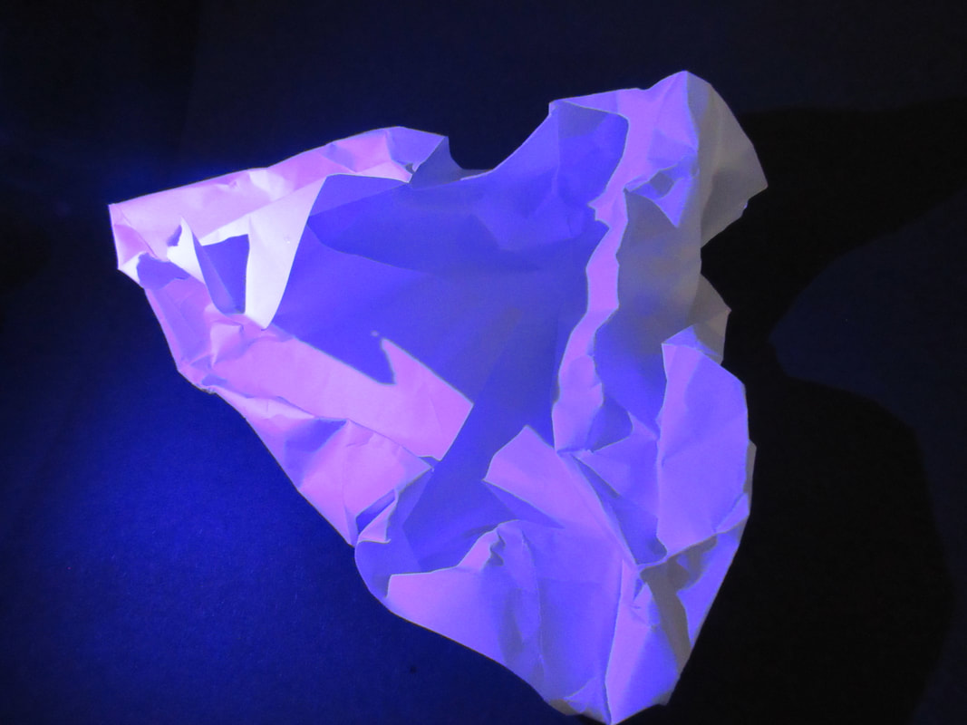
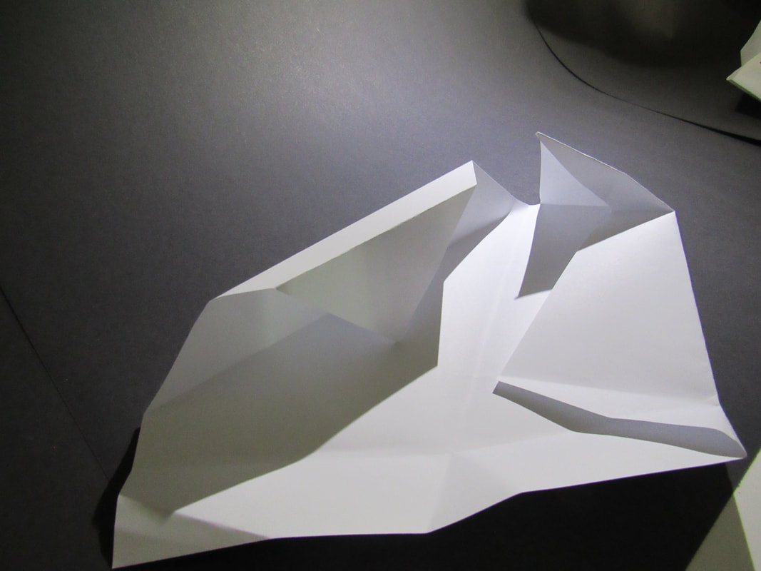
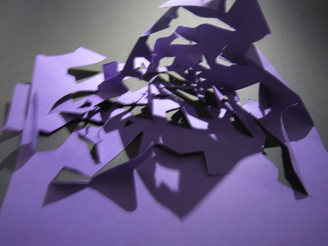
Assessment Model:
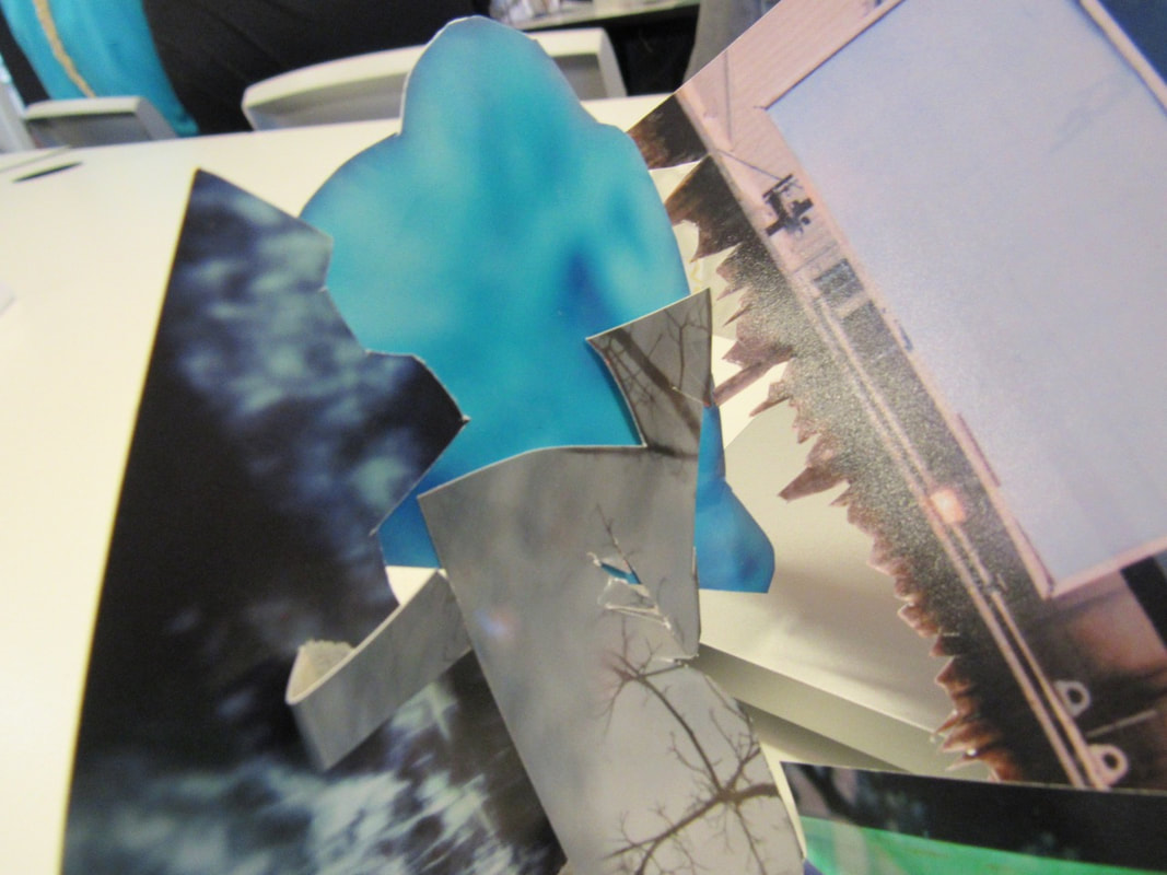
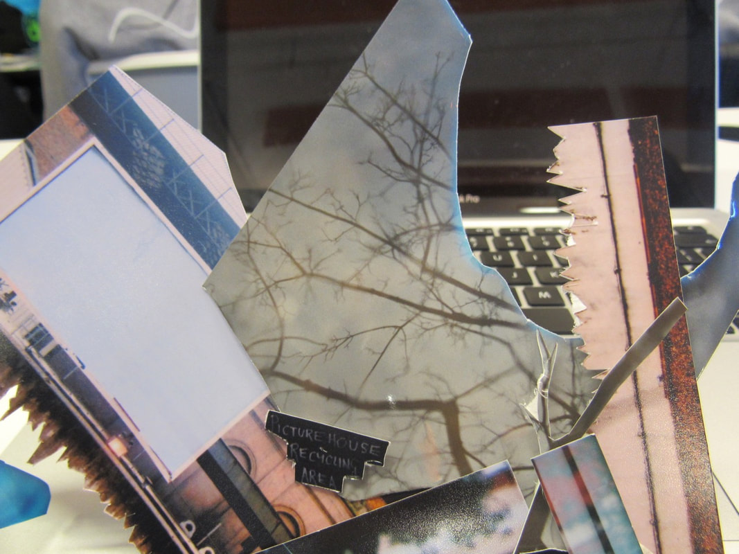
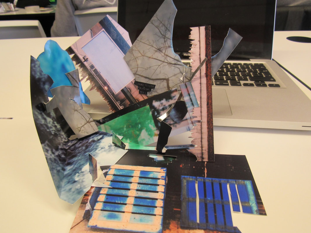
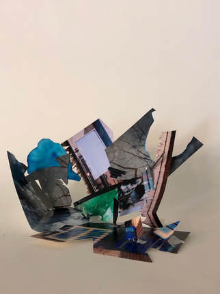
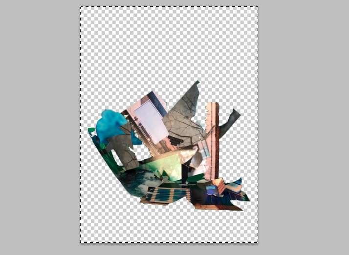
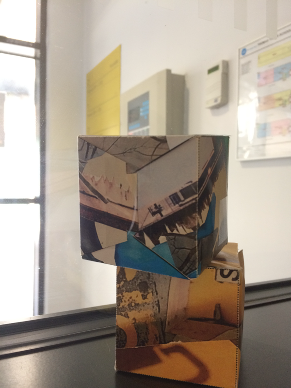
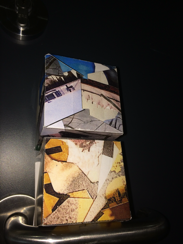
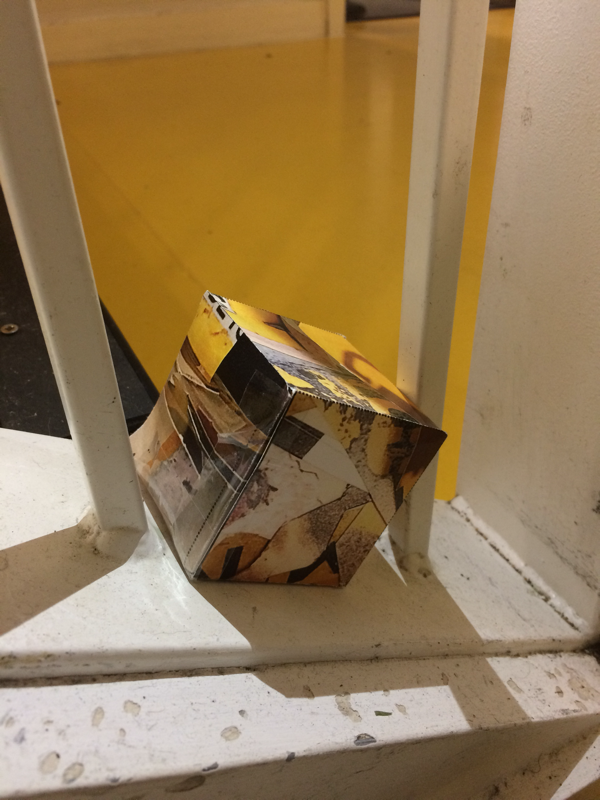
In this section of the assessment we used the five photos that we picked out and we got to cut them out and we put them together to make a sculpture.
|
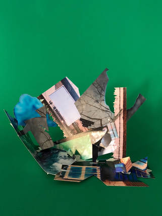
|
My sculpture was a bit tilted to one side but I was still proud of myself as I think I was quite imaginative during the task and I experimented with different ways I could put the pictures.
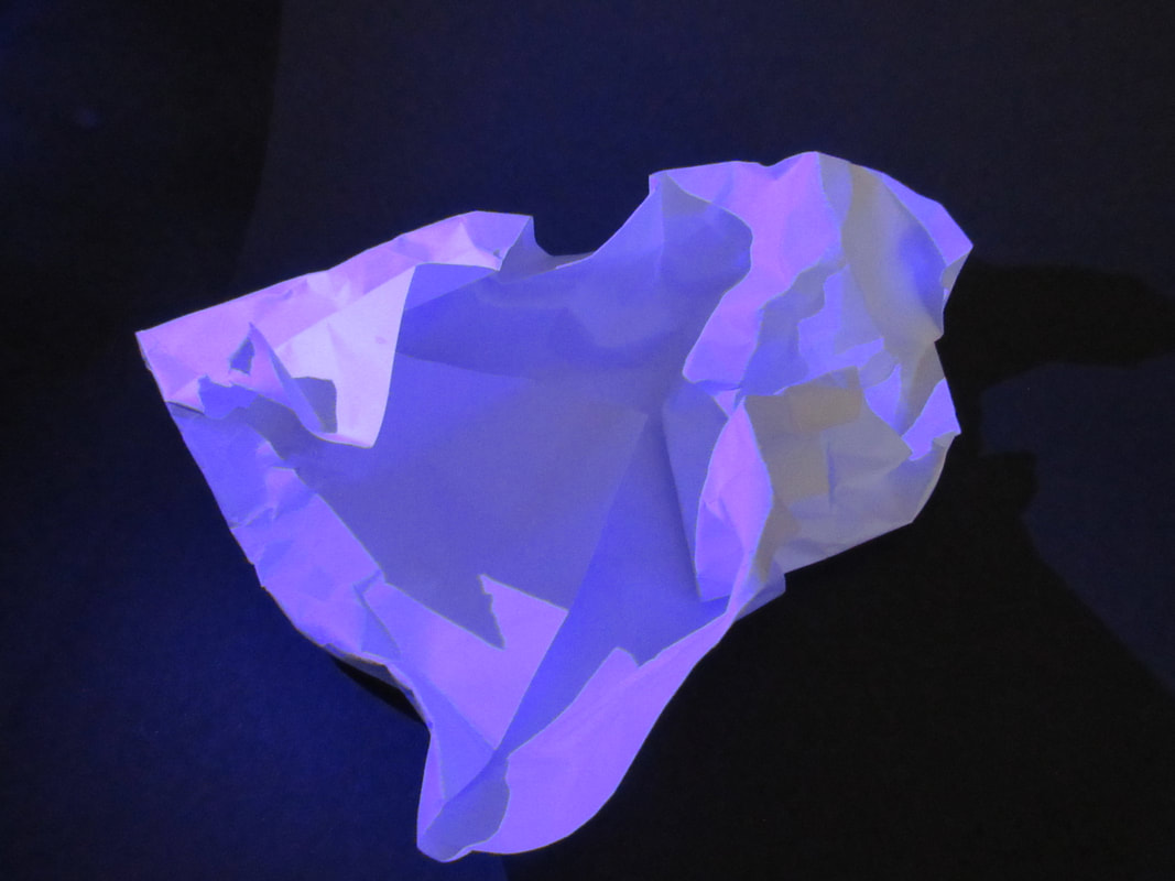
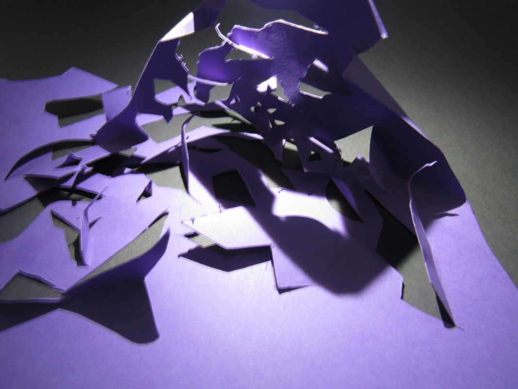
Photoshop:
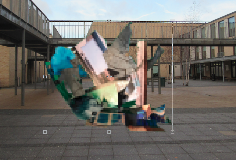
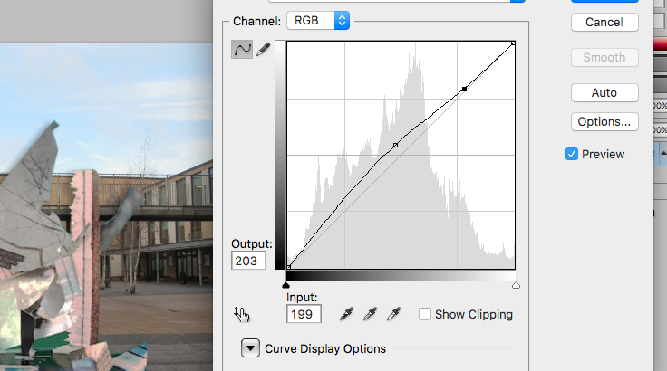
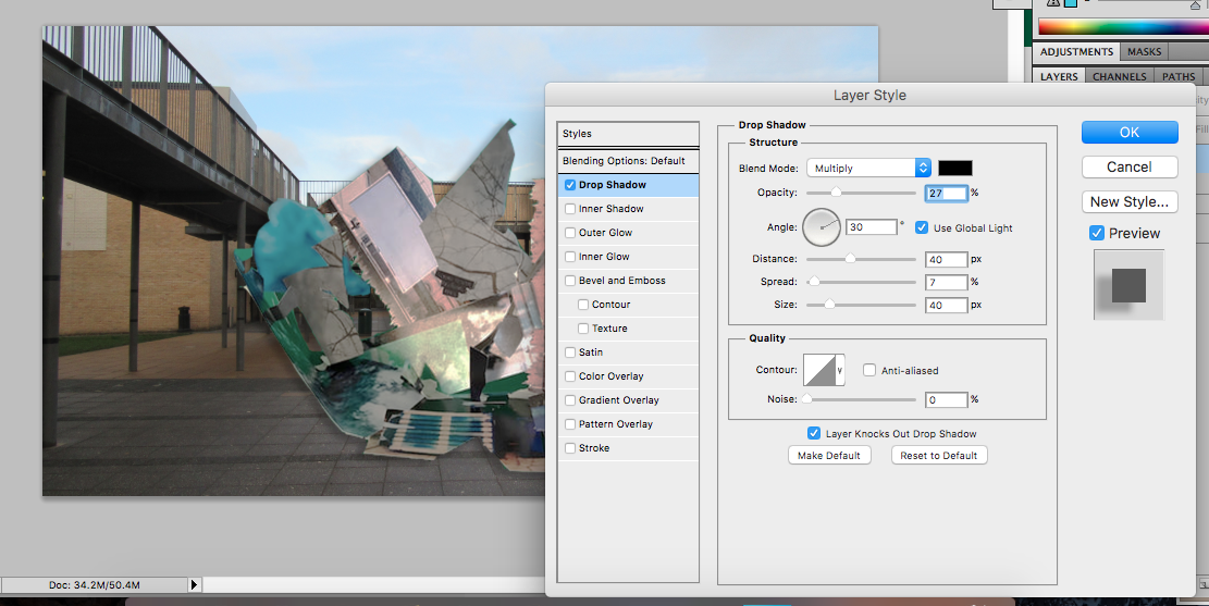
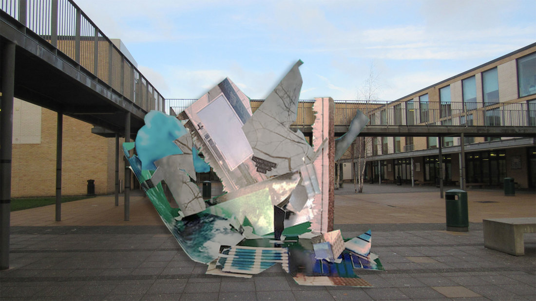
WWW:
I think that I didn't do too bad and I was quite careful with cutting around the sculpture.
EBI:
I think that I could change the angle where you can see the sculpture and cool the colours down more.I also think that next time I would need to change where the shadow is as in the one above there is a shadow of the sculpture in the sky and it shouldn't be there.
Evaluation on the whole assessment:
I think that for our first assessment I did quite well. In the first task I got to explore where I could put photos and I got to challenge my imagination when making the sculptures but my sculpture turned out quite well. I did struggle with the photoshop activity as some of the edges of the sculpture were quite hard to cut around using the computer and the shadowing could have been better but st least for next time I will know what to do. Overall I think I did quite well and I tried my best in this assessment.
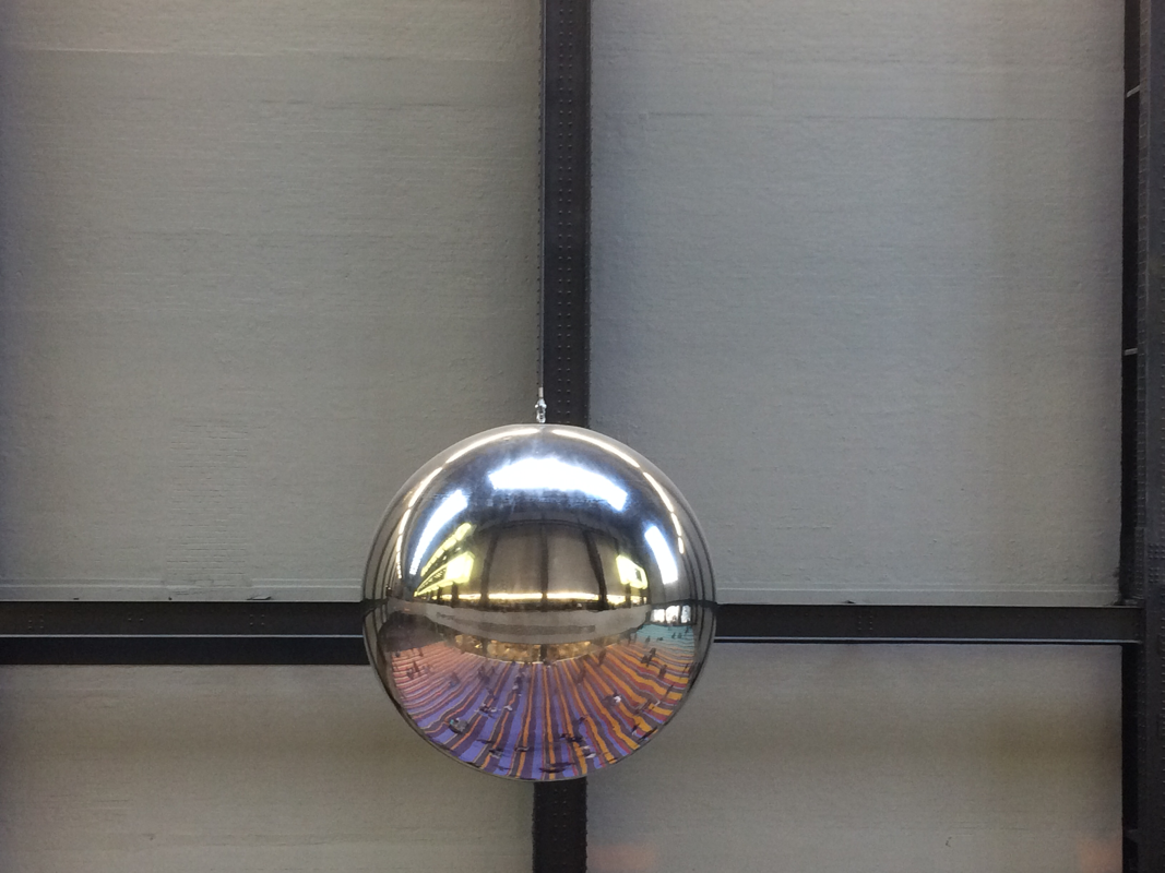
Photograph comparison:
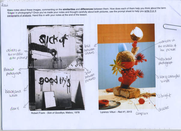
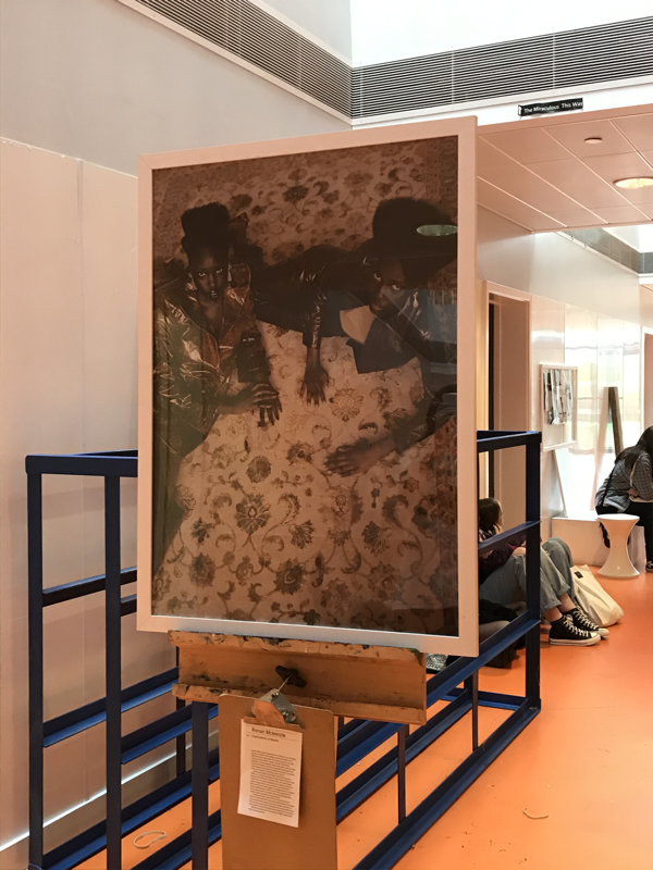
The two photographs that we were given were "sick of goodbys" by Robert Frank which is put together with two photographs. The two photographs are of mirrors, on the first mirror it says 'sick of' and on the second "goodbys" and the photos he took were reflections of the mirrors with objects. Lorenzo Vitturi's "Red #1" has a model In the middle of the picture which has a lot of red on it and there is a mess at the bottom of it. Frank's photographs are two landscape, still life pictures put together to make a portrait shape. Vitturi's photograph is a still life picture that is in a portrait shape. What is surprising about these pictures is that they look very different but when you look at them carefully there are a few similarities. Something strange about Frank's photograph that I saw was that "goodbys" was spelt wrong, this might have been on purpose to make whoever was looking at it wonder why they spelt it wrong it adds mystery to the photograph.
The main similarities between these photographs are that they both have objects in them and they are both in the middle of the picture. Another similarity between these photographs is that the shape of them is the same, they are both portrait. Frank's picture includes a a split between the two photographs and in Vitturi's photograph there is a split between the orange board to the blue wall and the blue wall to the white table which the model is on. The space in the photographs are that in Frank's photo the top picture is mainly of the mirror, the reflection and smudges around the side of the mirror, whereas the bottom shows the mirror, the reflection and also some shadows around where the mirror is. Vitturi's picture has a model in the middle which is on a table and the background which is blue in the middle and orange at the top. What I find interesting about both of these photographs I that in the bottom photograph the photo is taken at a different angle to the top photograph so that you can see the shadows around the mirror. What I find interesting about Vitturi's photograph is that the sculpture is quite neat and put together is an particular way but the objects that are around the bottom of the sculpture are not placed in a particular way, the are messy.
There are different kinds of edges in these photographs. In Frank's photographs I can see drip type of edges from the letters on the mirrored sharp edges from the mirror and sharp edges from the shadows as well. In Vitturi's picture I can see sharp edges from the flowers and lots of curved edges from other objects in the sculpture. Both photographs have the same edges around the outside of the pictures. Each photograph helps me think about the relationship between edges and photography because it shows that everything you see or take picture of has edges, wether it's a reflection like in Frank's photo or lots of objects put together like in Vitturi's photo. If I could ask these photographers any questions I would ask Frank- what gave you the idea to use the small object that is in the top picture?, why did you choose to take the pictures in Mabou?. I would ask Vitturi- what gave you the idea to have very vivid colours in your picture?, why did you choose the objects you used in the photograph and where did you get them from?
A different title that I would give to the photograph by Frank would be- "Mirrors of Mabou" because he uses mirrors in the picture and the picture was taken in Mabou. Another title for Vitturi's photograph could be- "Sculpture of Chaos" because there is a sculpture in the picture and there is amiss around the bottom of it. If I were to be inside Frank's photograph I think that It would feel quite dark and sad as it is black and white, it could also feel sad because of the quote that is on the mirrors: "Sick of Goodbys", this quote could almost make me feel quite lonely because it is as if someone has left. If I were to be inside Vitturi's photograph I thin that it would feel quite exciting as there is a lot to look at and explore inside the photograph, I also think that with the mix of objects and colours it Ould feel quite exotic. I think that Frank made his photograph to pass a message on about the feelings in the picture. I think that Vitturi made his photograph because it has a lot of bright colours that are only in particular places and it almost doesn't make sense. These images look very simple but they could have a hidden meaning which makes them a to more complex. I think what interested Frank was the message on the mirror and what the meaning behind it was. I think what interested Vitturi was the choice of colour and that the sculpture has a range of objects. I think that they were both trying to put across different ideas and I think its quite easy to tell that Frank's photo is based on the quote in the mirrors but it is quite hard to figure out what Vitturi's photograph is trying to show because it is quite complex and mysterious. I think that frank's theme in his photograph is the goodbys which could show loss of maybe a person. I think that theme of Vitturi's photograph is colour or an organised chaos because there is an organised sculpture but it is also messy.
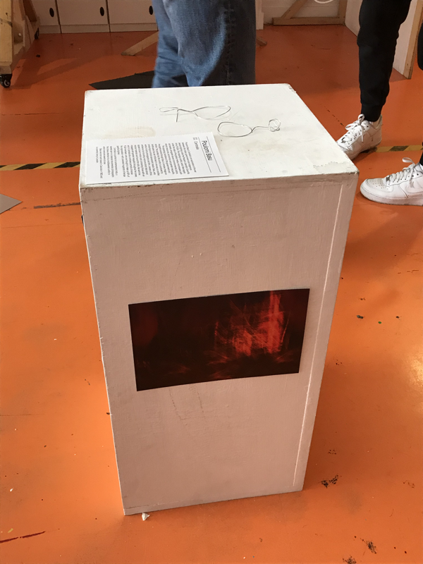
Concertina book:
WWW:
I think that I worked quite hard on this project and I was quite proud of myself when I managed to make the triangular concertina book, I also added a square one which I thought was quite cool.
EBI:
I think that I could have made the triangular concertina book a bit longer so that I wouldn't have to add on the square concertina book. I also found that with the triangular concertina book it is quite hard to tell which way is the right way up and which way to open it. I also think that I could have taken some more interesting photographs as I think that the photos that I took were quite simple. I will try to take more complex photos of interesting objects that I see everyday.
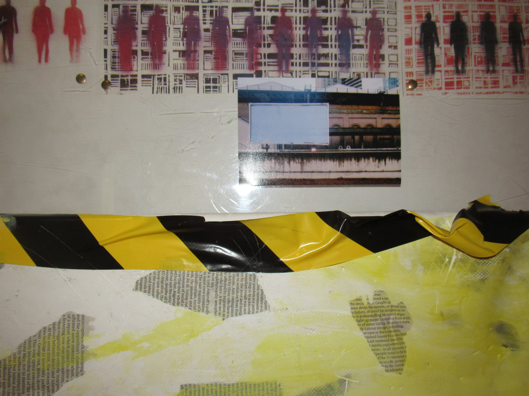
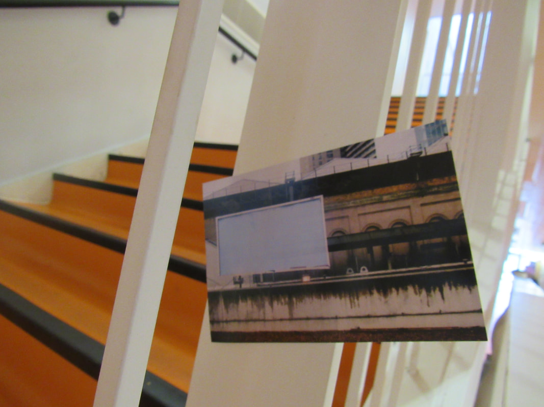
Edges Exhibition:
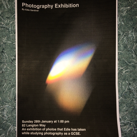
This is the poster that I made for my exhibition.
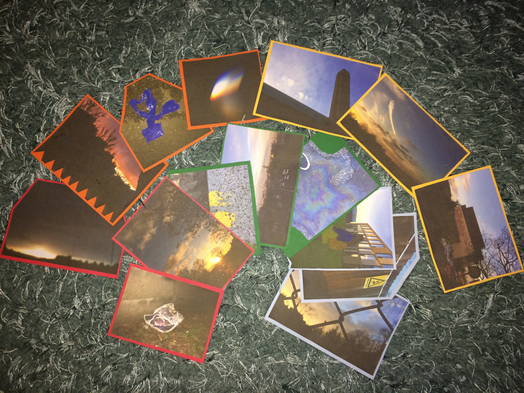
These are the photos that I will be using in my exhibition.
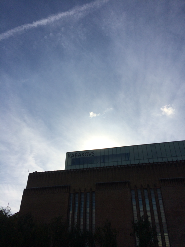
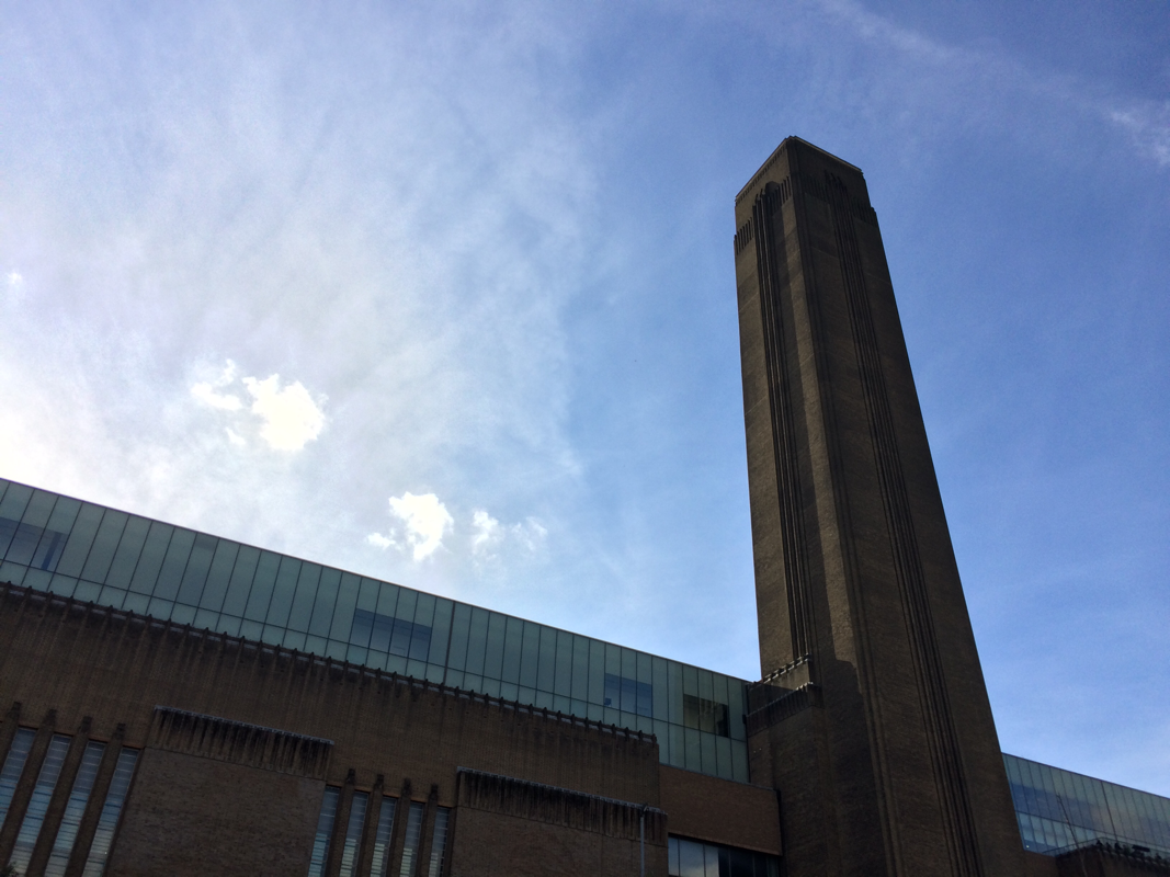
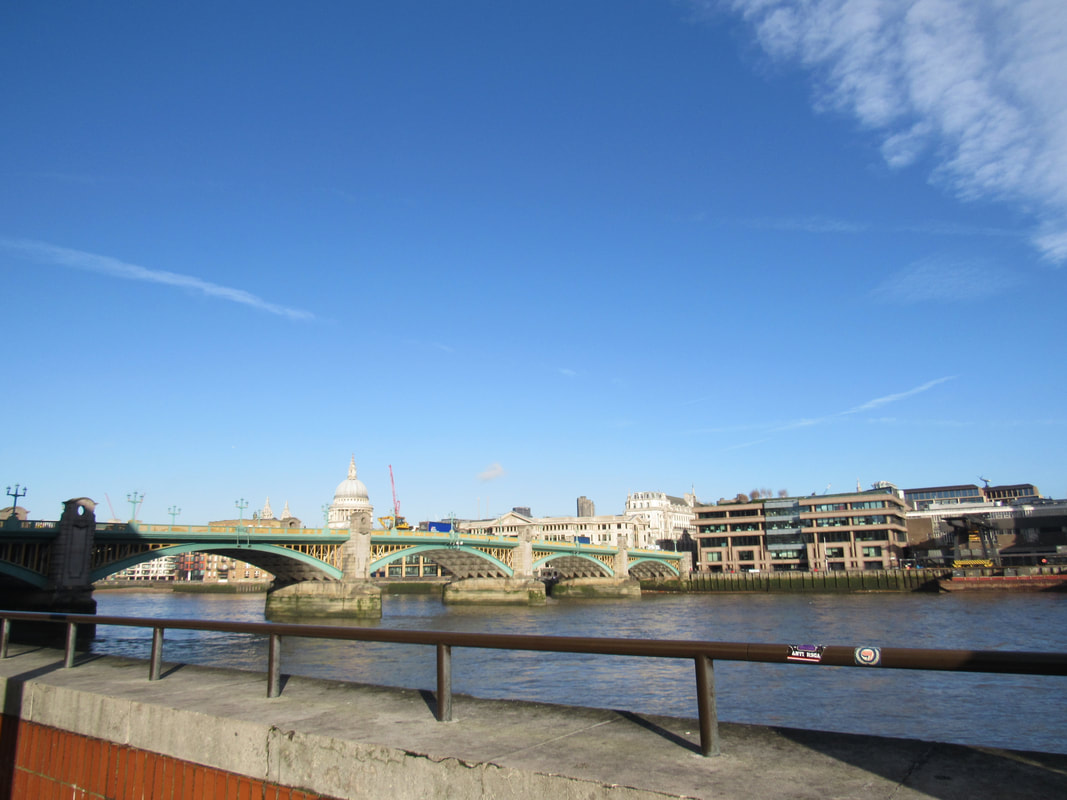
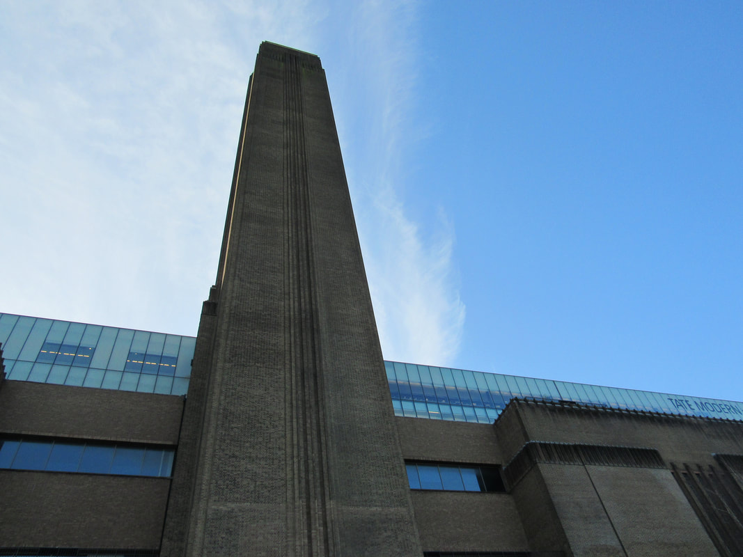
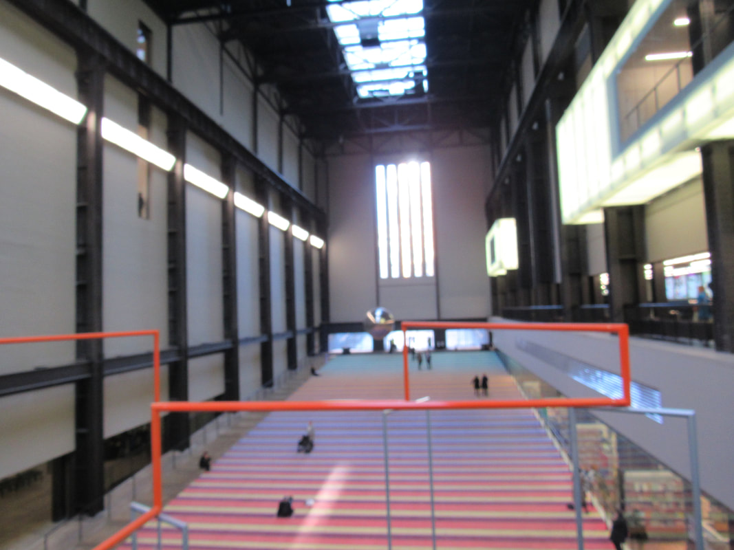
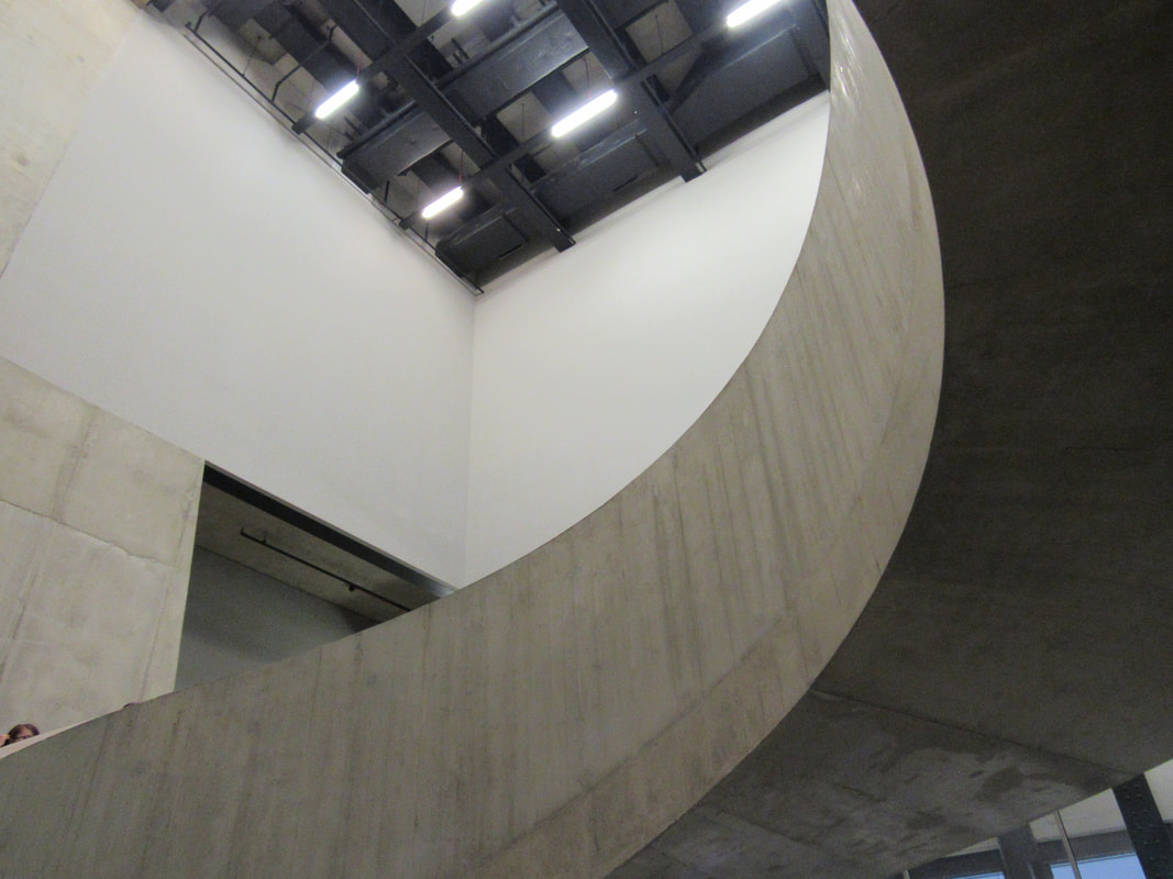
Tate trip:
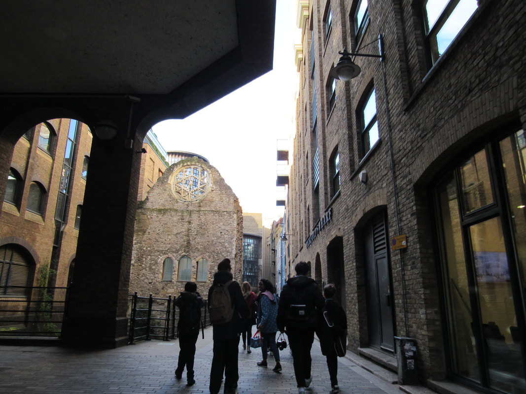
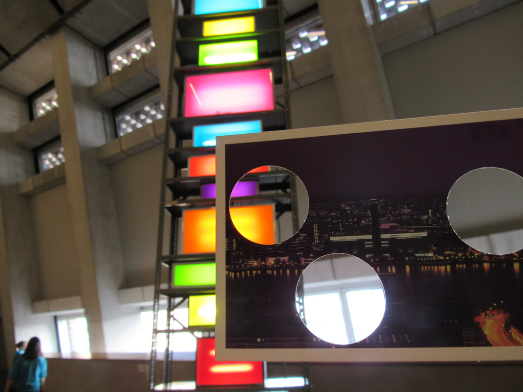
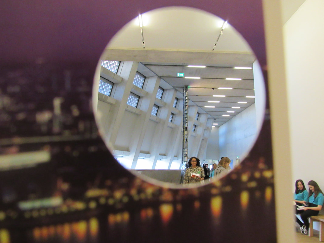
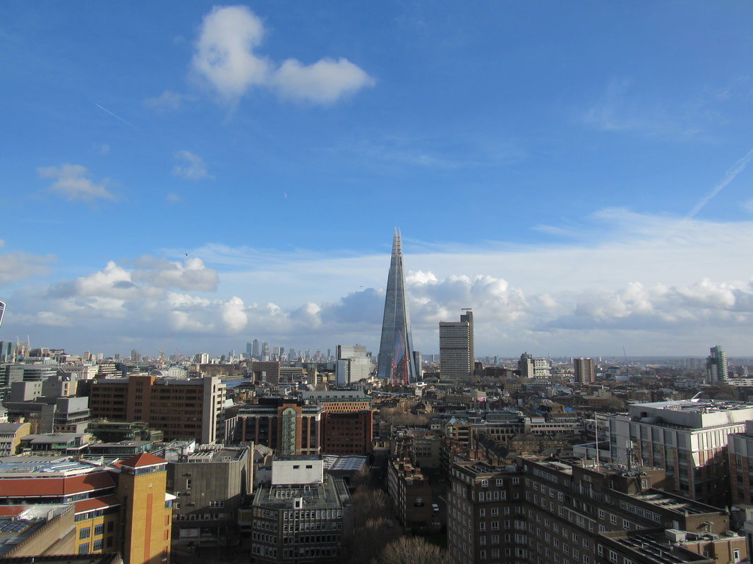
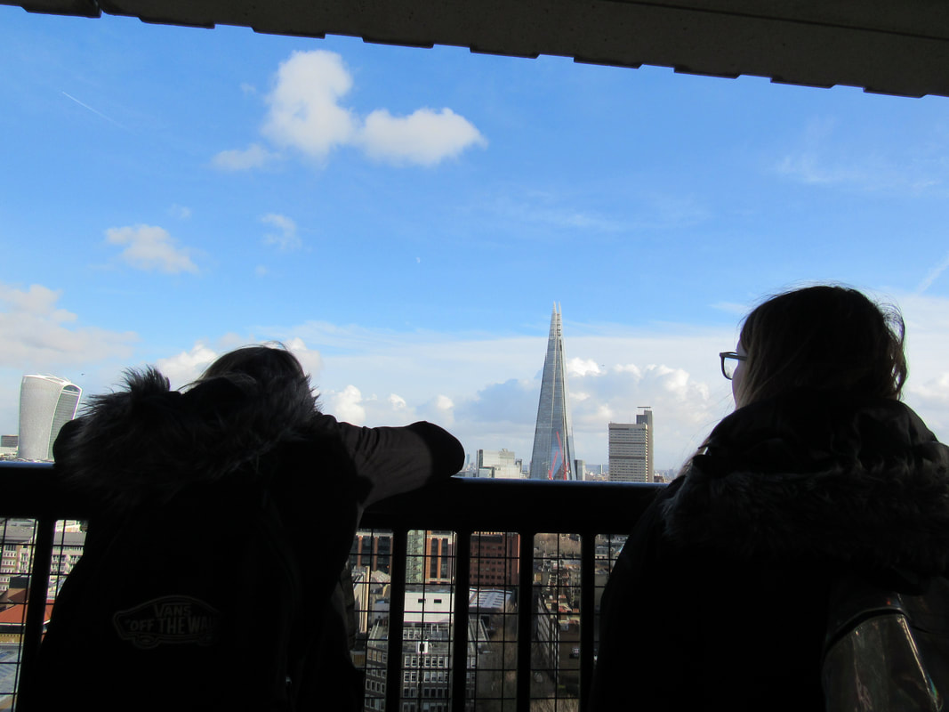
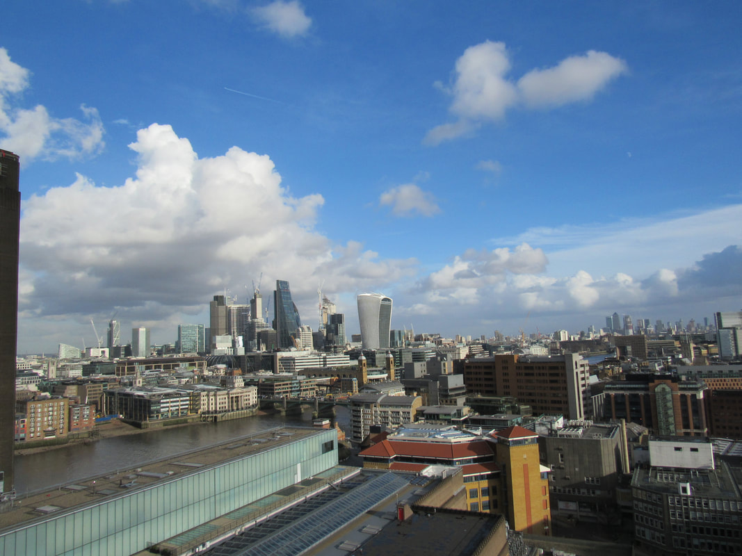
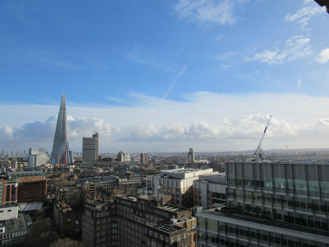
My experience at the Tate:
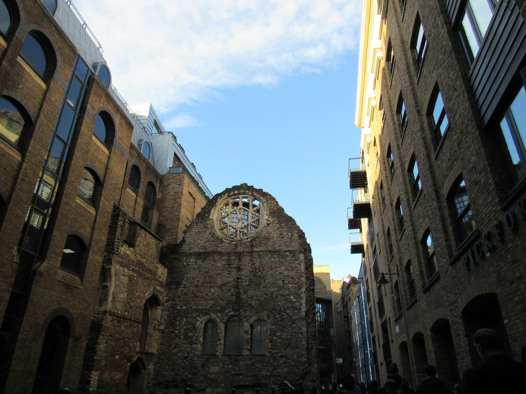
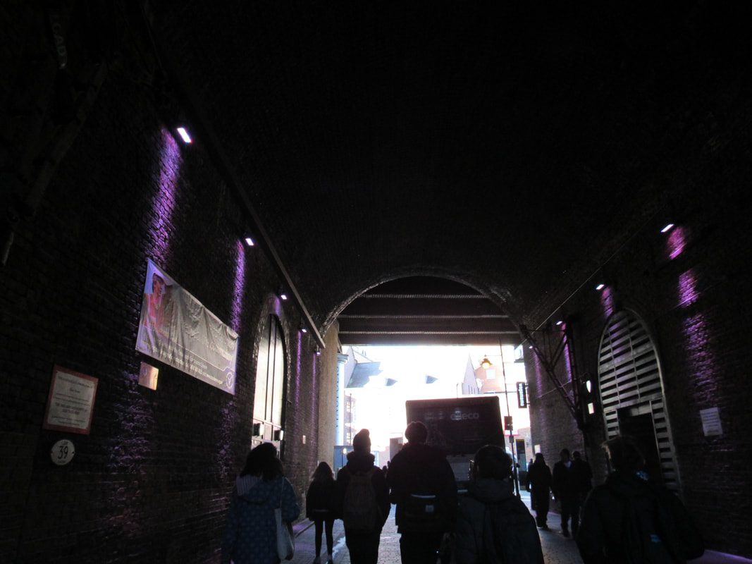
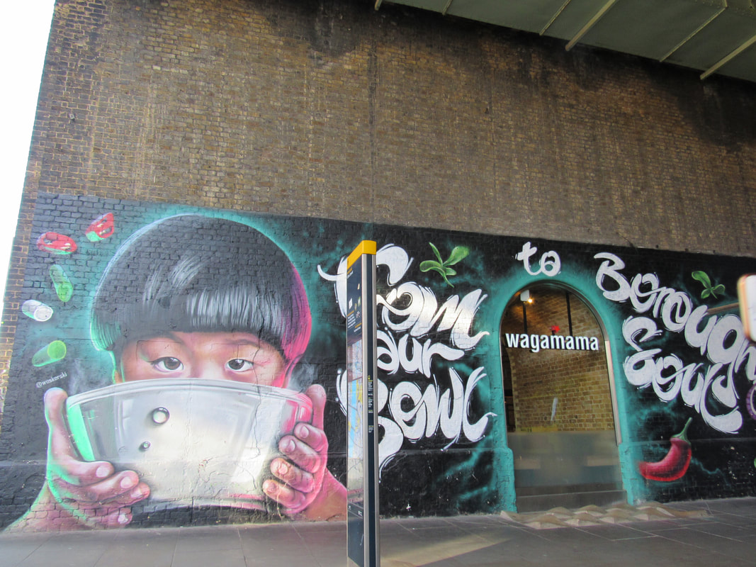
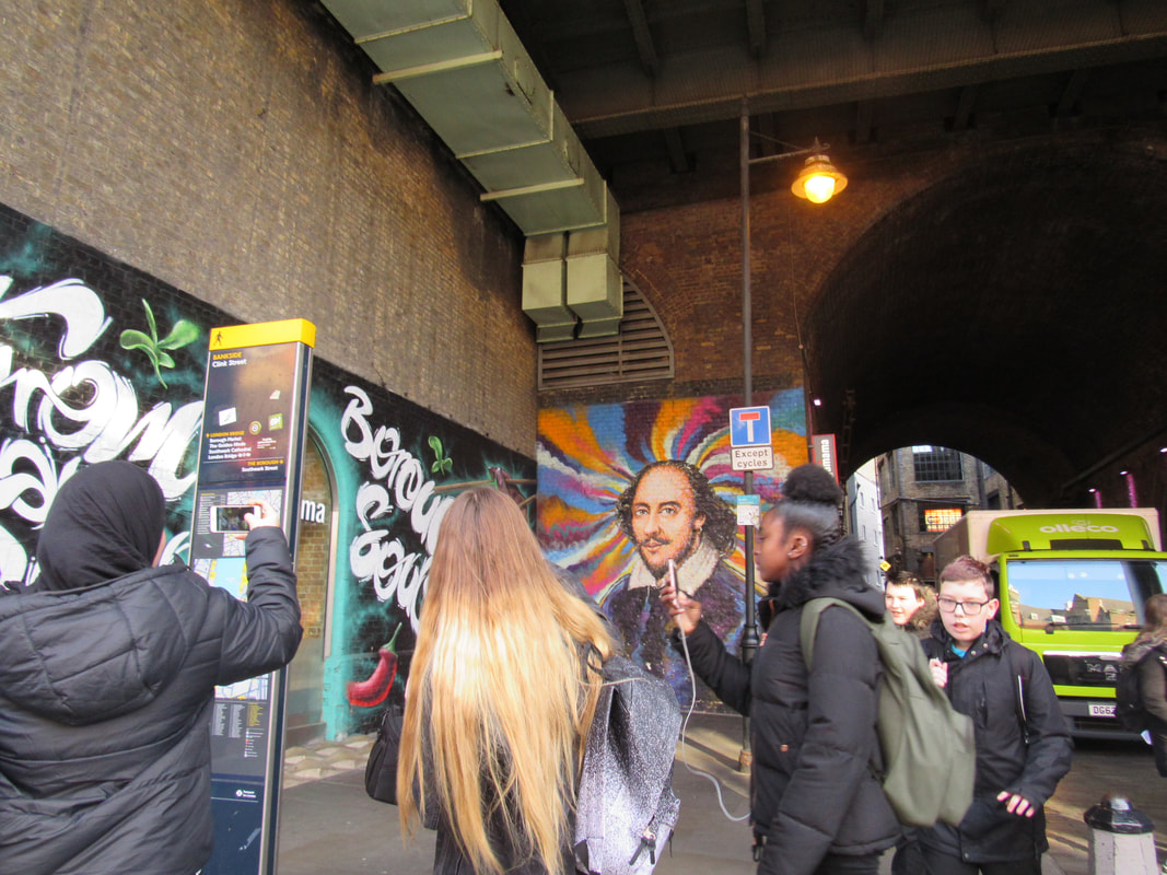
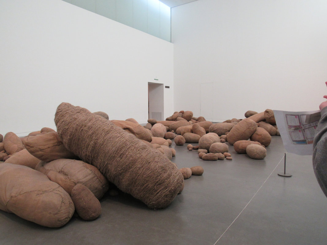
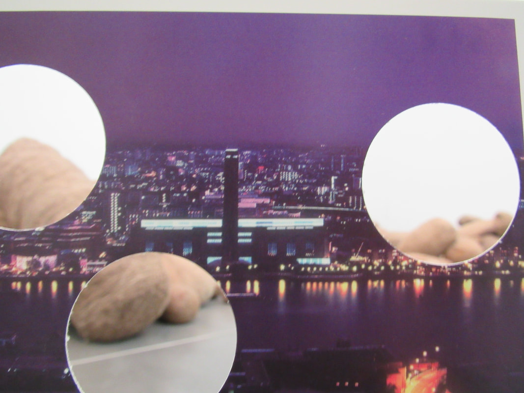
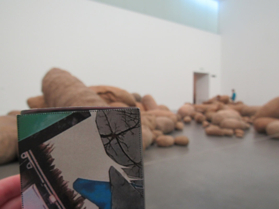
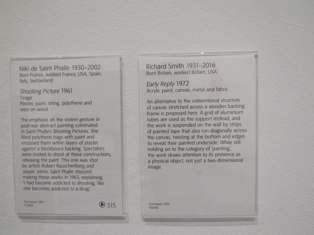
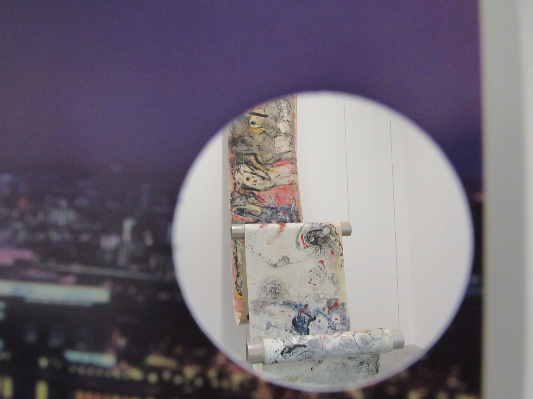
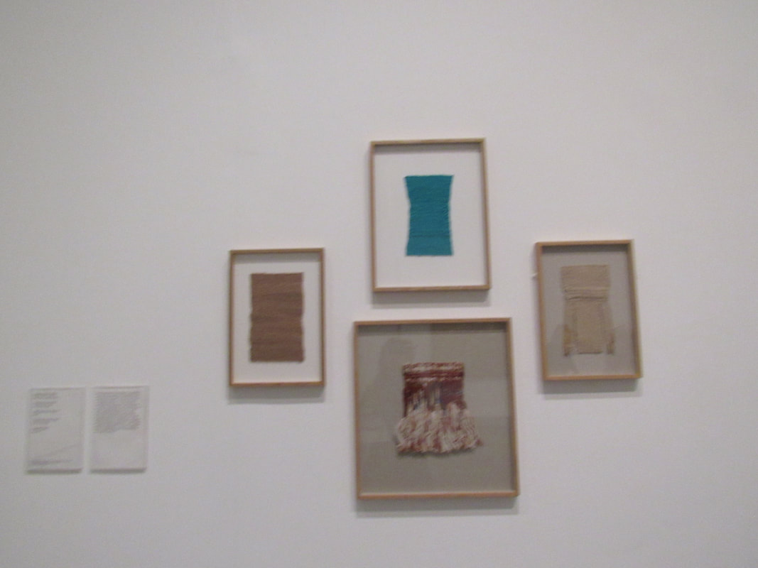
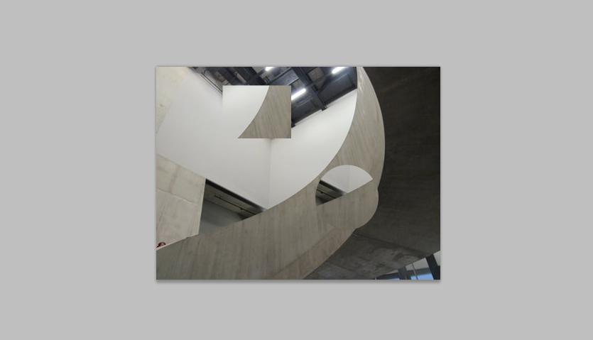
On our trip to the Tate we did a lot of walking, so I was very tired but there were a lot of interesting exhibitions that we went to see. Some sculptures that we saw were a bit more interesting than others (to me). One sculpture that I saw was what looked like bunch of potato sacks, which I thought was weird but I didn't really find it that interesting because there wasn't a lot going on. I enjoyed going to the dark room that we had to use flash photography in order to see it as I liked the patterns on the walls. I also enjoyed going to the top of the Tate Modern and seeing the view of London and we could also see the Shard. I also liked some of the street art that we saw on the way to the Tate. I thought that it was interesting to see lots of different styles of art and photography as I think it has inspired me to be more creative and work outside of my comfort zone more.
Edges exhibition:
WWW:
I am quite happy with how my exhibition turned out. I think that I tried quite hard with this project.
EBI:
I think that I could have tried to find more interesting places to put my exhibition. I could have also thought of different ways I could have printed out my pictures and made the layout of the exhibition more interesting.
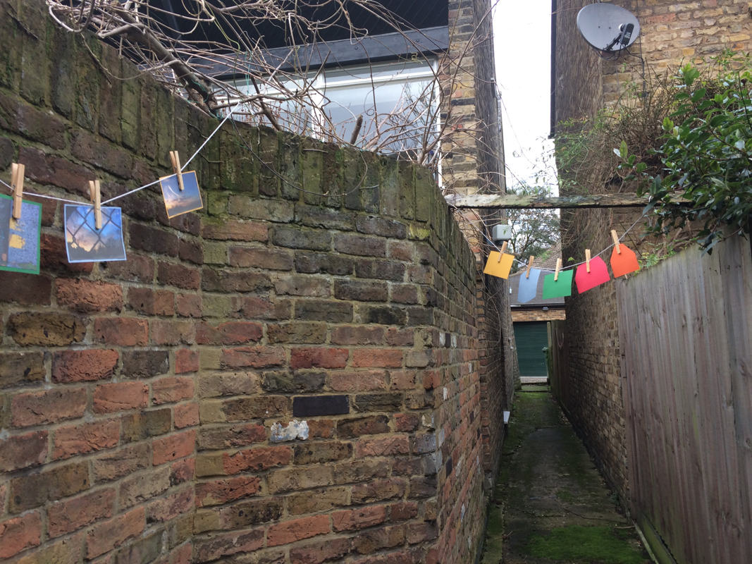
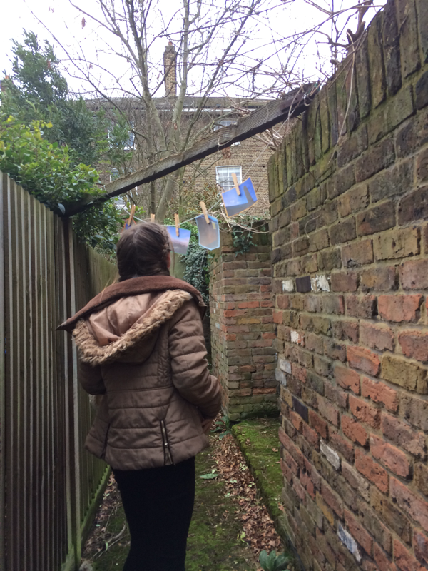
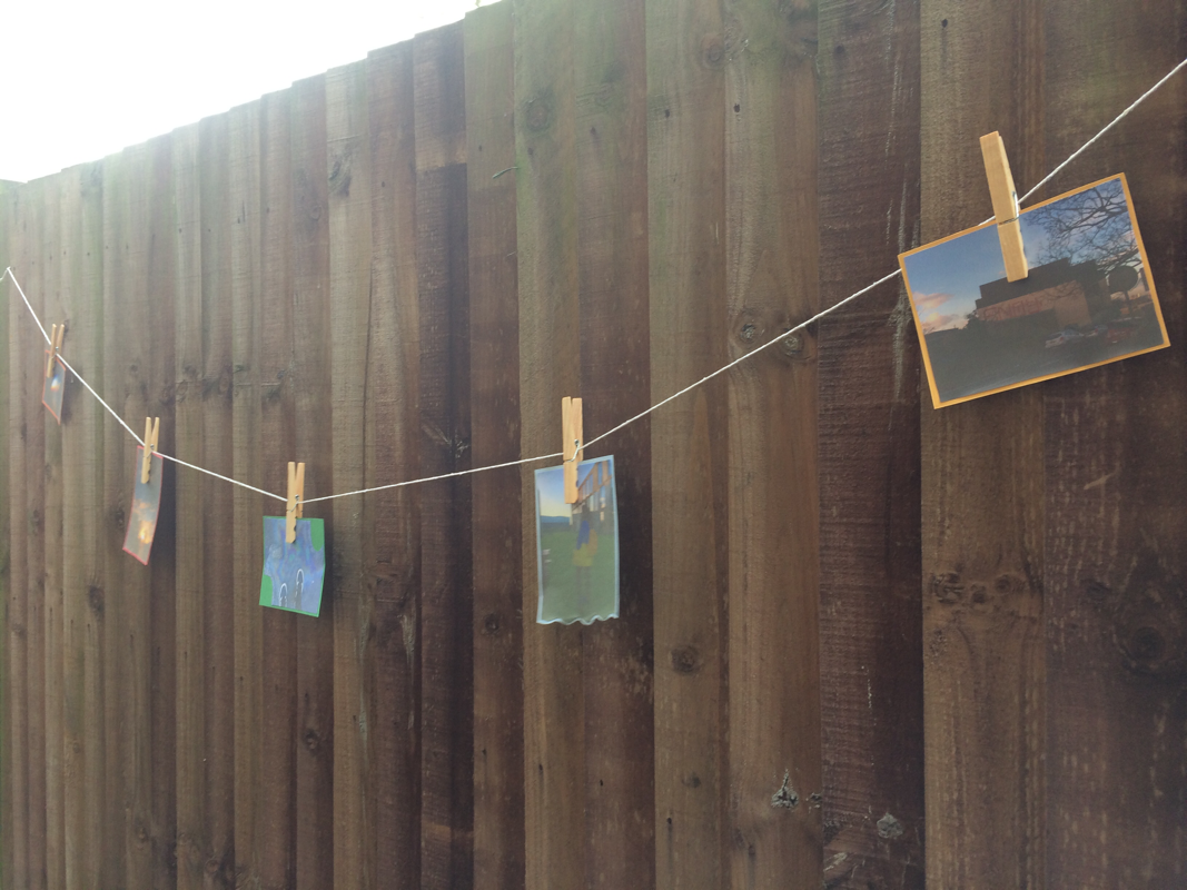
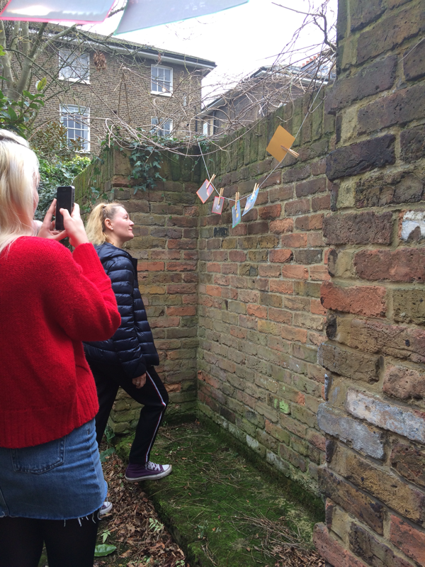
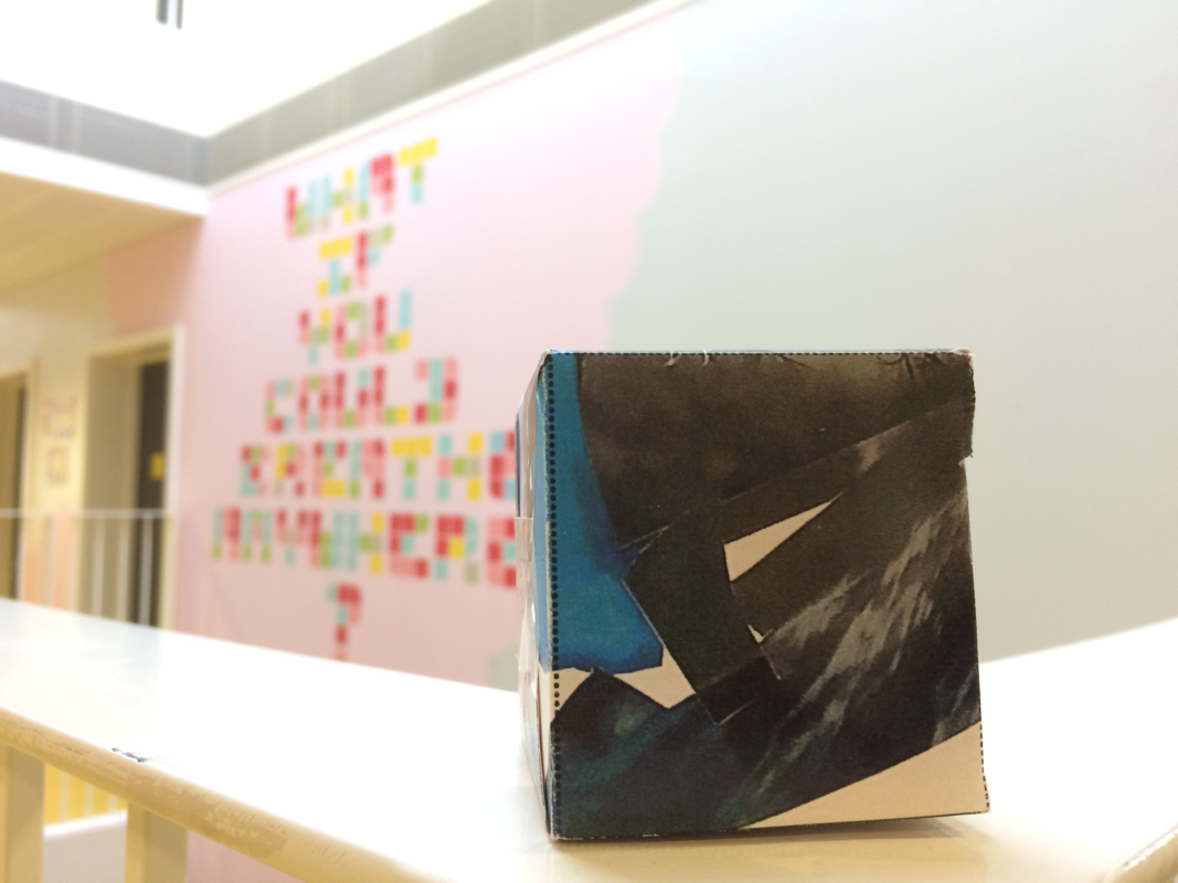
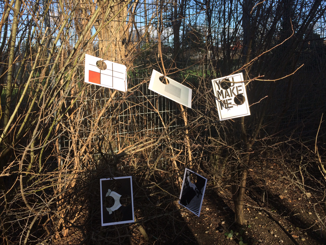
Experiments:
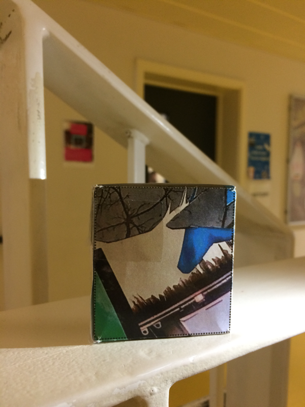
WWW:
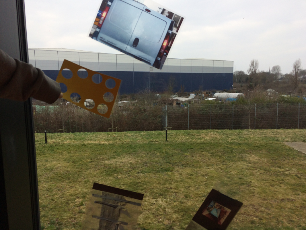
We used the cubes and cut out pictures. We experimented with putting the pictures in different places such as on a bush.
EBI:
I think that I could have taken more close-up pictures of the cards with the holes in them when they were hung on the branches of the bush.
Experimenting with photoshop:
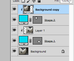
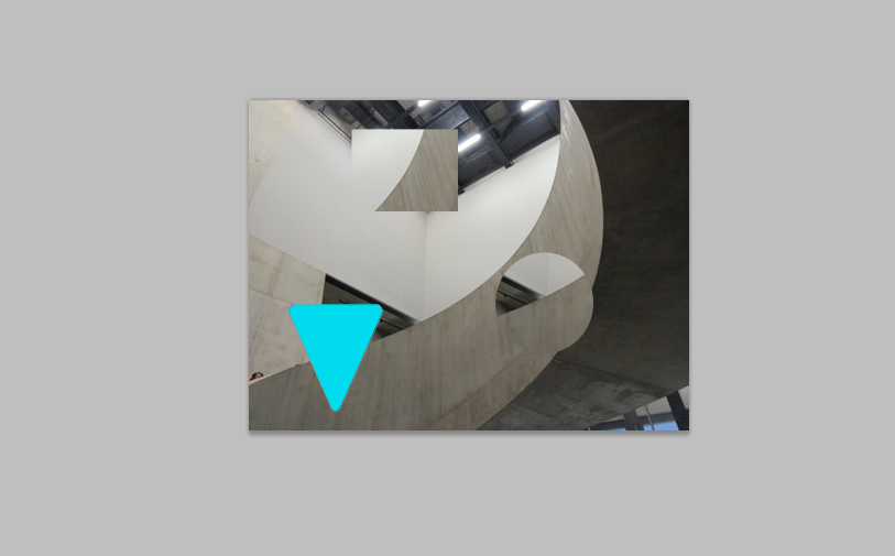
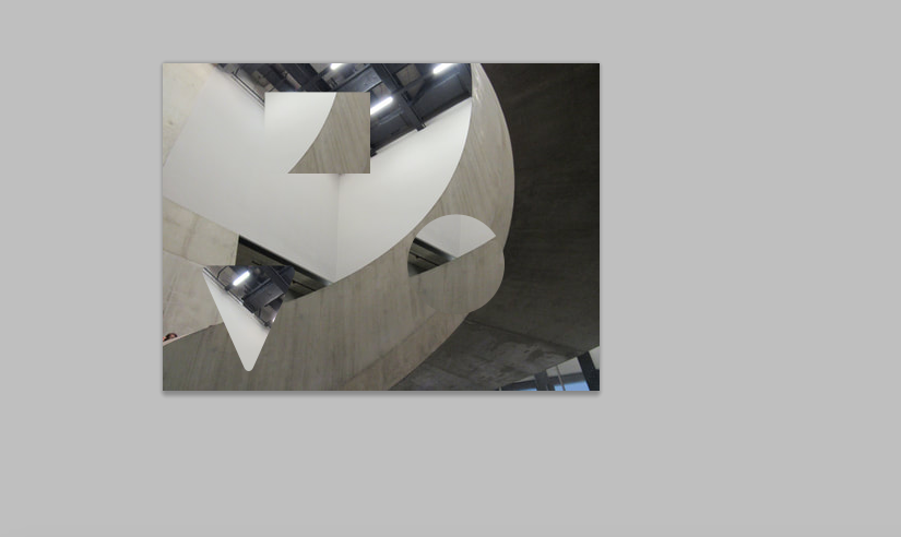
This was the process that I took in order to make the finished product:
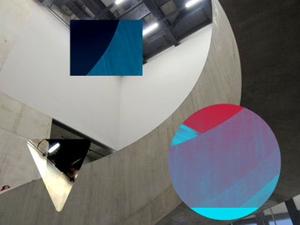
I also changed the colour of the shapes by pressing on normal and dropping down, I then experimented with the different colours I could make the shapes.
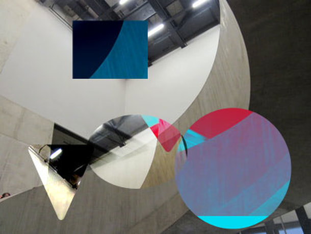
I am going to try experimenting with object clipping and practise using photoshop.
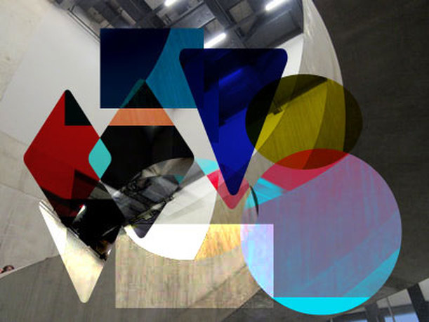
I think that I could have tried to add more shapes and overlap them more. Other than that I am quite happy with how it turned out as I am not very confident with working on photoshop but I am getting better.
Experiment with edges:
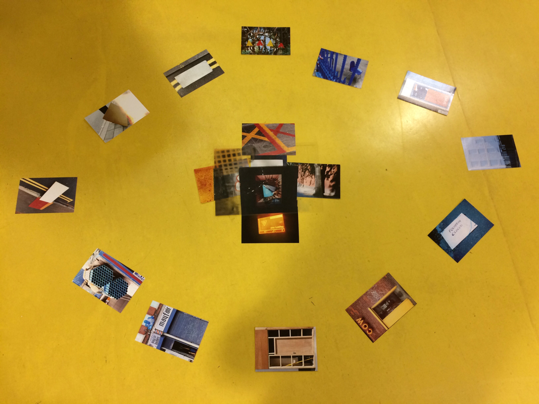
WWW:
I think that we tried to use all of the resources we chose and we tried putting them in different shapes.
EBI:
I think that we could have tried layering them more and try taking pictures of them from different perspectives. I also think that we could have tried choosing a theme for the photos, like picking pictures that are the same colour.
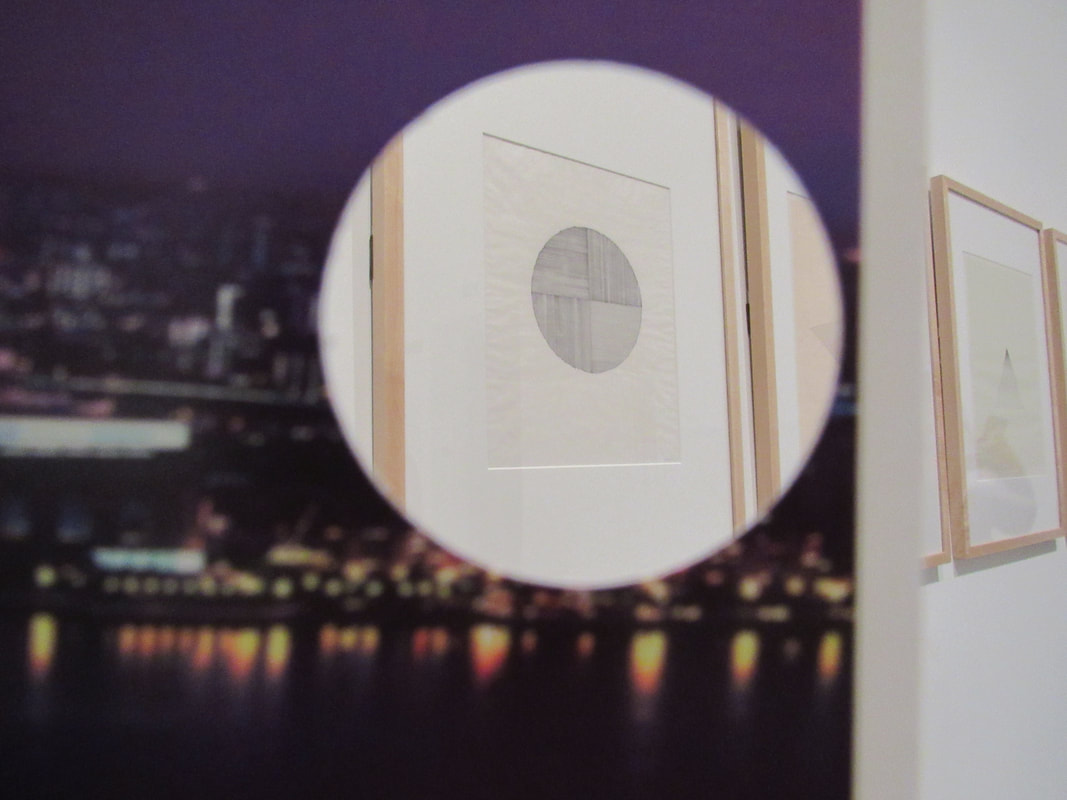
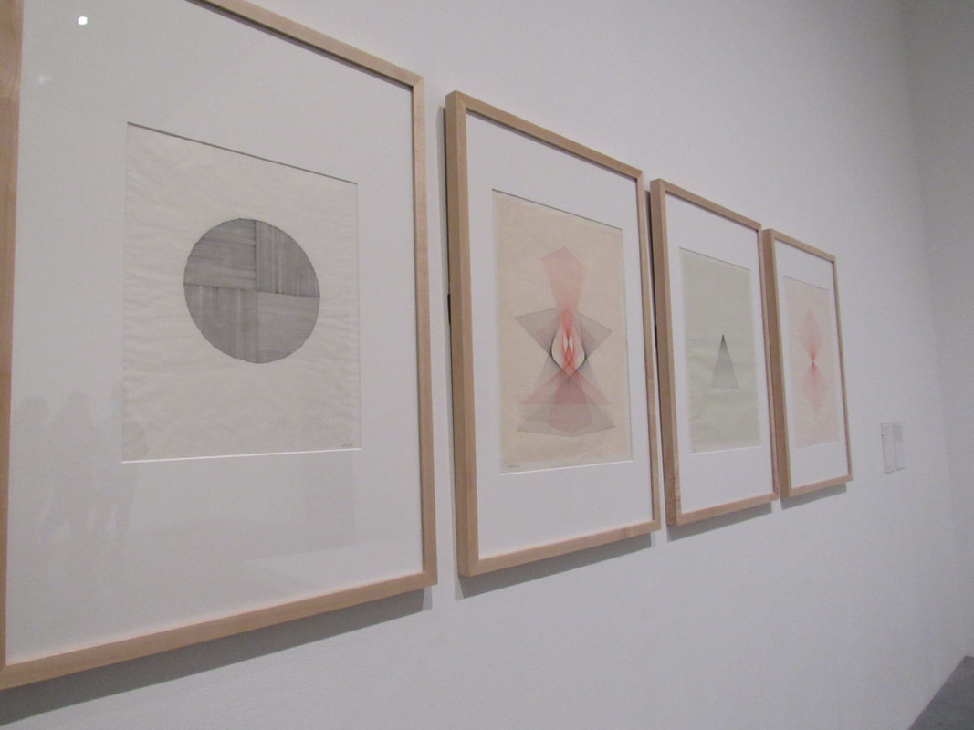
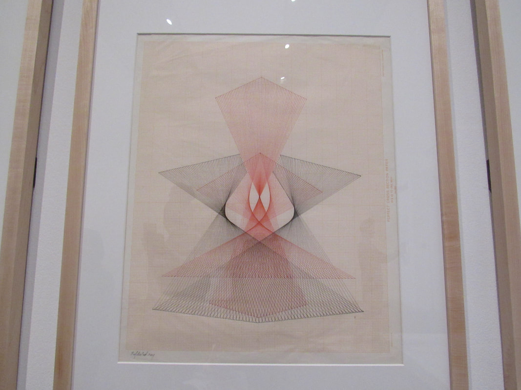
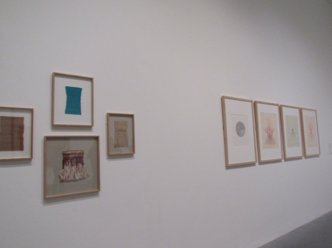
Edges assessment:
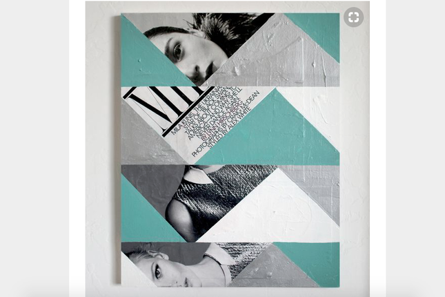
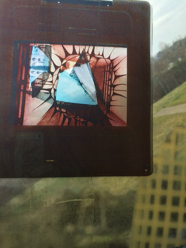
I like how the photographs have been cut into triangles and there is a pattern to it, I probably wouldn't make something like this but I like the design.
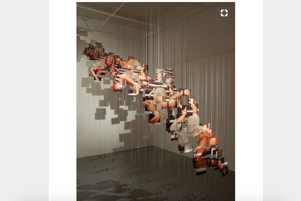
I think the way this artist displayed their pictures is quite interesting as they are getting higher as you go along.
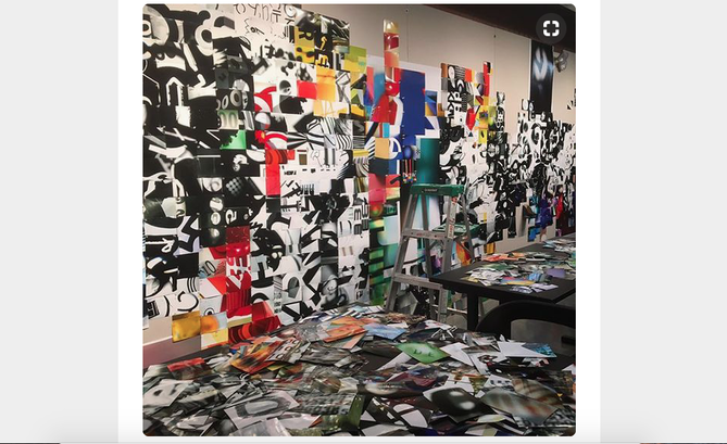
I like the way the pictures at the bottom are placed very random and there are different bursts of colour.
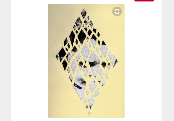
I think I might do something a little bit like this but I do not plan to make a particular shape with all the pictures, they will be randomly shaped and randomly placed. Some of them will also be folded up to make the collage more 3D, then I will put in somewhere quite random and take a picture of it.
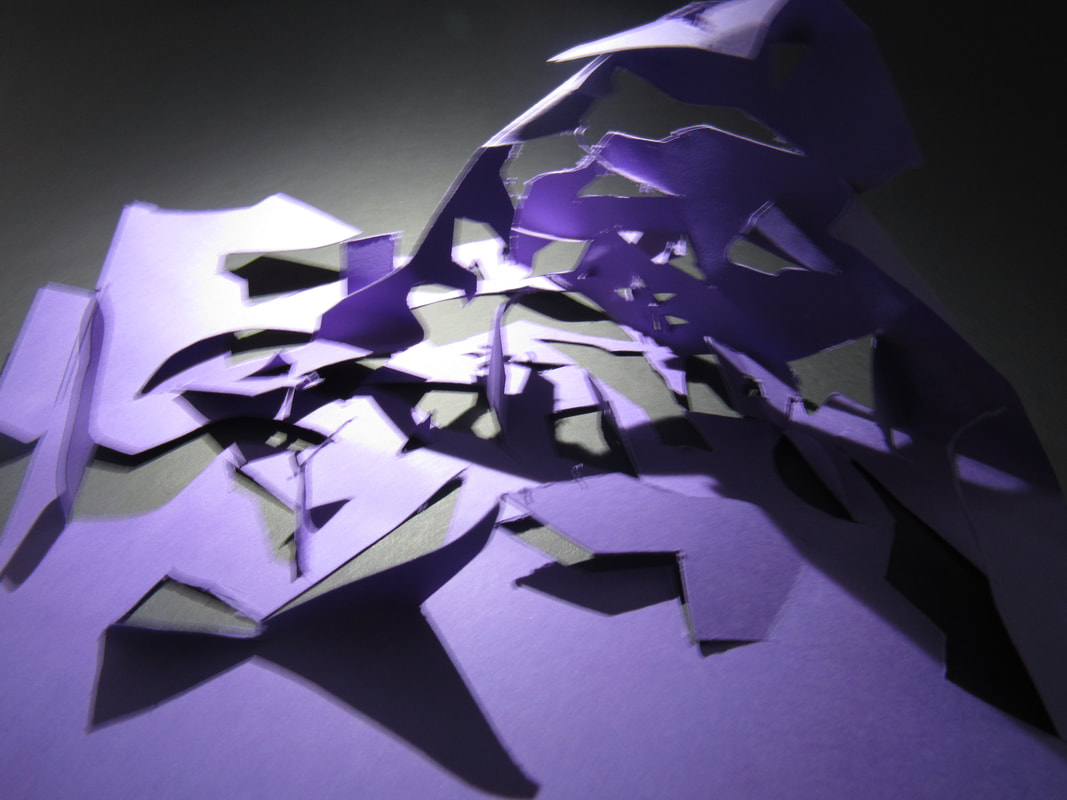
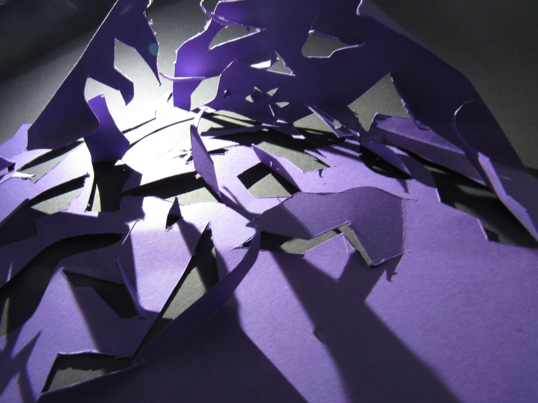
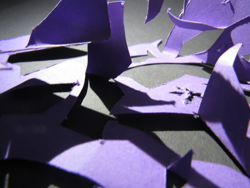
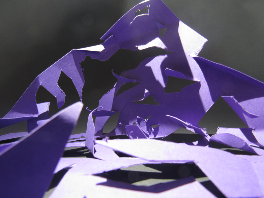
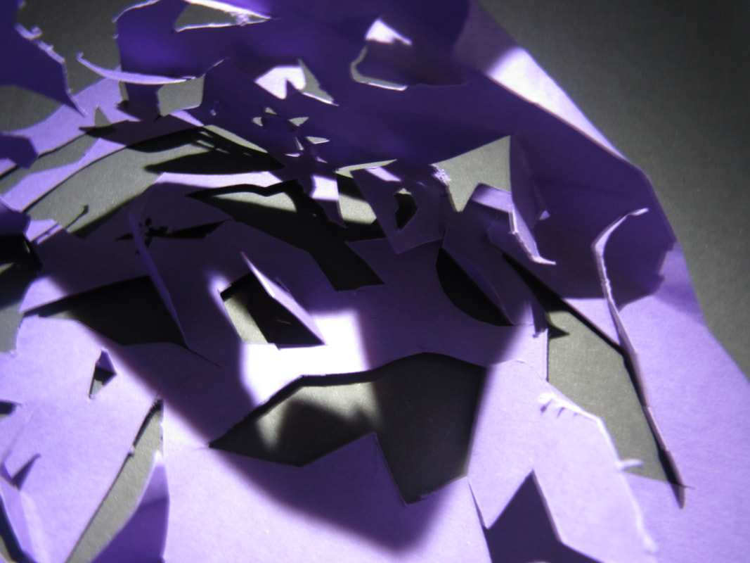
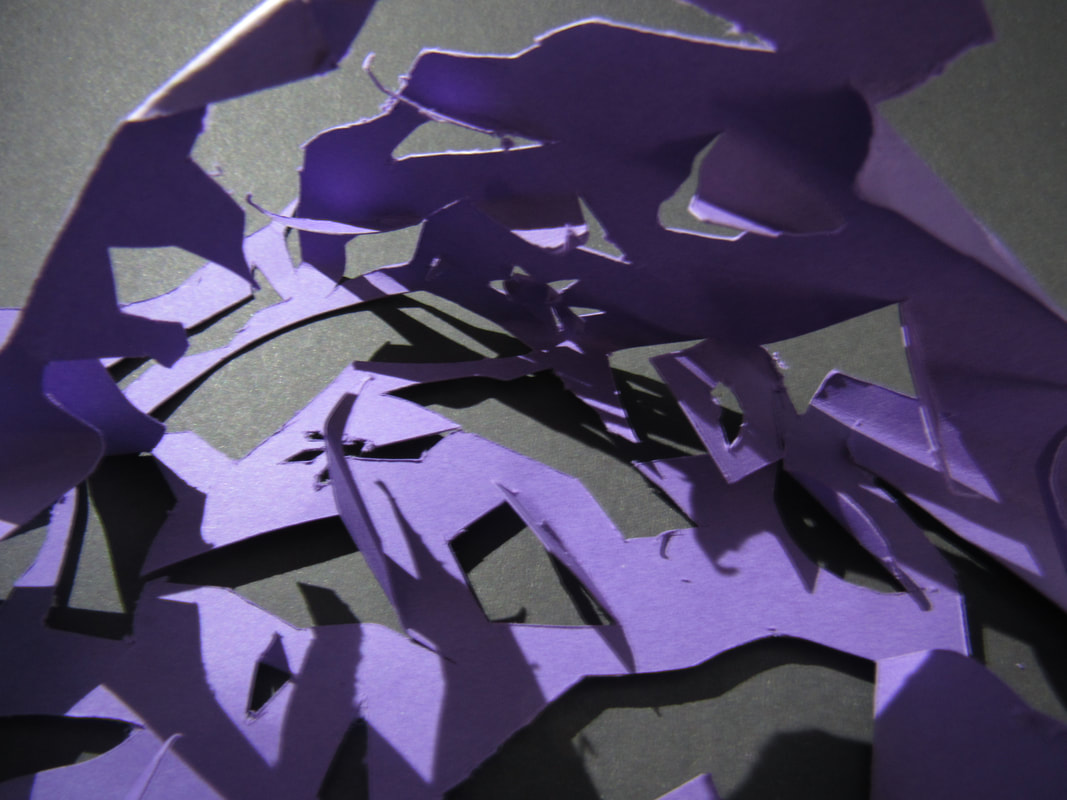
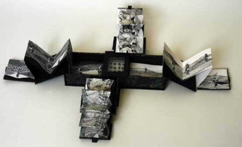
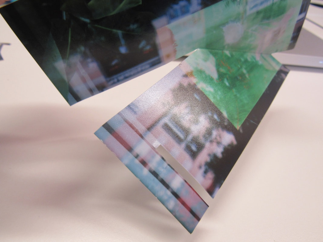
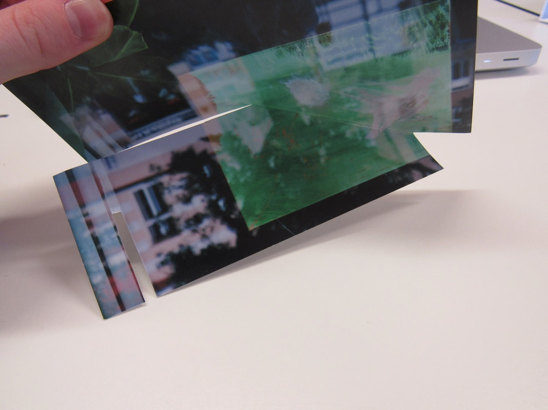
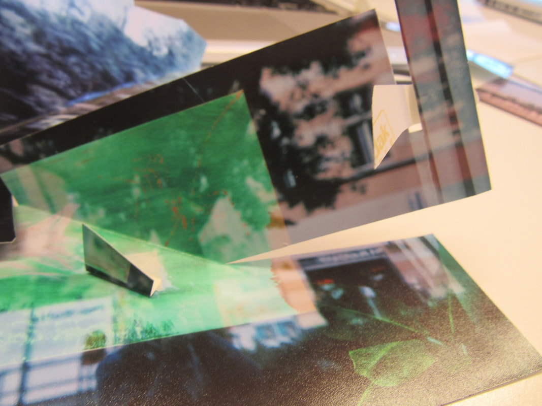
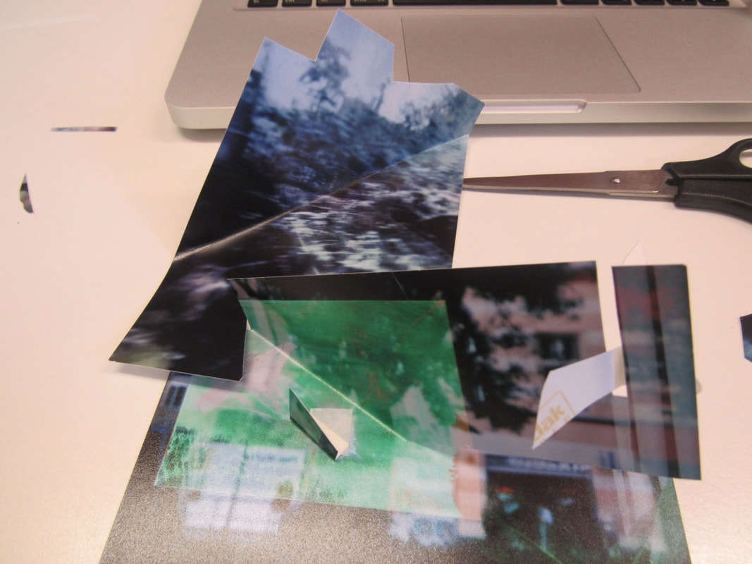
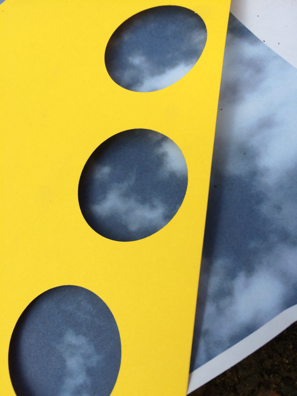
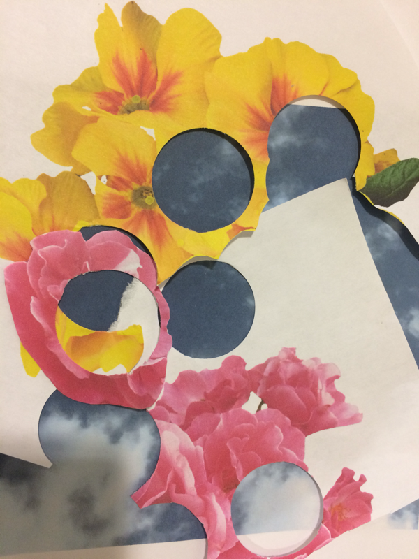
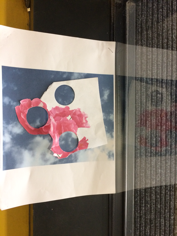
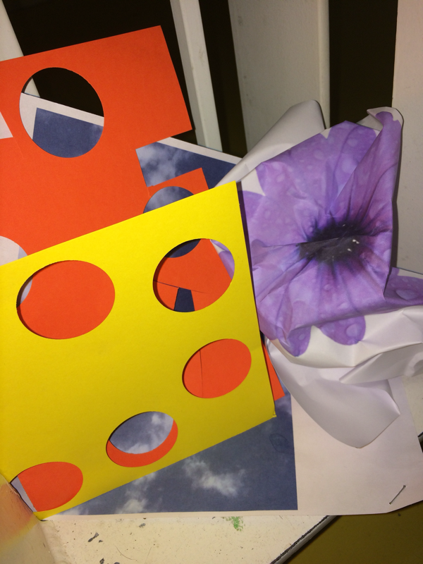
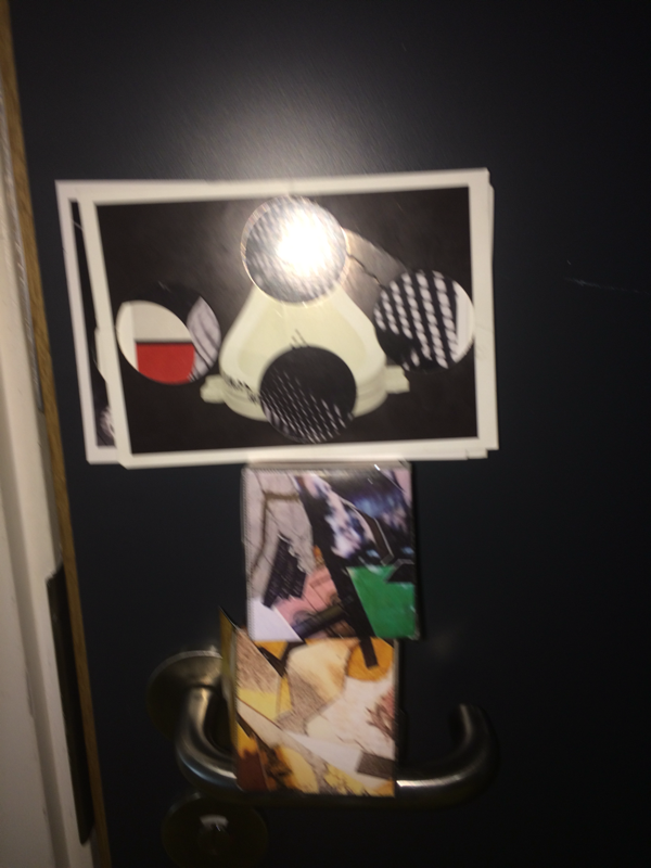
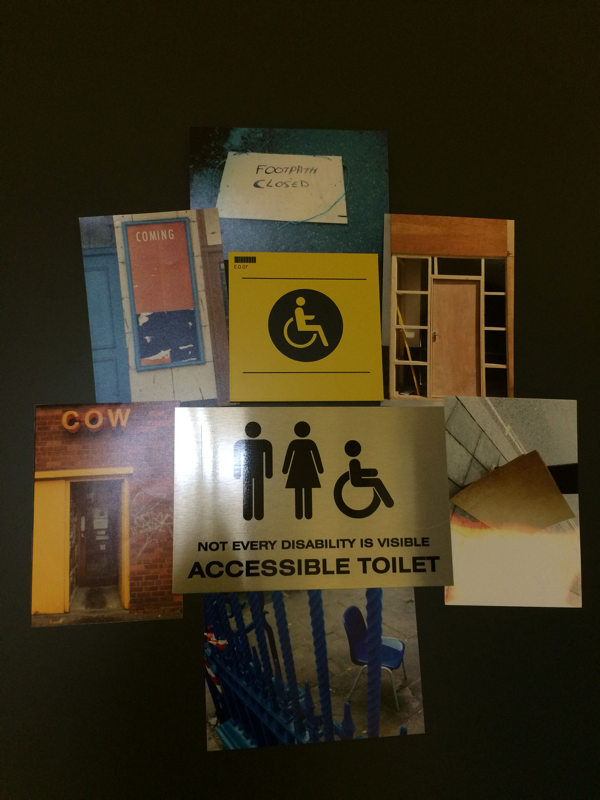
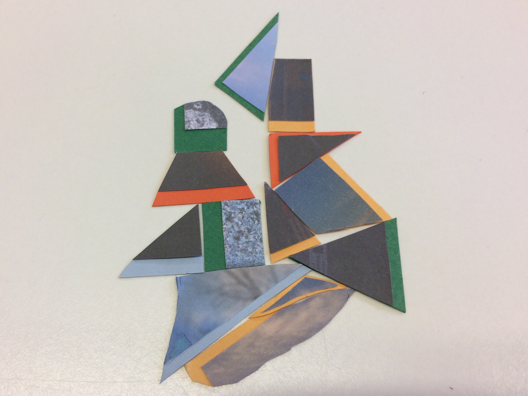
Edges final piece:
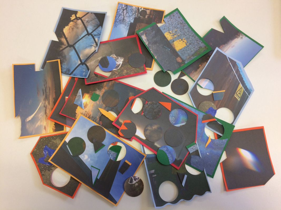
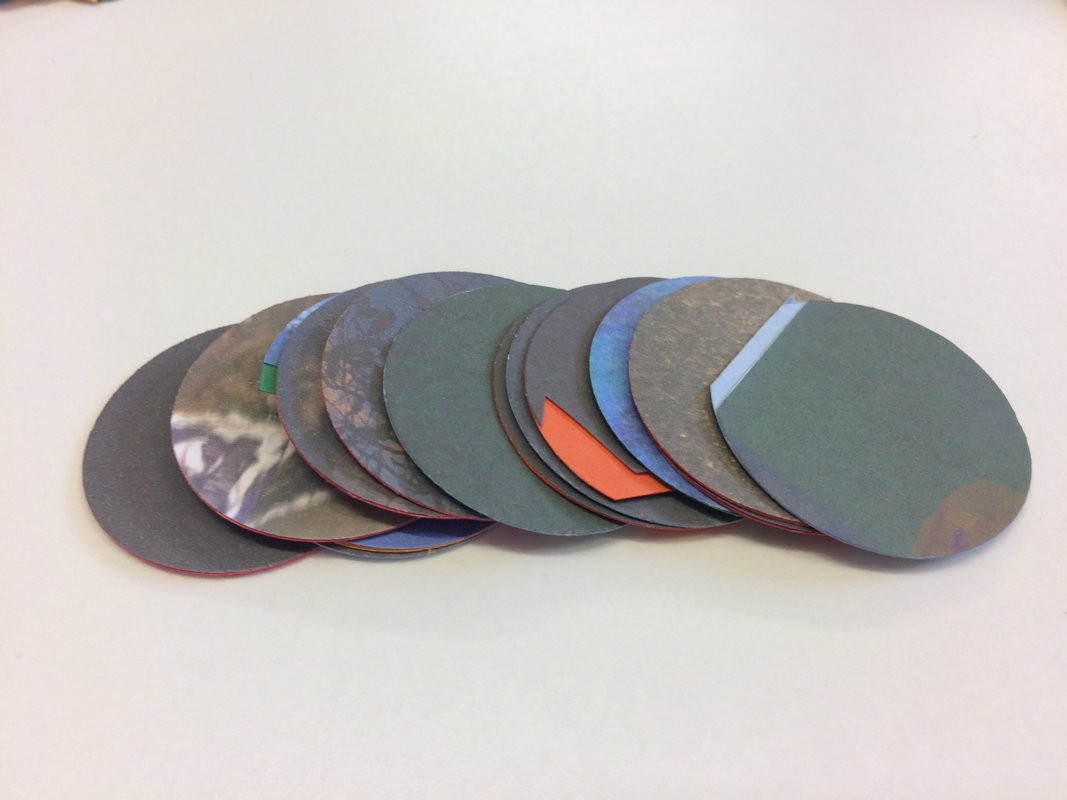
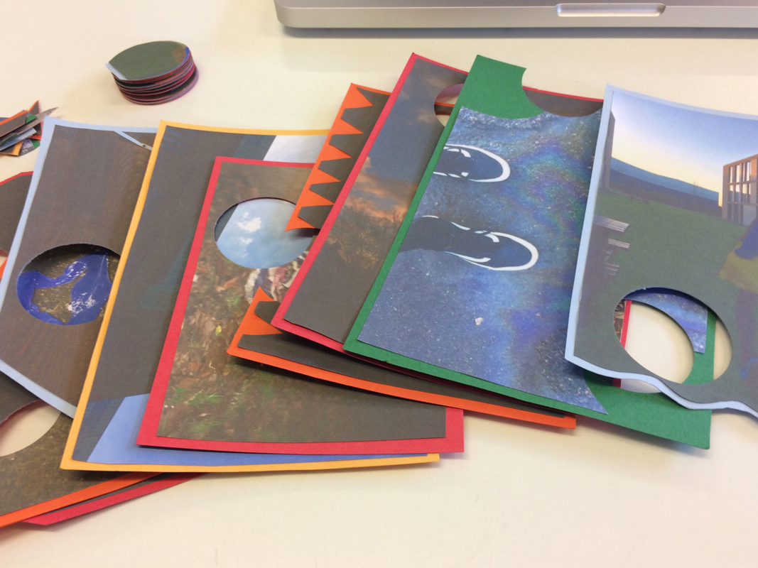
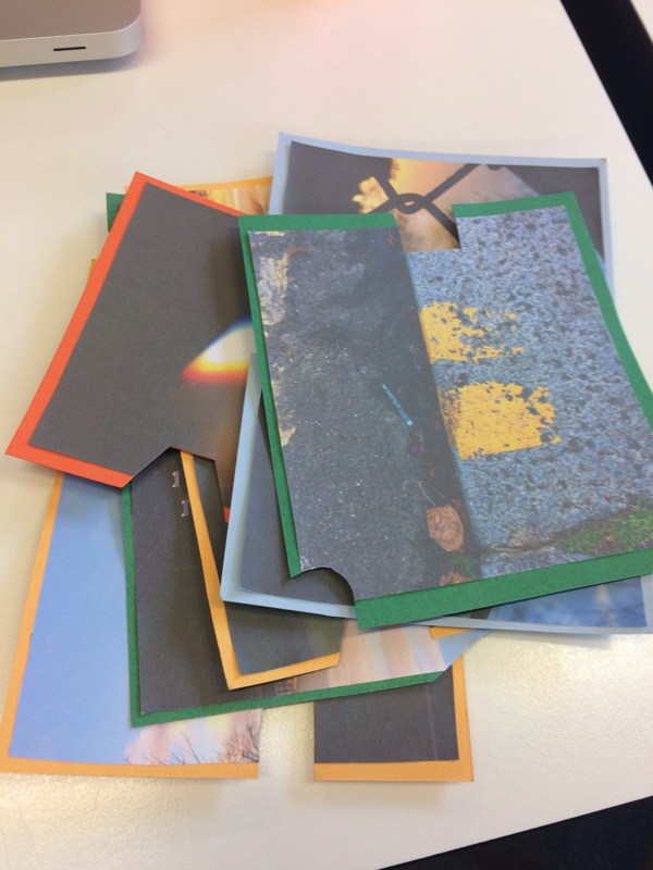
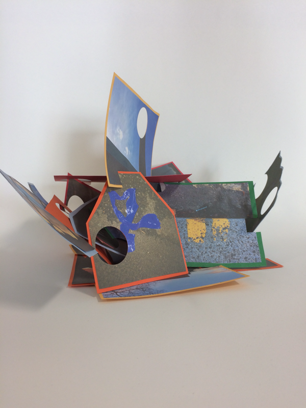
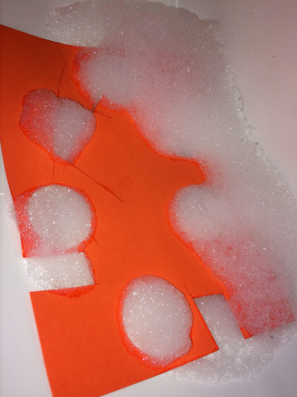
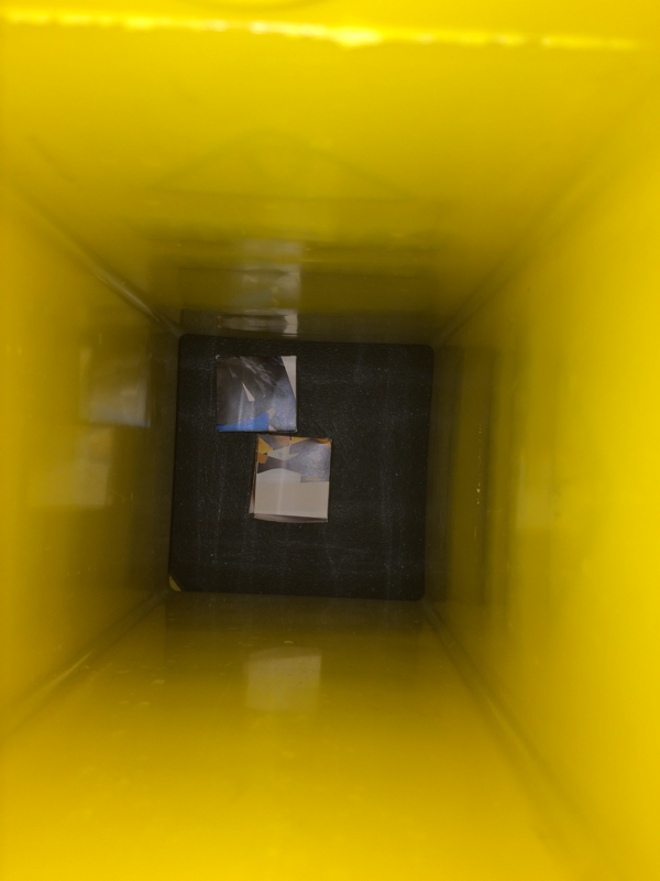
I have cut holes into some of the pictures and I have cut random shapes out of the rest and I plan to put them in some sort of collage that will be 3D.
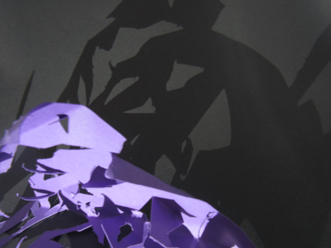
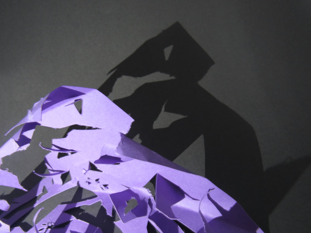
My final product is a sculpture which was made up of the pictures that I printed out. I think that I could have added the shapes that I cut out and put them in different places like the circles, which could have been put in the wrong holes in the pictures (that I had cut circles out of) but I did not have time to do that.
WWW:
I think that I did quite well in this assessment. I am quite happy with how it turned out . I like that I printed the pictures out on different coloured cards as I think it added a bit more colour to the sculpture that I made using the card. I also like how I cut different shapes out of the cards such as the circles, the triangles and squares. I think it relates to the theme of edges because of the shapes I cut out and the way the cards were placed.
EBI:
I think that when I was making the model it would have been better if I had included the shapes that I cut out (the circles, triangles and squares) in the model that I made, I think that I could have cut more shapes out of the cards as well. I think I also could have tried taking pictures of my sculpture in different places around the school. I also think that if I had the extra hour on the Friday I would have been able to put my pictures on the A4 piece of card. I think I might have been able to use the idea of edges a bit better by including the different shapes that I cut out or making the shapes I cut out a bit more abstract and not just triangles and squares or maybe just have one shape that I cut out of all of the cards instead. I could have tried to take more risks as well.
evaluation:
During this edges assessment I tried making a sculpture and I think that it turned out quite good, I also tried cutting out circles and triangles which add a nice effect. I didn't look at any particular artists for this assessment but I looked on Pinterest at different ways of displaying pictures and I found some very interesting pictures that I wouldn't have tried to recreate but I thought looked cool. I don't think I took as many risks as I should have. My final outcome is a few pictures of the model and the pictures I used to make it. I am happy with the sculpture I made because I think that it looked good and I am happy with the way I connected all of the pictures. I think I have learned to trust my ideas more and find ways to work around problems.
